Design
Tools
Wendy Mackay & Michel Beaudouin-Lafon
Laurent Grisoni, Président
Professeur des universités, Université de Lille 1
Yannick Prié, Rapporteur
Professeur des universités, Université de Nantes
Peter Dalsgaard, Rapporteur
Professeur associé, Université d’Aarhus
Annie Gentes, Examinatrice
Maître de Conférences HDR, Télécom Paris-Tech
Gillian Crampton-Smith, Examinatrice
Professeur Émérite, Univ. de sciences app. de Potsdam
Michel Beaudouin-Lafon, Directeur de thèse
Professeur des universités, Université Paris-Sud
Wendy Mackay, Co-encadrante de thèse
Directrice de Recherche à Inria Saclay
Summary
Mainstream digital graphic design tools seldom evolved since their creation, more than 25 years ago. In recent years, a growing number of designers started questioning the resulting invisibility of design tools in the design process.
In this dissertation, I address the following questions: How do designers work with design software? And how can we design novel design tools that better support designer practices?
Using StoryPortraits, a method designed to capture rich qualitative insight in a form that supports both analysis and design conversations, I first study four designer practices, ranging from specific design operations such as color selection, alignment and distribution, to more complex endeavors such as layout structuring and collaboration with developers.
In these empirical studies, I analyze the wealth of designer practices and I characterize the existing mismatch between current digital design tools and designers practices. I show how design tools, because they decouple creativity from tool use, prioritize values such as efficiency and user-friendliness that do not support existing creative practices.
Facing this mismatch, designers need to resort to programming to benefit from the computational power they can't access with traditional tools.
Based on my empirical findings, I propose a new type of design tools, Graphical Substrates, that combine the strengths of both programming and traditional Graphical User Interfaces.
I design nine different tools that address the needs identified in the four empirical studies by reifying specific user process into Graphical Substrates probes.
In four structured observation studies, I show how designers can appropriate these probes in their own terms.
For designers to fully benefit from Graphical Substrates, I argue that they need to acknowledge the fundamental design practice of tweaking. I also argue that we should let designers reify their own graphical substrates from specific examples. I design and explore several ways to embed these two mechanisms into Graphical Substrates.
In this thesis, I argue that Graphical Substrates open the design space of designers' tools by bridging the gap between programming and graphical user interface to better support the wealth of designers' practices.
Résumé
Les outils de design graphique traditionnels n’ont que peu évolué depuis leur création, il y a plus de 25 ans. Récemment, un nombre de plus en plus important de designers commence à questionner l’invisibilité de ces outils dans le processus de design. Dans cette thèse, je m’intéresse à deux questions principales: Comment les designers travaillent-ils avec leur outils de design numériques ? Comment peut-on créer de nouveaux outils numériques pour le design qui supportent les pratiques existantes ? En utilisant StoryPortraits, une méthodologie de synthèse graphique crée pour capturer les experiences des designers en une forme qui supporte à la fois l’analyse et le design, j’étudie en premier lieu quatre pratiques de design. Celles-ci s'échelonnent depuis des opérations spécifiques telles que la sélection de couleurs, l’alignement et la distribution d’objets graphiques vers des pratiques plus complexes telles que la structuration de la mise en page et la collaboration avec des développeurs pour créer de nouvelles interactions. Dans ces quatre études empiriques, j’analyse la richesse des pratiques des designers et je caractérise le décalage existant entre les outils numériques actuels et les pratiques des designers. Je montre comment les outils du design numérique actuels détachent la créativité de l’utilisation des outils en donnant la priorité à des valeurs telles que l’efficacité et la facilité d’utilisation qui ne reflètent pas les pratiques creatives existantes. Face à ce décalage, les designers se tournent vers la programmation pour profiter d'une puissance de calcul et d’une flexibilité à laquelle ils n’ont pas accès avec leurs outils traditionnels. Je propose un nouveau type d’outil de design nommé “Substrats Graphiques”, fondé sur les résultats empiriques de mes quatre études et qui combine la souplesse et l'expressivité de la programmation avec la manipulation directe permise par les interfaces graphiques traditionnelles. Je conçois neuf outils différents qui répondent aux attentes identifiées dans mes études empiriques en réifiant (transformant en objets concrets) les processus spécifiques des designers en tant que Substrats Graphiques. À travers quatre observations structurées, je montre comment les designers s’approprient ces substrats dans leurs propres termes. Afin que les designers puissent véritablement bénéficier des Substrats Graphiques, nous devons prendre en considération la pratique fondamentale de l’ajustement. Nous devons également permettre aux designers de réifier leurs substrats à partir de leurs propres exemples. Je conçois et j’explore plusieurs manières d’intégrer ces mécanismes dans les substrats graphiques. Dans cette thèse, je soutiens que les Substrats Graphiques ouvrent l’espace des possibles des outils pour les designers en permettant de combler l’écart entre la programmation et les interfaces graphiques.
Introduction
When I first started my design curriculum, during our first class, our professors asked us to install a set of “design applications”; namely the Adobe Creative Suite. It was a prerequisite, just like having a notebook and some pencils at hand. During my studies, for each project, we were asked to carefully select the material and the industrial process we would use. We would always question the design brief and look for opportunities to challenge client assumptions about how such material was meant to be used or how such industrial or craft process had to be applied. However, not once did we consider questioning the applications that we were using at every step in the process. Design software was a dead angle in the design process.
Design software tools revolutionized the design process as soon as they were introduced in personal computers, around 1990. They greatly facilitated and optimized the different steps of the design and production process. Designers could finally access and interact with real time visualization of their work. Graphic designer and critic Ellen Lupton recalls: “being able to directly manipulate type, photography, color, and being able to see it in real time, as you are working, that’s what it’s all about, that’s the revolution” (Briar, 2017). Design software also profoundly transformed design industries themselves, especially graphic design. Behind the scene, design software led to the disappearance of many intermediary professions and thus concentrated design work in the hand of the designers themselves.
More than 25 years after, we saw the democratization of internet and the wide spread of mobile phones. Design practice accompanied this movement and many novel design disciplines appeared, including interaction design and service design. In an essay published in Digital Design Theory (Khoi, 2011), graphic designer Khoi Vinh explains that “Design solutions can no longer be concluded; they’re now works in progress, objects that continually evolve and are continually reinvented”. Yet, contrary to design practice, the digital design tools landscape mostly did not change. The same few design applications that were introduced in the 1990’s are still being used by the overwhelming majority of designers almost 30 years later. Moreover, these tools have hardly evolved. If we look at toolbars for example (), we can see that they are based on the same logic and they still provide the same tools since their origin. Rather than evolving, they “bloated” (McGrenere, 2000).
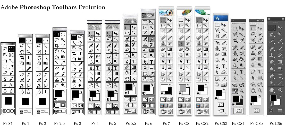
Comparison of Adobe Photoshop Toolbars since 1987. Note how little they have changed.
The stagnation of the design tool landscape led to the progressive invisibility of design software in designers practice. In fact, as New Media professor Olia Lialina demonstrated, the message from Adobe in their advertisement campaign is that the best kind of design requires designers to forget about their tools, so that they can focus on the core of their work: being creative (Lialina, 2012). The logic behind this assertion is that, ideally, the creative process should be decoupled from the tools. Thus, the invisibility of design tools should in fact become the ultimate goal for tool creators.
Does the current Design Software stagnation and invisibility imply that designers’ tools are a solved problem?
Two different elements demonstrate that design software remains an open question. First, design software invisibility is particularly striking when we consider the reasons behind design birth. Design origins are generally traced back to the industrialization of of Britain in the 19th century. For design pioneer William Morris and the British Arts and Crafts movement, the emerging industrialized mass production meant a uniformization of the resulting products, as well as a degradation in product quality (Morris, 1884). In response to this trend, they advocated for a tighter connection between design, craft and production. William Morris himself was extremely prolific and practiced dyeing, weaving, cabinet making, and printing among other crafts. Before the era of industrialization and the separation of people and the means of production, craftsmen were creating their own tools. They were extremely ingenious in adapting their tools to one’s hand size and handedness, or to achieve particular effects (). Morris sought to preserve this tradition.
While Morris and the Art and crafts movement could be considered “luddite” in their rejection of machine (Thomis, 1970), a few decades later, the pioneer Bauhaus design school encouraged its students to embrace machines and explore their potential. Designers were to appropriate industrial processes to create high quality products. (Papanek, 1972)
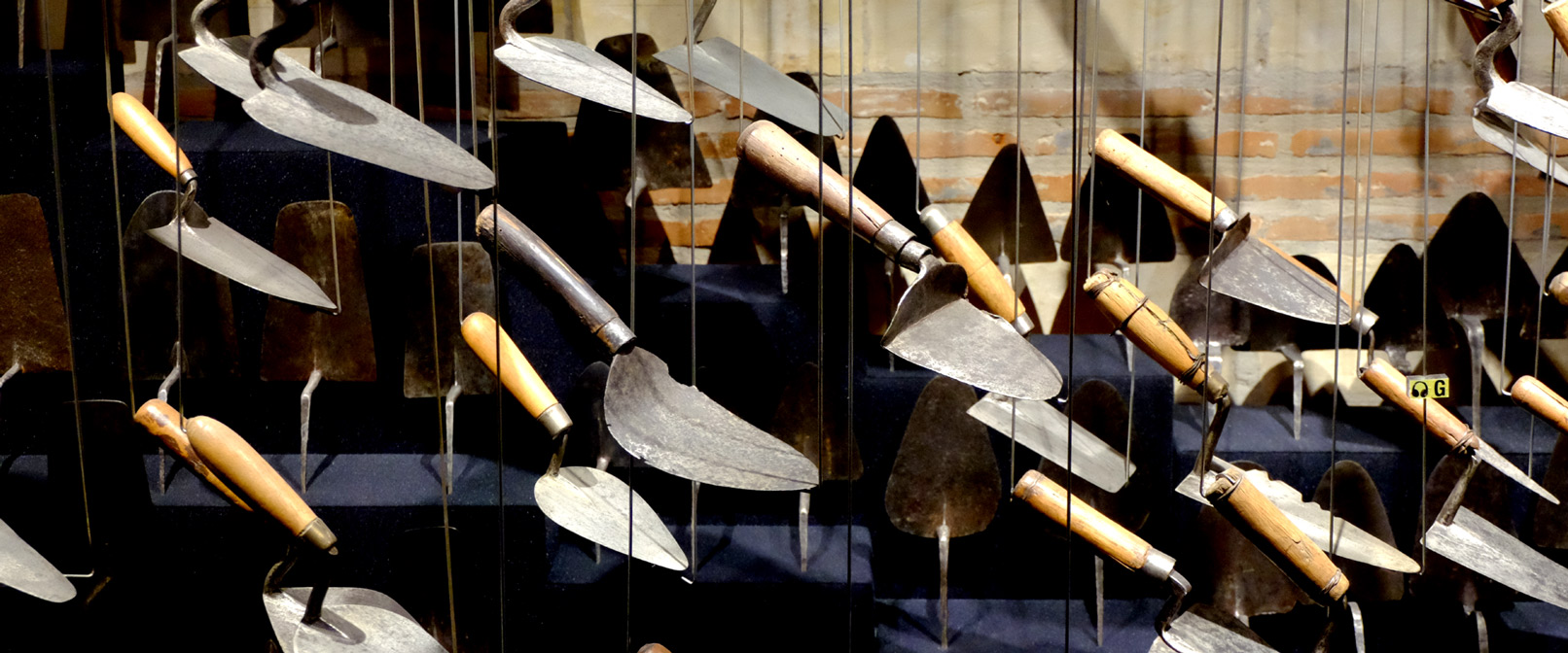
Few of the many trowels that can be seen at the "Maison de l’outil et de la pensée ouvrière" in Troyes, France. Note how very similar they look, yet how uniquely different each one of them is.
Thus, at the origin of design was the intention to reappropriate production means and to fusion design and production. Following this line of thought, separating the question of design and design tools is impossible. Design Software is an open issue because part of a designer’s work is to choose and question their tools. The second, and probably more important reason is an emerging reappropriation movement coming from designers themselves. In recent years, more and more designers started learning programming languages. The iconic Processing programming language and environment, launched in 2001, was among the very first tool that sought “to introduce visual designers and artists to computational design” (Reas and Fry, 2007). Its influence spread beyond graphic design and led to the Arduino project, an electronics platform aimed at facilitating the creation and prototyping of interactive products. For designers, programming offers a whole new range of dynamic capabilities that traditional software does not yet provide (Reas and McWilliams, 2010).
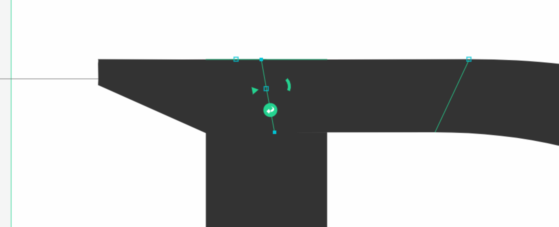
Interface detail of Prototypo, a parametric font design tool created by designer Yannick Mathey
These pioneer initiatives nurtured a new generation of designers who started building design software, usually for their own needs. In a 2012 essay commissioned by Centre National des Arts Plastiques for the magazine Graphisme en France (Reas and McWilliams, 2012), Casey Reas and Chandler McWilliams asked several designers who program their own tools: Why do you write your own software rather than only use existing software tools? How does writing your own software affect your design process and also the visual qualities of the final work? They found that some ideas were prevalent across respondents. First, designers explained that writing custom software gives them more control over the resulting artifact. The second is that new tools bring novel creative opportunities: “Experienced designers know that off-the-shelf, general software tools obscure the potential of software as a medium for expression and communication. Writing custom, unique tools with software opens new potentials for creative authorship”(Reas and McWilliams, 2012). A few designers also produce tools for other designers. An early example is Scriptographer, which lets designers extend Adobe Illustrator’s functionality by writing simple scripts in JavaScript. More recently, Prototypo is an interactive font creation software based on a parameterized customization. Prototypo is also one of the rare tools that provides a fully visual interface (). Alongside these mostly individually-led initiatives, a new design software industry is gradually emerging, with tools such as Sketch and Affinity Designer. This movement is especially visible in recent areas of design, such as interaction design. In these disciplines, the gap between the actual interaction design work and traditional software created for the printing process is especially salient.
At the same time, several designers started to question the lack of interest and diversity in design software through their writings. According to designer and design critic David Reinfurt: “Function sets, software paradigms, and user scenarios are mapped out for each software project to ensure the widest possible usability, resulting in an averaged tool which skips the highs, lows, errors, and quirks.” (Reinfurt, 2007). In his thesis “digital tools and graphic design”, graphic designer Kevin Donnot wonders “Why couldn’t we accept that tools influence us and that we could choose them depending on their impact? Shouldn’t we ask ourselves which tool is appropriate before mechanically resorting to our usual software?” (Donnot, 2011). This recent interest started bringing design software in the spotlight (Leray and Vilayphiou, 2011). Yet, if the need for novel design tools is real, we currently know very little about the current relationship between designers and their digital tools and what types of design tools would suit them.
Research Questions
Grounded in these preliminary observations about the current state of design software, I articulated two complementary sets of research questions for this thesis:
How do designers work with design software?
How do designers work with and around design tools? How do they appropriate existing software and adapt it for their specific practices? How do current design tools support these practices.
How can we create design tools that better support design practice?
What tools can we create to support current design practices? How would designers work with these new tools, and how would these tools influence their existing practices?
The reflective aspect of these first two questions call for a second set of broader questions on the nature of design tools. Designers design for others. But how should we design for designers? How does designing tools for designers differ from designing other tools? Can we use the same principles to design for creativity and for productivity?
Definitions
Design is a very broad and multi-disciplinary field, involving many different practices, cultures and traditions. In my thesis, I chose to focus on graphic design and interaction design. Graphic designers professionally create documents, laying out content in space. Yet, many aspects of their work, including choosing color, aligning visual elements or even creating layouts are not exclusively the prerogative of graphic designers. Many different professions create documents as part of their daily work. Even if they don’t focus on the graphic design aspect of these documents, they nevertheless need to carry the same design tasks. New tools created for designers could potentially also transform how these non-professional perform their own design tasks. Even within this limited scope, graphic design practices are extremely diverse. To study design tools from complementary angles, I focus on successive task levels, starting from very focused and specific tasks to more and more higher level, structural and collaborative, tasks. I started with extremely focused practices: color selection as well as alignment and distribution, which are intrinsic to most design work. Yet, these two tasks are only one specific aspect of any design project. To complement these first two inquiries, I then turned to a more complex design task, layout structuring. Unlike color and alignment, current design software applications do not include a single dedicated tool for layout manipulation. Finally, I studied designer-developer collaboration when creating interactive systems. These four different design activities, address design tools from different perspectives and scales.
Defining design tools might be an endless endeavor, because the intricate architecture of software tends to blend different levels of granularity. In this thesis, I define design tools as individual tools within design applications such as Adobe Illustrator and InDesign. For example, in this thesis, I call design tools individual panels and commands such as color pickers, alignment commands, levels panel, Adobe Photoshop filters, etc. I otherwise use the term design software application to refer to design applications such as Adobe Illustrator, Photoshop and InDesign that include a wide variety of design tools.
Research Approach
This thesis is at the cross-roads of design and human-computer interaction. Over the course of this PhD, I positioned myself as a design researcher borrowing from HCI methodologies. Design research is a relatively new field of research, and, not unlike Human-Computer Interaction, is still arguing over a canonical definition. But before trying to define design research, I must first settle on a definition of design. Many have been proposed, but for the sake of convenience and because it fits my personal philosophy rather well, I chose the definition proposed by Herbert Simon in 1969:
“everyone designs who devises courses of action aimed at changing existing situations into preferred ones.”
―Herbert Simon in The Sciences of the Artificial, p.130
One could argue that this goal is shared with engineering. A key differences, however, is that design focuses on what Horst Rittel and Melvin Webber in 1973 called "Wicked Problems" (Rittel and Webber, 1973). Wicked Problems cannot be easily addressed through science and engineering methods. Rittel and Webber coined this term “in reaction to the casting of design as a science and also in response to systems engineers’ inability to apply scientific methods to address social problems”. Zimmerman explains that wicked problems cannot be accurately modeled, because the different stakeholders hold conflicting perspectives of the issue at hand. It is therefore impossible to adress this problem using “the reductionist approaches of science and engineering” (Zimmerman et al., 2007).
Now that we have proposed a definition of design, we can approach a definition of design research. Frayling, Professor at the Royal College of Art, proposed a classification of design research in three components (Frayling, 1993): Research for design, Research into design and Research through design. Findeli, in 2004, redefined these three types of design research (Findeli, 2004) as follows:
“Research for design” aims at guiding design practice. This research is collected by designers to document different aspects of their project (technical, sociological, ergonomics...) that will then be used to nourish their design process.
“Research into design” is mainly found in universities and research centres contributing to a scientific discipline studying design. It documents objects, phenomena and history of design.
“Research through design” is the closest to the actual design practice. Designer/researchers who use Research through Design seek knowledge and understanding through the making of artefacts.
My thesis follows a “Research through design” approach. More concretely, Findeli’s description again as his description of research through design practice accurately reflects my own practice:
“the aim of designers is to modify human-environment interactions and to transform them into preferred ones. Their stance is prescriptive and diagnostic. Indeed, design researchers, being also trained as designers – a fundamental prerequisite – are endowed with the intellectual culture of design; they not only look at what is going on in the world (descriptive stance), they look for what is going wrong in the world (diagnostic stance) in order, hopefully, to improve the situation. [...] Their epistemological stance may thus be characterized as projective.” (Findeli, 2004)
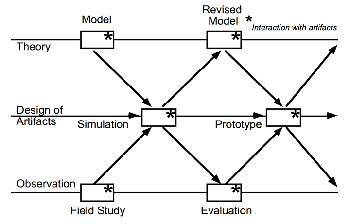
-Mackay and Fayard’s triangulation framework, articulated around theory, design of artifacts and observation.
According to Pedgley (Pedgley, 2007), one of the main obstacles to acquiring knowledge with this method is that “Designers are not used to accounting for what they know or do”. Schön also concur that this type of knowledge is “implicit to our patterns of action and in our feel for the stuff with which we are dealing” (Schön, 1984). To address this issue, I conducted my PhD using Mackay and Fayard’s triangulation framework, originally defined in the context of Human-Computer Interaction (). As Mackay and Fayard pointed out, “HCI cannot be considered a pure natural science because it studies the interaction between people and artificially-created artifacts, rather than naturally-occurring phenomena, which violates several basic assumptions of natural science” (Mackay and Fayard, 1997) In order to integrate design and scientific knowledge, they propose to iterate over three different levels: theory, artifact design and observation. Findings from each of these steps nurture the subsequents. Following this framework, I articulated my thesis contributions around this threefold structure.
Following design researcher Bill Gaver’s demand for new artifacts to manifest and exhibit design research results (Gaver and Bowers, 2012), I produced artifacts to explicit my findings at each level in the process. These artifacts are the foundation of the present thesis.
Thesis Statement
My thesis concerns the mismatch between the principles underlying current graphic design tools and the daily practices of graphic designers. Mainstream design tools decouple creativity from tool use and prioritize values such as efficiency and user-friendliness that do not reflect designers’ needs. I propose to turn graphical design substrates, the ad hoc principles created and used by designers in their work, into design tools that bridge the gap between graphical design tools and programming. Graphical Substrates can be turned into interactive objects that represent and mediate relationships among graphical elements. These reified relationships can scaffold and evolve during designers’ exploration phase. I demonstrate how we can create Graphical Substrates directly from specific designers’ practices and how we can let designers themselves reify their own graphical substrates from their unique examples. By integrating tweaking mechanisms in the substrates themselves, they can become a novel type of flexible and powerful design tools.
Thesis Overview
In Chapter 2, I analyze the differences among design software application that were developed by computer scientists, by the industry and by designers themselves. I also review the impact of design software from three perspectives: designer's accounts, empirical studies and media studies analyses.
I then divide my thesis in two parts, each targeting one of the two sets of research questions presented above. In the first part of the thesis, I investigate designers' practices with digital tools by studying four complementary practices. In chapter 3, I present StoryPortraits, a technique for interviewing, synthesizing and visualizing designers’ stories into a form that supports later analysis, and inspires design ideas. In chapter 4, I inquire into designers practices with color. I present the Color Portraits Design Space that characterize five key color manipulation activities that demonstrate the breadth of designers interaction with color. I validate the Color Portraits Design Space with scientists and engineers before using it to analyze the limitations of current color tools. In chapter 5, I study alignment and distribution practices with professional designers and regular users of authoring software. I analyze the main limits of the current alignment and distribution commands. In chapter 6, I present a study of designers strategies to structure layout. We explore the wealth of strategies and present the “graphical substrates” framework: underlying structures onto which designers organize their layout. I analyze how designers who code can reify their substrates and develop them further. In chapter 7, I present two studies exploring the collaboration issues and strategies between designers and developers. I show how their current tools require a lot of reworking and redundancies that introduce mismatches. We call these mismatches design breakdowns and divide them in three categories: missing information, edge cases and technical constraints. In chapter 8, I discuss the results of the four previous chapters to understand commonalities among design tools. I analyze the mismatch between designers' practices and the underlying principles behind design tools.
In the second part of the thesis, I investigate how we can create and explore design tools that support the activities described in the first part. In chapter 9, I present four color tools supporting the corresponding practices identified in the ColorPortraits Design Space. I explore them as probes (Hutchinson & al., 2003), as new means of understanding how designers work, with designers and scientists to understand how they can interpret them in their own work. In chapter 11, I explore how we can reify graphical substrates through two first probes directly inspired by designer' stories. I explore these probes with graphic designers and I incorporate their feedback in a prototype that fully reifies graphical substrates in the context of CSS. In chapter 12, I present Enact, a tool that facilitates the transition phase between designers and developers during the creation of interaction. We first start with a participatory design workshop to elicit novel ways of representing the interaction that satisfies both professions. We build Enact based on this feedback, combining interconnected visual, symbolic and interactive views. I then explore how it affects designers and developers collaboration through structured observation studies. In chapter 13, I discuss the different tools and propose principles for the creation of design tools that better reflect and support existing designers' practices.
Background
In this chapter I propose a brief analysis of the history of graphic design software applications to better situate and understand the current relationship between designers and their digital tools. In this chapter, I discuss graphic design tools mostly at the software application level. In each subsequent chapter of this thesis, I provide a more detailed related work to situate each project in its specific context.
I divide this chapter in two complementary sections: I first analyze the history of graphic design software from the perspective of their creators. I explore how design software gradually came to be, what were the the underlying conceptions behind them and how did they differ from pre-existing techniques (). To do so, I identify and explain how design software applications were produced and envisioned from three complementary perspectives: from computer science research, from the industry and from designers themselves. In the second part of this chapter, I inquire into what we know of the relationship between designers and graphic design software applications. I explore how designers perceive these digital design tools and how they work with them. I also report on three different perspectives that provide complementary insights: designers writings on the early moments of digital design software, empirical studies of the impact of the computer on designers' practice as well as a few theories developed, both in HCI and in Media studies, to understand the impact and the logic of digital design tools.
Design Software -
creator perspectives
In the first part of the background, I present a succinct history of digital graphical design software applications. If we want to study how designers work with their tools, we first need to understand how did these tools come to be. Obviously, the history of tools for design is a very complex and intricate one. My goal here is not to provide a precise and exhaustive history -for a first hand account on the history of paint software, for example, see Smith's (Smith, 2001)- it is instead to understand how producing design tools can be done very differently in different contexts. According to Suchman (Suchman, 2007), “Every human tool relies on, and materializes, some underlying conception of the activity that it is designed to support”. Designers design for others. But who designs for designers? Studying the intention behind software can help us understand the hidden assumptions that often go unquestioned. According to philosopher of technology Simondon (Simondon, 1958), a study of technology should not approach technology from an individual perspective. Instead, each technical object belongs to a technical lineage and cannot be fully understood outside of it.
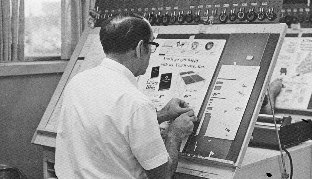
Prior to using design software applications, designers used to create layouts through “paste-up”, cutting and pasting different content elements onto a blank page.
In this section, I present three main lineages of graphic design software applications. These three lineages and their resulting software applications obviously influenced each other. This is especially true from the research world to the industry (Myers, 1998), but they nevertheless were designed in very different contexts and for very different purposes. The first type of design software applications emerged as experiments by computer scientists. They used design software as a way to explore and enhance the potential of computers. The second wave of graphic design software applications came later from the industry and sought to replace traditional graphic design tools. Therefore, creators tailored design software applications for integrating them into pre-existing workflows and facilitating designers adoption. The third lineage are design tools created by graphic designers themselves. Because designers were working for themselves, they could explore how graphic design software impacted their work and generally tried to reinvent what graphic design meant.
Design Software
from a Research perspective
The first computers, built before and during World War II, were designed and used as powerful calculators “for specific purposes, such as solving equations or breaking codes” (Grudin, 2012). Therefore, the first computer users were mathematicians. When a single computer would fill an entire room and required programs to be written on punched cards, it could be hard to imagine the versatility that we are accustomed to today. The gradual shift towards designing computers as tools for creation first happened in the research world, as computer scientists started questioning the relationship between people and computers. The following projects were never commercialized and thus never used by professional designers, yet they all were pioneers in recognizing the power of the computer as a design tool.
Memex (1945) and Xanadu (1960)
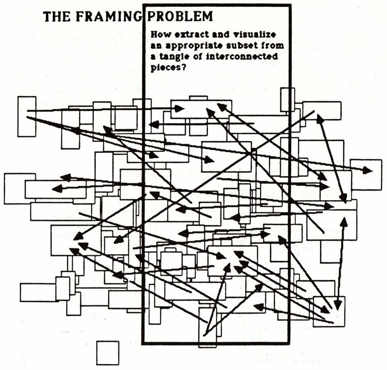
-The Framing Problem, “How [to] extract and visualize an appropriate subset from a tangle of interconnected pieces”, by Ted Nelson in Computer Lib/Dream Machines, 1974
The Memex was not a tool for designers per se, but it pioneered a vision of computers that would deeply affect how we access information, ultimately questioning the role of design. In 1945, at the end of the war, Vanevar Bush, in his visionary article “As we may think” (Bush, 1945), proposed to shift the vision of computing to envision the computer as an empowering tool available to everyone. According to Bush, a Memex would become the equivalent of a private library, it would help individuals store all their books, records and communications, “an enlarged intimate supplement to his memory”. Even if it was never built, the Memex had a great influence on the subsequent development of tools to shape information and on human-computer interaction as a whole. As design researcher Masure explains, the infinite storage envisioned by Bush questions the modalities of access of this content (Masure, 2014). How should the content be presented? In that sense, the Memex was already a tool for design, carrying the seeds of the future that designers need to shape today. Deeply inspired by Vanevar Bush’s vision, Ted Nelson, developed the notions of hypertext, and hypermedia: interconnected text, graphics and sounds.
His book Computer Lib/Dream Machines, published in 1974, is a peculiar graphical object in itself (Nelson, 1974), following the precepts of hypertext. With his project Xanadu, initiated in 1960, Nelson questions the practice of graphic design by proposing a hypertext system that defies the idea of fixed content. In his book, he envisioned some of the impact that hypertext would have on designers. For example, he envisioned “the Framing Problem: How (to) extract and visualize an appropriate subset from a tangle of interconnected pieces” (). HyperText influenced the World Wide Web creator Tim Berners Lee and provided the foundations for the new world graphic designers currently need to shape.
Sketchpad (1963)
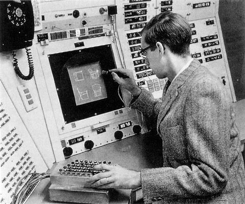
-Sutherland’s Sketchpad system. Built in 1963, it is considered to be the first visual interface and, coincidentally, the first digital design tool
In 1963, Ivan Sutherland published his PhD dissertation in which he presented the groundbreaking Sketchpad system. Usually considered the first graphically based interactive system, it was developed at the MIT’s Lincoln Lab under the direction of Claude Shannon, father of information theory. This application demonstrates a few groundbreaking principles, some of which are yet to be seen in common Computer Aided Design applications or graphic design software today. Using a light pen as a pointer directly onto the screen, Sketchpad lets designers create shapes on the screen by creating points onto the screen (). Using command keys on a separate keyboard, designers can create and apply constraints, such as making two lines perpendicular or parallel. Sutherland also introduces an object oriented approach (before it even existed in programming languages). Instead of having to manually create multiple copies of a same shape, Sketchpad lets designers create and instantiate objects. Changes made to the original shape are reflected in all its instances. Among other features, Sketchpad also provides a zooming interface. The initial goal, according to Sutherland, was to make the computer “more approachable” ( Sutherland, 1963) by using displays. Sutherland wanted to explore drawing as a new way to interact with the computer. His thesis title, “a man-machine graphical communication system”, makes explicit this vision, one of a partnership between humans and machines.
Sketchpad was not design to support existing practices nor replace traditional tools in the industry. According to Sutherland himself, the principles behind Sketchpad are inspired by his interaction with the computer as well as by programming concepts (constraints and object oriented programming).
It has turned out that the properties of a computer drawing are entirely different from a paper drawing not only because of the accuracy, ease of drawing, and speed of erasing provided by the computer, but also primarily because the ability to move drawing parts around on a computer drawing without the need to erase them. Had a working system not been developed, our thinking would have been too strongly influenced by a lifetime of drawing on paper to discover many of the useful services that the computer can provide (Sutherland, 1963)
Sketchpad paved the way for CAD (Computer Aided Design) software as well as for HCI (Human-Computer Interaction) as a whole. Among others, it notably inspired Douglas Engelbart (Engelbart, 1962).
Genesys (1969)
Genesys is another interesting early example of a design software: “An Interactive Computer-Mediated Animation System”. It was built for creating animation by Ron Baecker in 1969, as part of his PhD at the MIT’s Lincoln Lab. The system uses a Rand Tablet, ancestor of today’s graphic tablets. One of the key notions of GENESYS is that animations are “movements-that-are-drawn”. A hand-drawn picture can either be a visible object to be animated, or a motion path for other graphical objects. Furthermore, not only could an object follow a hand-drawn motion path, it could do so with the same velocity and dynamism that was used to draw the line ().
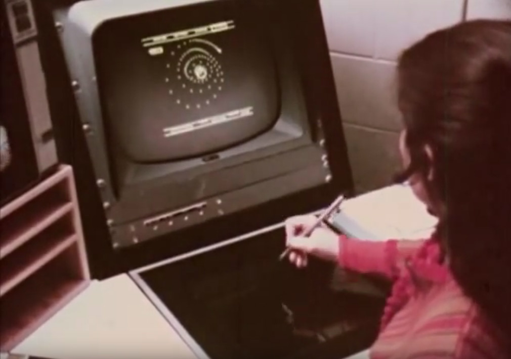
-Ron Baecker’s Genesys. Built in 1969, it is the first digital tool explicitly designed to support animators’ practices.
Contrary to Sketchpad, and visionary at its time, GENESYS was directly inspired by animators’ way of working. Baecker even tested his system with professionals and asked them for feedback. Baecker also stresses that “The computer is an artistic and animation medium, a powerful aid in the creation of beautiful visual phenomena, and not merely a tool for the drafting of regular or repetitive pictures” (Baecker, 1969). This new vision of the computer, as a creativity support tool remained peculiar for a long time.
Pygmalion (1975)
During his PhD, David Smith, created Pygmalion: “A Creative Programming Environment”. He programmed it in smalltalk, an influential programming language created by Alan Kay and Adele Goldberg, Alan kay also being Smith's PhD advisor. Smith's goal was to bridge the gap between art and science, arguing that during the Renaissance, people like Da Vinci were both artists and engineers. For him, creative people, such as designers, should be able to use computers, not only as users of software applications, but rather as programmer themselves. According to Smith, “the main goal of Pygmalion is to develop a system whose representation and processing facilities correspond to mental processes that occur during creative thought” (Smith, 1975). Drawing inspiration from both SketchPad and Genesys, Smith wanted to make programming visual. Smith was especially influenced by the research on creative thinking of his time and he based his design on some concepts borrowed from that literature.
One such notion was incrementation: “[In Pygmalion,] since creativity is incremental, programming proceeds in a step-by-step, interactive fashion, much as one uses an editor to change a body of text”. Pygmalion also introduced a second key idea: the notion of “icon”. Instead of symbols and abstract concepts, Pygmalion uses concrete display images called “icons” to represent abstract notions such as variables or even to save lines of code for later reuse ().
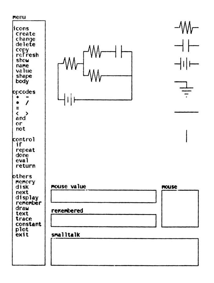
The interface of Pygmalion, “a creative programming environment”
After working on Pygmalion, Smith went on to work at Xerox Parc. As one of the main designer of the Xerox Star computer, he popularized the icons which became a cornerstone of the graphical user interface paradigm that most of our current interfaces derive from.
Sketchpad, Genesys and Pygmalion, all originated in research contexts and were not destined for professional use. In fact, more than tools created to support professional designers work, these projects instead drew inspiration in designers' way of working to transform computers themselves. They introduced novel ways for interacting with computers based on their creators' understanding of creative thinking.
Graphic Design Software
from the Industry Perspective
Most early principles for interacting with computers were invented in universities, but the industry then appropriated them (Myers, 1998). Software dedicated to graphic designers were no exception.
Quantel - PaintBox
In the domain of TV Graphics, Quantel released its PaintBox in 1981 and revolutionized the production of television graphics. PaintBox was a computer graphics workstation, it could only be used for producing animated graphics and its price made it unaffordable for designers who did not work in large companies (). On the other hand, because it was a dedicated workstation, it could handle high quality images and video effects far beyond what was possible with general purpose computers at the time. Following its moto: “crafting the tools that do the job without users needing to know how they work” (Prank, 2011), the PaintBox creators tried to simulate how traditional illustrators worked and to give them the same tools that they were used to work with.
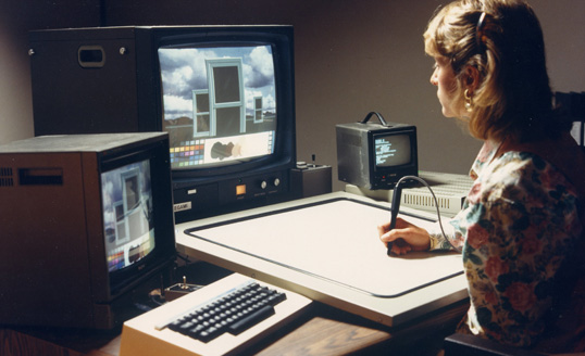
Paintbox, by Quantel, revolutionized animated graphics by mimicking traditional designers tools such as stencils.
Its setup was similar to Genesys, with a pressure sensitive pencil as input and a TV-like monitor as output, so designers could directly paint “on the screen” the way they used to do it on paper. The PaintBox provided tools that mimicked existing illustrator tools such as “airbrushes” and even a color palette where designers could mix color swatches. They also provided “stencils” to let designers separate objects from their background and paint only specific parts of the final image. If Paintbox was hegemonic for TV animated graphics, it was however hardly used by graphic designers whose work was ultimately printed because Paintbox did not handle the necessary resolution.
Mac Write & Mac Draw
The macintosh, release in 1984, launched the era of desktop publishing (Grudin, 2012). For most of graphic designers in the publishing industry, the macintosh was the first computer they encountered (Levit, 2017). Contrary to the PaintBox, it was not specifically designed for them but was instead a general purpose computer.
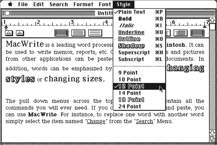
The Mac Write Interface. The focus of the tool is on writing text, rather than formatting it. The sample text says that it can be used to “write memos, reports, etc.”
The first Macintosh proposed only three general purpose software: Mac Draw, Mac Paint and Mac Write (). Those three software interface principles were direct heir of the Xerox Star, the system that Smith helped to develop at Xerox Parc that established user interfaces mimicking the office paradigm. Before the Macintosh, designers were used to work “blindly”, not seeing what the final output would look like before it came back from the printer. At that time, the traditional process of laying out content, named paste-up, was a very mathematical work, requiring a lot of preparation and calculation as designers had to manually trace guides on their sheet to make sure all their elements were aligned. In contrast, on the Macintosh, graphic designers were able to see the content they were manipulating before printing the final result. Mac applications had adopted the “What You See Is What You Get” paradigm in which designers could change fonts and instantly see the result on the screen. On the other hand, the purpose of Mac Write was to write content as much as to format it. This initial focus influenced the type of formatting functions available, which were limited, from a professional graphic designer point of view. Similarly, influenced by this focus, Mac treated text and image manipulation as utterly different activities, thus separating them in different applications.
Aldus PageMaker
Rapidly, however, a few companies such as Aldus and Adobe, realized that the printing industry would certainly adopt graphic design software if they could allow them to output high quality printed pages. To establish its economic success, design software needed to pursue an apparent continuity with existing environment and techniques (Masure, 2014). In 1985, Aldus released Page Maker (), a Macintosh dedicated software for desktop publishing. This piece of software was, this time, specifically created to supplant traditional technologies and fit within the existing printing industry practices.
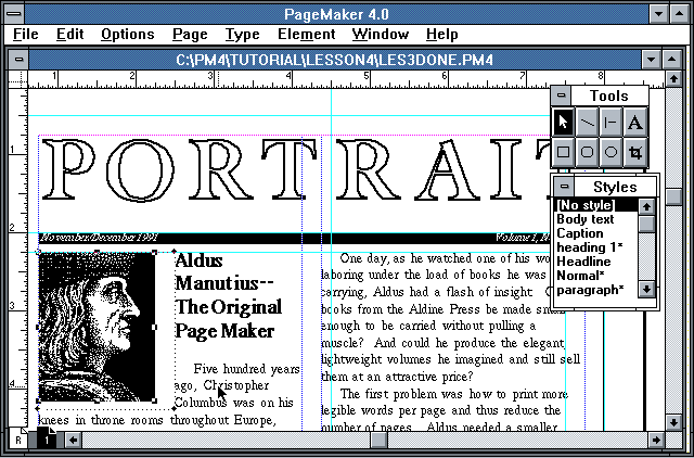
The PageMaker Interface
As his founder explains, “most of the page maker interface and dialogs and the way it works, the basic functions came from my experience of having done past up myself with a razor blade” -Paul Brainerd (Levit, 2017). Indeed, Page Maker, and its successors, Quark XPress and Adobe InDesign introduce the possibility to freely drag and drop text onto the page. Moreover, the way desktop publishing software handles text is a reminiscence of the paste-up process that used to be prevalent in the industry: First, designers would do phototypesetting to generate the whole text using the right font at the right size. They would receive single columns scrolls that they would then cut and paste onto the page. In desktop publishing too, as exemplified in (), the text is received as one infinite scroll, it is disconnected from its container. Designers can then compose, cut and adjust the containers. The key difference being that the text continuously flows in the containers, offering greater exploration possibilities to designers.
A second example of the influence of the traditional process over desktop publishing can be found in its way of handling page format. In desktop publishing too, when creating a project, a designer must first select page dimensions as well as margins and a column system. These parameters are then fixed and not supposed to be changed. This echoes the traditional paste-up process in which the designer first chooses a page size and establishes page margins and a grid. This page becomes the canvas onto which she can experiment with text and image positioning. Yet, in desktop publishing, the choice to first set page size and margins is not dictated by a technical constraint, rather, it simply reproduces a pre-existing process.
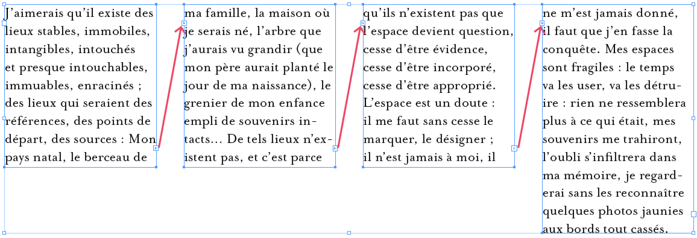
The influence of Paste-Up can be seen in how InDesign deals with text. Designers can cut and paste the text in separate rectangles
A last example can be found in the type of functionalities enabled by desktop publishing. When presenting their software, PageMakers’ developers explained: “it was designed with the industry in mind, in other words it does half-tones, ligatures, kerning, all the words that the typesetting industry has been familiar with.” (Paul Brainerd, in Computer Chronicles, 1986”). Here again, it is interesting to observe that desktop publishing first and foremost developed functionalities that matched previously existing ones in the industry. In fact, because their goal was to fit within existing workflow and to be easily adopted by designers, they tried to mimick the existing process. Therefore, they proposed very few functionalities that went beyond what traditional processes could produce.
On the other hand, they introduced the WISIWIG paradigm to designers who were previously used to work without seeing the end-result of their production. The conditions and environment behind the emergence of graphic design dedicated software led to the reproduction of pre-existing constraints and principles, coexisting with novel possibilities. László Moholy-Nagy gives a compelling example in another domain: “Square plates would have been more convenient than round ones because they are easier to store. But as the first plates were created from a potter’s wheel, they then went on keeping their rounded shape, despite the new methods [...] that provided total freedom of shape” (Moholy-Nagy, 1973). After the initial standards were established, graphic design software mostly did not change. They gradually added more features but their core functionalities remained the same until now.
Design Software
from a designer perspective
Few graphic designers were able to experiment with computers before the era of personal computers. Yet, this limited access did not prevent a few designers to perceive that computing would transform the way they work.
Karl Gerstner - Designing Programs
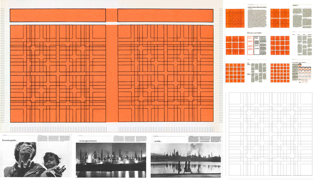
Karl Gerstner, extract from Designing Programs, 1962.
One of the designers who explored the impact of of computing was the swiss Karl Gerstner (Armstrong, 2009). In his 1968 book entitled Designing Programs, he proposed a manifesto, advocating for a deterministic approach of graphic design. He transposed what he understood from the rigor of computational programs into the typographic grid, turning it into a system (). For Gerstner, the computer was mainly a computational machine that he could use to compute all the potential solutions of a design. The design process thus had to be discretized into a set of parameters in order to make it computable. The designer’s work was then to cast aside all the bad solutions proposed by the computer and, iteratively, to keep the best one. Even if Gerstner was not using design software at that time, he already had perceived the impact that computing could have on the profession: “How much computers change – or can change – not only the procedure of the work but the work itself”. (Kröplien, 2011)
Muriel Cooper
If some designers were able to envision how computers could impact their profession, very few had the chance to work with computers before any of the common interface metaphors became ubiquitous. An almost unknown, yet critical example of a designer who profoundly explored design software tools was MIT professor and graphic designer Muriel Cooper.
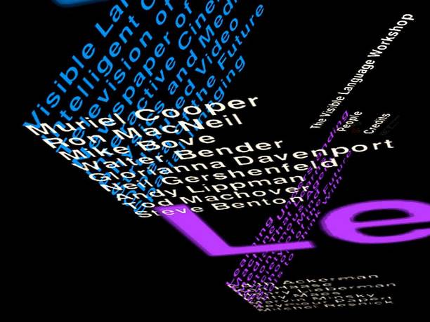
“Typography in Space”, an interactive three-dimensional space in which the reader can freely browse, 1994
In her workshop, Cooper sought to explore and extend the influence that graphic design could have on the new digital world. She also explored the influence that computers would have, in return, on the profession of graphic designer. She considered that the “desktop metaphor”, developed since the 1970’s and used in most mainstream applications, was only a transition state in Human-Computer Interaction. (Cooper, 1989)
When she started exploring graphic design with computers, there were no design software. Her students needed to directly program. For her, it was critical that they participate in the creation of their own tools and in exploring their potentialities. As designers were directly involved in the creation of their own tools, the interfaces and interactions created by Cooper and her students were radically different from the ones produced in the research world as well as from the tools that were developed in the industry.
For example, none of Cooper's projects contained the notion of the page. Because this notion did not exist in programming, Cooper and her students were able to think about novel ways to represent information outside of this frame. Instead, they chose to create a 3-dimensional world for displaying information (Strausfeld, 1995). The reader could freely navigate this space to access the information presented on many different 2D planes (). A second example is Perspective, a grid expert system developed in 1989. The system proposes several layouts based on images chosen by the designer and following a simple rule system. Cooper was seeing the computer as a partner for designers who would be designing processes instead of final layouts:
“As applications for multi-media develop, such as electronic documents, electronic mail transactions, and financial trading, the need for automatic layout and design intelligence will be crucial [...]. Designers will simply be unable to produce the number of solutions for the vast majority of variables implicit in real-time interaction. Design will of necessity become the art of designing process.” (Cooper, 1989)
Processing
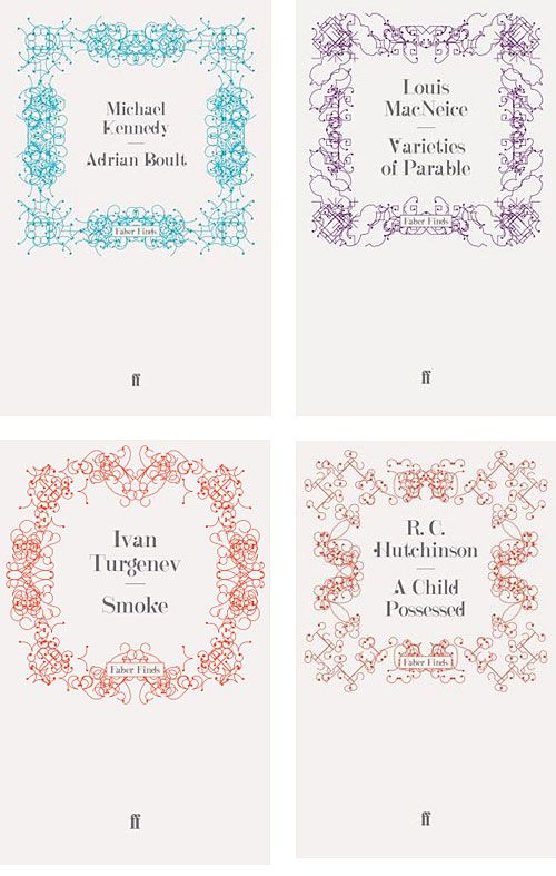
-Faber Finds, Generative book covers, by Karsten Schmidt and Marian Bantjes. Programmed using Processing. 2008
Following Cooper’s approach, John Maeda, one of her students, founded his own workshop: “design by number”. At that time, personal computers had become affordable and graphic design software had appeared. Designers had become users of design software applications created by the industry, rather than creators of their own tools. For designers, learning programming was tedious, because they needed to learn a lot before even being able to display a single square on their screen. To tackle this issue, his students, Ben Fry and Casey Reas, started the Processing project in 2001. Its goal was to make programming easily learnable by designers by emphasizing visual representation. Yet, contrary to Cooper’s approach, they explicitly favored an evolutionary approach, rather than a revolutionary one (Fry, 2009). Built on top of Java, Processing is a simple programming language whose focus is on producing visual and interactive output. Yet, even if Processing is first and foremost a programming language, it also came with a minimalistic Integrated Development Environment also designed to encourage designers to visualize the result of their program as soon as possible. Processing has proved to be extremely influential within the design world, it even sparked a new aesthetic in graphic design (). By giving designers access to programming, it contributed to bringing back discussions about graphic design tools in the spotlight.
Digital design tools created by designers resulted in very different types of tools. Whereas the industry tried to mimick existing design techniques to fit within a pre-existing ecosystem, designers of digital design tools used the opportunity of the digital medium to question the notion of design and to redefine their field.
Design Software -
User perspectives
In the second part of this chapter, I now review the different types of accounts about digital design tools from the perspective of their users. I explore how designers perceive these digital design tools and how they work with them. I review three approaches to this inquiry. I first focus on what a few designers themselves wrote and said about the impact of digital tools on their practices. Empirical studies, mostly from an HCI perspective give us other ways to understand the relationship by observing it in more controlled or longitudinal ways. Finally, I give an overview of different theories that have tried to characterize designers' work with their tools as well as to understand digital tools' underlying conceptions from the perspective of media studies.
Designers accounts
To understand the relationship between designers and their digital tools, we can look at what designers themselves wrote and said. In her documentary Graphic Means: A History of Graphic Design Production, graphic designer and director Levit interviews many graphic designers and shows the spectacular transformations happening in the graphic design industry as computers progressively find their way into designers hands (Levit, 2017). Before the digitalization of the printing industry, graphic design was an entire industry with many different and complementary professions (typesetters, paste-up artists, photomechanical technicians...) coexisting with complex machinery to operate. At a macro level, one of the most crucial transformation brought by computers to graphic design happened off-screen. Because designers could do everything themselves, most of the aforementioned intermediary profession disappeared, leaving all the work in the hands of the designers. This movement greatly empowered graphic designers as their prerogative grew to encompass layout but also type-setting, the art of composing text. It also required designers to acquire new skills. This profound transformation drew a lot of critics from established designers (Armstrong, 2016). The inclusion of computers in the design work also led to a drastic acceleration of the work (Levit, 2017).

April Grieman - “Does it make sense?”, in Design Quarterly, 1986
At an individual level, we can find evidence of the influence of digital tools by looking at the designs produced when design software applications first emerged. In fact, when personal computers started democratizing software in the 1980’s, they directly fostered a new graphic design era. As graphic designer Cece Cutsforth recalls, “you saw a lot of this whole movement of stuff just being collage, because you finally could” Cece Cutsforth, in Graphic Means, 1:10:50.
One of the first and most famous examples of this revolution was produced in 1986, by April Grieman, with the first Macintosh and MacDraw. She produced a large poster for the 1986 issue of the magazine Design Quarterly (). She found inspiration in the potentiality of the tool, moving away from the very rigid grid revered by many graphic designers at that time. Because of the inherently limited resolution of the dot matrix printer she was using, she accepted and fully embraced pixelization as part of her work. By doing so, she propagated a graphic design revolution, the ‘New Wave’ design style in the US (Armstrong, 2016).
In contrast to Grieman's work, graphic designers Erik van Blokland and Just van Rossum did not see graphic design software as liberating. For them, there is an inherent limitation in the fact that graphic design software is a commercial mass product. It is therefore designed to target a large group of professionals by providing functionalities that are perceived by software designers as the most desired by the community. “You can do everything with a program as long as there are enough people who want to do the same thing. But as it is precisely the task of designers to discover new possibilities, in their case, the use of a computer can be more of a handicap than an advantage. [...] In the long run, this leads to a monotonous computer driven uniformity” (Middendorp, 2004).
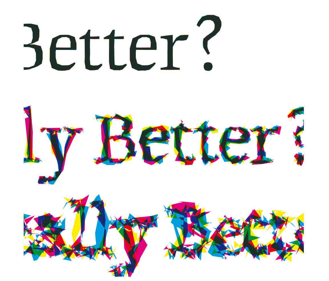
Is Best really Better, FF Beowolf font, Erik van Blokland and Just van Rossum, 1990.
Erik van Blokland and Just van Rossum were creating typography in the early 1990's. Each of their new typefaces was designed to explore a specific potential of the computer: “through our experience with traditional typesetting methods, we have come to expect that the individual letterforms [...] should always look the same. This notion is the result of a technical process, not the other way around. However, there is no technical reason for making a digital letter the same every time it is printed” (Middendorp, 2004). To realize their vision of ever different letters, they had to “hack” digital graphic design tools. Instead of using a graphical user interface to draw their Beowolf font, they modified the underlying language, Postscript (). By adding a bit of randomness to the language, Beowolf became a typeface “that changes while it is being printed”. They called their method: “What you see is not what you get”. These two valuable accounts on graphic design during the early age of graphic design software present their authors reflections on design as a field and on their own practice. Yet, because their target audience is generally other designers, these documents provide relatively little information on the concrete practice of design with digital tools.
Empirical Account
Empirical studies are a second way to apprehend designers' relationship with their digital tools. As early as 1967, Cross conducted a study with designers to figure out what the design requirements for Computer Aided Design systems might be as well to evaluate the impact of such systems (Cross, 1967). At that time, only a few years after Sketchpad's major breakthrough, fully functional CAD systems were still hypothetical. To simulate what they might look like, Cross coined a simulation technique, close to the “Wizard of Oz” technique (Cross, 2001), in which human beings pretend to be computers. Because design software did not exist at that time, practitioners did not know what to expect from such systems. Cross conducted a first series of 10 experiments, giving a design brief to designers and asking them to produce a sketch concept with the help of a simulated CAD system. They could interact with it by writing message on paper and showing them to a camera and they would receive answers on the screen. Cross’s goal was to observe how they would choose to interact with such a system, hoping to extract requirements for building future CAD systems. The first results were not positive as using the CAD system induced stress on the designers part and didn’t result in better designs. Cross explored an alternative version of the experiment by asking the system (or rather the human behind the curtain) to create the design while the designer was judging the results. This version was more enjoyable for designers but required the CAD system to be able to design, which, as Cross tested in later experiment, did not work so well (Cross, 2001).
Years later, in the 1990’s, as design software were becoming more and more common in design agencies, a few studies investigated their impact on graphic design agencies and publishing companies. For example, Bellotti and Rogers (Bellotti, 1997) conducted a six-month field study to investigate “the changing practices of the publishing and multimedia industries”, focusing specifically on the multiple representations at play and on the relationships between computers and the other artifacts used by designers. They emphasize the “continuous switching between representations” of the same content and advocated for tools to better integrate the paper-based methods and “electronic technologies”. Similarly, Diane Murray conducted an ethnographic study of graphic designers in 1993 (Murray, 1993). She revealed how material traces are interwoven with the social aspect of a design studio life. Designers leave visible their sketches and work in progress so that anyone can look at them and enrich them by critiquing them. In 1995, Sumner conducted an ethnographic study of user interface designers working with digital tools (Sumner, 1995). She witnessed the evolution of tooling environment and practices at a time when software were quickly appearing and changing. She realized that designers were creating what she calls Toolbelts, a collection of several tools supporting their different practices. Designers did not simply used the tools, but appropriated them and re-purposed them for specific activities. She also showed how “a large part of these designers’ job is ‘designing their design process’” (Sumner, 1995). These different ethnographic accounts demonstrate the complex interplay between designers, computer tools and corporate needs. They however focus mainly on the relational aspects of design work but give us little detail on how concretely designers work with their digital tools.
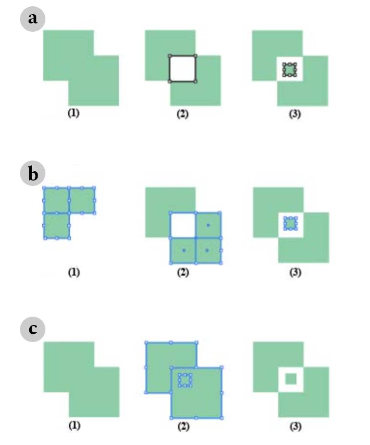
Three visual composition strategies for the same visual composition task, in (Jalal, 2016)
More recently Jalal conducted a structured observation (Jalal, 2016) with 12 designers to investigate the different tools and strategies used by designers to reproduce a poster in Adobe Illustrator. She discovered that, to achieve the same result, designers would deploy a wealth of strategies and tools (). For example, one of the tasks was to cut 12 rectangles into triangles. Among the 12 designers, she observed eight different strategies to achieve this effect. Even when the software had built-in dedicated tools, designers tend to rely and prefer tools that allowed them a more direct manipulation of graphical elements. Moreover, she was surprised by how often designers would reflect on their strategies, either considering them as “clever tricks”: strategies that they would reuse in the future, or “bad hacks”: strategies that they used as a way out but did not consider proper ways of achieving the result. This lab study highlights the richness and variety in designers’ individual interaction with tools, even within the same application.
Yet, we still have very little knowledge on how designers design with and around software. Bellotti and Rogers, in 1997, were already advocating for more studies to understand how designers work with design software applications (Bellotti, 1997). We also start seeing evidence that designers don’t passively use software. With this thesis, we focus on understanding designers’ relationship with their digital tools in the wild, focusing on extracting principles that could help us inform the design of design tools.
Theoretical accounts
To understand designers relationship with digital tools, we can look at the different theories that tried to explain it. In HCI, design researchers often draw inspiration from Schön’s influential book: The Reflexive Practitioner. How Professionals Think in Action to explain how designers work. According to Schön, designers have what he calls “reflective conversation with the situation” (Schön, 1984). From a set of observations with architects, psychotherapists and systems engineers, Schön demonstrates how they approach problems as unique cases and focus on the peculiarities of the situation at hand. They don’t propose or look for standard solutions. Instead, Schön argues that “in the designer’s conversation with the materials of his design, he can never make a move which has only the effects intended for it. His materials are continually talking back to him, causing him to apprehend unanticipated problems and potentials” (Schön, 1983). Dalsgaard further explores the pragmatist perspective to consider tools in design as “instruments of inquiry” (Dalsgaard, 2017). He argues that tools also affect our perception and understanding of the world and help us explore and make sense of it. He proposes a framework for understanding the role tools play in design, with five qualities for “instruments of inquiry”: perception, conception, externalization, knowing-through-action and mediation. The perception of digital design tools as instrument is also developed by Bertelsen & al. Originally proposed in the context of musical creation, they introduce the notion of instrumentness as a “quality of human-computer interaction” (Bertelsen, 2007). They propose to consider creative software as instrument in the musical sense, to be able to move away from the ideals of transparency and usability. They argue that “the software is comparable to a musical instrument since the software becomes the object of [the composer's] attention and something he explores, tweaks, observes, and challenges in a continuous shift of focus between the sounding output and the instrument”. They argue that the notion of instrumentness can be adapted beyond music creation and be relevant to describe designers relationship with their digital tools.
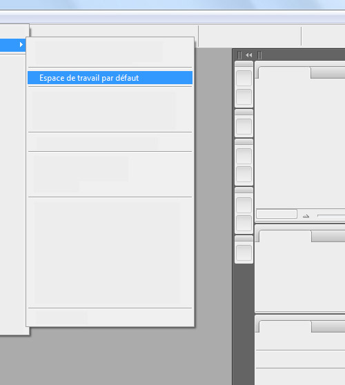
“Default Workspace”, Anthony Masure, 2013
Outside of the HCI literature, the emerging field of media and software studies attempts to explore the underlying assumptions behind design software. In 2003, professor of cultural studies Matthew Fuller explored the principles behind authoring software (Fuller, 2003). Taking Microsoft Word as an example, he highlighted the dissonance between creative activities and the task oriented way in which authoring software application were built on. According to Fuller, they embed a very specific notion of work borrowing from Taylorism, where human actions are decomposed into minimal tasks. He remarks, for example, that the use of templates and wizards makes it very easy to create certain types of work-related documents, such as letters and CVs, while some others (suicide notes, for example) do not receive the same attention. To better understand the logic behind software, he proposes to look at the missing features of Word: “For instance, which models of “work” have informed Word to the extent that the types of text management that it encompasses have not included such simple features as automated alphabetical ordering of list or the ability to produce combinatorial poetry as easily as “Word Art”? (Fuller, 2003). Focusing on design-oriented authoring software, media researcher Lev Manovich, differentiated traditional media production and what he called “new media” production (Manovich, 2001). According to him, design software exemplify a new paradigm: “the logic of selection” within menus of actions and filters. He argues that media produced with current digital design software applications are rarely created ex nihilo, they are “collage of existing elements” assembled from menus. In his PhD dissertation about the design of software, Masure shows how new versions of Adobe Photoshop add functionalities that are in fact specific automated functionalities, for example, automatically replacing objects on a photograph with a generated background in Photoshop CS5 (). He argues that this type of functionalities is meant to simplify the work of the designer by automatizing it. In doing so, Masure argues that “the semi-automatic functionalities orient the image towards a state that is socially and culturally accepted” (Masure, 2014).
Summary
This chapter explores the history of design software from the perspective of those who created them as well as those who used and analyzed them. In the first section, I analyze the history of design software, focusing on how their condition of creation affected their design. I introduce how design software were produced from three complementary perspectives. The first one are design software created as HCI experiment by computer scientists. The second one, in the context of graphic design, came later and sought to replace traditional, analog, graphic design tools. The third path are design tools created by graphic designers themselves and that sought to reinvent what graphic design meant. In the second section, I explore how designers perceive these digital design tools and how they work with them. Designers themselves wrote about the impact of digital tools on their work during the early days of computers. They demonstrate how, from their origin, digital tools were both seen as empowering and limiting. Empirical studies, mostly from an HCI perspective give us other ways to understand the relationship by observing designers daily work with computers in more controlled ways or in longitudinal studies. They reveal the complex interplay between on-screen and off-screen design work. Finally, I give an overview of different theories that have tried to characterize designers' work with their tools as well as to understand digital tools' underlying conceptions from the perspective of media studies. These three different perspectives all show the intricate interplay between designers and their tools. However, we still lack an empirical understanding of designers daily practices with their digital tools, from very specific tasks to more global endeavors.
Studying Designers
If our goal is to create digital tools for designers, we must investigate designers’ daily practices with current design software. We need to understand how designers work with and around digital design tools: how do they appropriate and adapt them for their specific needs? We also need to understand to what extent current design tools support these practices. Tools play a key role in any given creative process (Bertelsen, 2007) and it is difficult to decouple and analyze a creative process without taking into account the different tools that support it. I chose to study designers’ relationships with their digital tools through the angle of designers’ practices: instead of looking directly at how designers use particular tools, I focus on how designers carry specific design tasks and observe alongside how they integrate digital tools as part of their strategies. To do so, I chose four specific and concrete specific design tasks within overall design projects.
In the following chapters, I present the results of four complementary projects investigating design tasks at different levels of complexity. I chose them because their different scales would allow me to look at design tools from very different points of view and, hopefully, reveal both different and common traits across design task scales. I first started with extremely specific practices: color selection as well as alignment and distribution. Both these practices are currently supported by dedicated tools, namely the color selector and the alignment and distribution commands. Moreover, these two tools are included in all mainstream design software. To complement these first two inquiries, I turned to a more complex graphic design task: layout structuring. This practice has long been associated with a well established conceptual tool, namely the grid (Williamson, 1986). Yet, it is indirectly implemented through several features in common graphic design software tools. Finally, I inquired into designers collaboration practices with developers. By definition, this practice takes place at the verge of design software tools, as designers need to give their design to developers for them implement it in their own tools.
To study such a wide variety of design activities, I felt the need to establish a dedicated methodology. Artists and designers themselves find it difficult to describe their process. This is what epistemologist Michael Polanyi calls “the tacit dimension” of practice (Polanyi, 1966). Because I am focusing on the material aspect of the design process, I designed and introduced a methodology to elicit and document designer’s practices, taking into account the material aspect of their work.
StoryPortraits
In the first part of this thesis, I inquire, document and analyze designers’ practices in order to inform the design of novel digital design tools. Artifacts occupy a central position in designers’ practices and this specificity guided my methodological choices. How can we, as design researchers, best convey the richness of the stories that designers tell about the material aspect of their design processes? In this chapter, I introduce StoryPortraits, a technique for interviewing, synthesizing and visualizing designers’ stories into a form that supports later analysis, and inspires design ideas. I then report on how we used and adapted them for analysis purposes as well as for design conversations.
Context
Interviewing people is one of the main methods used for understanding designers practices and experiences. When we conduct design research, our goal is generally not only to capture and analyze a phenomenon, but also to inspire ideas for products or tools. Wright and McCarthy suggest that user-generated stories (Wright and McCarthy, 2005) can inspire ideas throughout the design process. According to anthropologist Tim Ingold, “the advantage of stories, is that they provide to practitioners the means to say what they know without having to specify it.” p231 (Ingold, 2013). In our case, we are interested in retaining qualitative details from the data in a form that supports both analysis and design. In this context, representing the results of these interviews so as to support both analysis and design remains an open question. Current Human-Computer-Interaction (HCI) practice is largely dominated by written accounts, due mostly to the traditional publication format used in HCI. Trying to enrich this linear format, researchers have introduced several methods for documenting different aspects of interviews, including mind maps (Faste and Lin, 2012), and video summaries (Mackay et al., 2002).
Yet, it is generally when documenting their own design process that HCI and design researchers have developed creative techniques. They have also developed techniques to visualize the design process itself, such as previsualization animations (Wang et al., 2014), comics (Dykes et al., 2016), post-hoc annotated portfolios (Gaver and Bowers, 2012), and design workbooks (Gaver, 2011) that capture design iterations and inspire new design possibilities. However, these methods were created for documenting the design side of projects more than interview results. We lack a concise, visual-based method of capturing current design processes and using them as a foundation for design.
When trained as designers, design researchers use sketching as a fundamental medium of expression, but also as a medium for recording. In his interaction design sketchbook, Verplank (Verplank, 2009) describes sketching as an essential designer’s tool for capturing preliminary observations and ideas. As McKim explains, seeing, drawing and imagining are tightly linked: “Seeing feeds drawing, drawing improves seeing. What we see is influenced by what we imagine; what we imagine depends on what we see”. Following this path, we introduce StoryPortraits, which capture the situated nature of story-based data through sketches.
Critical Object Interviews
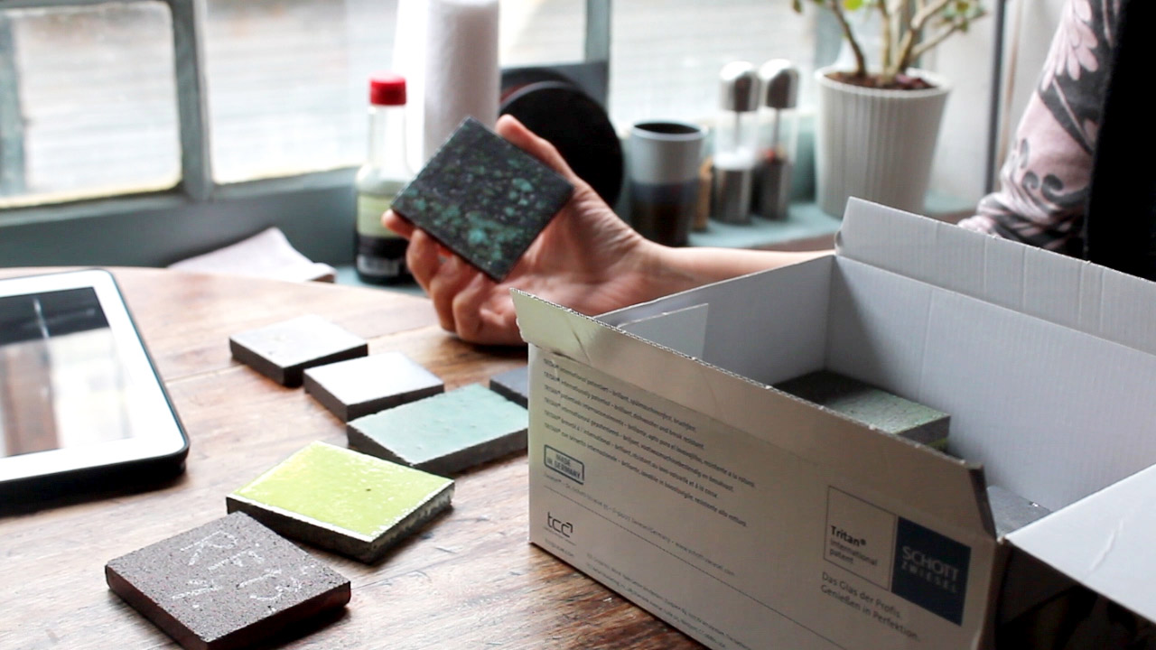
-During a critical object interview, an interviewee demonstrates the different steps in the process, guided by the artifacts at hand.
Interviewing skilled professionals about their work can be more complex than it seems at first sight. Practitioners know more than what they can tell. Therefore, it can be hard to distinguish between the general method designers synthesized for communication purposes and the specific process they devise for a particular project. Proposed by Flanagan in 1954 (Flanagan, 1954), the critical incident interview technique sought to collect “direct observations of human behavior in such a way as to facilitate their potential usefulness in solving practical problems” in the context of the U.S. aviation army They were developed to understand what led up to airplane crashes. This technique focuses on extreme behavior examples, rather than “normal” ones, hence the term critical. In the context of HCI research, Mackay developed a variation of critical incident technique (Mackay, 2002) for interviewing users and uncovering recent breakdowns that they experienced in their daily lives. The goal is to discover stories about events, objects and times that reveal information useful for the design of interactive systems. These stories are then turned into creative opportunities for designing solutions that closely match user issues. To interview designers, we adopted this interviewing technique and adapted it for creative practitioners. In critical object interview, we use artifacts as focal points during interviews (). Because artifacts are specific and are the result of a unique process, they make a great entry point for uncovering specific practices in the form of creation stories. By using concrete artifacts, interviewers and interviewees gain a shared understanding.
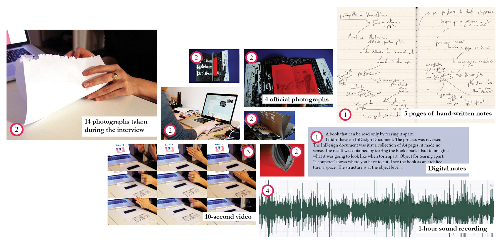
① Hand-written notes summarize key story points and quotations as notes and sketches. ② Photographs show the work setting, tools, artifacts, and sketches, as well as demonstrations and intermediate steps. ③ Video captures demonstrations and interactions with artifacts and tools. ④ Audio records conversations.
They can physically point and manipulate specific parts of objects, tools and artifacts. When probing for more details, interviewers can ask for more artifacts as supplementary evidence of the unfolding process. Taking into account distributed cognition theory (Hutchins, 1995), we also organize interviews in practitioners’ workshop or office to ensure that they have most of their documents, objects and files at hand during the interview. Seeing and manipulating artifacts also prompts specific memories. Because the critical object interview technique relies on interviewees’ memory to recall past actions, we focus their most recent projects and use recent artifacts to prompt rich stories.
We are interested in capturing stories about the creation of physical or digital artifacts. During the interviews, we first ask participants to choose a final artifact –analog or digital– from their most recent project and describe the steps they went through to create it. We then probe for details about the specific steps participants went through to create this artifact. We also ask for the intermediary artifacts and document versions produced in the process to probe deeper into the different steps. During the interview, we record four types of information: audio for recording the conversation; video to capture demonstrations and interactions with artifacts and tools; photographs to document the work setting, tools, artifacts, and sketches as well as demonstrations and intermediate steps; hand-written notes to summarize key story points and quotations as notes and sketches. At the end of each interview, the traditional way for proceeding is to transcribe the whole conversation. This approach, inherited from social sciences, does not take into account the particularities of design research needs and critical object interviews. Because interviews center around artifacts and manipulations of such artifacts, transcriptions might result in a too verbal-oriented account of the interview. We are instead interested in capturing insights about the design process that will lead us to new design approaches. Our goal is to preserve the situated nature of story-based data into a form that supports later analysis, and inspires design conversations. To support this goal, we propose StoryPortraits, a technique for synthesizing and visualizing designer stories.
From Story-Based Interviews to StoryPortraits
Creating StoryPortraits
The primary goal behind the creation of StoryPortraits is to facilitate the analysis of qualitative data. StoryPortraits are summaries, they provide a point of entry into interviewees’ full stories but they do not replace the raw data. I devised the main constraints for creating StoryPortraits. First, an analysis implies the possibility to confront and compare data. To improve comparability, each StoryPortrait is created according to a common structure. I choose a static visual representation rather than a video format, so I could lay out and compare different stories side by side. I chose a one-sided A4 page to ensure the visibility of all the information at all time. I also decided to mix different types of representations in order to highlight different aspects of each story. First, a centered photograph of the main artifact provides a descriptive icon for the story. It shows the context of the overall story as it typically represent its final outcome. Second, hand-drawn illustrations provide didactic representations of each step of the story. They depict specific manipulations, artifacts and tools in use during intermediate steps. StoryPortraits also include text, either descriptions of actions and decisions stated using the interviewee’s own vocabulary or direct quotations from interviewees, reflective statements and opinions about the process. They complement visual content with insights and explanations from the interviewee.
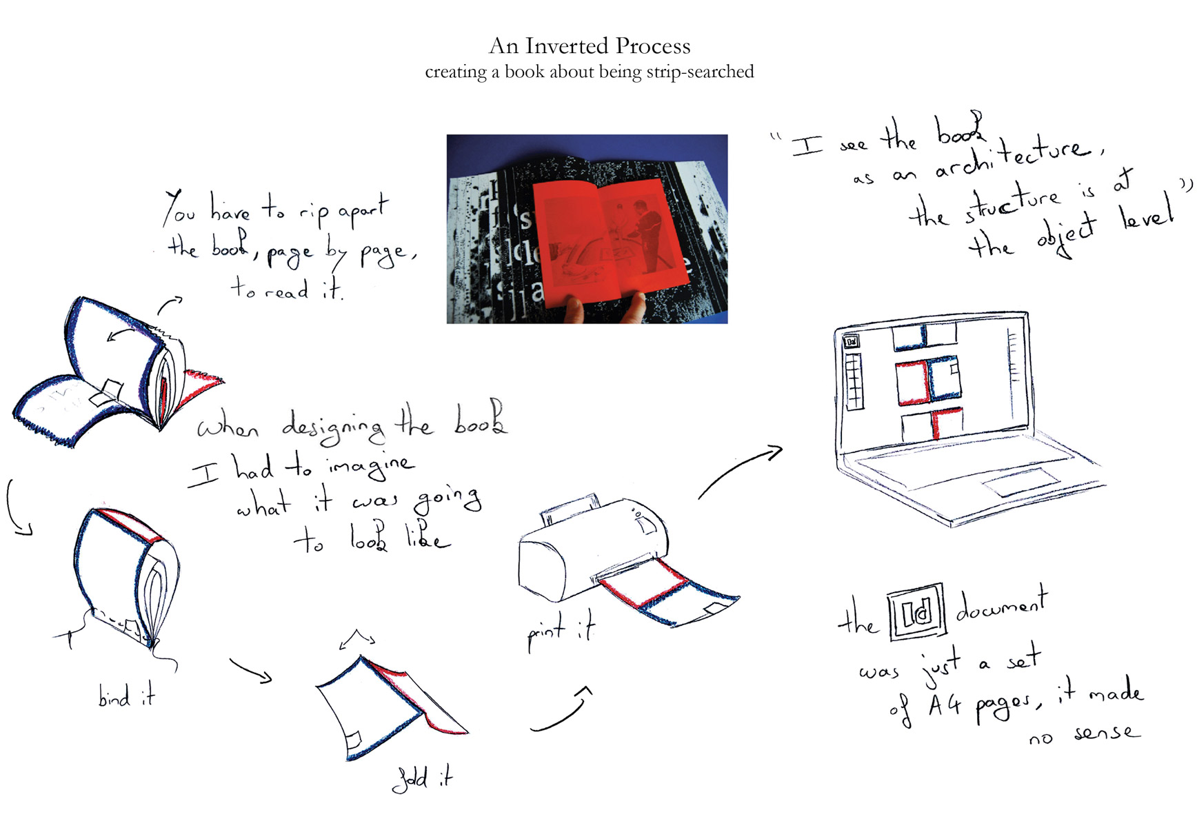
The resulting StoryPortrait synthesizes key elements from the qualitative data of figure 22 into a concise story, represented as a set of illustrated steps that fit on a single page.
Both () and () present the same story. In this story, the designer was describing her process to create the architecture and the layout of her book. The story focuses on the material process followed by the designer to construct her unusual book: one needs to rip it apart in order to read it. This design choice echoes the book’s theme: strip searching. Figure 22 summarizes all the raw data captured for a single story: hand-written and digital notes from two different interviewers; 14 photographs showing the setting, as well as demonstrations and manipulations of tools and intermediate artifacts by the interviewee; a ten-second video depicting one of the manipulations and an hour-long audio recording of the interview. Figure 23 shows the resulting StoryPortrait, synthesizing the raw data from figure 22 into a concise story.
StoryPortraits’ adaptable structure
In (), I present the overall structure of a StoryPortrait. Like any design artifact, StoryPortraits must accommodate hard constraints, but they also leave room for the adaptations required by each particular story. Items in blue represent elements with a fixed-position: title, photograph and identification code. Each serve as identification token: they facilitate comparison and skimming within a collection. Items in red represent elements with varying positions: quotations, arrows, text descriptions and illustrations. They adapt to the data and the specificities of the depicted project. Each project is different and requires its own type of interview.
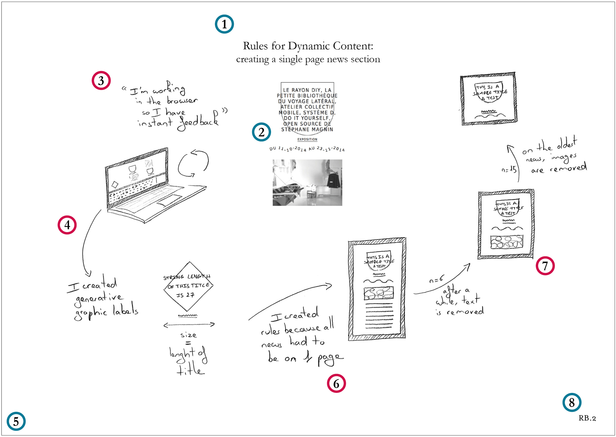
Structure of a StoryPortrait. ① Title - Context and key design idea. ② Picture - Photograph of the artifact. ③ Quotation - Reflective statements and opinions about the process. ④ Arrows - Indications of possible reading paths, including merging and branching. ⑤ Paper size and orientation - A4 landscape facilitates both print and on-screen use. ⑥ Text description - Actions and decisions stated using the participant’s own vocabulary. ⑦ Illustration - Didactic representation of each step of the story, including intermediate steps, tools and strategies. ⑧ Code - Unique identifier for each participant and each story. ◯ Fixed-Position Elements - Facilitate comparison and skimming within a collection. ◯ Varying Elements - Adapt to the data and the goal of the project.
I adapted StoryPortraits for the three different projects we conducted. For example, StoryPortraits created for the ColorPortraits projects (chapter 4) are vertical. For the interviews on layout (chapter 6), I decided to make them horizontal to facilitate their display on screen. The third project, Design Breakdowns (chapter 7), investigates how designers and developers collaborate. To visualize this new type of story, I structured StoryPortraits as parallel timelines that represent the exchanges between the two partners over time. The general constraints of each StoryPortrait provide an overall framework as to how much data can be selected for each StoryPortrait. Yet, choosing what to represent and what to omit from a StoryPortrait is a real challenge. That concern is also true for textual transcripts for example (Lapadat, 1998), but StoryPortraits require a high level of summarization that might makes this task harder. I propose here the few principles that I followed in all the projects and helped me ensure the overall usability of StoryPortraits later in the process. To make StoryPortraits useful tools for later analysis and design phase, design researchers should first and foremost ensure consistency among StoryPortraits. Therefore, one person should create all the StoryPortraits of a project. The visual illustrations are the main elements of a StoryPortraits and should thus be selected and drawn first. The quotes and text description should complement and further contextualize illustrations rather than simply describing them. However, more than rigid and definitive rules, I argue that StoryPortraits should always be re-designed taking into account the specific goals of each projects.
Reading StoryPortraits
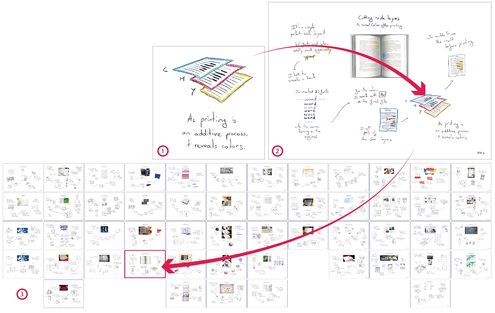
Levels of Detail. ① Individual Steps use text and sketches to precisely describe a particular design process. ② StoryPortraits situate each story, illustrate the action, reveal chronology, and show the final artifact. ③ StoryPortrait collections provide an organized overview of the StoryPortraits. This collection is arranged by participant (column) and chronological order (row).
I designed StoryPortrait with the idea of supporting different levels of analysis. StoryPortraits can be read at three different levels of detail (): from individual steps to StoryPortraits themselves and also as a collection of StoryPortraits. Generally separated by arrows and centered around an illustration, individual steps provide detailed descriptions of a specific design process. The hand-drawn illustration describe intermediary artifacts or manipulations. At the StoryPortrait level, the story is the main focus. The reader can chronologically situate it and understand its context with the photograph of the final artifact. Finally, because StoryPortraits follow a prescribed format, they can easily be assembled as a collection. By spatially organizing them, readers can compare stories both within and across participants.
A Research, Design and Communication Tool
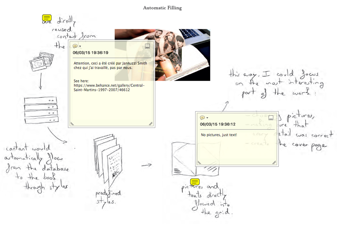
Participants annotations on a StoryPortrait. The first clarifies the context of the story: “Careful, this system was created by J. and I only used it”. The second corrects a misunderstanding: “No pictures, only text”.
Besides the initial goal of supporting interview analysis, I created StoryPortraits as a way to easily communicate stories among all team members, especially members who did not participate in the interviews. Over the course of the three different projects in which they have been used, StoryPortraits turned out to be useful in a wider variety of ways. I present below the different ways in which team members appropriated StoryPortraits throughout the whole process.
Communication with Interviewees
Because StoryPortraits were created artifacts based on interviews, we used them to verify and deepen stories with interviewees. We shared StoryPortraits with study participants. In return, they validated our findings, provided relevant new context, corrected misunderstandings and added new insights. shows two annotations from a participant about a StoryPortrait. The first clarifies the context of the story: “Careful, this system was created by J. and I only used it”. The second corrects a misunderstanding: “No pictures, only text”. One participant also asked if she could use her StoryPortraits as a way of presenting her design process to her clients.
Supporting Analysis
During the analysis phase, StoryPortraits provided physical support for conducting grounded theory analysis (Strauss, 1987). StoryPortraits did not replace raw data but provided tangible and visual links to it when needed. StoryPortraits format helped us to compare stories side by side to extract recurring themes, semantic terms and design space dimensions ().
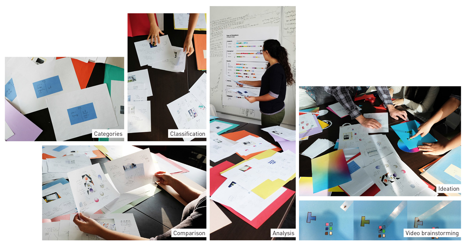
StoryPortraits were appropriated in various ways during the analysis and the design phase.
We also iteratively classified stories by spatially positioning StoryPortraits, laying them in space on a table and stacking them in groups. Taking advantage of the empty back, we used Post-it notes, storing them on StoryPortrait backs to keep track of the current state of the analysis. We used them to store possible categories and other annotations.
Supporting Design
StoryPortraits compactness made them self-sufficient and easily reusable artifacts. We were able to use them during brainstorming sessions. We used StoryPortraits to inspire ideas for novel design tools. In fact, many of the proposed tools in this thesis come directly from specific practices depicted in StoryPortraits. Brainstorming participants who had not participated in the interviews used StoryPortraits to grasp the interviewees’ problems and design strategies. It helped them to brainstorm ideas for new tools grounded in the participants’ stories.
Communication with diverse Audiences

We used StoryPortrait as support for visually presenting interview results to diverse audience including scientific and design conferences. While the abstract analysis is well explained through words, StoryPortraits ground stories to provide a shared understanding of the story and its implications.
Because StoryPortraits are a visual summary, they can provide concise, easy-to-understand descriptions of participants’ design activities to both research and practitioner audiences (). We presented individual StoryPortraits to summarize qualitative results; and included collections of StoryPortraits in videos to illustrate the analysis of the three design projects in which we used them. By playing on different scales, we could use the overall visualization in video, for example, to visualize whether each story mapped with a category.
Adapting StoryPortraits
StoryPortraits proved to be valuable assets in three different projects. Yet, because I produced them all, it is unclear whether and how they can be used by other design researchers. To study this question, I taught this technique during a 45-minute workshop with 33 design researchers at the ‘PhD by Design’ 2015 Conference.
Participants: We recruited 33 design PhD students who were participating at the ‘PhD by Design’ 2015 Conference. All were design researchers but none of them were familiar with the technique.
Procedure: During the first 15 minutes, we briefly explained both the critical object interview technique and the StoryPortrait technique. We showed examples in a descriptive approach rather than a prescriptive one. We then paired participants and asked them to interview each other about their recent use of design notebooks (7 minutes each) using the critical object interview technique. The goal was to document recent surprising uses of research notebooks by design researchers. After the two interviews, we asked each participant to create a StoryPortrait based on the interview (15min). Given the very limited time allocated, we asked participants to use pen and paper only to create their StoryPortraits. We chose to focus on notebook usage because we knew that virtually all participants would be carrying personal notebooks with them at the conference and that they had supposedly used them recently.
Data Collection: We took notes of participants discussions during the workshop, and at the end of the workshop, we collected StoryPortraits of 11 participants.
Results
All participants were able to produce StoryPortraits based on their interview results, in a very limited time. Because they only had sketching material, participants could not add pictures to their portraits. Yet, the resulting StoryPortraits were very diverse in the type of information they described. The resulting StoryPortraits included sketch-only (.a) or mostly text representations (figure 29.b). One example also proposed a non-temporal representation (figure 29.c), departing from the idea of story. This StoryPortrait instead described specific strategies in a layered manner. Another interesting example focused on an emotional representation of the story (figure 29.d), sketching facial expressions over time. These examples demonstrate that StoryPortraits can be adapted by design researchers to represent different types of data obtained through critical object interviews.
Discussion
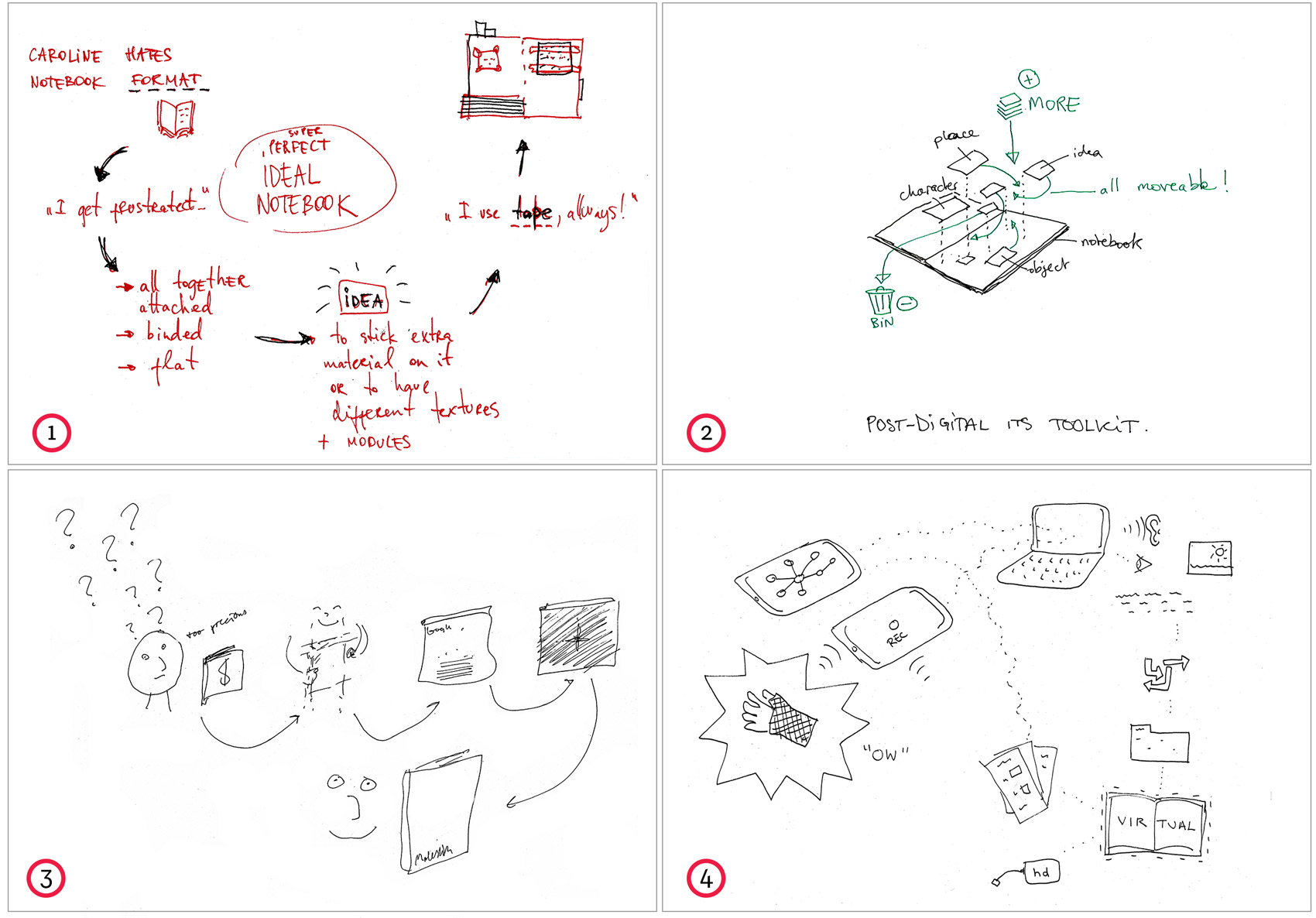
The resulting StoryPortraits included mostly text (1); non-temporal (2); emotion-focused (3) and sketch-only (4) representations.
One of the main challenges when creating a StoryPortrait is deciding what detail to include and what to omit. Researchers must conduct a thorough analysis of the stories before they select which details to include in a particular StoryPortrait. StoryPortraits cannot replace raw data but will act as pointers to it. Yet, each StoryPortrait should include sufficient detail to convey the principal story dimensions, as well as surprising details that can spark ideas for design. The person who creates StoryPortraits get a greater understanding of the data by selecting specific moments, quotations and actions.
Traditionally, text has been, and is still the primary medium for documenting and analyzing qualitative data. With StoryPortraits, in the context of artifact-focused interview, we propose to give a greater importance to visual elements as the basis for qualitative research. In that regard, illustrations are key elements for StoryPortraits because they can precisely convey physical manipulations and artifacts. Yet, we think that representing the steps in each story does not require extensive drawing skills. Indeed, rougher sketches can remind researchers of the incomplete nature of the data they are analyzing. In the design phase as well, when using StoryPortraits as inspiration, rough sketches prompt participants to fill in gaps in the story and, later, encourage new ideas.
Summary
In this chapter, I introduced StoryPortraits, a technique for synthesizing and visualizing designers’ stories into a form that supports later analysis, and inspires design conversations. StoryPortrait as a documentation technique is tightly connected with critical object interviews: an interview technique that focuses on the artifacts and tools used along the process. I describe StoryPortrait original structure that combines hard constraints such as a fixed format to facilitate comparison and soft constraints that can be adapted to best render the specificities of each story. I then demonstrate how I adapted them for the three projects in which I used them in this thesis. I also show how to read them, taking into account different levels of detail, from individual steps to StoryPortrait collections. I then report on their usage during the course of this thesis. Their physical representation facilitated comparison across stories as well as manipulation and annotation during the analysis phase. StoryPortraits also enriched the communication with the interviewee, it inspired ideas for design of interactive tools, and communication to diverse audiences. StoryPortraits allowed me to integrate rich, qualitative data from designers throughout the research and design process of this thesis.
Color
manipulate Color?
in collaboration with Ghita Jalal.
To investigate designers’ practices with digital tools, I chose to start with an elementary design element: color. Despite its apparent naivety, color has been an enduring source of exploration for designers. According to designer Hella Jongerius, “[its] complexity makes it an endless subject for investigation. No colour is ever exhausted” (Jongerius, 2010).
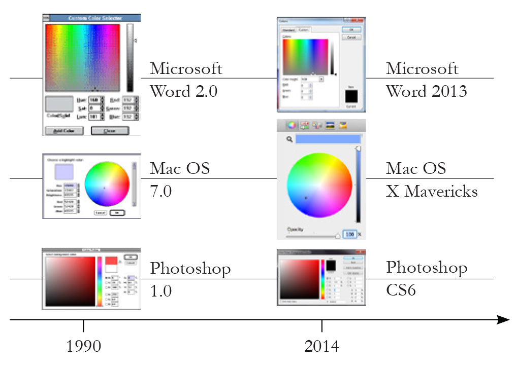
-ColorPickers did not evolve since they first appear in mainstream software, around 1990.
Applications for creating digital media usually include a color picker, with the same recurring features: a two-dimensional visual representations of a specified color model and controls to select color spaces and parameter values within that space. Designers can select individual colors from the color space, either with the cursor or by specifying a three-digit code, such as an RGB or a CMYK value. Some color pickers also allow designers to select a color from a pixel in an image, from existing color swatches or from user saved color swatches. Despite being ubiquitous, color pickers have changed little over the past 25 years. () shows almost identical layouts and controls for three common color pickers; the only new features are their underlying color spaces, which have been updated according to research in color perception (Faul and Ekroll, 2002) and representation (Meier, 1988).
Of course, one reason that color picker design does not evolve could be that color picking is a "solved" problem – designers use color pickers seamlessly to manipulate color in digital documents. However, color theorist and educator Joseph Albers (Albers, 2013) argues that color is not merely a scientific object that can be abstractly understood and that tools such as color wheels provide little value for designers when it comes to work with color. He advocated instead for “an experimental way of studying color and teaching color” through colored paper experiments. To address this gap, we need to understand how artists and designers currently manipulate color in their own practice, with or without digital tools.
Background
Color is one of the most fundamental and basic elements manipulated by designers. Yet, color is a deceptively complex notion studied by many different scientists from various angles. Because color perception is more complex than directly sensing wavelengths of light, color is a very complex property to characterize and manipulate. Psychologists showed that the brain interprets signals from individual photoreceptors as distinguishable, subjectively different colors (King, 2005). The relative nature of color perception creates many illusions. For example, the phenomenon of simultaneous color contrast which causes a color’s appearance to be affected by the color that surrounds it (Chevreul, 1854). Taking into account such illusions, designers need to develop a deep knowledge of color and its effects as they need to craft colors for each individual artifact that they create.
Color is fundamental to designer’s work, yet it is one of the most complex to master. Some designers devoted their lives to understand the role played by color in design work. Itten and Albers, both professors at the Bauhaus proposed radically different visions of color. Itten was interested in establishing a practice of color, rather than a scientific understanding of it (Itten, 1996). According to him, designers and artists must take into account impression (perception of color), expression (emotional reaction to color), and construction (conveying meaning), combining all three to create each desired effect.
Albers argues that color is “the most relative medium in art” (Albers, 2013) and used practical exercises to teach novice artists and designers about the nature of color and to explore how it can convey mood and meaning. Traditionally, this hands-on approach, through intensive practice and experience, is still the default way for designers to develop a nuanced understandings of color.
Yet, outside from pedagogical approaches, most designers don’t formally talk or write about their personal practice of color in their projects. Today, we still know very little about how designers manipulate color in their daily work and especially digitally.
Study
With this first study, we are interested in how designers manipulate color in their work, and which tools and techniques do they use in the process. Although digital color tools are our primary concern, we also want to understand physical color practices that have evolved over centuries and may inspire new ways to manipulate color digitally.
Participants: We observed and interviewed eight artists and designers (4 men, 4 women; age 23-45) who consider color an essential part of their work practice. Their professions included painter, illustrator, ceramist, spatial designer, graphic designer, product designer, service designer and interaction designer.
Procedure: We interviewed participants in their studio or office for about one hour and a half. We used a critical object interview technique: we asked participants to tell stories about their use of color in recent projects and to show us the resulting artifacts. We probed for situations in which their interaction with color was particularly effective, but also when it was extremely difficult or impossible.
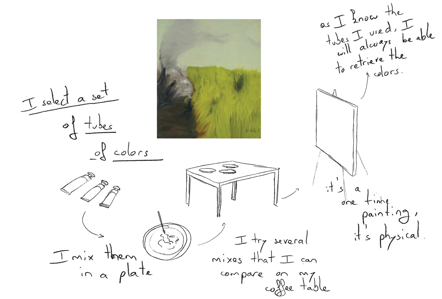
-Four to Five StoryPortraits per participants depict stories of color manipulations
Data Collection: We recorded audio for each interview and took written notes. We also recorded video of participants’ interactions with the objects they had created, and photographed each artifact and any related color creation or manipulation tools.
Analysis: We created a StoryPortrait to illustrate each story (see Chapter 3), with a photograph of the artifact, as well as drawings to describe each step in the color creation and manipulation process (). We later showed these storyboards to the participants to verify the details. We performed a grounded theory (Glaser and Strauss, 1999) analysis and defined ten different color manipulation categories. We mapped each story to one or more categories and later chose the five most representative categories to create the ColorPortaits design space described below.
Results: the Color Portraits Design Space
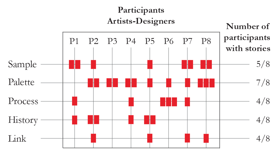
-Mapping of designers stories with the Color Portraits design space dimensions. One story can map to more than one category.
We collected 35 individual stories from eight participants. We identified many surprising practices: 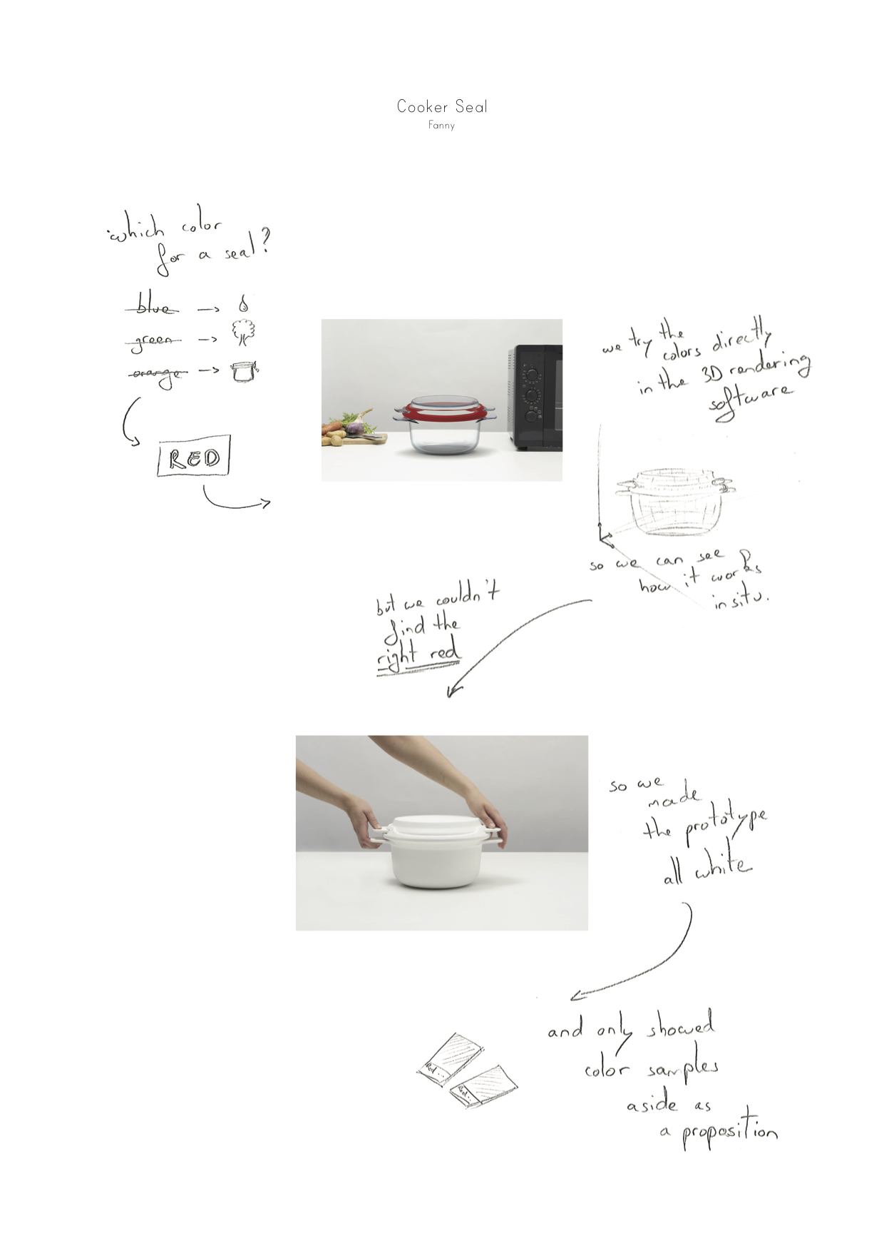 P2 (spatial designer) explicitly chose an “incorrect” color to indicate to the client that the final color had not yet been chosen. Similarly, several participants moved back and forth between physical artifacts and digital colors to reach satisfactory colors. However, the following analysis focuses on the most common color manipulation practices, chosen because they appeared in half or more of the participants’ stories, usually with multiple examples per participant ().
Samples: Picking and Tweaking
One of the expected color manipulations is to sample a specific color. Surprisingly, only two participants mentioned cases in which they selected a color from the color picker and used it without further modification. 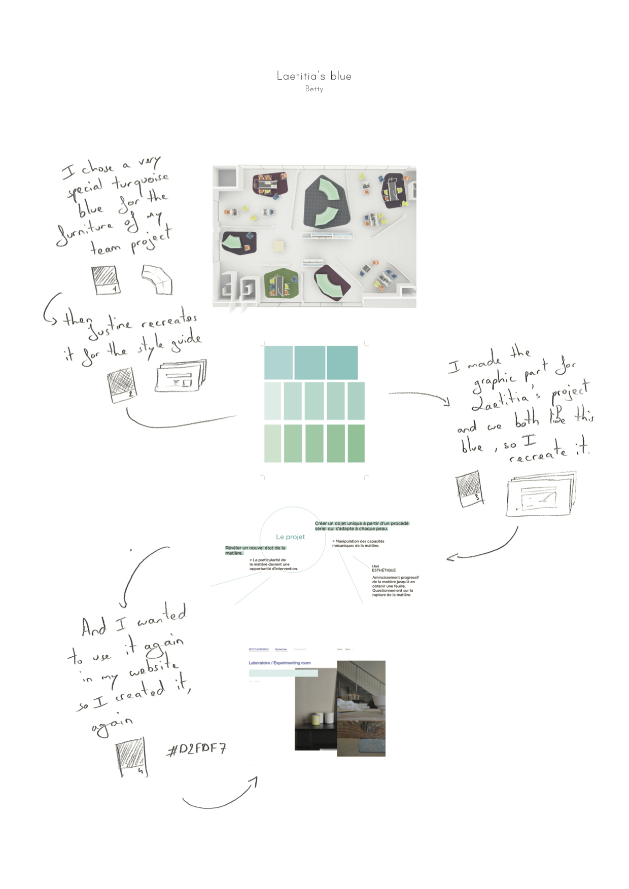 P6 (Product Designer) used Adobe Photoshop’s color picker to recreate a particular blue she had already used in her project for a website, and P4 (Graphic designer) tried to create “unusual colors” by using Adobe Illustrator’s color picker. Most participants (5/8) selected colors from a variety of samples, including online websites, color palettes and photographs, as well as physical objects, such as ceramics, textiles but also color standards from catalogs. Occasionally, participants used the sampled color directly, mostly when they needed to ensure conversion between digital and material colors, such as when P4 (Graphic designer)
 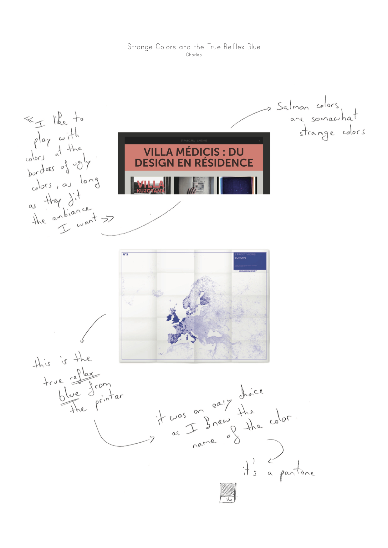 chose a blue from a catalog to ensure that the printed version of his poster would appear exactly as he wanted. Choosing color from the RAL catalog was also reassuring for P1 (Painter).
  He knew that he “could still find the same color in a hundred years”.

-Designers pick colors from diverse sources, and often tweak them later.
More surprisingly, in all remaining cases, participants started by selecting a sample and then tweaked it before applying it to the artifact. P7 (Service designer) created a palette using Kuler, 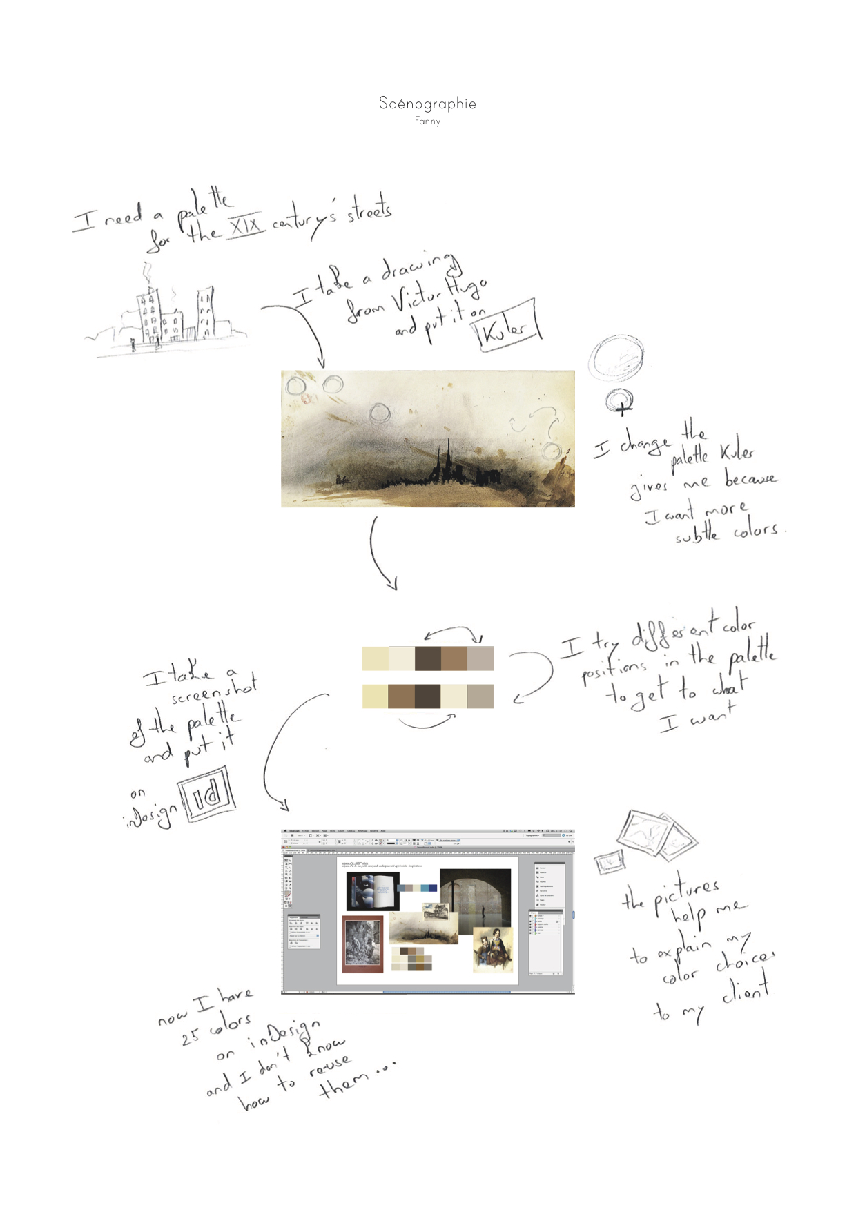 extracted colors from the screen with InDesign, changed one of them, and then used the resulting palette in his final design. P1 (Painter)
 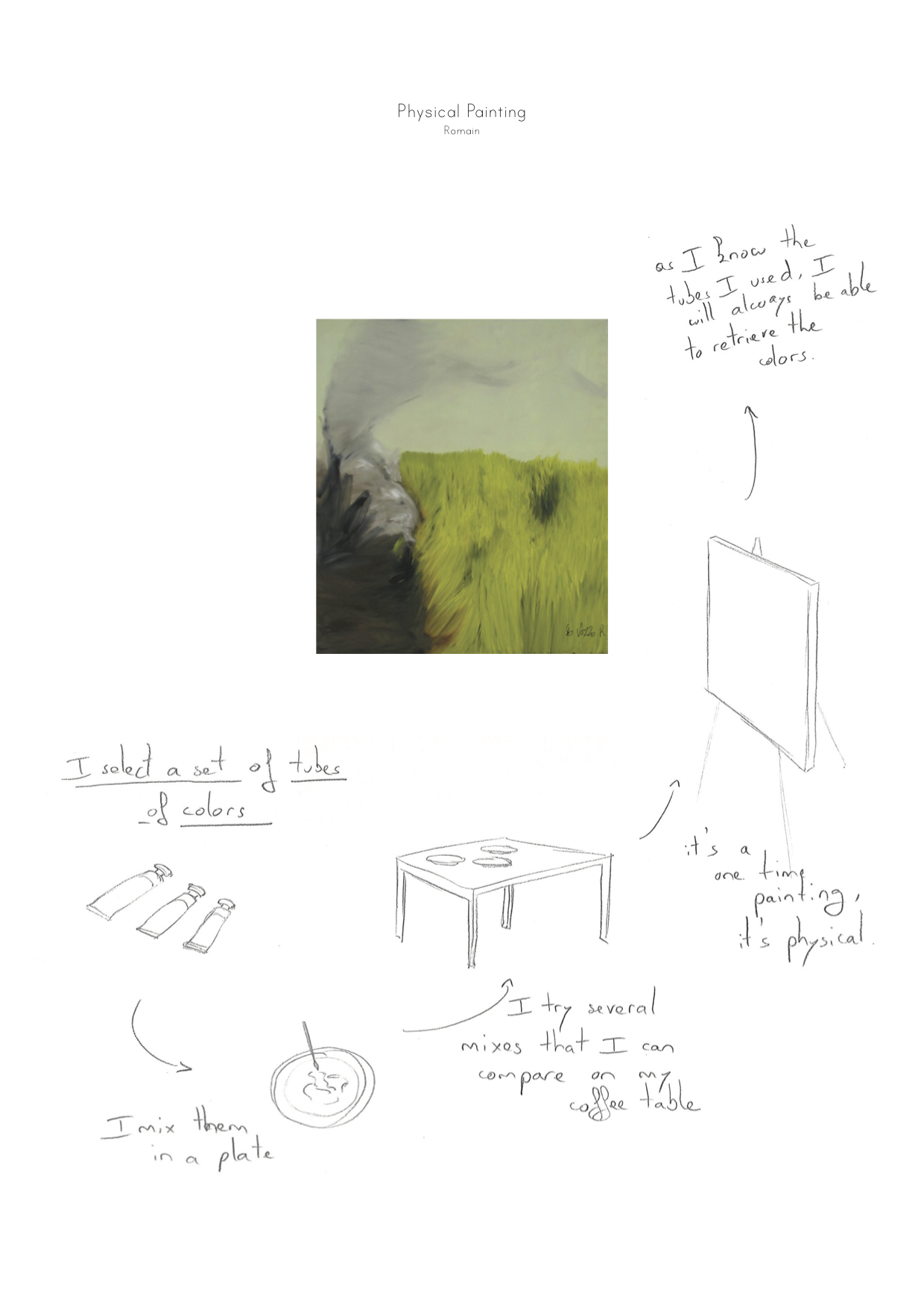 selected a set of three tubes of oil colors and mixed them in his plate to obtain the final colors for his painting. When participants used color pickers, it was only as a step within a much more elaborate color manipulation process. For example, P8 (Illustrator) used the eyedropper tool in the Macintosh OS color picker to select a colored pixel from an image in a magazine.
 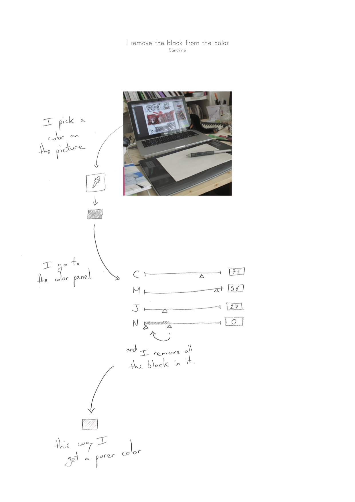 She then decided to purify it by “removing the black”, which she accomplished by placing the color in CMYK color space and sliding the black (K) parameter to zero.Similarly, P2 (Exhibit designer) sampled colors from paintings she had found online, and then used the color picker to tweak the samples before adding them to her mood board. shows the gap between the traditional understanding of color selection as being an immediate color picking from a color space, and the wealth of sources as well as the tweaking generally applied by designers.
Palette: Manipulating color relationships
Participants rarely worked with individual colors. Instead, they created coherent sets of colors, palettes, and manipulated them as a whole. Most participants (7/8) created related sets of colors rather than separate individual colors. In fact, it is extremely rare that a project would involve only one color. Thus participants wanted to create coherent sets of colors, according to the characteristics that they specify. For example, P2 (spatial designer) took photographs of several colored objects to experiment with palette creation. 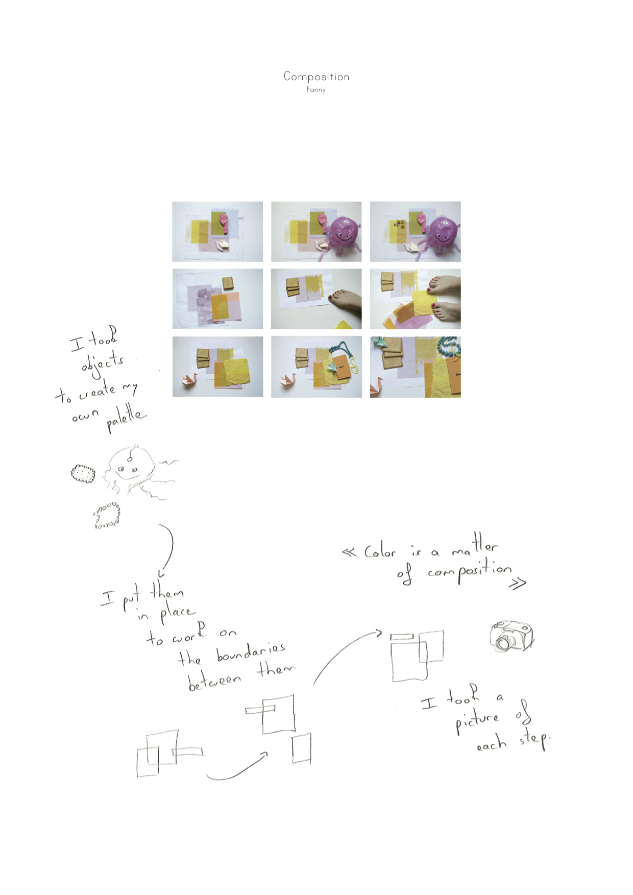 For her, “each picture is a different palette”. Although the pictures contained the same objects, their positions differed, which resulted in different color compositions and effects. Participants were very concerned with how different colors appear when used together.
 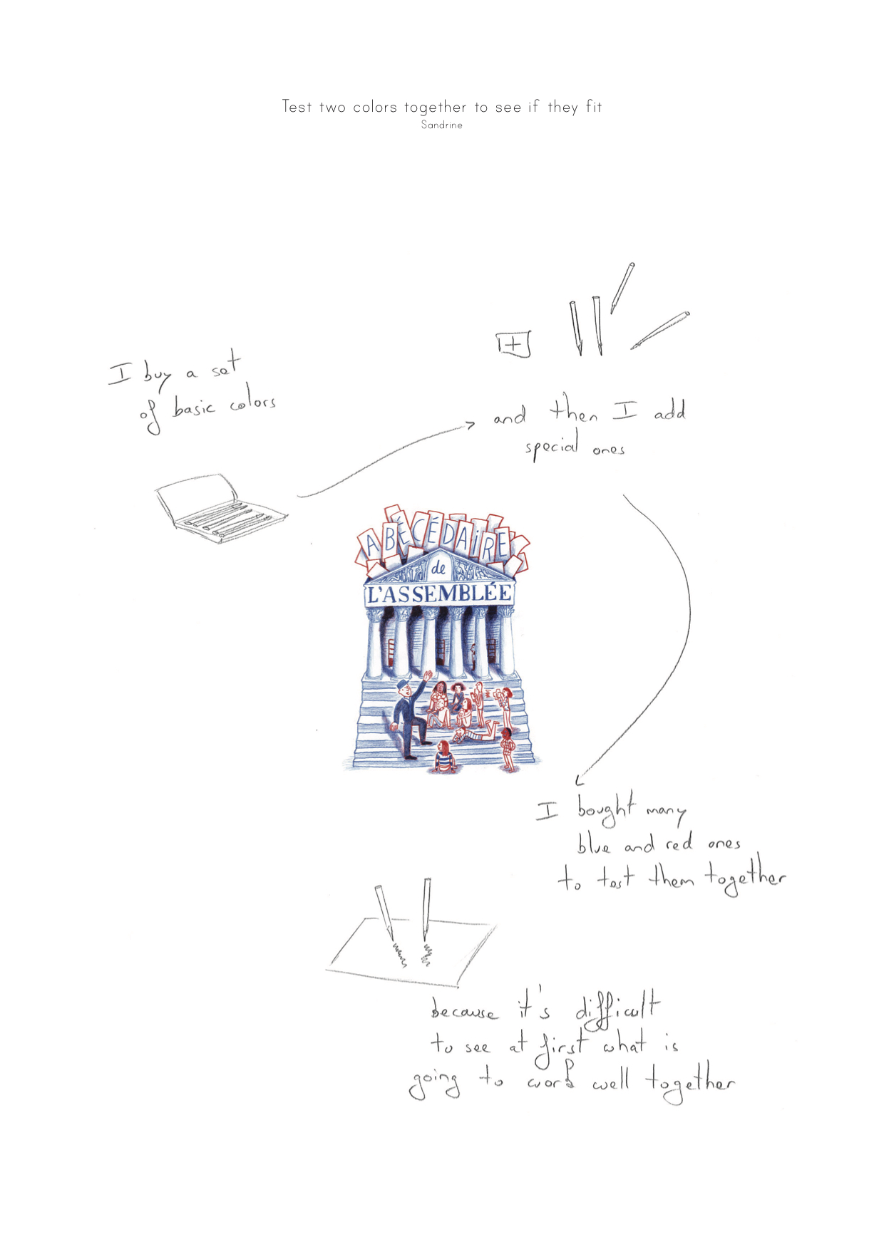 For example, P8 (Illustrator) had a restricted palette of one blue and one red for a set of book illustrations. She bought a variety of blue and red pencils and tested how they looked together, before making a final choice.
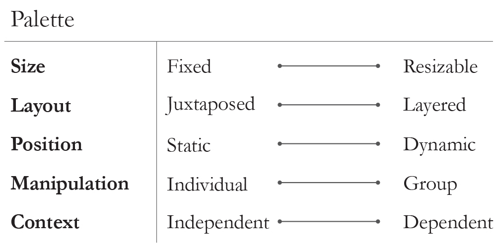
-Designers adjust size, layout and position of one or more colors, ideally in context.
Participants also wanted to apply a single color change to affect an entire palette. For example, P8 (Illustrator)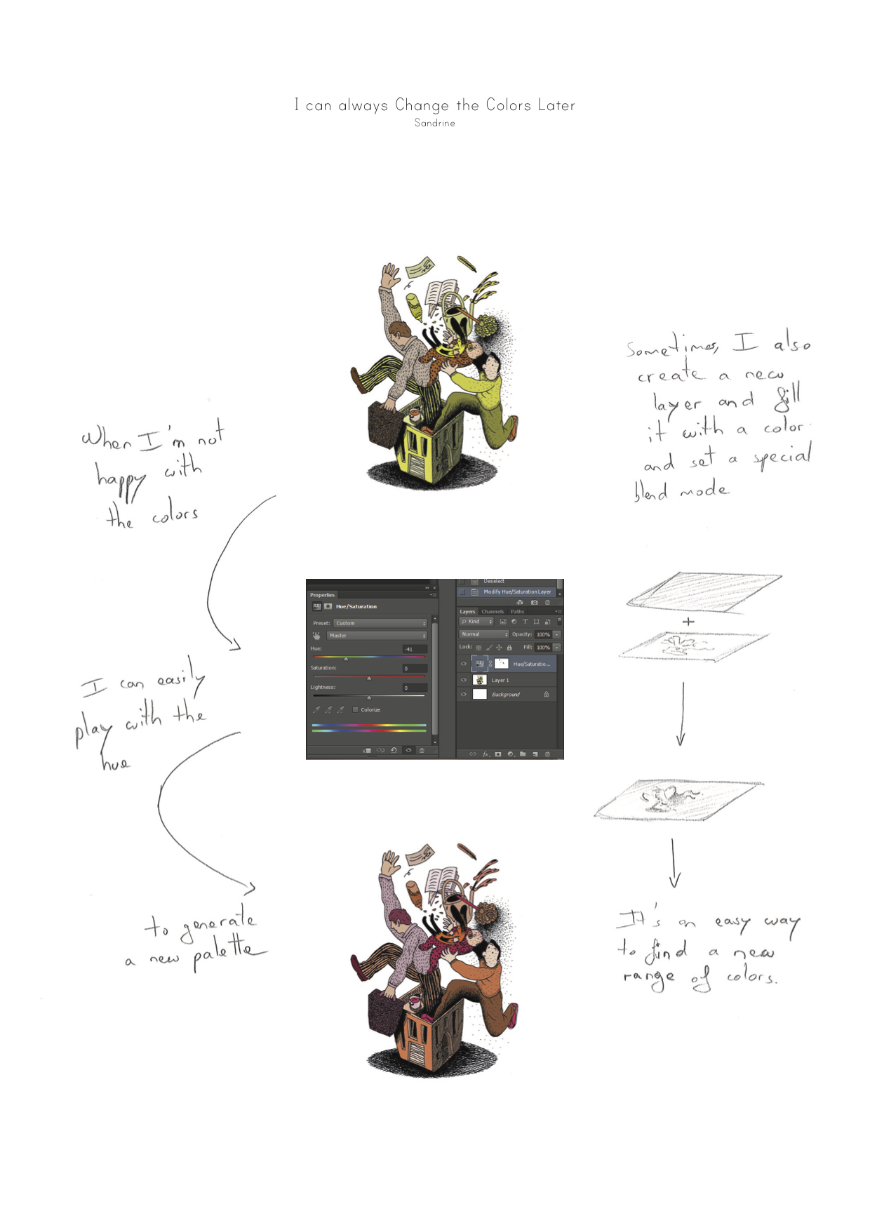 created one palette and then modified the hue of each color by the same amount, which generated a new palette. Simultaneously adjusting one property for the entire set of colors allowed her to maintain a related, harmonious color palette. Participants often wanted to manipulate spatial dimensions and contextual characteristics of each palette to control color relationships. Unfortunately, color pickers do not allow designers to resize or reshape color swatches, nor do they let designers explore color variations in context.
defines the five above mentioned manipulations of color palettes, including: comparing swatches of different sizes, layering or repositioning colors, manipulating groups of colors as a unit, and interacting with color independently, such as within a color picker, or in the context of the remaining colors. Current color pickers consider colors as independent elements and do not provide functionalities to support selecting and manipulating colors in the context of other colors.
Composites: Combining Colors with other effects
Colors are affected both by their surrounding colors and by other adjacent elements such as textures. Participants also considered these aspects when creating and manipulating colors. Half of the participants (4/8) needed to couple color with other elements, such as texture and lighting effects, and manipulate the resulting combination. P2 (Exhibit designer) described the screen as “a flat surface that does not always transpose the richness of the physical world”.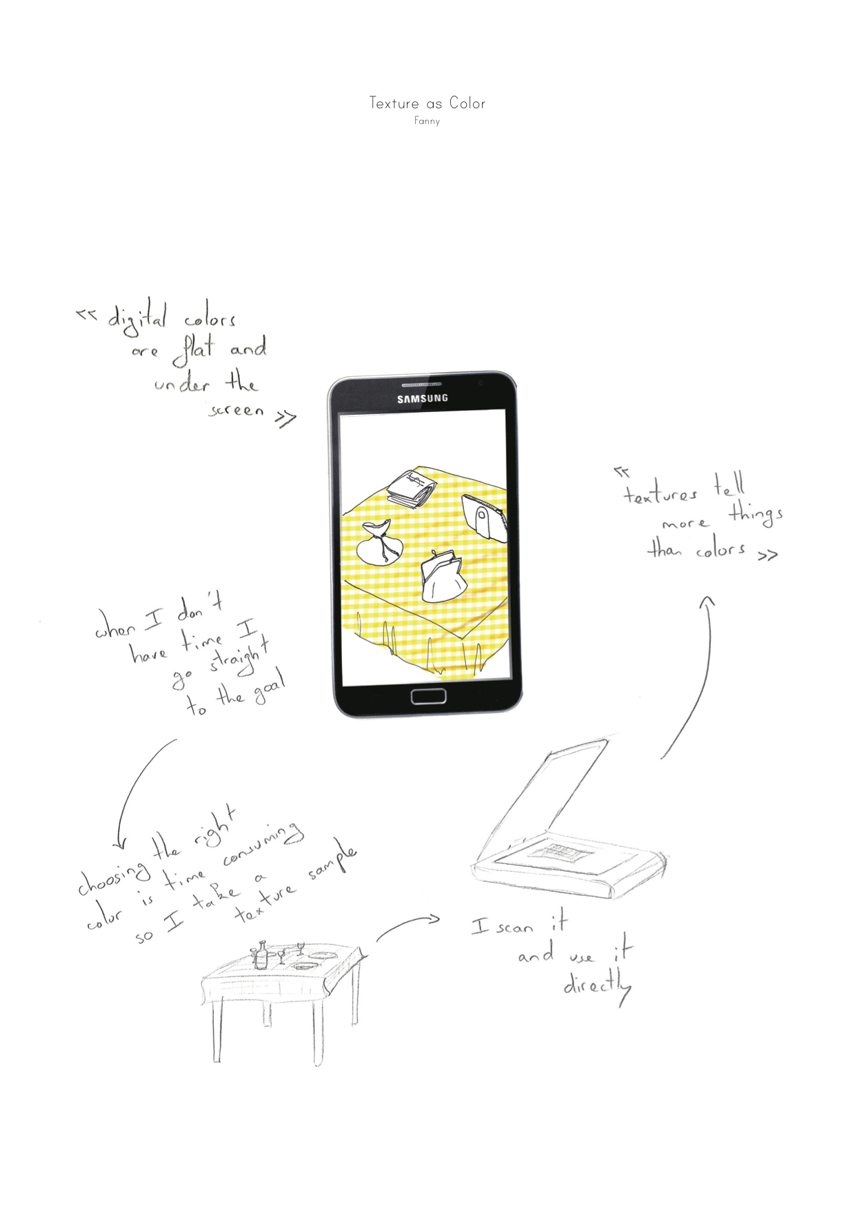 To reproduce the yellow texture of a tablecloth on the screen, she scanned it and used the resulting image to provide the effect she wanted. For her, the color did not exist without the underlying texture. P8 (Illustrator) used Photoshop to manipulate a color and a texture that she paired together in several illustrations.

-Designers combine and decompose colors with disparate components.
In order to do so, she had to manipulate the two components separately each time. P1 (Painter) created a special preparation that added a particular type of light reflection to each color.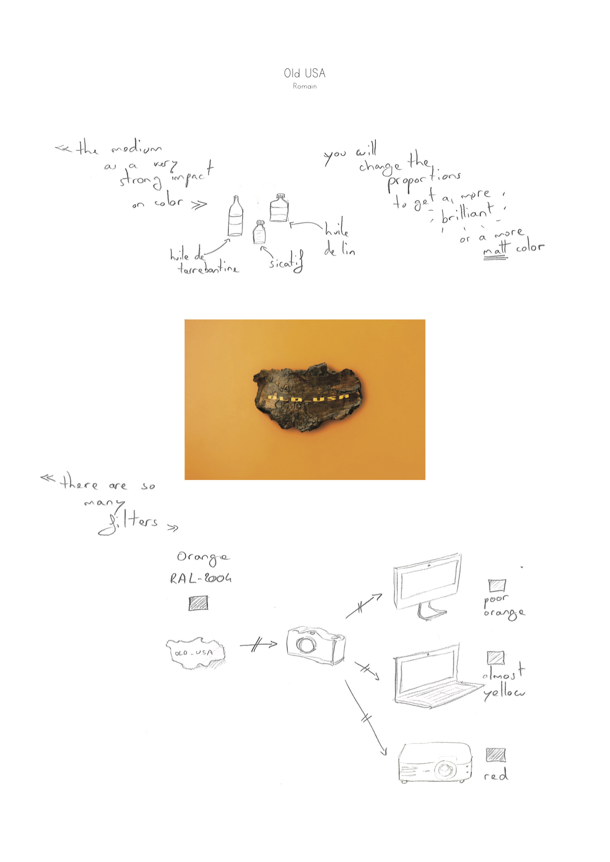 He considered this combination of color-plus-reflection as his personal signature. defines the two activities related to color composites, including: composing and decomposing multiple components, and manipulating these components individually or together. Color tools are designed to manipulate properties based on pure colors. They do not support creation of complex color-texture composites, nor can designers manipulate individual elements as separate subcomponents that can be assembled and disassembled as needed.
History: Interacting with past actions
Participants often performed similar tasks again and again, or revisited old artifacts when creating new ones. They needed to remember both how they initially created colors and also how the colors were applied in the final artifact. Participants were also interested in intermediate steps, which would let them explore alternative paths without starting over.

-Designers record color sources and targets, as well as intermediate steps.
Half the participants (4/8) sought ways to save meaningful intermediate steps in the process of creating a final color. For example, P5 (Ceramist) kept samples of every color she created over the past decade, as well as “recipe” notebooks containing personal names, codes of the different mineral used and the numbers of trials needed to obtain each color. A few participants (2/8) also kept track of source colors. For example, P7 (Service designer) saved images he downloaded from the internet: “I use these images to extract colors for my palettes and I keep them for later reuse”. Other participants saved their final palettes with the resulting artifact. For example, P4 (Graphic designer) 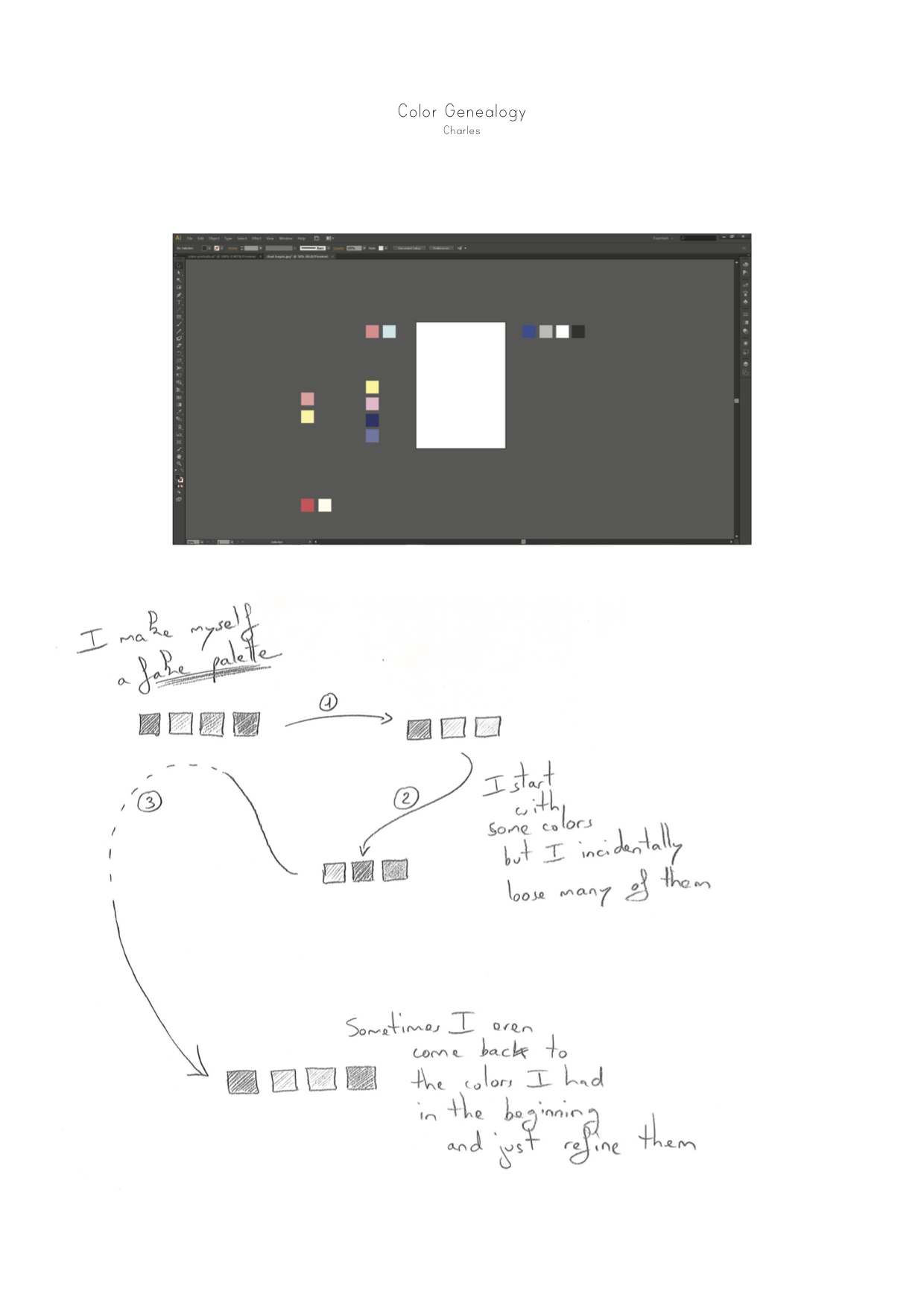 placed all the colors he had tried as rectangles in the unused space beyond the margins of his Illustrator document, and saved them as part of the final document. Some participants (2/8) wanted to return to a previous use context, with both the initial color source and the final artifact. For example, P5 (Ceramist) used several previously created red tiles to develop a nuanced set of three slightly different red tiles for another client. defines two activities related to history, including: preserving source materials and final artifacts, and capturing intermediate steps in the selection process. Current color pickers support only the most limited form of history. Although many provide slots for recording previous color choices, these colors are devoid of context about their sources, the sequence of steps necessary to recreate them, and the final result.
Process: Revealing activity over time
Sometimes participants who create physical objects observed color changes that revealed useful information about interim states. Unlike previous dimensions, color here is not the focus, but rather a means to an end.

-Designers react to naturally occurring changes in color to indicate progress.
Half the participants used color to indicate how they created an artifact or the amount of time spent on its creation. 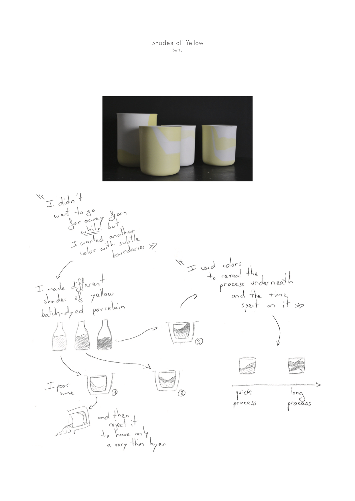 P6 (Product Designer) observed colors to determine important details about her design process: “Just by looking at the pot, you can see how many layers I used”. In another project, she heated metal chairs, which caused the metal to change colors.
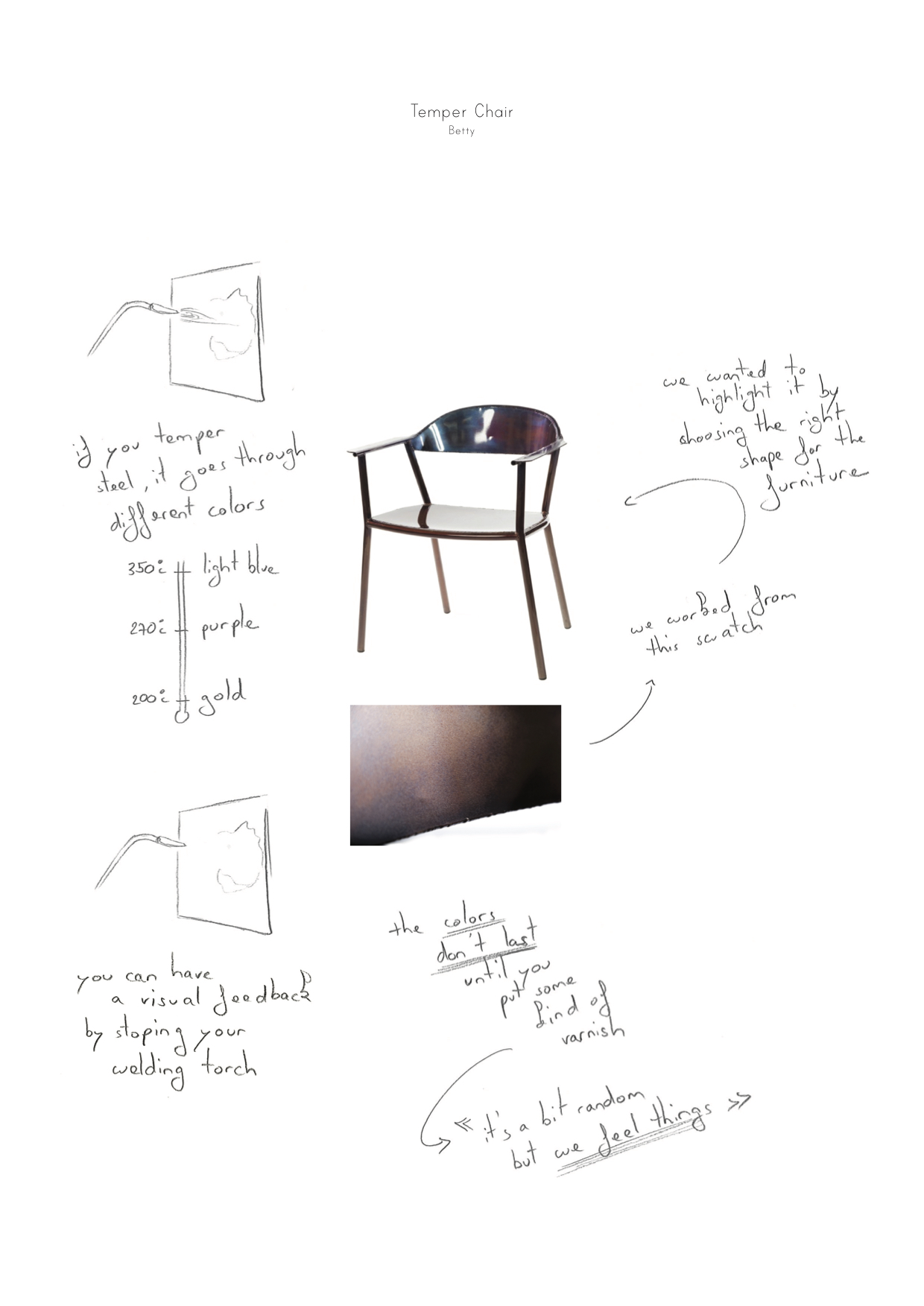 She stopped the process when she liked the color and applied a coating to stabilize the color. Here, she manipulated color indirectly though changes in temperature. This suggests an interesting opportunity for electronic color manipulation tools, in which color change reveals the underlying changes in an online activity. defines two activities related to the color change process, including: manipulating color that results from other activities and revealing on-going processes. This dimension is not taken into account by current color tools as colors are usually completely separated from the objects they are applied to. Changes applied to the object itself won’t affect its color.
Testing with non-color specialists
Even if our main goal is to create color tools for designers, we are also interested in testing the broader applicability of the Color Portraits design space. To do so, we interviewed eight scientists and engineers (6 men, 2 women, aged 23-45), from the following disciplines: biology, biochemistry, computer science, data visualization, game developing, virtual reality engineering, automatics and information theory. Each interview lasted approximately one hour, in the participant’s office. As before, we asked participants to show us recent artifacts they had created and to describe the steps they followed to incorporate color. At the end of the interview, we asked for additional stories related to each design space category. We recorded audio for all interviews and recorded video of participants’ interactions with the resulting artifacts.
Results and Discussion
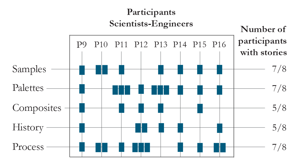
-Mapping of scientists and engineers’ stories with the Color Portraits design space dimensions. One story can map to more than one category.
We collected a total of 34 stories, three to five per participant. () shows that scientists and engineers have similar color manipulation requirements as artists and designers. We saw similar proportions of activities for both groups and were surprised at how important these second group of participants consider color manipulation. For example, P10 (Biochemist) organized a full afternoon workshop with his colleagues to choose colors to establish color standards to represent different molecules. P15 (Information theorist) found choosing a color for a figure very time-consuming: “I might spend half an hour to find the right amount of blue in my color”.
Samples
Scientists and engineers, like artists and designers, actively sample and then tweak colors (7/8). For example, P10 (Virtual reality engineer) looked for images on the Internet to find inspiration. He sampled several colors as initial references and then adjusted them to create his own set. P13 (Data visualization researcher) wanted to visualize data about cycling teams, so he began by sampling an image of the team t-shirt. He then modified the colors to make them easier to distinguish from each other.
Palettes
Although none of these participants referred to a palette explicitly, almost all (7/8) interacted with sets of colors. For example, P9 (Programmer) created a palette for a user interface design by selecting a few primary colors. He then programmed a script to add a small amount of black to all of his colors to increase legibility. P12 (Geologist) scanned an image from a microscope image of a rock, using polarizing paper to change all colors simultaneously: “This lets me preserve the relationships among the colors”.
Composites
Many participants (5/8) were interested in achieving particular effects that required a combination of color and a second element. P10 (Virtual reality engineer) combined a grass texture with green to create the grass for his 3D space: “I played with the combinations to get this effect with my 3D rendering software.”
History
Over half the participants (5/8) kept track of interim steps in the context of previous color manipulations. For example, P14 (Game developer) created folders of colors where she recorded her color choices and later reflected on them, in the context in which they had been created: “I look at the colors, dates of creation and names I gave the colors to see how my perception of these names changed over time.”
Process
Interestingly, almost all scientists and engineers (7/8) used color to indicate the progress of an on-going activity. P9 (Programmer) used highly distinctive colors for his Java classes in order to quickly check the complexity of a piece of code: “If the class has many colors, it means that it has a large number of dependencies and it will be hard to test”. Similarly, P16 (Information theorist) used a colored pen to mark variables in her equations, which helped her communicate and follow the evolution of her calculations.
In summary, seven participants described color-manipulation stories related to at least four of the five dimensions. This suggests that the color manipulation activities we identified for artists and designers, for whom color is a major focus of their work, also apply for scientists and engineers, even if color is more of a means to an end.
Analysis of current color tools
Designers and artists manipulated color in creative ways, along dimensions expressed in the Color Portraits design space. In the interviews, we observed how designers’ process usually went beyond merely using color tools. Here, we analyze two existing color tools to see how much they support the five key designers’ activities: Photoshop color picker and Adobe’s Color CC. The Adobe Photoshop color picker is embedded within a professional application designed to help artists and designers edit photographs or illustrations. Adobe Color CC is an online tool with a large library of themed palettes contributed by users as well as an interactive tool that incorporates color theory to generate new color palettes.
Both Photoshop color picker and Color CC support sampling well as designers can not only select from predefined sets of colors, use the eyedropper to sample from other sources and also modify the sampled color, even if only through a set of color space parameter sliders. While this first dimension is well represented in both tools, the other dimensions receive far less support. Photoshop color picker does not support the creation nor the modification of color palettes. Color CC lets designers select palettes from a wide crowdsourced library. However, while designers can change one color to affect the rest of the palette, they cannot control their spatial arrangement. Moreover, although they can take advantage of pre-defined color rules to create certain types of palettes, such as complementary colors, they cannot define their own rules to determine and manipulate their own personally defined color relationships. Although Photoshop’s color picker and Color CC both allow designers to save colors which they can reuse later, neither preserves context, nor the steps in the creation process. Neither tool supports creating or disassembling composites of multiple colors and textures, nor do they support the use of color to reveal activity.
Although they do not comprise an exhaustive set, these three color tools are widely available and represent the most common color tools available to designers. This analysis reveals that color tools are primarily designed to support color selection. They look at the end goal of the design task, which is to select a specific color. They then propose an interface that maximizes the amount of colors from which designers can choose and minimizes the actions needed to attain any specific color. This is why color selection tools revolve around color spaces. Color Spaces encompass all possible colors, the interaction consisting in navigating this potential space. In fact, it is as if color tools creators considered that designers have a specific color in mind of which they want to retrieve the numerical value. They created tools that focus on the efficiency of color selection, rather than the exploratory approach used by designers. In the interviews with designers, we have seen that this imagined “user scenario” does not happen. Instead, designers continuously invent processes and recipes to reach desirable colors. We can see that many gaps remain in the Color Portraits design space, suggesting opportunities for the design of innovative color tools.
Summary
In this chapter, I presented a study investigating designers’ practices with colors. We conducted a series of 8 critical object interviews with designers and artists who manipulate both digital and physical colors. Using StoryPortraits, I depicted 35 individual stories that showed the breadth and the extremely detailed color manipulations performed by artists and designers in their work. From these stories, we created the Color Portraits design space to characterize five key color manipulation activities: sampling and tweaking individual colors, manipulating color relationships, combining colors with other elements, revisiting previous color choices, and revealing a design process through color. We tested the applicability of the Color Portraits design space with scientists and engineers who also performed the same type of color manipulation in their daily work. Using the Color Portrait Design Space as a reference, we then analyzed two color tools dedicated for designers. We found that, apart from sampling, they poorly support designers’ color manipulation activities in their current form. I argue that this is due to a lack of understanding of design activities as exploratory-driven rather than efficiency-driven.
Alignment
in collaboration with Marianela Ciolfi Felice.
Aligning and distributing objects in space are two very common strategies for designers to organize content in documents. From a Gestalt Theory perspective, alignment is a concept that produces grouping and organizes information to create order (Wagemans et al., 2012). Virtually all design software applications propose the same tools for aligning and distributing objects: a set of 12 dedicated imperative commands (). Each command performs the alignment or the distribution of the selected objects based on their reference point: left, center and right; top, middle and bottom.
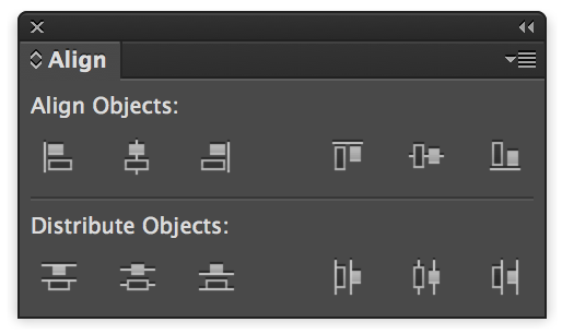
-The alignment and distribution command panel in Adobe Illustrator
Just like the color picker tool studied in Chapter 4, commands as we know and use them today were introduced in the very first versions of authoring applications, such as MacDraft, a CAD application for the Apple Macintosh, released in 1984. More than 30 years later, only the appearance of icons differentiates this early version of the alignment commands. They are also ubiquitous not only in design-dedicated software but also in general authoring applications. Over the years, HCI researchers proposed several novel alignment and distribution techniques, such as GACA (Xu, 2015), a “group-aware” alignment technique to enhance designers practices. Yet, we still know very little about how designers handle this task in their daily work.
Background
A few previous studies highlighted the problem of positioning objects in contexts other than design. For example, Janecek et al. (1999) reported that an expert Colored Petri Net designer spent over 60% of his time in a basic design task performing tedious and repetitive operations to reposition graphical objects. Mackay et al. (Mackay, 2000) reported that “expert users seriously underestimate how much time they spend on minor manipulations of the tool, especially those involving layout”. These petri net designers estimated that they spent approximately 5% of their time on graphical repositioning, but video records showed that they actually spent closer to 30%. However, we do not know how designers and regular users of authoring applications perform alignment and distribution in their work. To what extent do current alignment and distribution commands support their existing practices?
Study
Participants: We interviewed twelve regular professionals (ages 24-38; four women) who use Adobe Illustrator, Adobe Photoshop, Sketch, Inkscape, Gimp, Corel Draw, Microsoft PowerPoint and Prezi in their daily work. Half the participants (6/12) were professional designers (UX, product, and web designers); the other half included a software developer, a design student, a biologist, a political scientist, a geologist, and a computer scientist.
Procedure: We used a critical object interview technique: we interviewed participants in their offices or homes and invited them to show us recent projects in which they had to lay out graphical objects. We asked them to recall specific problems, focusing on breakdowns (interactions that led to unexpected or incorrect results), innovations, and appropriations (the personal strategies they used, especially when dealing with breakdowns). We also encouraged them to show us these problematic tasks, and observed their reactions to mismatches between their expectations and the system’s behaviour.
Data Analysis: We performed a Grounded Theory analysis (Glaser, 1999) to classify the collected stories. We identified specific issues in each story and cross-checked them with the other stories. This provided us with a list of the issues faced by participants when aligning and distributing graphical objects.
Results
We were surprised by the diverse strategies devised by participants to achieve desired alignments and distributions. Whereas all participants used the dedicated commands, most participants (8/12) also aligned and distributed objects “manually”. For example, they first used the mouse to roughly position the object, and then used the arrow keys to visually fine-tune it. Participants viewed alignment and distribution commands as “automatic” operations, and treated everything else as “manual” operations, including using rulers (8/12), making visual comparisons within a zoomed-in area (7/12), and typing in coordinates (2/12). All the designers and one developer (P12) made extensive use of the keyboard to align and distribute objects, not only because it is faster, but also because “there are too many options and menus” (P3, UX designer) that clutter their screens and make them “lose focus” (P2, web developer/designer). Most participants (8/12) used and appreciated the automatic guidelines that appear in some graphical editors, even though they are not persistent.
We identified three key issues that participants faced when positioning objects using current graphical authoring tools. We define them below and we show the different strategies used by participants to overcome these limitations
Lack of persistence: Alignment and Distribution Commands do not keep objects aligned or distributed, forcing participants to realign or redistribute them after every minor change.
Lack of control: Participants often cannot predict the results of their commands. Participants also lack tools for making and preserving minor corrections or ‘tweaks’.
Lack of generality: Participants are limited to horizontal and vertical layouts when aligning and distributing objects.
Persistence
With traditional tools, applying an alignment or distribution command moves the objects but leaves no concrete trace of its use. Any change to one of the objects will likely require the designer to reapply the command. This lack of persistence leads to the repetition of actions and hinders the reuse of previous results. For example, P5 (web designer) aligned two objects vertically: “I wanted to move one to the right. I wish I could do it only in the horizontal axis, instead of being worried about introducing an offset in the vertical one. Some constraints are obvious to me but they are not captured by the tool, so it gives me more freedom than I need, and I have to realign”.
The lack of persistence is closely related to the need to support repetitive, rather than just one-time tasks. Optimizing repetitive tasks currently requires some planning, such as creating auxiliary structures or guides, which is not worth it for most one-time tasks. P9 (computer scientist) explained that “you need to have an idea of how the objects should look, and only then align with the commands, not the opposite; so you either plan everything in advance, or you reapply everything you did”. P3 (UX designer) explained that “for a one-time thing I do the job manually, but for a frequent task I find a tutorial to learn how to solve it with tools”.
To counter the lack of persistence, participants created “hacks” using other tools. For example, half the participants reused a previous alignment or distribution by duplicating the objects and replacing them with new ones, even though P9 (computer scientist) considered this to be “cheating”. P7 (political scientist) and P10 (biologist) wanted to know the distance between two graphical objects: “The grid is not enough, I cannot count the squares.” (P7). P8 (geologist) needed to add tags to several pictures at the same position relative to their frames: “I wish I had a way to declare this to the program”. P9 (computer scientist) wanted equal spacing among items and created an invisible spacer – a transparent rectangle with the same height as the space he wanted to duplicate. P11 (design student) created her own spacer by “cutting the distance between two objects and pasting it between the rest of them”.
Control
The icons used to depict alignment and distribution commands appear intuitive, but participants still had difficulty predicting the results. P1 (designer) was trying to distribute objects and the outcome was not what he expected: “It is not clear what will be the effect of the command, even if you have some experience with the tool. It is normal to have to undo and retry, sometimes it does not do what you want. See? This does not make sense to me. I am not even sure if I chose the right command”. P9 (computer scientist) wondered: “I am aligning with respect to what? Does the selection order matter?” P10 (biologist) had the same problem with distribution: “What is the reference? Is it the width of the page?” P9 (computer scientist), after successfully aligning a group of objects inside containers, added: “Now I was lucky, sometimes I have to undo and repeat the action, because it moves the element or the box. I have to be always alert, and do it in a precise mechanical way, always thinking of making the selection in the correct order”.
Current command-based systems do not reveal how their algorithms work. Few highlight the alignment’s pivot (the object used as a reference to align other objects to it) or the object’s anchor (the reference point within an object used for alignment – usually the object’s center or a side), and even fewer let designers choose them. Designers cannot pre-determine if or how the selection order will affect the output. Half the participants did not feel in control and were frustrated by the commands, which they described as ‘awkward’ (P12) and ‘too automatic’ (P4, P5).
P5 described annoying limitations of the tool: “There is a problem with hierarchy in layers and groups. Sometimes I cannot directly relate an object to one in another group, because they do not see each other; I have to ungroup and regroup so that the tool lets me align them”. These breakdowns caused P10 (biologist) to completely lose faith in commands: “Align vertically always makes a disaster. I do not trust it, so I do not trust align centers either”. P12 (developer) also felt the loss of control: “I have more trust in moving things manually because I find it more practical, I can put them exactly where I want”.
Alignment and distribution commands use the geometric center of objects, but sometimes this does not match the object’s visual center. Seven participants had recently used commands to align what they referred to as ‘irregular’ or ‘weird’ shapes, including icons, logos and text within a graphic design. All were forced to fine-tune the result to make it aesthetically pleasing. We call such edits tweaks. For example, P3 (UX designer), P5 and P6 (web developers/designers) switched to a grid view and manually arranged each object’s position. To our knowledge, current tools completely ignore such tasks, so designers must perform them manually after each use of an alignment or distribution command, therefore increasing the need for repetitive actions, preventing output reuse and increasing the likelihood of errors.
When Participants felt that they could not trust the alignment and distribution commands, they prefered to rely on other means. For example, P2 (web developer/designer) needed to ensure equal spacing among a series of objects: “I do not understand the distribution commands, so what I did was to cheat. I put one object next to the right side of the first one, I selected it and then pressed shift and the right arrow. I counted how many times I pressed the arrow, this gave me a kind of procedural measure of the space between the objects that I memorised and then repeated for the rest”. P10 (biologist) used a similar procedure, because “it is safe”.
Generality
Sometimes designers want to align objects along a diagonal, or shapes other than a straight line. They may also want objects, such as the arrows in a diagram, to remain parallel in spite of future edits. However, most current tools are limited to horizontal and vertical alignment and distribution.
Some participants came up with clever tricks to align complex graphical elements. P5 (web developer/designer) puts his icons and labels inside transparent square containers that are larger than the icons, which he keeps aligned: “The white space between an object and its square generates the illusion of space between two icons, but in reality it is a fake space, the containers are next to each other, so it is easy for me to locate them in regular positions. I have 100% control over what happens”. P9 (computer scientist) described a similar strategy: “Look how I cheat. I create a fictitious box with a certain alpha, but not transparent, with a distinctive colour, very different from the background so it highlights and I remember it is not a real object. Then I center each icon in its box, I group each pair, and I align the boxes”.
P12 (developer) had to align text and images at different angles. Due to the lack of tool support he had to check visually if they looked right. P5 (web designer) was working on a wheel-shaped menu, with icons in the center of each slice. He had to create an “icons guideline”, a layer with a grey circle that served as a visual guide to place the icons. This guideline can be seen as a reification of the relationship among the icons in the circular menu, i.e. a concrete object he could interact with. P3 (UX designer), and P11 (design student) used similar strategies.
Alignment and Distribution are relationships, not actions
Participants aligned and distributed graphical content in a wide variety of ways. In the interviews, we observed how participants’ process usually went beyond merely using alignment and distribution commands and reveal a profound mismatch between the expected designer behavior implied by the tools and the actual designers’ practices. In the imperative command paradigm, alignment and distribution are seen as actions, rather than relationships. Commands are extremely efficient mechanisms for aligning once but do not provide any support for long-term and evolving alignment and distribution. Moreover, they are binary i.e., either something is aligned, or it is not. Our study shows that for designers, rather than isolated actions, alignment and distribution are a type of spatial relationship among graphical elements. These spatial relationships are flexible, they can evolve over time and can interact with other alignment and distribution relationships.
Summary
In this chapter, we investigated designers’ alignment and distribution practices, the minimal design task provided a perfect starting point for investigating designers’ practices. Moreover, they are currently supported by one of the the oldest tools in graphical authoring software: alignment and distribution commands. Despite the apparent simplicity of this recurring design task, our critical object interviews with 6 professional designers and 6 regular users revealed its inherent complexity. These stories allowed us to understand the current limitations of the alignment and distribution commands. We categorized the resulting impediments in three groups and we also analyzed the different strategies used by designers to overcome them. First, alignment and distribution command lack persistence, making it extremely tedious to reuse previous alignments and requiring designer to reapply commands for each modification in their composition. Second, commands lack control: designers generally don’t feel in control when applying the command, because they cannot visualize the underlying algorithm. Similarly, the binary nature of command prevents them to perform necessary tweaks in their composition. Finally, commands lack generality. They only provide a fairly limited set of option that rely on vertical and horizontal layout, leaving aside the far more complex compositions that designers create. We argue that imperative commands embody one-off actions, whereas designers perceive alignment and distribution as relationships among graphical objects.
Layout
in collaboration with Ghita Jalal.
After studying two specific design tasks with corresponding dedicated tools, I chose to investigate a more complex design task: layout creation. One of the main tasks of professional graphic designers is to organize graphical and textual content on the page. When creating magazines, books and advertisements, professional graphic designers traditionally use structures called grids: intersecting lines that partition the page to lay out content. The grid is designed to organize print content when the graphic designer knows, in advance, all of the characteristics of the final design, including content length, page size, binding, etc.
Traditional desktop publishing applications loosely base their structuring tools on the grid, e.g. guides, rulers, and masters. As we have demonstrated in Chapter 2, embedded in these tools is the assumption that output is printed: fixed and static. However, as interactive devices proliferate, so does the demand for layouts that display the same content into variable formats (). In addition, new types of media have appeared, such as websites, blogs and online magazines. In these new media, designers need to provide a template without knowing beforehand the content that will populate it. Continuous information streams and media diversity add new constraints and opportunities for structuring visual content. Yet layout structuring functionality did not evolve in desktop publishing software.
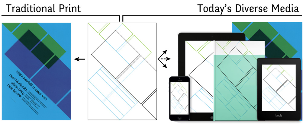
-Josef Müller-Brockmann’s grid for the Végh Quartet Poster in 1958 is based on a fixed print poster format. But is the grid enough to support today’s diverse media and formats?
We are interested in investigating how designers are responding to this paradigm shift. How do they create layout structures and processes that solve the problems of the contemporary graphic design landscape? Do they go beyond the grid? How are current digital tools supporting their practices?
Context
Few studies focus specifically on how graphic designers work with their tools. Murray (Murray, 1993) sheds light on social aspects of design practice, such as the importance of shared feedback among team members. Newman and Landay (Newman, 2000) focus on practical aspects of the web design process and analyze the role of several intermediate artifacts used by web designers, such as sitemaps and mock-ups. Herring et al. (Herring, 2009) demonstrate the importance of using examples both as inspiration and as starting blocks in creative design. These studies highlight the social and material aspects of graphic design, whereas we are more interested in practices developing in the earliest phase of laying out content.
Danis et al. (2000) show that designers begin by broadly exploring multiple alternatives. Cross (Cross, 2002) points out the importance of correctly framing the problem in the early design phase in order to define a set of “first principles”. For multimedia designers in particular, Bailey et al. (Bailey, 2001) state that, “the early design process begins with the exploration of content structure”. These studies demonstrate the critical role that structuring plays in the early phases of design, but offer few grounded examples of how designers actually accomplish this.
Study
Following the same methodology used to investigate designers’ interaction with color (Chapter 4), we are interested in the strategies, tools, and techniques used by professional graphic designers to create and structure layouts for both print and digital media.

-We interviewed 12 graphic designers in their studios (a). They demonstrated how they created layouts for both print (b) and digital media (c). They also showed us the physical (d) and digital (e) artifacts they used to create these layouts.
Participants: We interviewed 12 graphic designers (5 male, 7 female), age 24-50, with 4-25 years of experience (mean=10,5) who work in various environments (freelance, studio, agency) and create layout for digital media (2), print media (2) or both (8).
Procedure: We interviewed participants in their studio or office for about two hours (.a). We asked them to show us recent projects where they had to create a layout (Figure 42b-c) and the different artifacts used to develop it (Figure 42d-e). We asked them to tell us the story of how they made layout decisions for each project and how they obtained the final results. We probed for situations when they felt that creating the desired structure was straightforward, but also when it was challenging.
Data collection: At each interview, we recorded audio and video of the participants’ interactions with the documents they created, and we photographed each artifact and any related layout creation or manipulation tools.
Analysis: We analyzed the stories and depicted them as StoryPortraits: each includes a photograph of the artifact, as well as quotes and drawings that describe key steps in the process of designing a particular layout. We later showed the StoryPortraits to the participants to verify the details. Next, we performed a grounded theory (Glaser, 1999) analysis: we looked for emerging themes in the stories. We then went back to the stories to map them to each theme and organized the resulting categories into a descriptive framework.
Results and Discussion

-Participants establish graphical substrates based on properties extracted from concepts, content and context; mapping them to spatial and temporal properties.
We collected 52 specific layout creation stories from twelve participants (3-5 stories per participant). We found that seven participants use grids to structure their layouts. For example P1d defined her website structure using guides to create a grid. 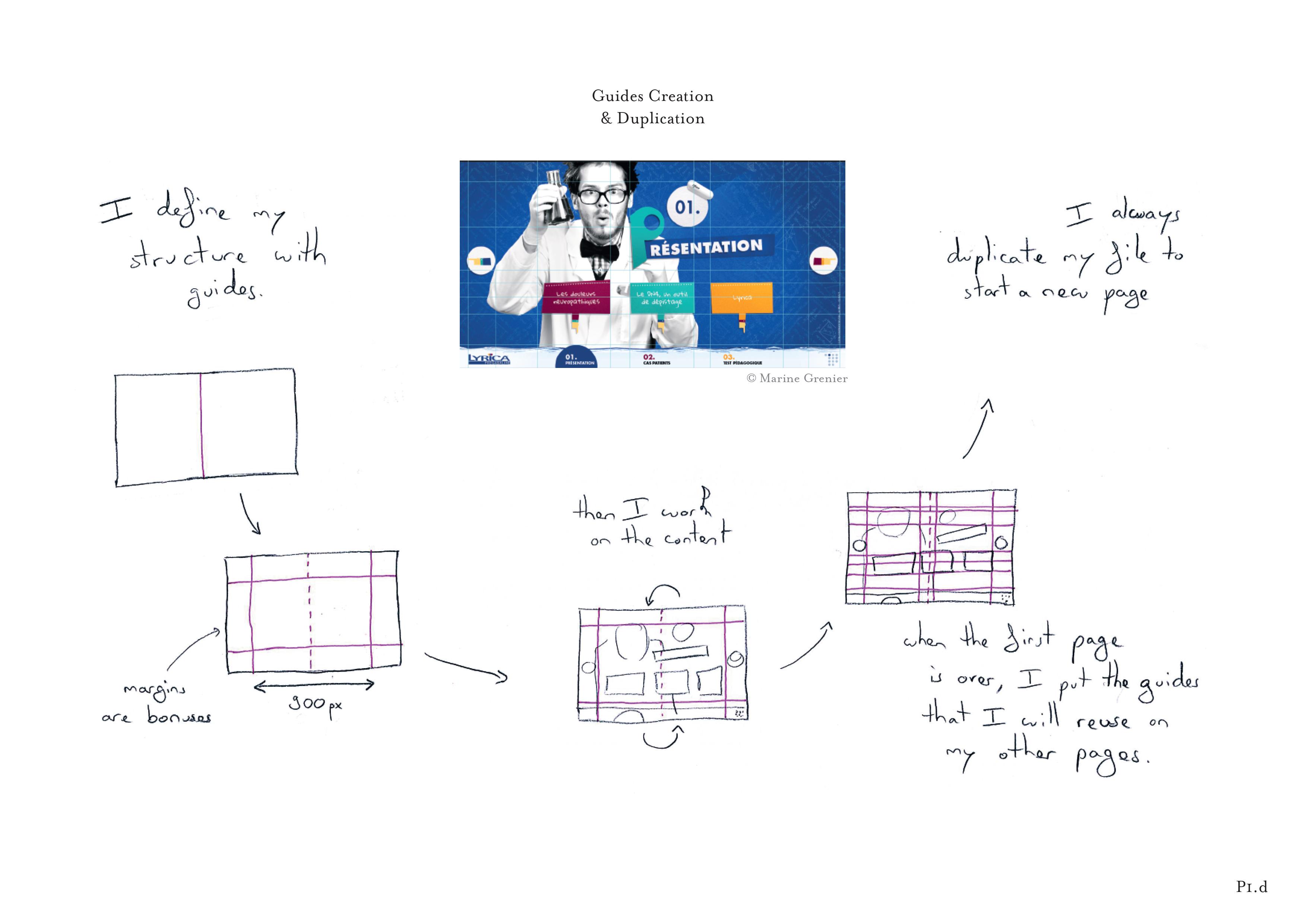 Some guides establish the margins that she takes into account, while others act as markers to guide content composition and alignment. When the first page is complete, she duplicates the file to reuse the guides with other pages. We also found that many designers go beyond grids to structure their layouts, establishing rules that describe how print or digital content should be laid out. P5b described a typical example:
 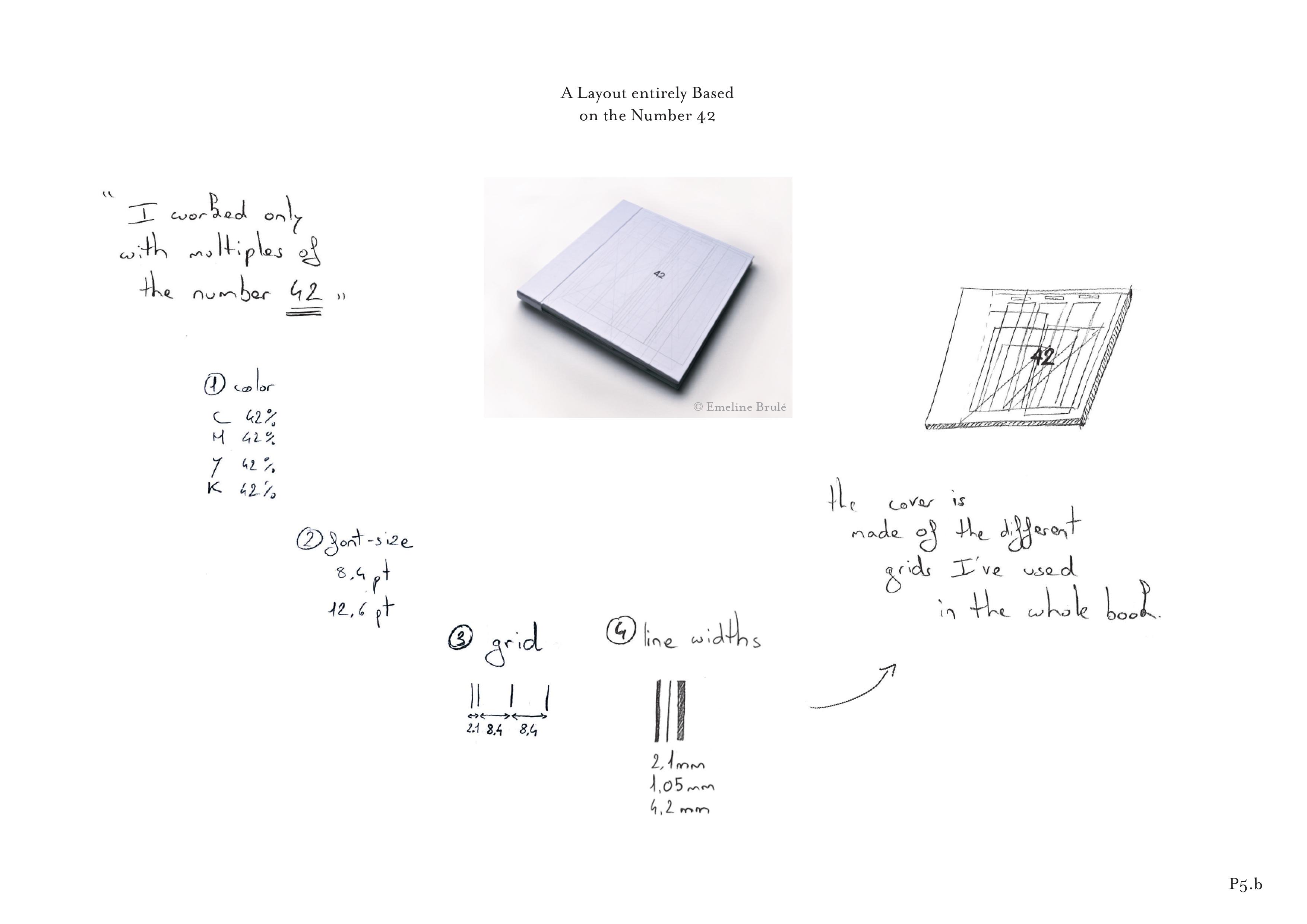 She decided to use only multiples of 42 to create the layout of the novel the Hitchhiker’s Guide to the Galaxy. Her layout clearly extended beyond a basic grid structure, since it required her to incorporate higher-level rules to manipulate these numbers and map them to the parameters that control the book’s layout, including the CMYK color values, font sizes, line widths and grid dimensions.
Graphical substrates
We found that all participants begin by establishing what they call “systems”, “principles”, “architectures”, “structures”, “rules” or “constraints”, or what we call graphical substrates. They share a common characteristic: they guide the layout, but rarely appear in the final result. By analogy with the substrates on which some living organisms grow, graphical substrates are the underlying structures onto which the designer “grows” a layout. As with living organisms, changing the substrate usually affects the layout as well. The term substrate has also been used in another creative context to describe how music composers represent their musical ideas (Garcia, 2012). Although a five-line musical score provides a standard structure comparable to a grid, many composers invent their own, innovative musical representations: “Although musical notation was important for all four composers, each composer designed his own personal musical substrate” (Garcia, 2012). We developed a simple descriptive framework that identifies the types of inputs and outputs used by participants to create and interact with graphical substrates (). Participants based their graphical substrates – or substrates for short – on three main types of inputs: concepts, content properties and context constraints, such as page dimensions. They then map these inputs to spatial and temporal output properties.
Inputs based on concepts
Almost all participants (11/12) created substrates that used concepts as input, like P5b’s use of the number 42. Some inputs are specific, such as numbers, others are more abstract, such as “ambiance”. For example, P4b created typographic landscapes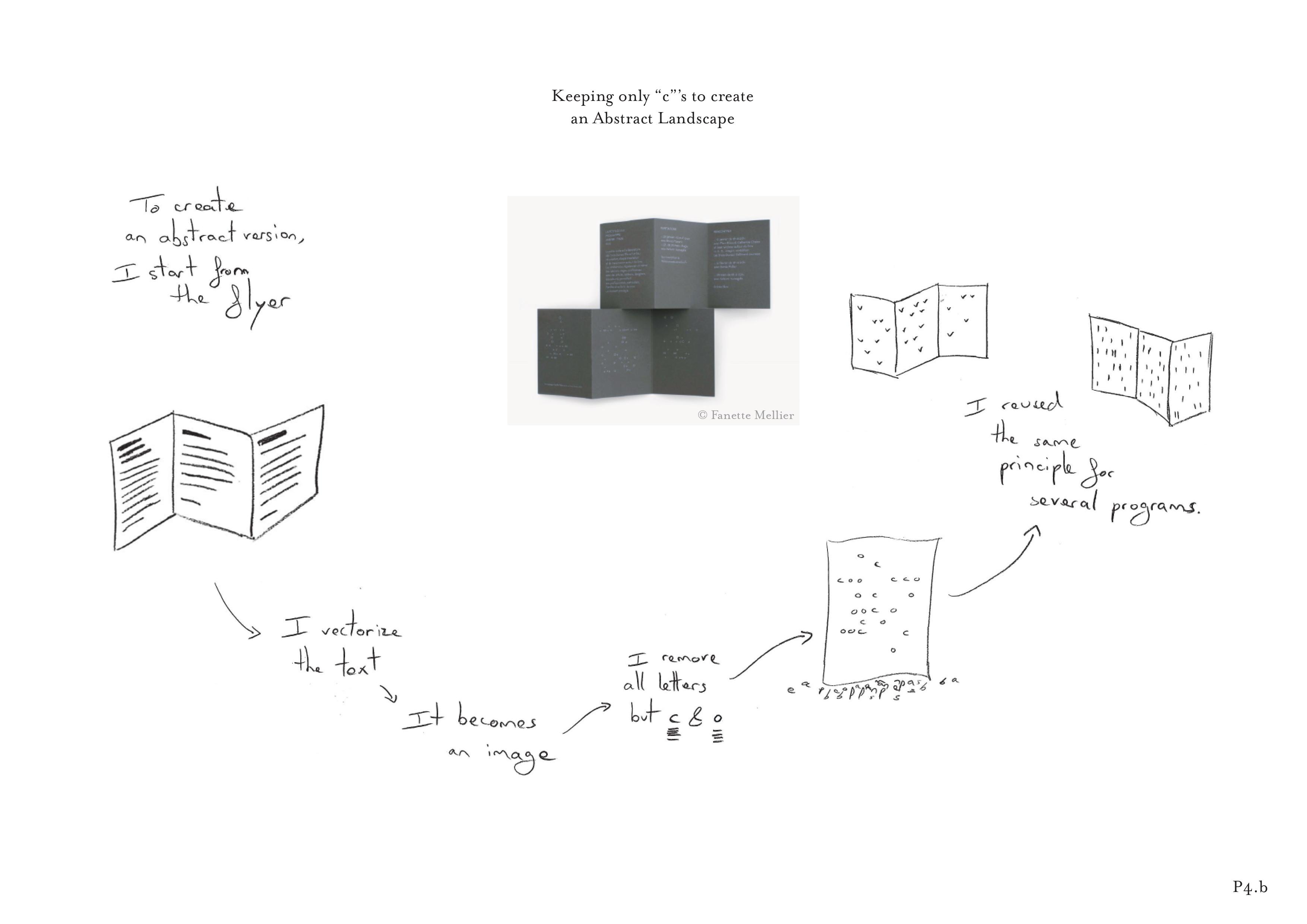 by preserving only one letter, “c”, from a text. She erased all the other letters with a drawing application and preserved the positioning of the “c”s, creating an abstract landscape of letters for each cover.
Inputs based on content
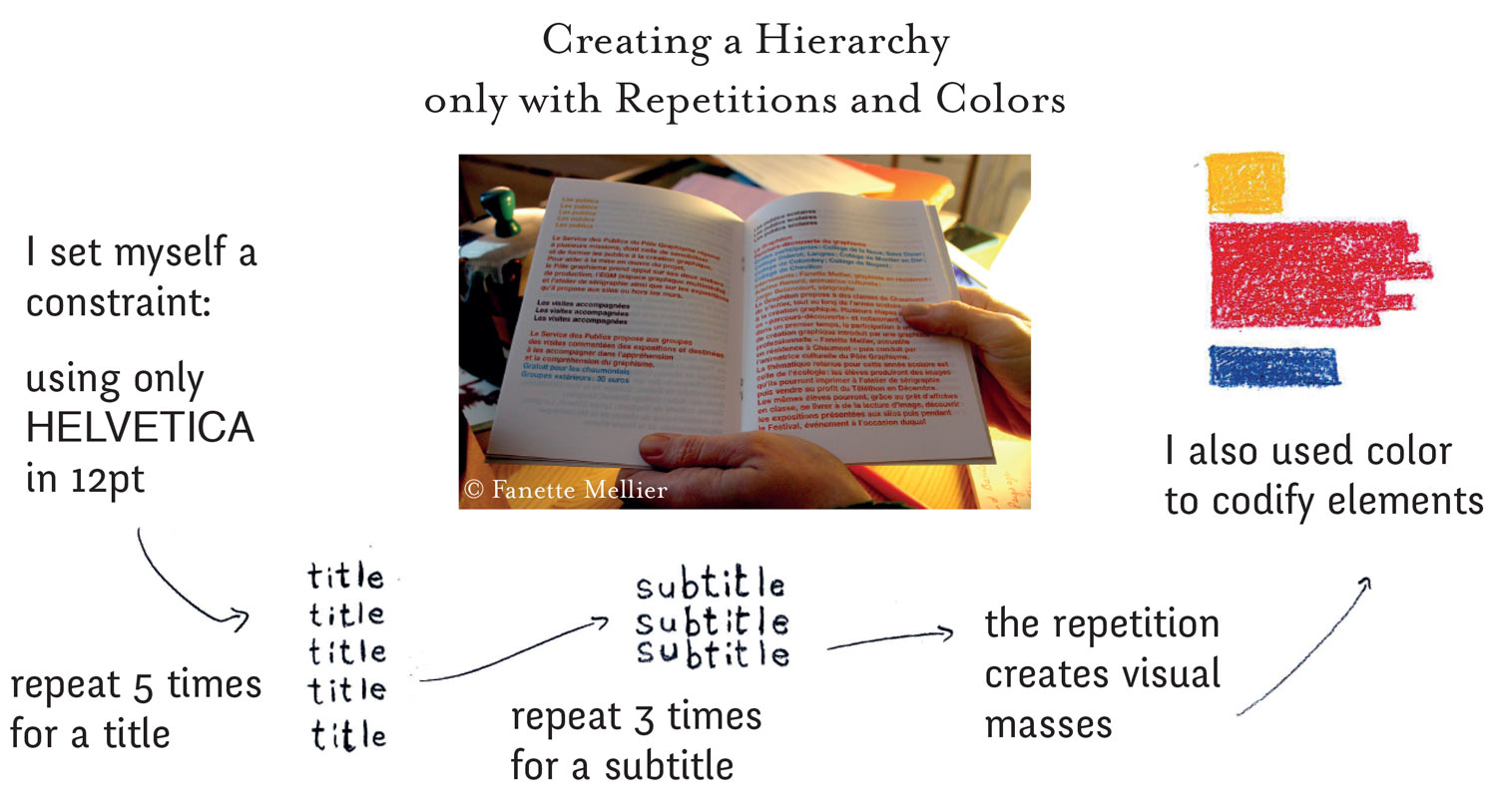
Three to Five StoryPortraits per participants depict stories of layout creation.
Ten participants created substrates based on content properties, e.g. title, subtitle, images, or on relationships among content elements. P7a explained that “information of the same nature must have the same style”.P4c wanted to see if it was possible “to lay out content without any typographic hierarchy.” for her book design (). She assigned different numbers of repetitions and colors to the different semantic types of content. For example, a title would be repeated five times, but a subtitle only three times (). Similarly, P7b created a substrate 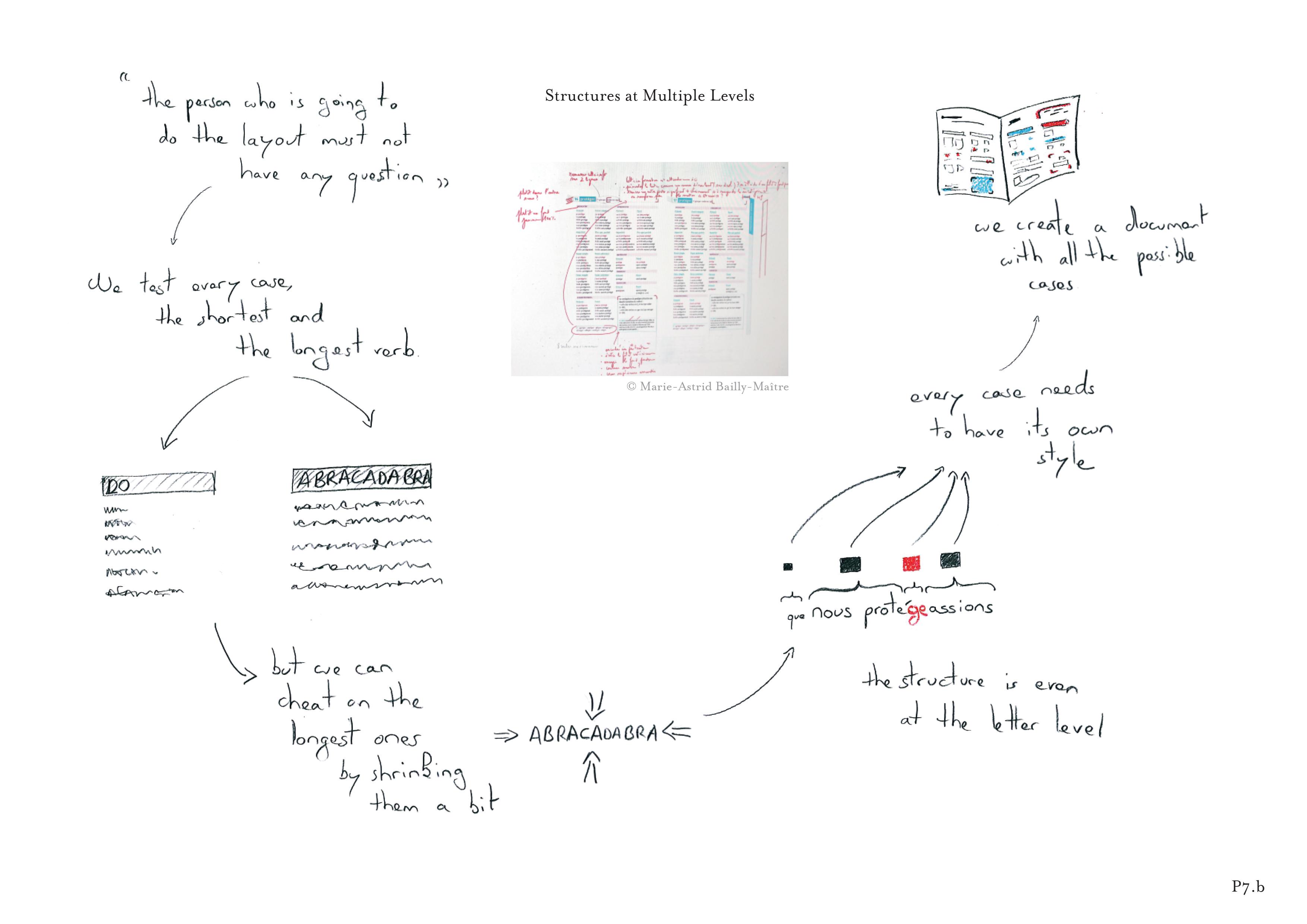 to visually distinguish the multiple semantic elements of a grammar book. In order to communicate its subtleties, she established a substrate at the letter level: “Every case needs to have its own style.”
Five participants mentioned projects that used semantic relationships among content elements to establish their substrates. P11a wanted to lay out a history
 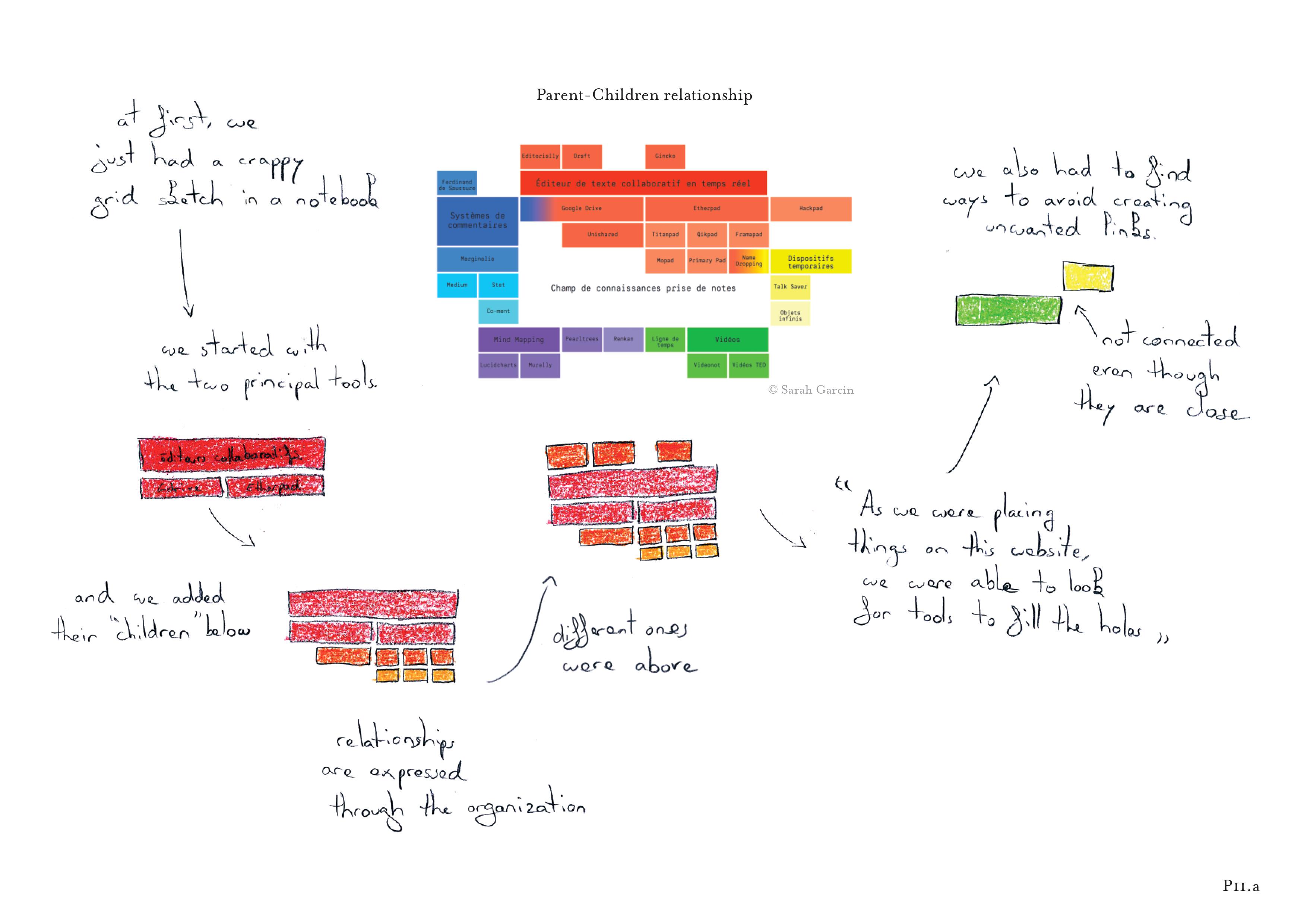 of text editing tools and based her substrate on parent-child relationships. She began with the two main tools and then defined a rule to dictate the layout: Place the “children” below and the “parents” above.
Inputs based on context
Ten participants used properties that they extracted from the context, including page and screen dimensions and properties generated by the printing process. They treated these contextual constraints as a source of creativity:
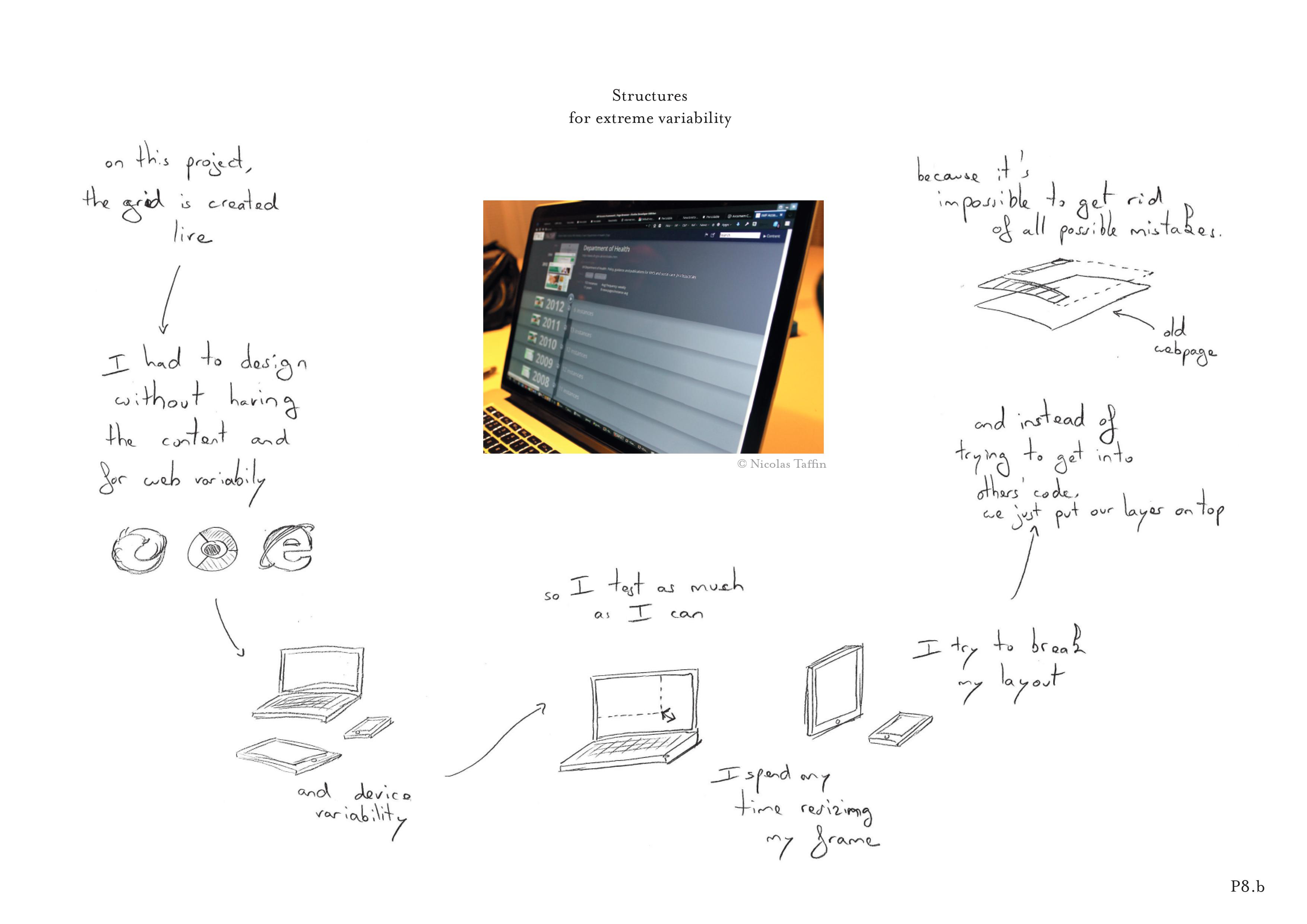 P8c programmed a grid system based on relative proportions that made it easy to adapt to very different screen sizes, allowing different reading contexts.
 P1d used a similar approach for a website: she created a grid based on the smallest physical screen dimension (900px) to accommodate all possible readers’ screen dimensions, and used it to influence all of her subsequent grid choices. Participants also used production constraints to create substrates. For example, P5d created a book
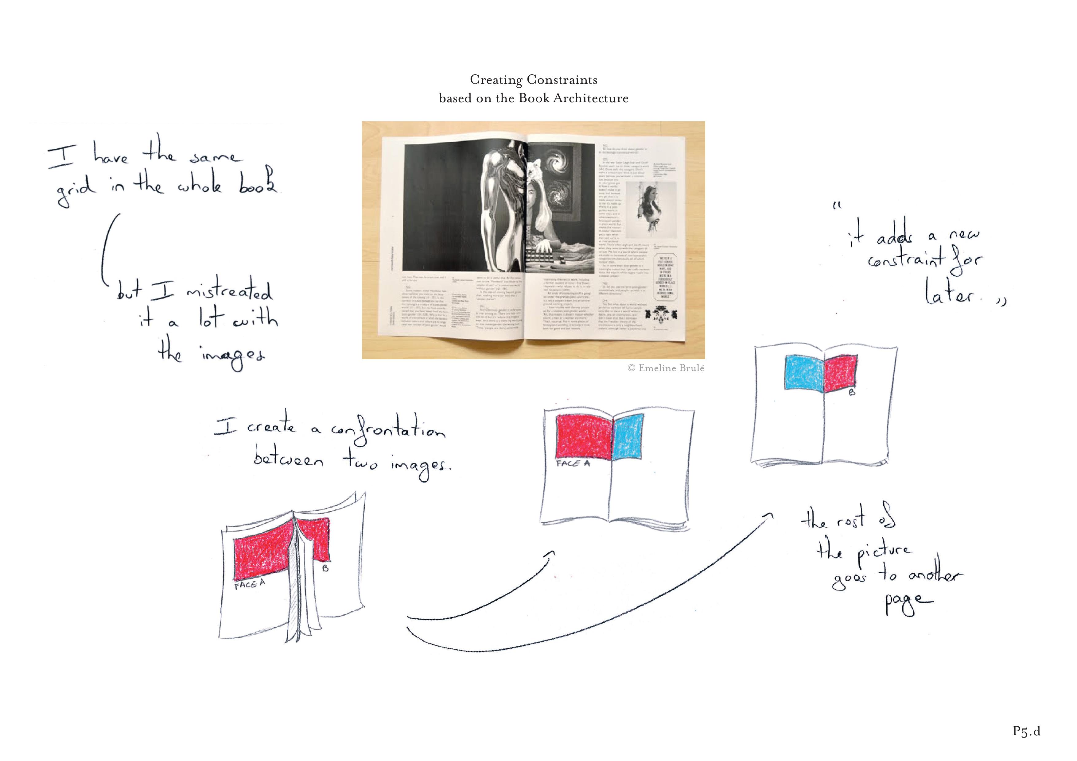 using sheets folded in two, which were nested and stapled. She used physical properties of the binding process to establish her substrate. She began by creating images that spanned full sheets of paper. Once folded, the left part of the image became separated from the right part, and was juxtaposed with the right part of another image, “creating an interesting confrontation”.
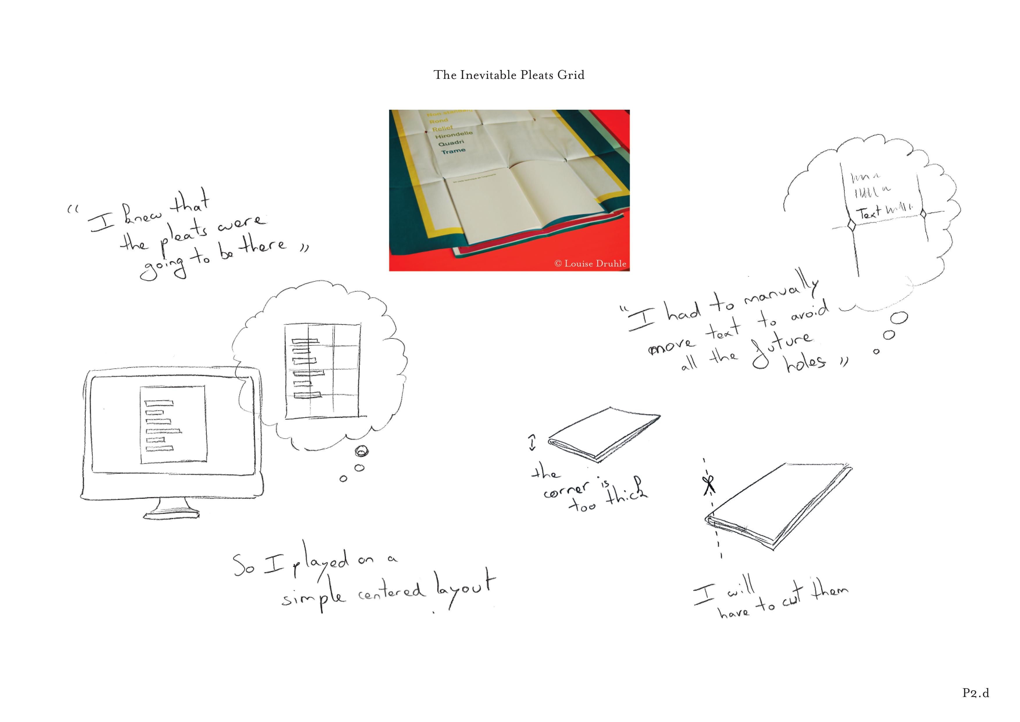 P2d had a project that required folding a poster. She used the fold marks as a layout constraint to ensure that text would not be printed on the folds. Once designers select the properties they want to use as inputs to their substrates, they map them to output properties. We identified two main types: spatial and temporal.
Mapping to spatial properties
Layout is most often viewed as the organization of the spatial properties of the content. Designers may focus on composition, e.g. by playing with the relative positions of elements on the page or on visual weight, e.g. by playing with relative proportions of content over white space (Figure 43).Eight participants used the positions of elements as output to their substrates. For example, P1b created an initial substrate
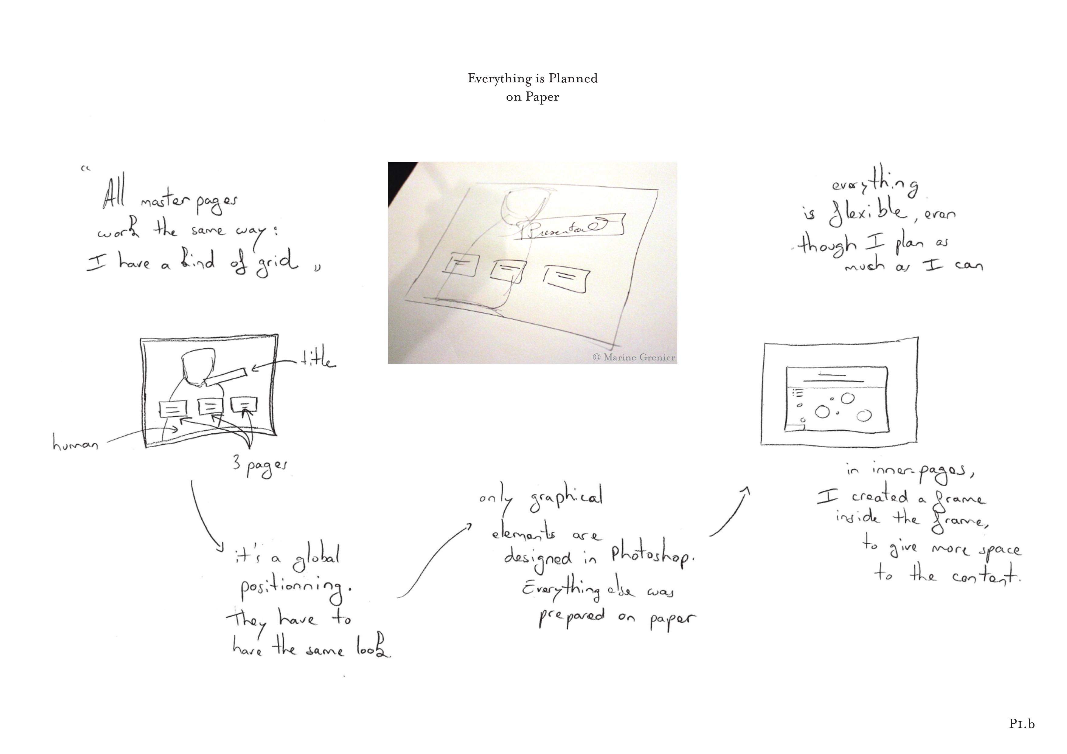 for the four master pages of a website where she defined the positions of the elements that would appear: “All master pages will work the same way. They should have the same look. It’s a global positioning”. In this case, she started by drawing and positioning elements on paper before moving to Adobe Photoshop. P9d defined the precise location of a recurring caption
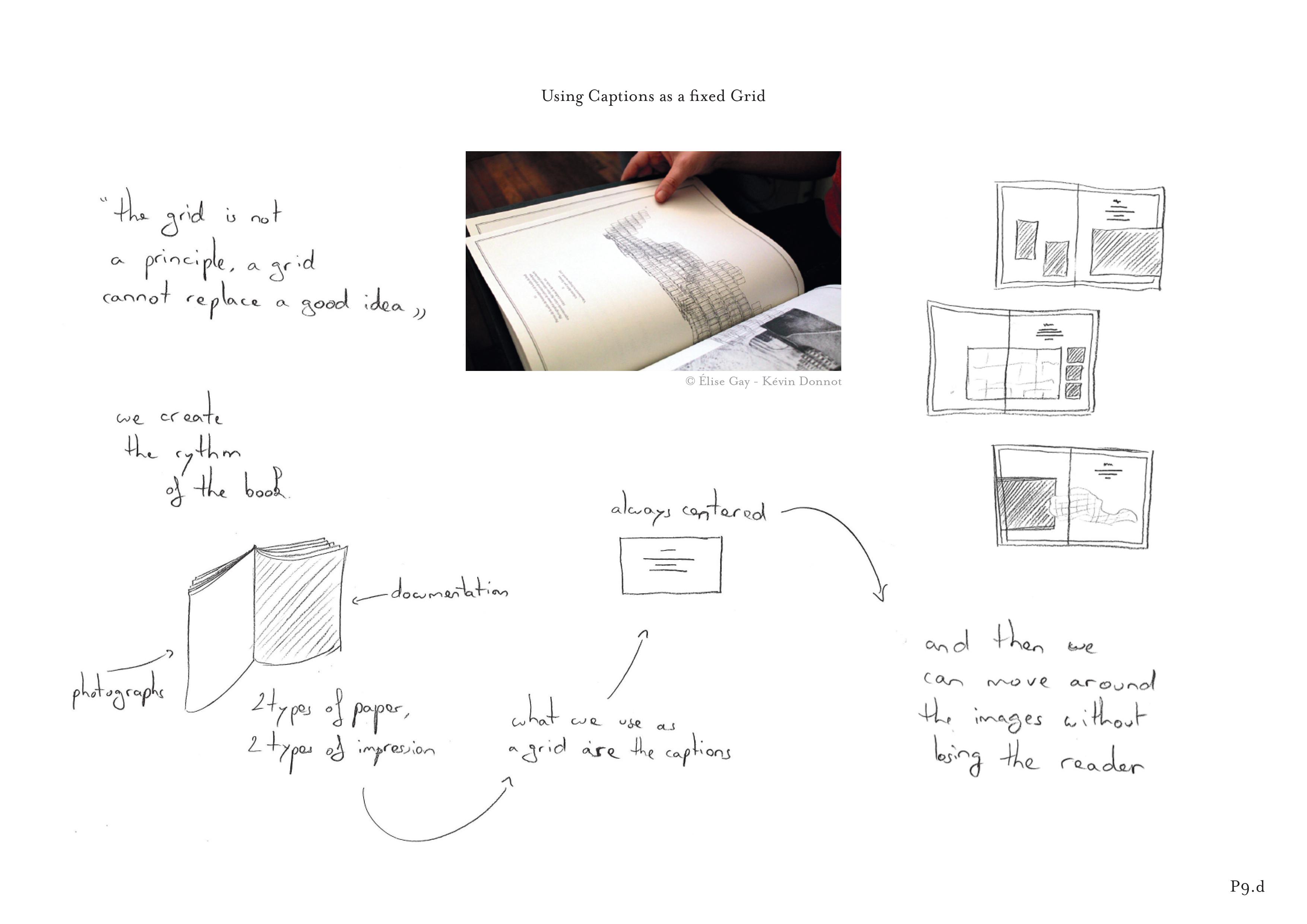 that appears on all pages of his book: “Then we can move the images around without losing the reader”. Nine participants used the visual weight and sizes of graphical elements from the content as output to their substrates. For example, P7a first played with the relative weights
 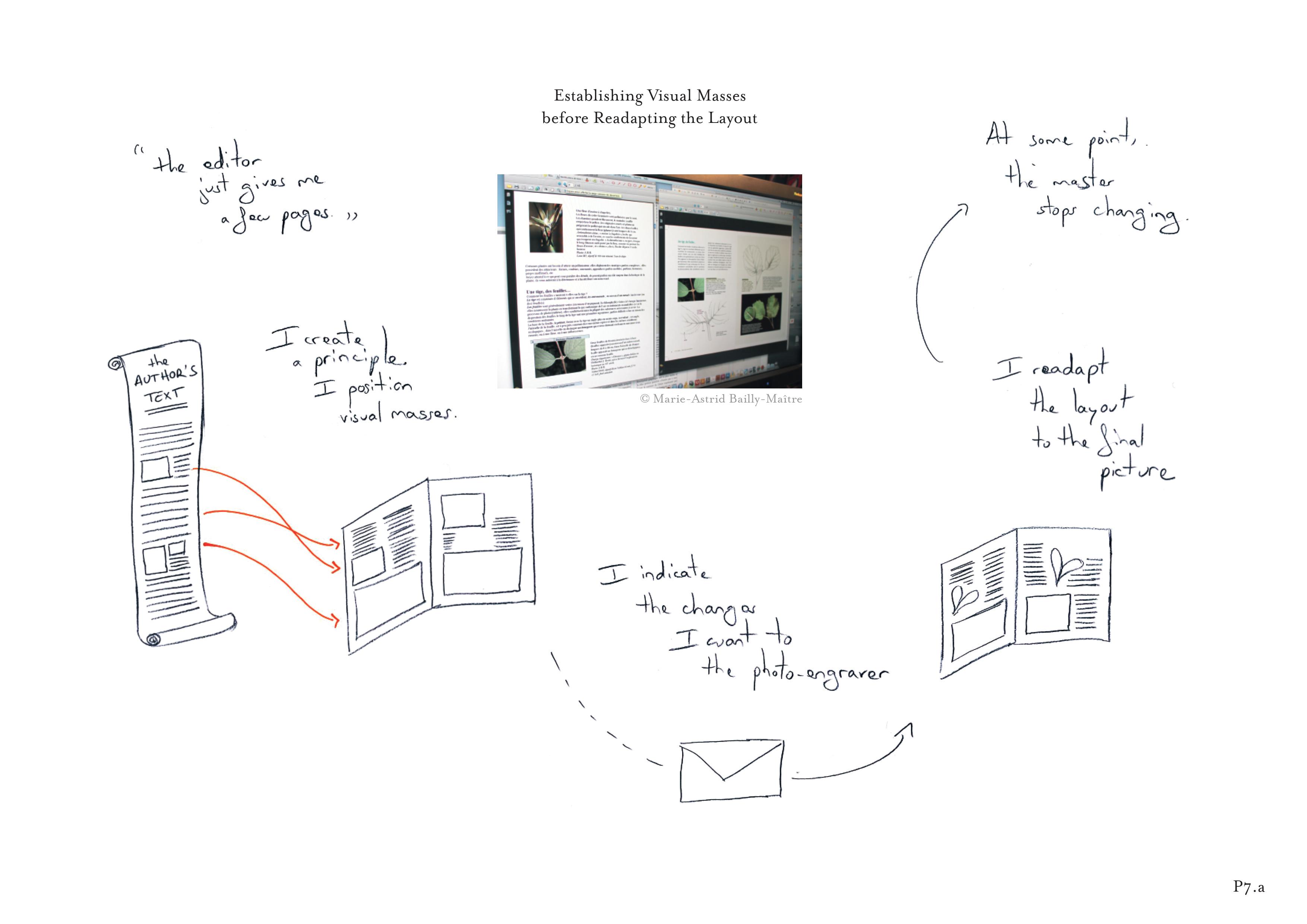 of different semantic elements: “The content creates visual masses, I use them when defining the principle of my book design”. P8c created a relative column system, then adapted it for all his website layouts.
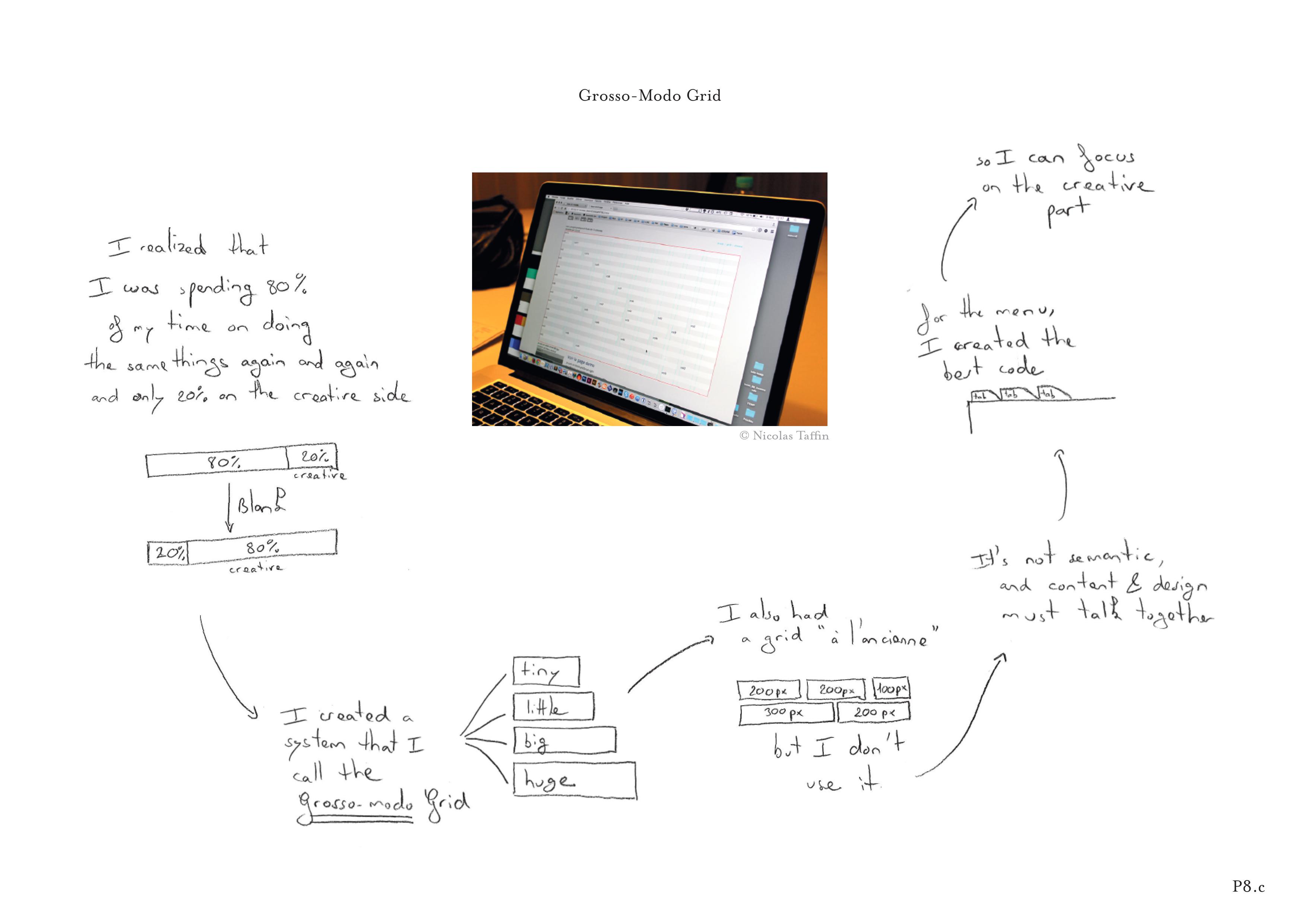 He calls it the “grosso-modo grid” because it uses approximate proportions (“tiny, little, big and huge”) that are extracted dynamically from the reader’s screen size.
Mapping to temporal properties
Layout is affected by temporal as well as spatial properties. Designers must often create a coherent series of layouts, such as the pages of a book or a series of posters. Ten participants created substrates that explicitly address either temporal evolution or rhythm across a series or collection.
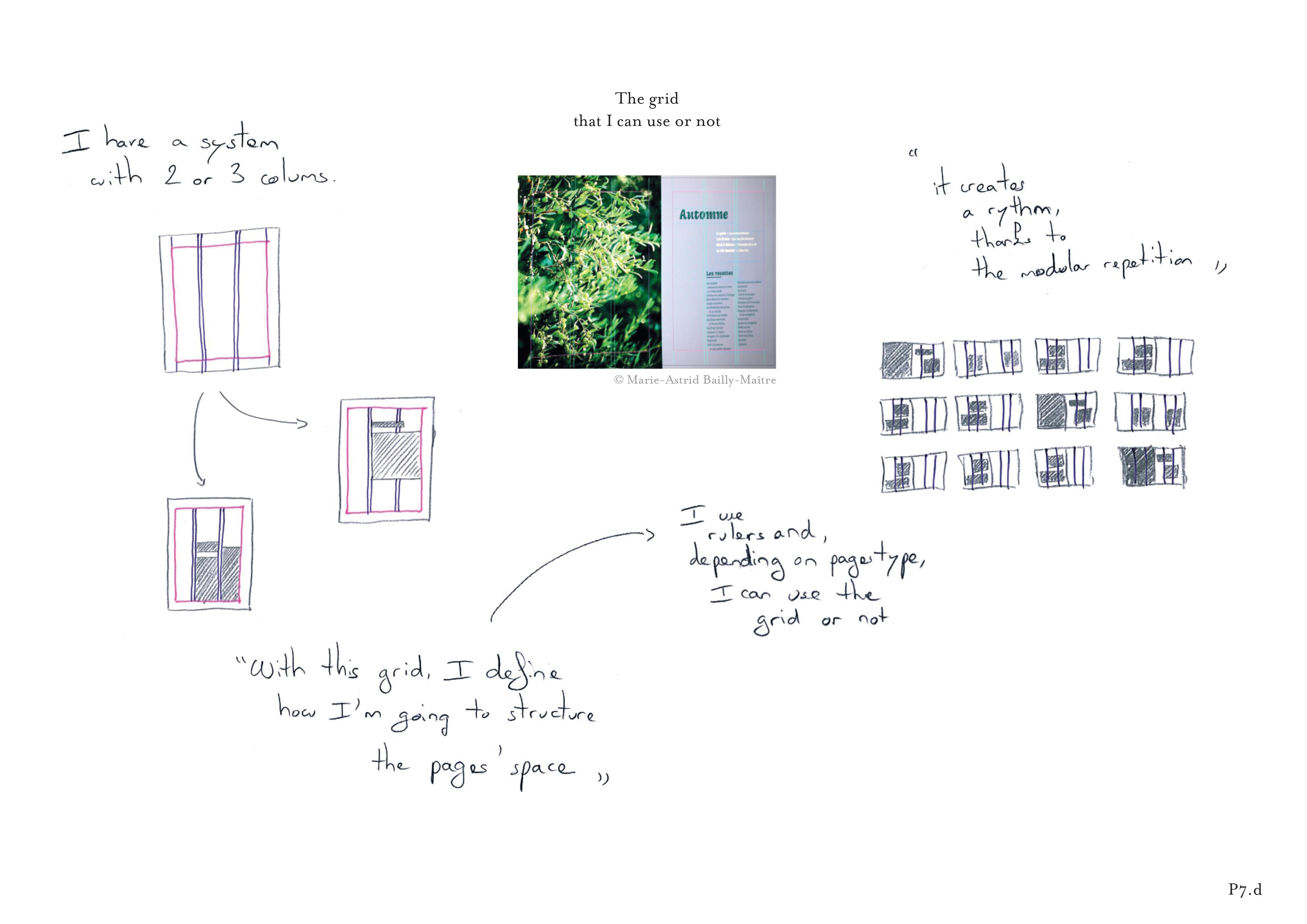 For example, P7d created a grid-system based on two or three columns for a cookbook. Depending on page type, she applied one of two grids: “It creates a rhythm thanks to the modular repetition of this system”. She used this temporal rhythm to guide the reader through the different content types.
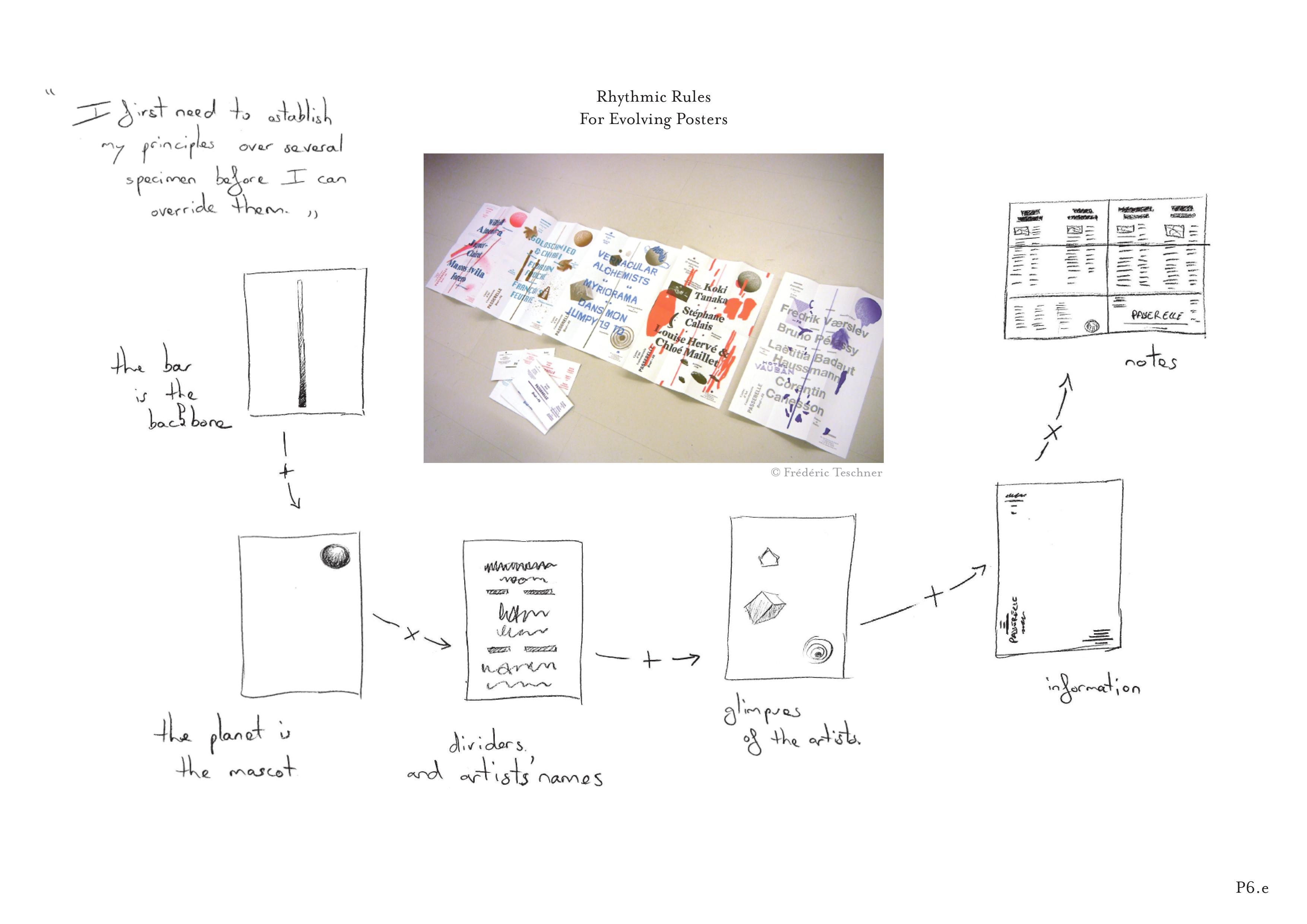 Similarly, P6e described a temporal pattern he created for a series of posters published every six months. Graphical components vary differently from one poster to the next. For example, the factual information and textured line at the center of the poster never change: “It is a backbone”. By contrast, the client’s logo partially evolves with each new poster, and the dividers between the content elements are always different.
Participants mainly used substrates to shape spatial and temporal properties of their layout. We also identified other common types of outputs, including color (Fig. 43) and font. This suggests that substrates can potentially shape a wide variety of layout properties.
Manipulating graphical substrates
Designers not only use graphical substrates as tools to shape particular layouts, but also to manipulate them as dynamic objects in their own right. We identified two main manipulation patterns: reusing and adapting.
Reusing
Most participants (11/12) reused existing substrates across projects, most often by modifying them (16 stories) or combining them with existing substrates (8 stories). For example, 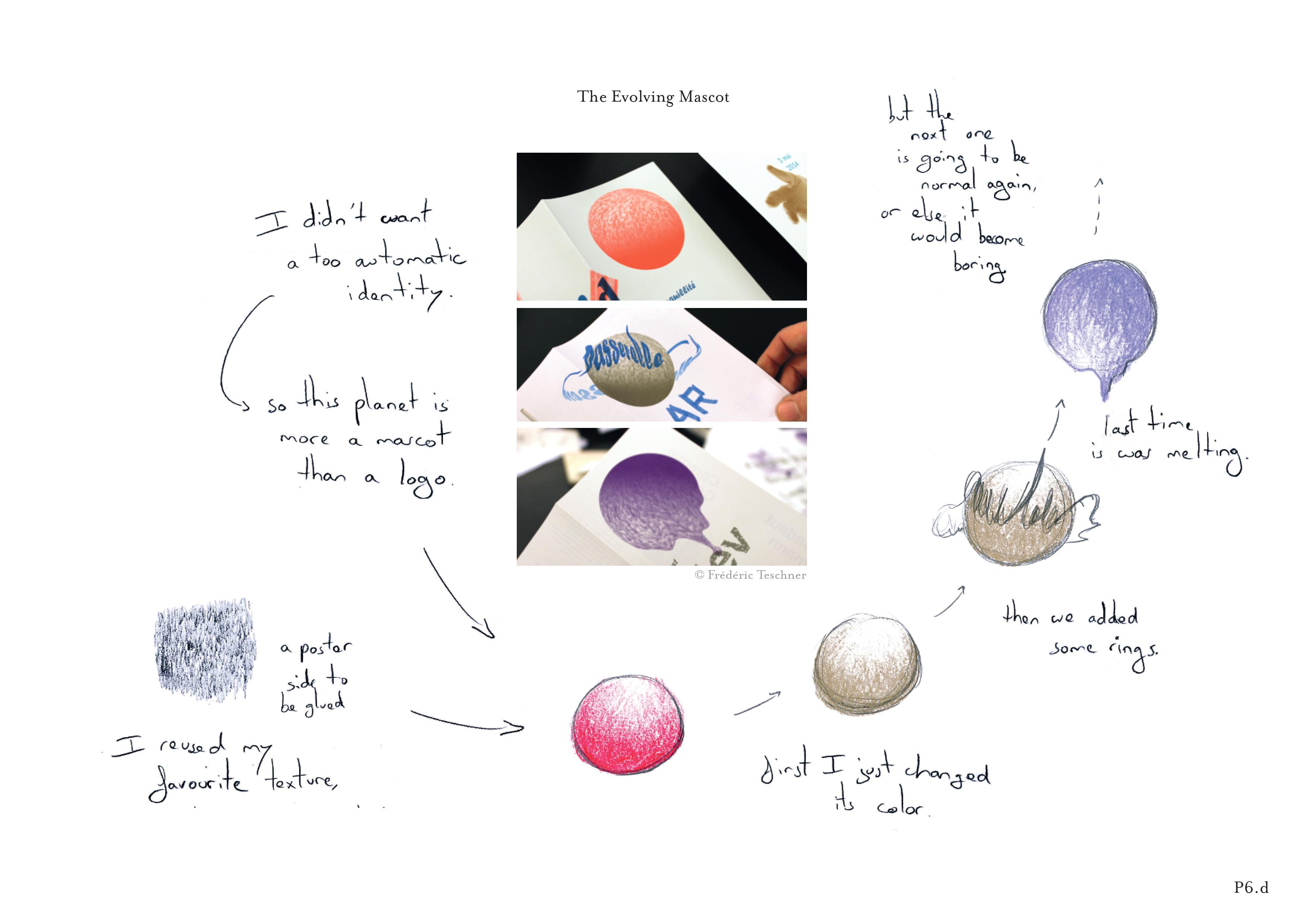 P6d created an evolving planet logo for a posters series. Each time, he manually reused the previous version and slightly modified one of its characteristics, such as changing the color or adding a ring. “I first need to establish my principles over several specimens before I can override them”. Similarly, P9c reused a substrate he created for the print identity of a company
 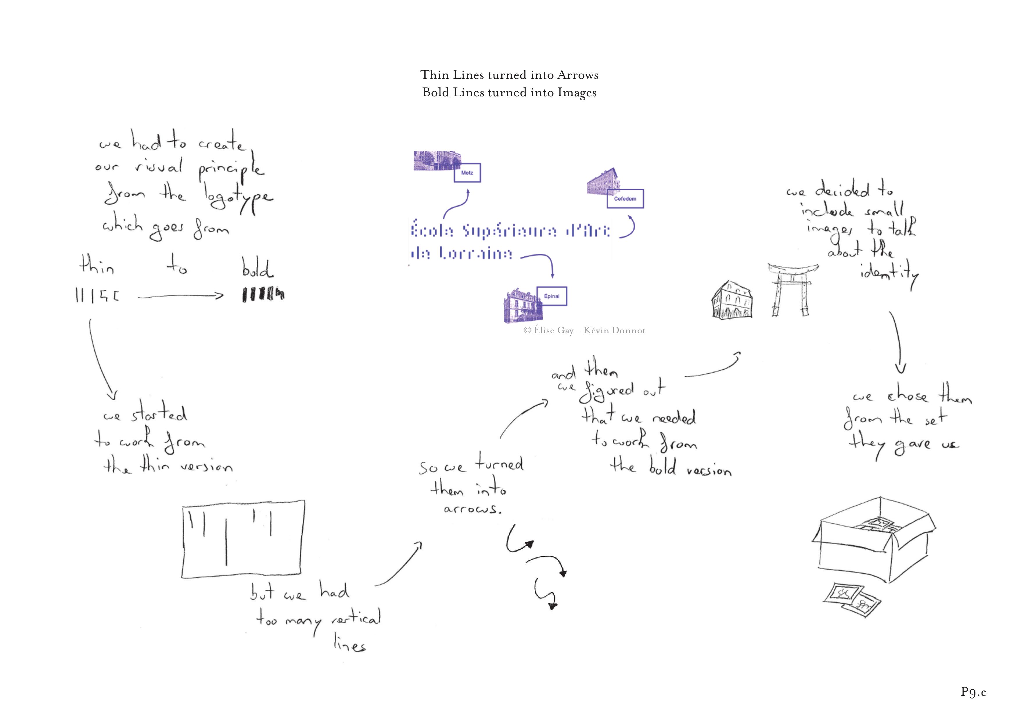 to apply it to the corresponding website. He kept some parameters, such as typography, but modified other rules to add interactivity to the website. Participants also combined multiple substrates or parts of existing substrates together. For example, P12c created a substrate for developing a coherent yet diverse set of characters for a short clip.
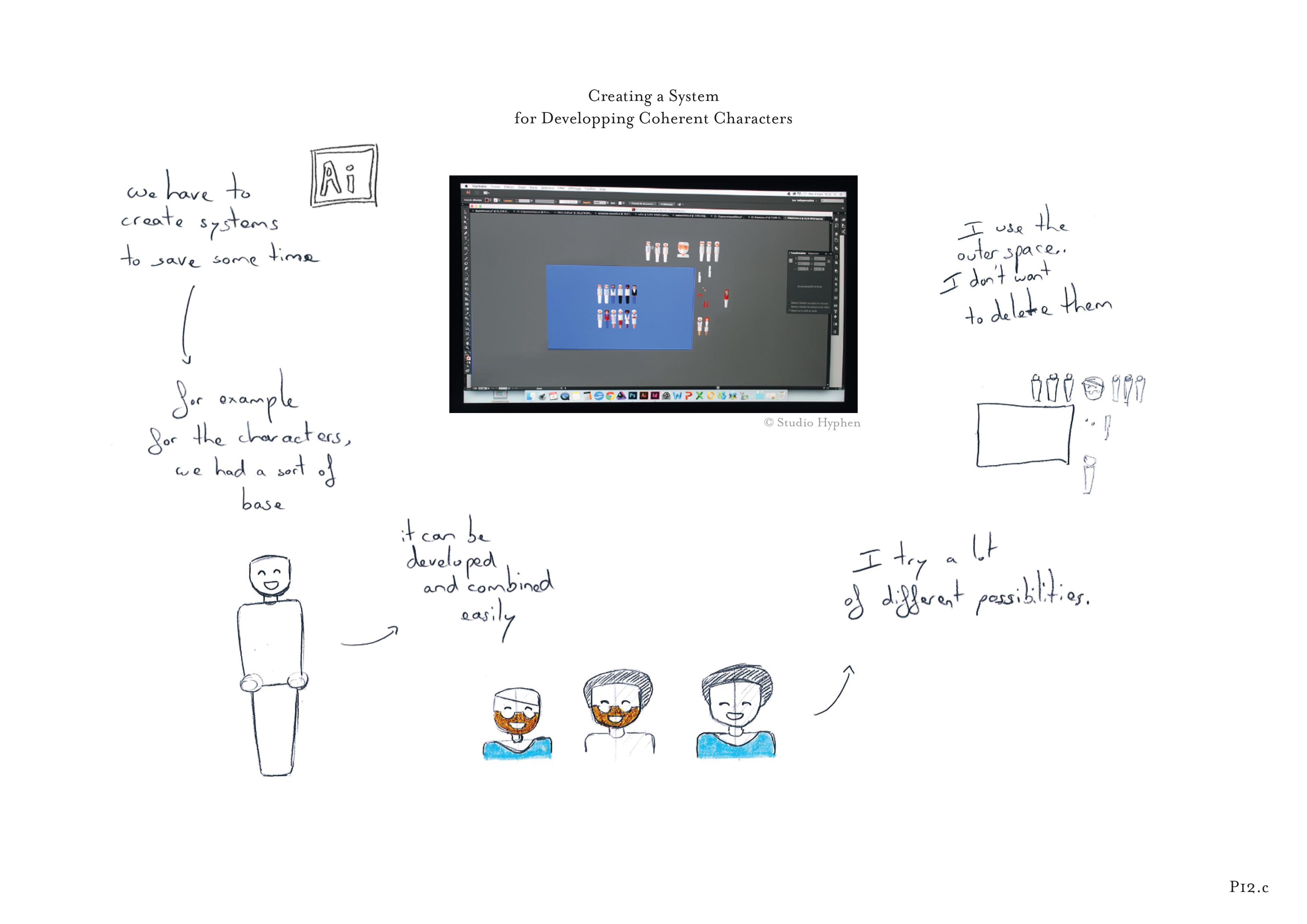 Each feature, such as hairstyle or clothes, is based on a substrate meant to be mixed easily with the others. Creating a new character involved a simple recombination of elements from each feature’s substrate.
Adapting
Participants created substrates that accommodate different levels of flexibility to cope with different levels of constraints within projects. While some rules and constraints may never be broken, such as the page dimensions of a book, a great part of the graphic designer’s work is “to find a solution for each case” (P7b). Eight participants, in 12 projects, created very flexible substrates to adapt to diverse and new constraints. For example, P1b created a “master page” on paper to structure the positioning of the elements of several web pages.  She explained that “Everything is flexible, even though I plan as much as I can”. Similarly, P10b created an initial structure for a book layout where all the images had the same vertical size.
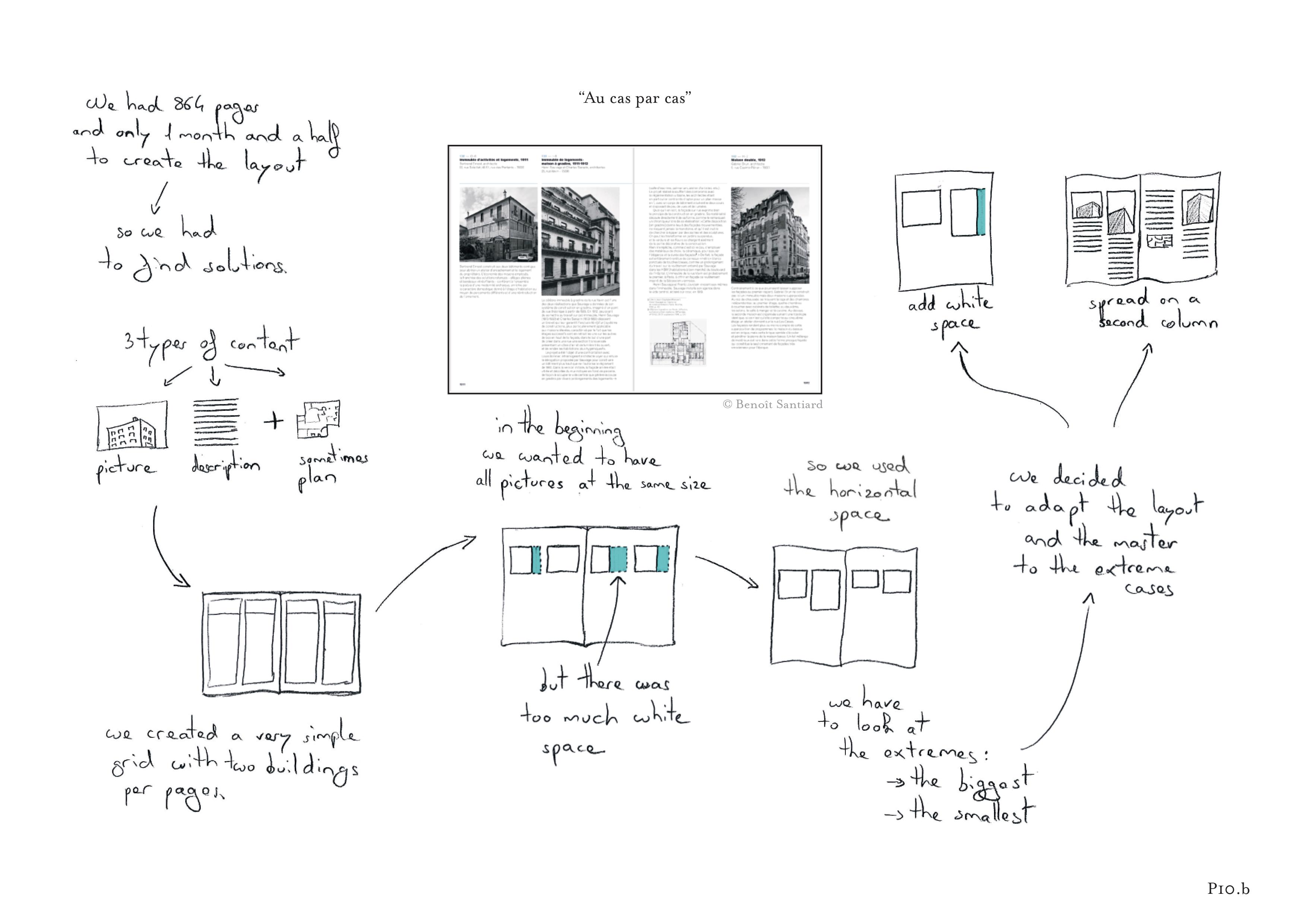 When he tried it with images of extreme sizes, it created too much white space on the page. So he broke his substrate for these extreme cases and adapted it with new rules to accommodate the smallest and largest images, such as spreading the content onto a second column.
Eight participants also created 15 “hackable” substrates. In each case, the substrate guides the layout but can also be tweaked or overridden if necessary. For example, P5c created a substrate that represents the visual blocks of a book.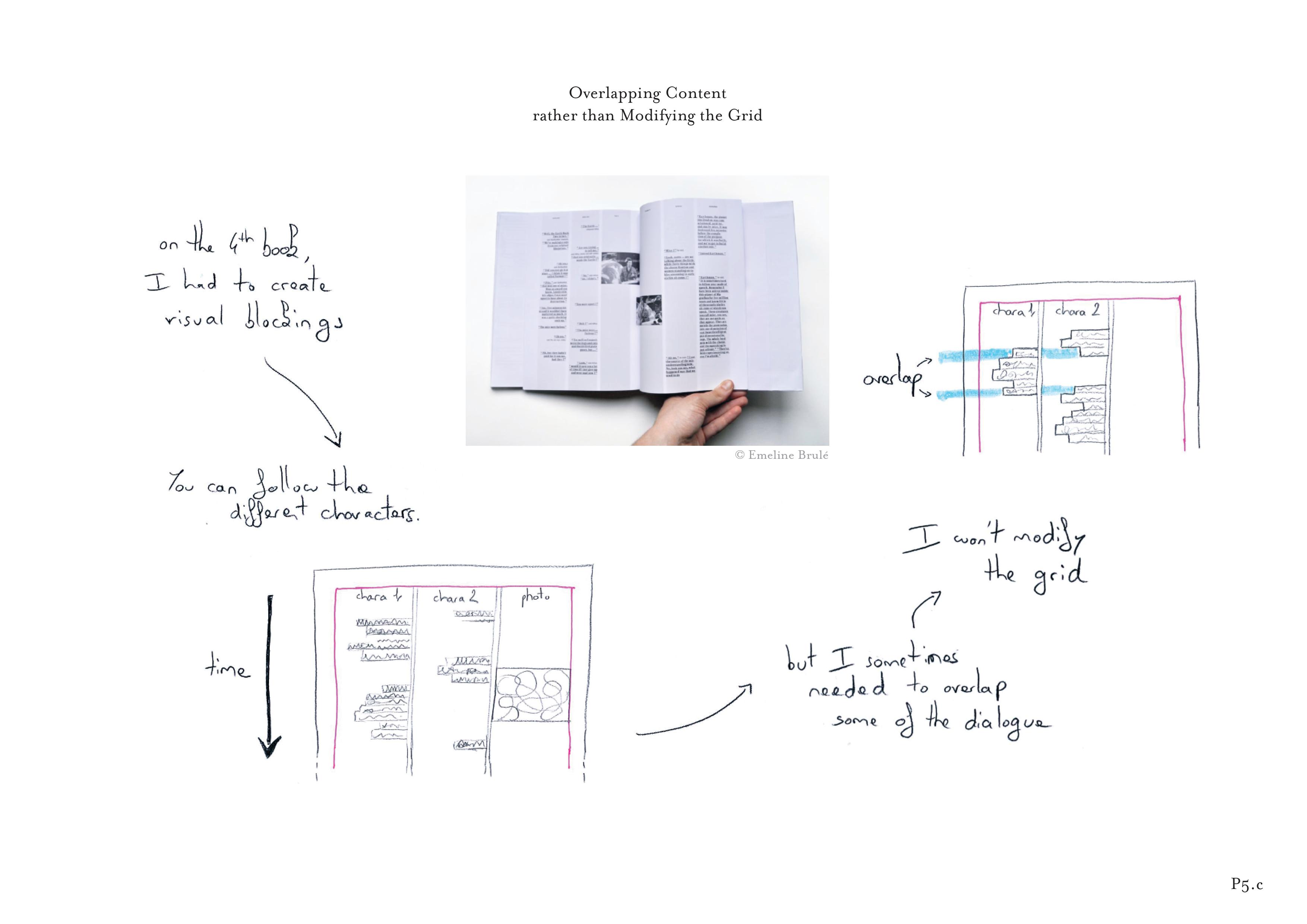 In a few cases, some of the dialog had to overlap vertically. This led her to manually override her general rule, in order to maintain the overall grid. P10d established a precisely defined substrate for a magazine cover with variants and invariants.
 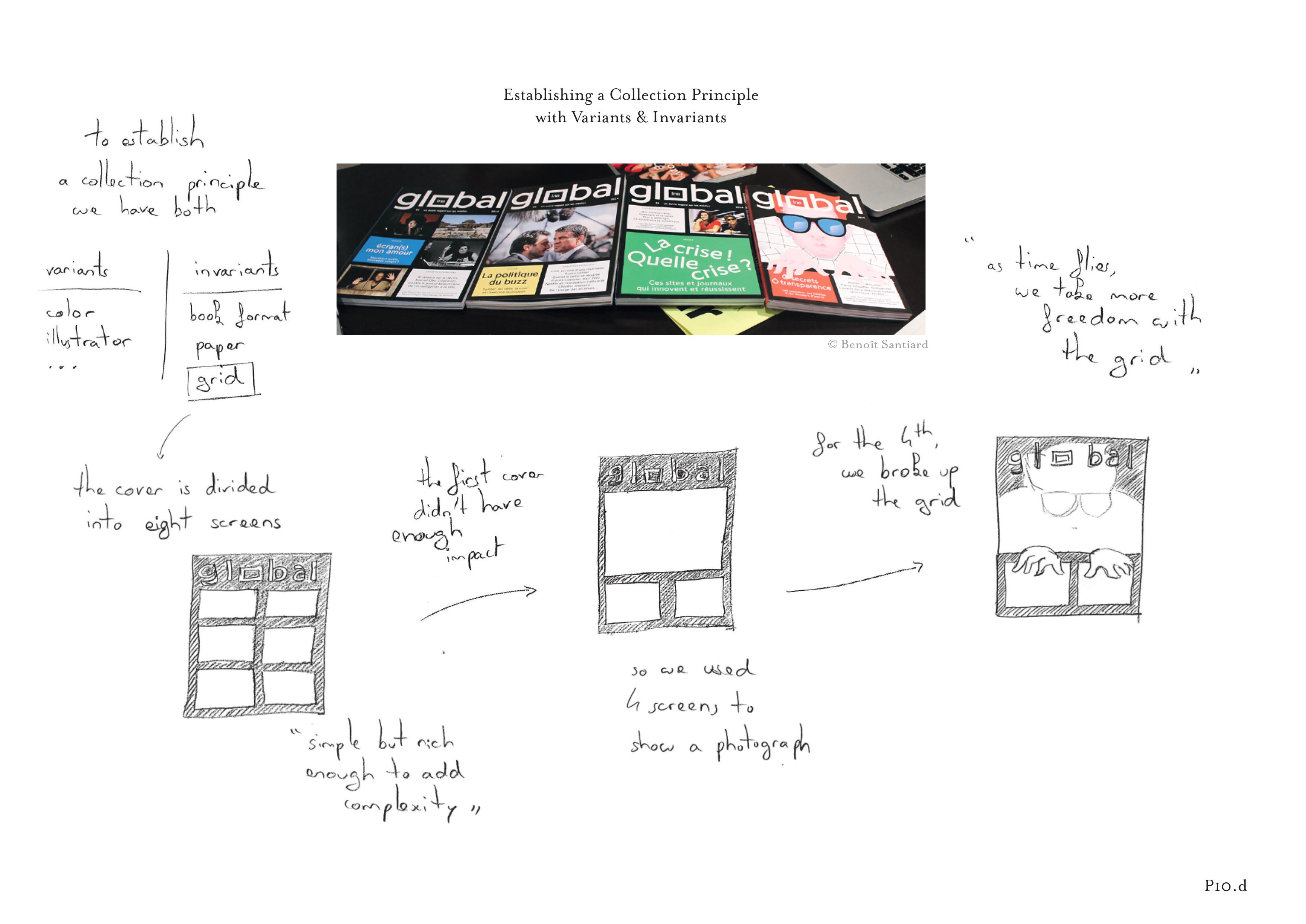 With each new issue, he changed the color and illustration, but retained the same grid. However, for the final issue, he decided to break the grid with an overlapping illustration.
Reifying graphical substrates
All 12 participants developed and could easily describe details of the graphical substrates they created for each project. However, most of these substrates were strictly mental constructs, ideas in the designer’s heads. Only participants who program could fully manipulate their substrates in existing tools. All 12 participants created substrates, with clearly identified, well-defined “rules” or “constraints” to manage layout. If they were reified, turned into interactive objects (Beaudouin-Lafon & Mackay, 2000), these rules could be executed by the system or by another graphic designer. For example, P5b’s book design based on multiples of 42 required her to manually set all the parameters of the book, including CMYK color values, font sizes, line widths and grid dimensions.  If she had a tool that let her treat these parameters as variables, instead of being hard-coded, she could easily change the number to 54 and change the whole layout accordingly.
Even so, not all substrates are reifiable, at least not easily. Half the participants reported stories (8) where they created part or an entire ad-hoc substrate using principles such as “ambiance” and “style”. These substrates could not be executed by a system or by another graphic designer unless they were defined more formally. For example, P7c inserted a set of pages into her cookbook as interludes between the recipe pages.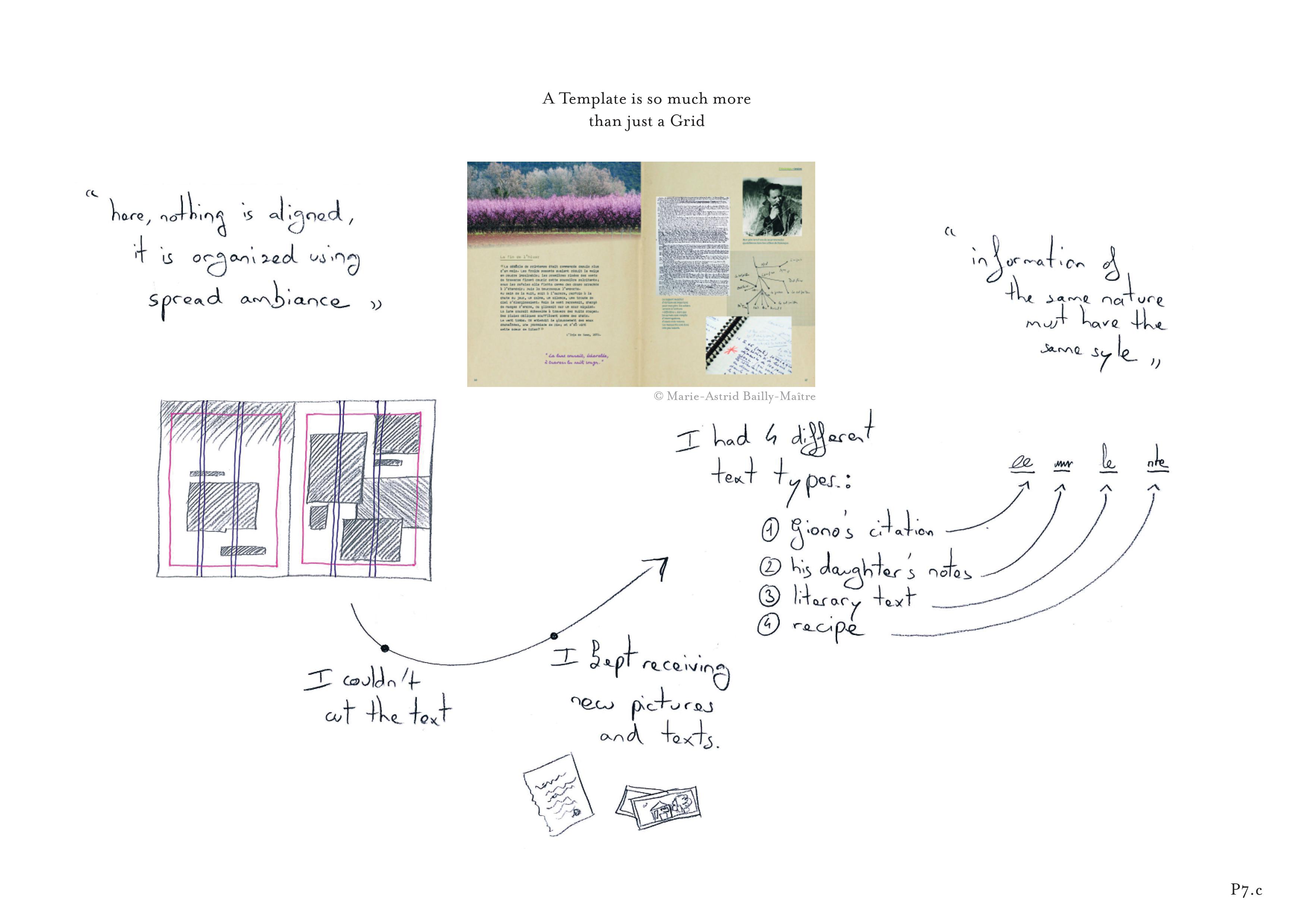 She said, “For these pages, nothing is aligned, it is organized using spread ambiance”, making it difficult to systematize.
Current tools offer limited support
Participants relied heavily on a limited set of traditional tools to express their substrates: guides, master pages, paragraph and character styles. However, these tools only support a fraction of the substrates that they actually used for layout. A first consequence of this lack of support is that designers must manage their substrates manually. For example, P12d created an animation principle for a crane appearing in a short video and decided to reuse it for all of her objects.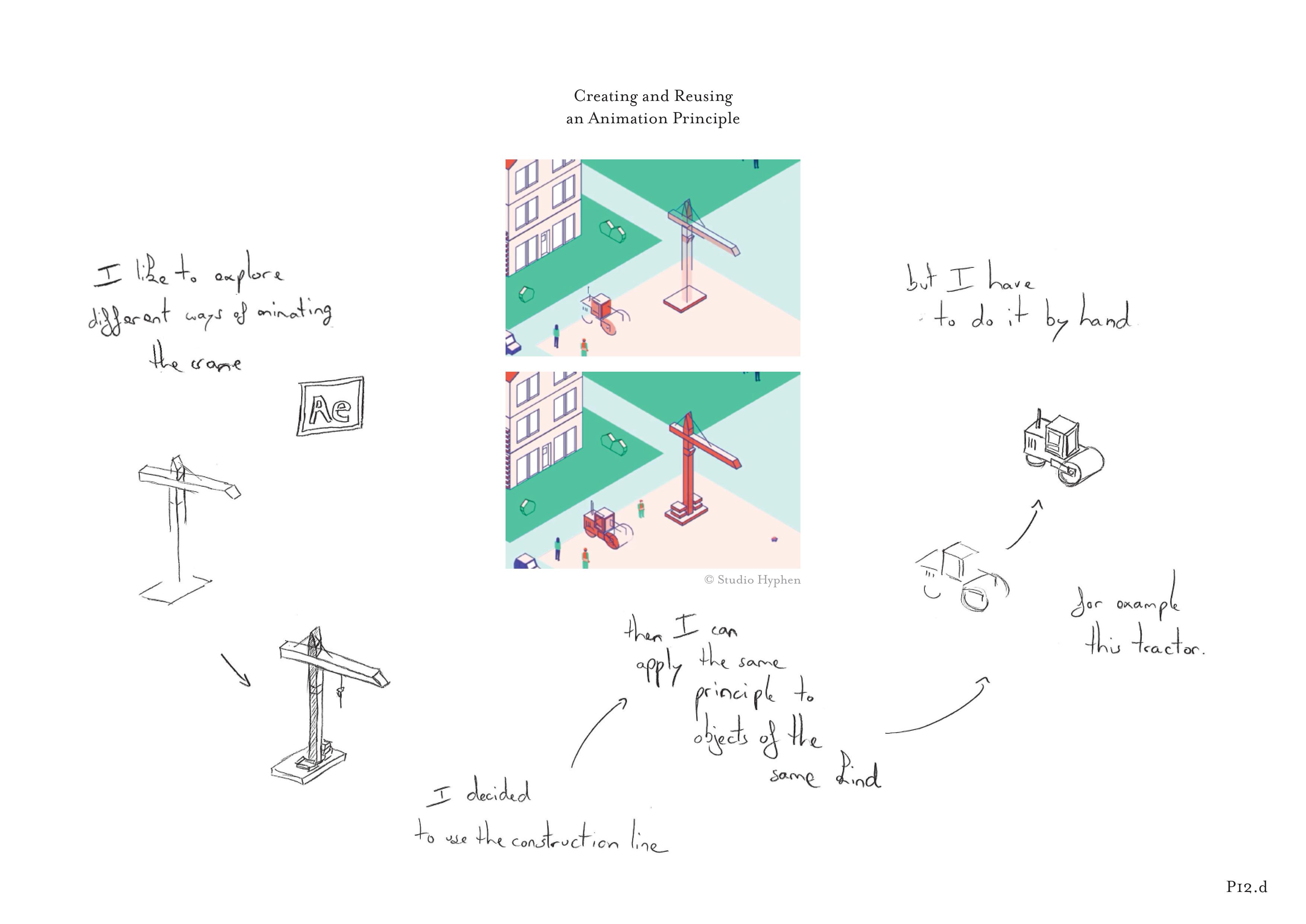 However, she had to adapt it and apply it to each object manually, because she could not express the animation in the tool directly. Another important consequence is that designers cannot easily share substrates with each other. We found only two cases where designers reified their substrates using traditional tools and shared the result with a colleague. P5a created a report layout in Microsoft Excel, because she knew that a non-graphic designer would be limited to Excel when creating the layout for the next issue.
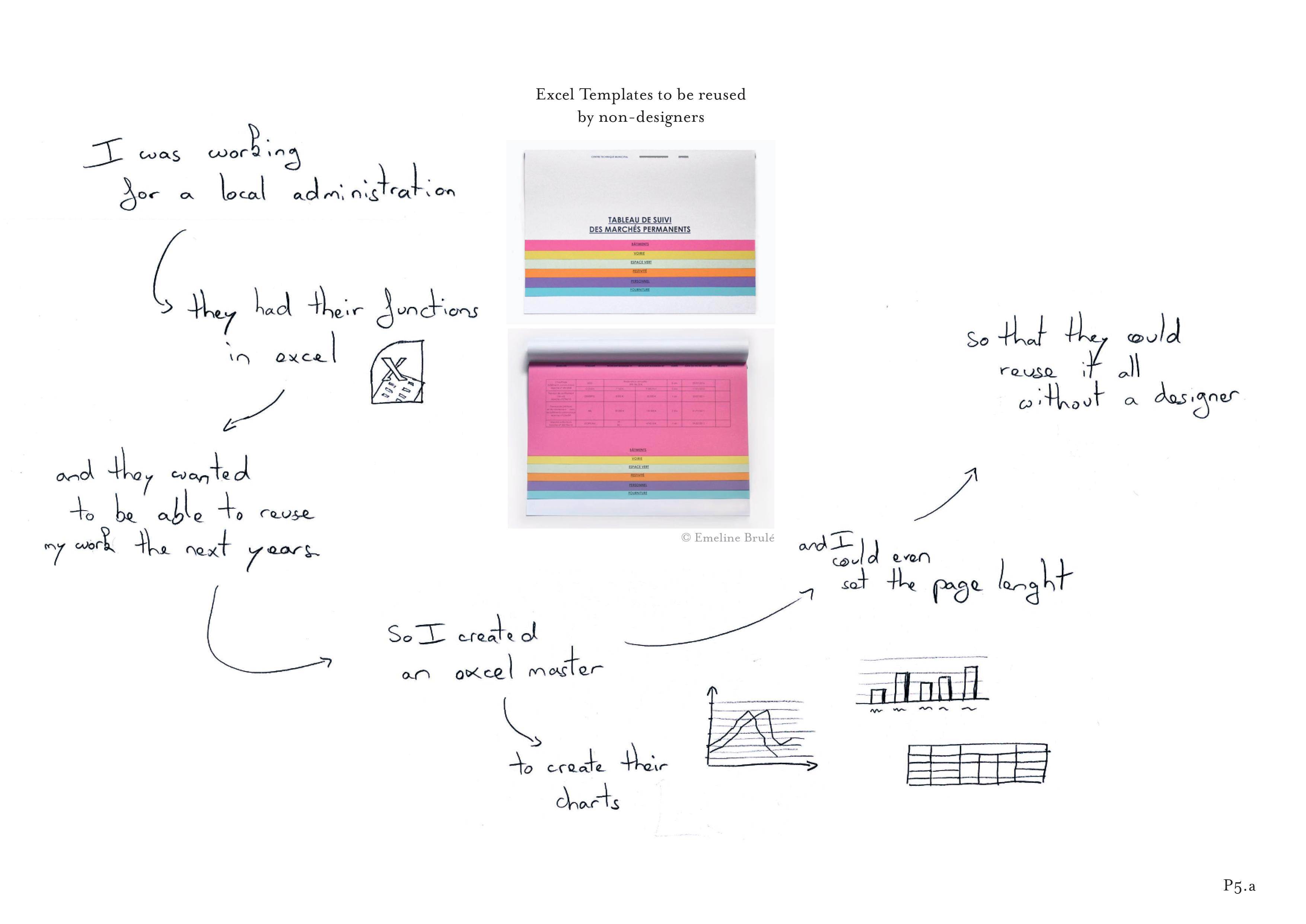 She based her substrate on the possibilities offered by an Excel master sheet and set as many parameters as she could to help her colleagues reuse the same layout. P7b created the substrates for a grammar book so that another designer could apply its content when creating the final layout.
 P7b first explored different layout principles with a one page example and later abstracted her substrate by creating a document with all the possible cases. She explained that “The person doing the layout must be confident about which rules to apply to each content type”.
Using code to reify graphical substrates
Half the participants created projects fully or partially implemented in code (17 projects), six of which resulted in printed artifacts. On further investigation, we noticed that designers explicitly reified their substrates in code. We identified three recurring approaches that are not supported by traditional design tools: supporting more diverse inputs, automatic application of substrates, and collaboration with the reader.
Generating more diverse inputs
Reifying substrates in code lets designers manipulate additional input properties as well as create new substrates that rely on complex relationships. For example, P8b created a website layout for visualizing other websites.  “I had to design without having the content, and for all the web variability”. He created a responsive grid based on different screen sizes, to make his layout support this diversity. Whereas traditional graphic design software would fix the format choice, P8b could use this input to better tailor the layout to each reader.
Participants who wrote code created substrates that changed according to content properties. For example, P11d produced hundreds of different posters during a one-night event. With her team, she created an installation with scanners that livestreamed images into a pre-established dynamic grid. The grid reacted to the image width so that wide images spread over two squares. The team also used a mixing console that allowed a designer to choose images in the stream to produce unique posters. Finally, participants created relationships among the layout’s content elements and applied different substrates to the same content at different times. For example, P3b established a rule that dynamically creates header images for a blog layout based on text length and creation dates as inputs.
 He also added rules to display fewer and fewer elements of the blog post according to their publication date, which enabled him to display all posts on a single page. He coded these rules which were then applied automatically by the system.
Automatically applying graphical substrates
Reifying their substrates in code lets designers choose how the system applies them to content. This partnership helps designers focus on the early exploration and creation of substrates rather than the time-consuming task of manually applying them to each content element. For example, P10a used a system of styles and grids to automatically lay out book content from a database. He greatly appreciated this workflow: “I could focus on the most interesting part: choosing pictures, making sure that every detail was correct and creating a cover page”. Similarly, P2a used Markdown to semantically tag the content of her book and then played with CSS properties to quickly explore alternative layouts.
 “I didn’t have to manually select all the images to see the change”. Automatically applying substrates to content also meant that designers could generate an infinite number of unique layouts. In another project, P2b created two layouts for the online version of her book. On the right side layout is dynamically generated as content flows downwards over time. Similarly, P9a created a generative website layout based on shifting and rotating arrows between content elements.
 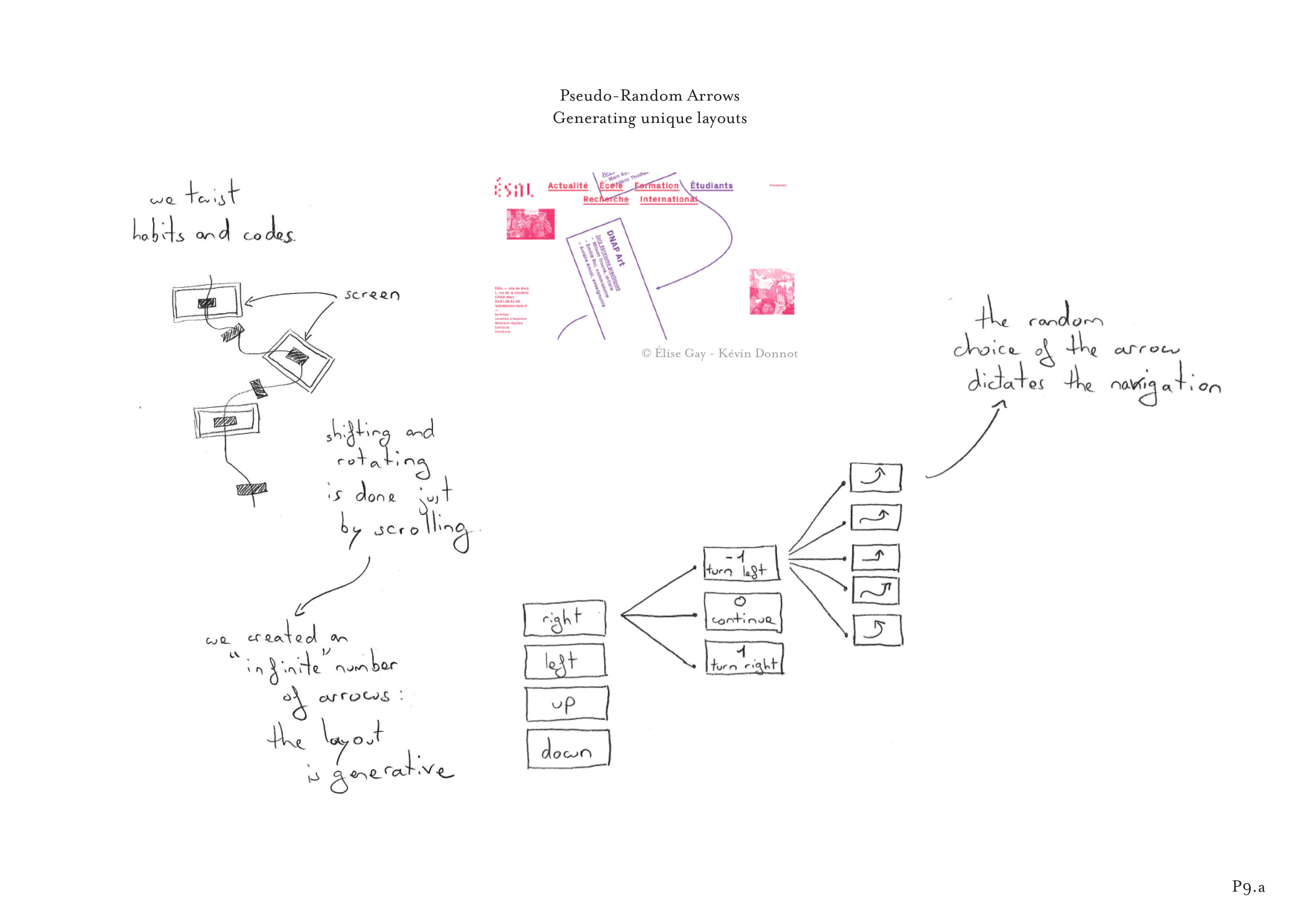 He created a set of arrows and gave a few simple rules to the system. The system then randomly chose the arrows, which dictated a unique, potentially infinite reading path for each visitor. Similarly, P3c created a series of generated images by trying to find “the shortest function that produces the greatest graphical diversity”.
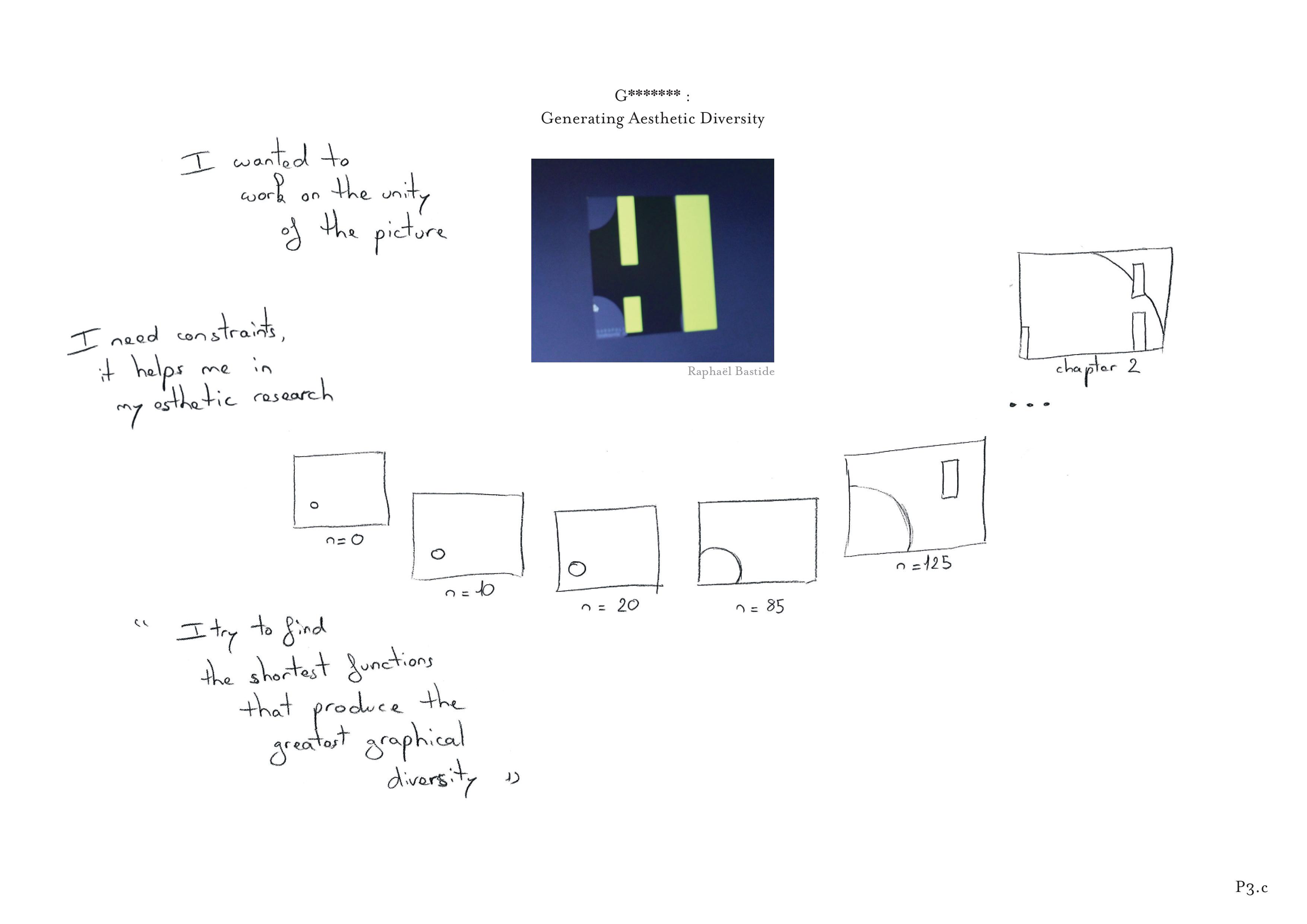 He focused on creating the substrate while the machine executed the code to create hundreds of different images for his series.
Involving readers and other designers in layout creation
Existing graphic design tools do not usually let designers modify the final layout, except with respect to window size. However, if substrates are reified in code, designers can let readers provide inputs or manipulate the substrate to generate layouts dynamically. P2c based her layout on an active partnership with the reader.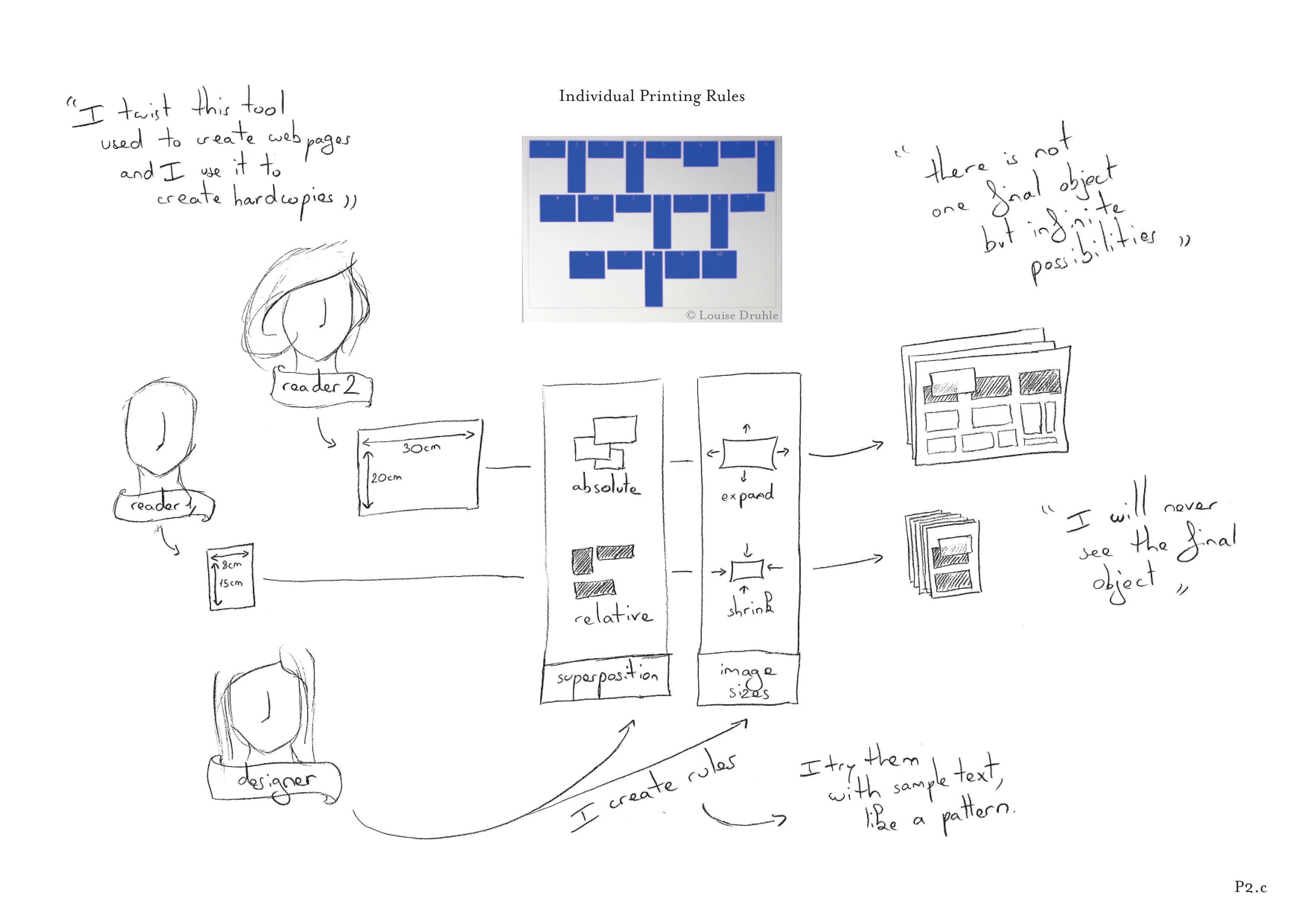 She created a book by hacking the possibilities of CSS Print. Each reader has to go to a website and provide a page size for their book before printing it. P2c designed the book layout to depend entirely on the book format, by using CSS rules such as relative positioning and width. She pointed out that “There is not one final object but infinite possibilities.” and added “I will never see the final object”. By embedding their substrates in code, participants could also create interactive layouts that directly react to the user’s actions. For example, P9b created an interactive substrate for a website layout.
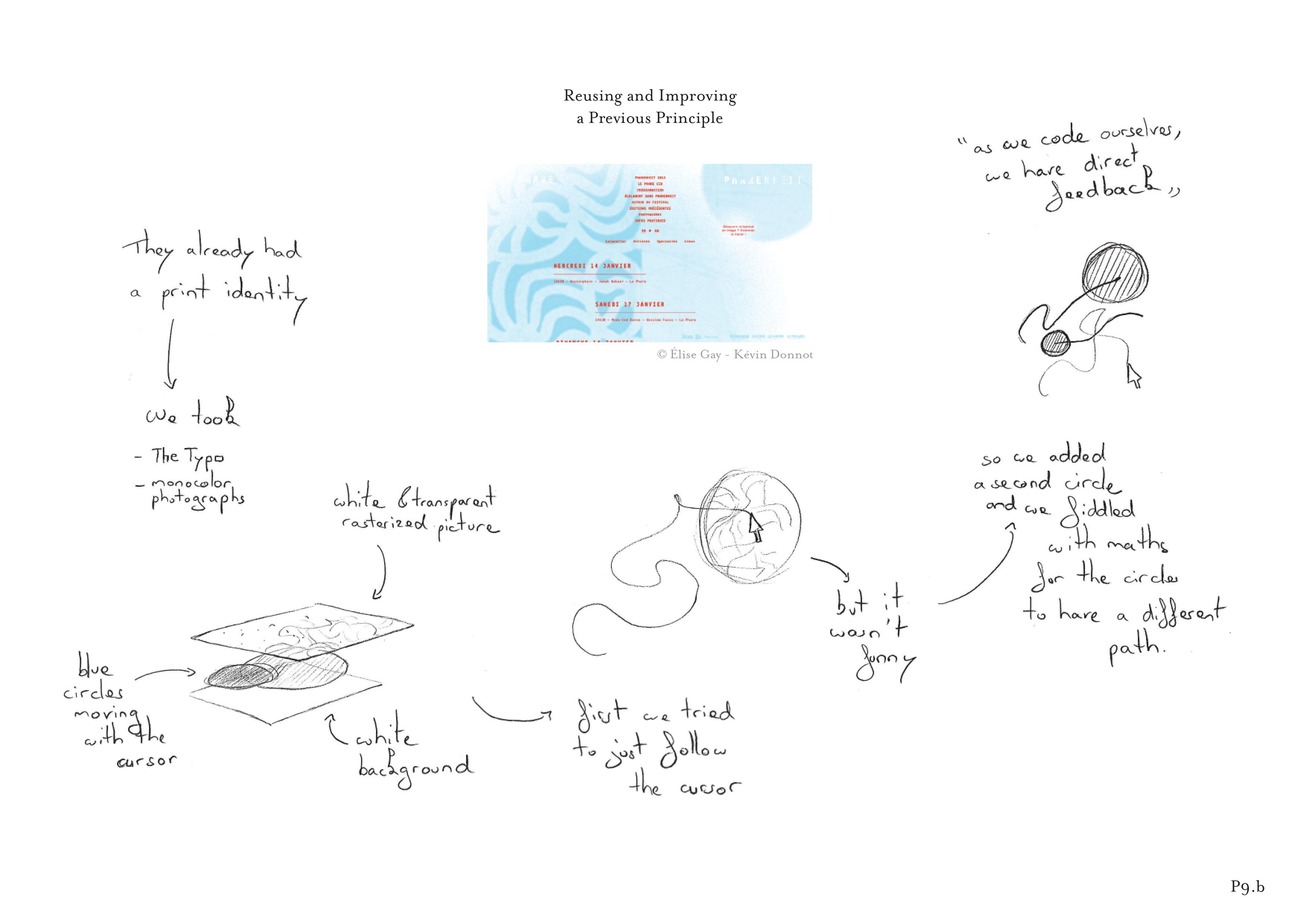 He programmed two circles that reveal the background image according to the movements of the mouse. The reader directly interacts and modifies the layout by revealing the different parts of the screen with cursor movements.
Our findings suggest that adding code provides many possibilities for reifying graphical substrates, for traditional print layout as well as interactive content. However not all designers can or want to program, and current tools only reify certain type of substrates such as guides and text styles. Current digital tools focus on creating and manipulating explicit visual properties but very few provide higher level support needed for graphical substrates.
Summary
In this chapter I investigated graphic designers’ strategies to structure their layout. Designers traditionally used grids to perform this activity but this tool does not have a direct equivalent in current graphic design software application. Our 12 interviews with professional graphic designers revealed that they use surprisingly sophisticated structures that go beyond the grid. We define them as graphical substrates: principles that guide the layout but rarely appear in the final result. We present a framework to describe how designers establish graphical substrates based on properties extracted from concepts, content and context, and use them to compose layouts in both space and time. However, most of these substrates are mental constructs and designers cannot materialize them using current layout tools. Graphic designers either manage them by hand or rely on code to explicitly represent them in their designs. These resulting reified substrates provided new possibilities for graphic designers, extending the types of inputs they could incorporate, automatically applying graphical substrates and involving readers in the layout creation process. Design work goes beyond manipulating visual properties, designers create and manipulate structure that guide the purely visual work. Digital design tools should provide support for these intermediary design artifacts.
Collaboration
in collaboration with Germán Leiva.
In previous chapters, I have investigated designers’ practices through three different tasks that are at the core of graphic design work: aligning and distributing graphical elements, manipulating color and structuring layout. These traditional tasks are still largely performed by individual designers but recent design fields, such as interaction design, require designers to closely collaborate with other professions. The collaboration with developers is especially interesting as the two professions rely on very different representations (visual versus symbolic) and because they focus on different aspects of the design process (Wolfgang, 1994).
Designers are trained to communicate visually: They use graphical editors, e.g. Adobe Illustrator and Photoshop, to create “static design documents” (Newman and Landay, 2000) such as wireframes and mockups. By contrast, developers are trained to work with abstractions: They use text editors and Integrated Development Environments (IDEs) to create functional systems. This setting questions design tools in a new way. When working with developers, designers are working at the boundaries of the field and they may reach the limits of their tools. Indeed, integrating designers’ and developers’ work practices has proven difficult, often leading to friction between them (Ferreira et al., 2011). One phase, especially, is of interest to us: the hand off phase during which designers transmit their static design documents to developers who then need to implement them into working code. This chapter focuses on the strategies used and problems faced by designers as they collaborate with developers. We especially focus on the representation, communication and interpretation of interactive systems.
Context
Designer-developer collaboration
Although user-centered design methods for interactive systems emerged in the 1980s (Donald, 1986), it took a long time for them to be integrated into software engineering processes. More than thirty years after, Silva and colleagues (Da Silva et al., 2013) identified three roles undertaken by designers during a project, and found that these role changes may complicate the designer’s collaboration with developers. In their literature review, Salah et al. (2014) survey the challenges of integrating agile methodologies into user-centered design practices. They show the need for a “shared understanding of the design vision”: developers must understand what they are expected to implement as soon as possible. In this context, Brown et al. (2011) analyze two major aspects of the collaboration process: collaboration events and artifacts. Their study of collaboration events shows that designers and developers constantly perform “interactional alignment work” (Strauss, 1988) and that the collaboration process is “patterned around the use of artifacts” (Brown et al., 2012).
Understanding the role of Artifacts
Star and Griesemer (1989) introduced the concept of boundary objects, which coordinate collaborative work within communities of practice. Lee (Lee, 2007) distinguishes between boundary objects designed to “satisfy the information needs of the collaborating parties” and boundary negotiating artifacts designed to push the boundaries in complex, non-routine projects that lack standardized objects for collaboration. In the context of designing and developing interactive systems, the most common boundary objects are design artifacts. For example, Newman (Newman and Landay, 2000) analyzed the specificities of intermediate artifacts such as sitemaps, storyboards, mockups and prototypes. On the other hand, few studies focus on collaboration with respect to design artifacts as boundary negotiating artifacts between designers and developers. Brown et al. (2011) established twelve categories of artifacts used for collaboration, including “design ideas”, “stories” and “interface proxies”. We are particularly interested in “interface proxies” because they serve as “a focal point for people to discuss”. Myers et al. (2008) surveyed more than 200 designers to understand how they address interaction in their design practices. They found that design documents focus primarily on the visual design: designers find it much easier to communicate visual appearance than interaction behavior to designers. Ozcen and colleagues (Ozenc et al., 2010) concur, noting that designers “struggle to have a conversation with the material” when creating refined interactive systems. Park et al. (Park, 2008) conducted a laboratory study that shows the differences between how designers and developers use text to represent interaction. They found that programmers “use more verbose descriptions” while “designer’s experience with tools like Photoshop and PowerPoint influences their natural expression of behaviors”.
Overall, the literature suggests that designers have difficulty communicating the design of interaction behavior to developers. However, the causes for these problems remain unclear. We need to better understand how designers currently represent interaction behavior to developers, as well as how their current tool support this process.
Study 1
Designer & Developers Interviews
The goal of the first study was to examine the existing practices of professional designers and developers from a wide variety of settings. We were particularly interested in how: designers represent and communicate a design; developers interpret the design; and designers and developers identify and overcome breakdowns that appear during the process. We conducted critical incident interviews (see chapter 3) about recent design projects, in order to obtain specific, detailed stories of their successes and failures. We were particularly interested in their problems representing and communicating interaction with each other. We also looked for recurring patterns across work settings, cultures and types of projects.
Participants: We recruited 16 professional designers and developers (7 women, ages 24-46) from France (8), Sweden (3), Argentina (2), the USA, Canada and China, who create web sites, mobile applications or interactive installations. Their work environments include: digital agency (6), design studio (4), start-up (2), freelance (2), and software factory (1). Participants P1ds-P8ds are designers (ds), self-described as UX Designer, Visual Designer, Interaction Designer, or Graphic Designer. Participants P9dv–P16dv are developers (dv), selfdescribed as Mobile Developer, Web Developer, Front-End Developer, or Creative Coder. Their experience in collaborating across disciplines, i.e. from designer to developer or from developer to designer, ranges from 1.5 to 20 years (mean 8). Half of them typically collaborate remotely, none have worked with each other. All participants reported that they follow agile methodology.
Procedure: We conducted critical object interviewed with participants in their studio or office for approximately 90 minutes. We asked designers to choose recent projects in which they collaborated with a developer, and asked developers to choose recent projects in which they collaborated with a designer. For each project, we asked them to show us their tools and the specific artifacts they created, and to describe, step-by-step, the details of how they communicated the design or implementation. We probed for both successful and unsuccessful collaboration examples.
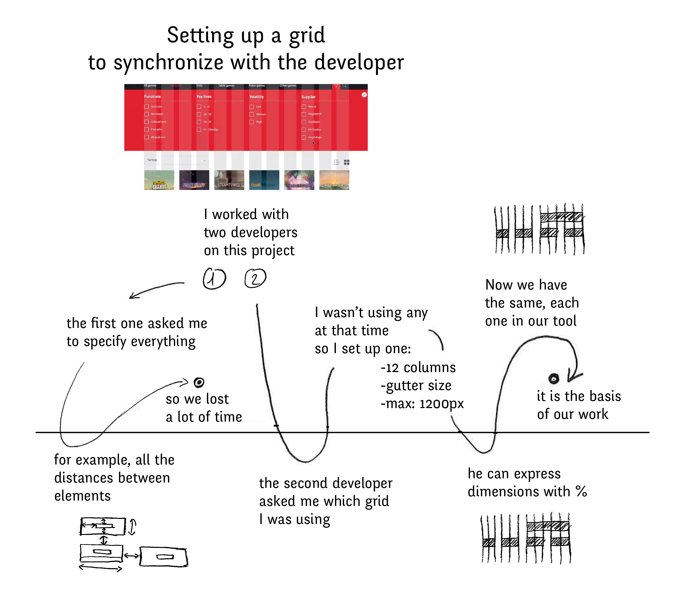
For this study, we created a new version of StoryPortrait centered around a timeline that shows the successive steps of the collaboration. Here, the developers's actions are on top and designer's on the bottom
Data Collection: We collected 25 stories (one or two per participant) from different projects. During the interviews, we recorded audio and video of the participants manipulating the artifacts they created. We also photographed the final products they produced and took notes.
Analysis: We analyzed the 25 stories using Grounded Theory (Strauss, 1987). We studied the projects with a particular focus on breakdowns related to creating or interpreting the design documents. We first selected examples that formed natural categories, looking for higher-level concepts that emerged from the details of each projects. We iterated and mapped each story to one or more categories. We illustrated each project with StoryPortraits (see chapter 3) to facilitate the analysis (). A StoryPortrait includes a photograph of the interactive system or a key artifact created during the project, as well as a timeline to show the successive steps of the collaboration, including the participant’s quotes and drawings.
Results and Discussion
Designers produce multiple design documents
All designers create multiple documents to communicate different aspects of their designs. Designers create extra design documents when the original design documents lack specificity or lead to confusion. Unfortunately, much of the information in these additional documents is redundant. We found that designers spent time recreating the same information across separate documents.
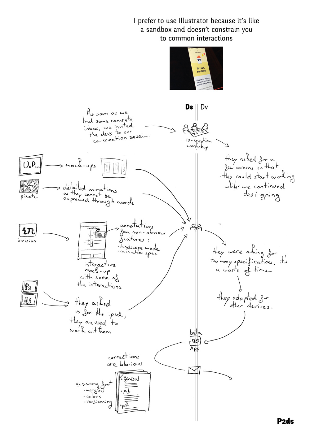 For example, P2ds created five documents to communicate the design of a small application: UxPin “for sharing mockups”; Pixate “for detailed animations that cannot be expressed with words”; InVision “for interactive mockups with basic interactions and annotations for non-obvious features”; Photoshop because “these developers are used to work with.psd files”; and Illustrator, “the software we actually use to produce the screens.” She also used email to communicate additional design details to the development team. Even with all these documents, this designer was unable to clearly communicate the design. Although all designers use images of “screens” to represent the visual design of the interface, these are insufficient to accurately describe user interaction. Designers resort to other formats, each with different trade-offs, to communicate their ideas. Most common is text, used extensively by all designers.
For example, P6ds briefly described in an email how the user moves between screens: “from the login screen, you slide to the next screen”. Text comments and annotations are easy to produce, but rarely sufficiently explicit or complete, leaving details open to interpretation. Less common is video (24% of the projects) which makes it possible to visualize custom animations, but is expensive, time-consuming and does not fully communicate the user experience. Finally, designers occasionally create interactive mockups (12% of the projects) using the built-in set of interactions in the tool of choice. These communicate how the interaction should feel, but only when the tool has the right set of pre-defined interaction types. All but one designer created custom “guidelines” or “specifications”.
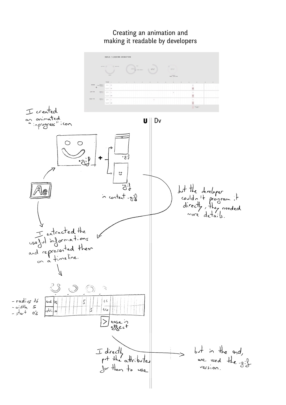 For example, P7ds created a video to communicate the design of an “in progress icon” animation. When the developer was unable to recreate the design from the video, P7ds created an additional file that “extracts the useful information [from the video] and represents it on a timeline”.
Developers recreate design documents
The most common activities mentioned by the developer include interpreting the design documents and recreating them with developer tools. For example, P9dv received an informal text description of a custom animation, but had to ask for a visual representation in order to fully understand the design. We were surprised by the amount of time that developers spent recreating design documents. Some developers came up with interesting strategies to increase their productivity.
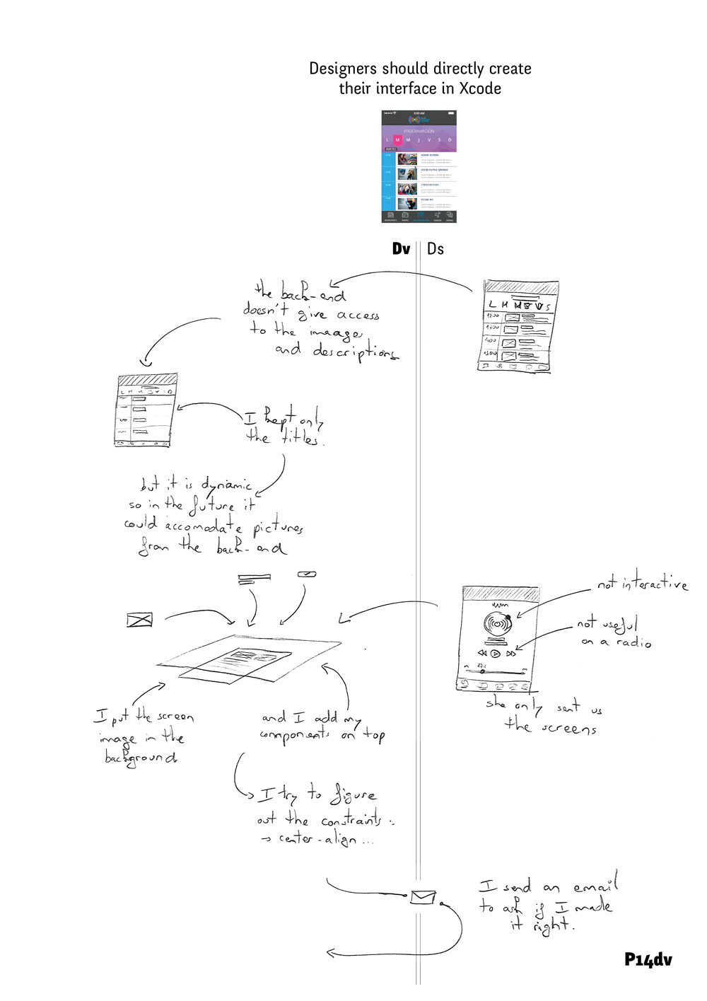 For example, when developing a mobile radio application, P14dv inserted the provided image as the background of her corresponding view in the IDE’s Interface Builder. She then positioned her components on top, to recreate the designer’s composition. She could then “figure out the [layout] constraints” of the screen to make it responsive, such as determining that some elements were center aligned.
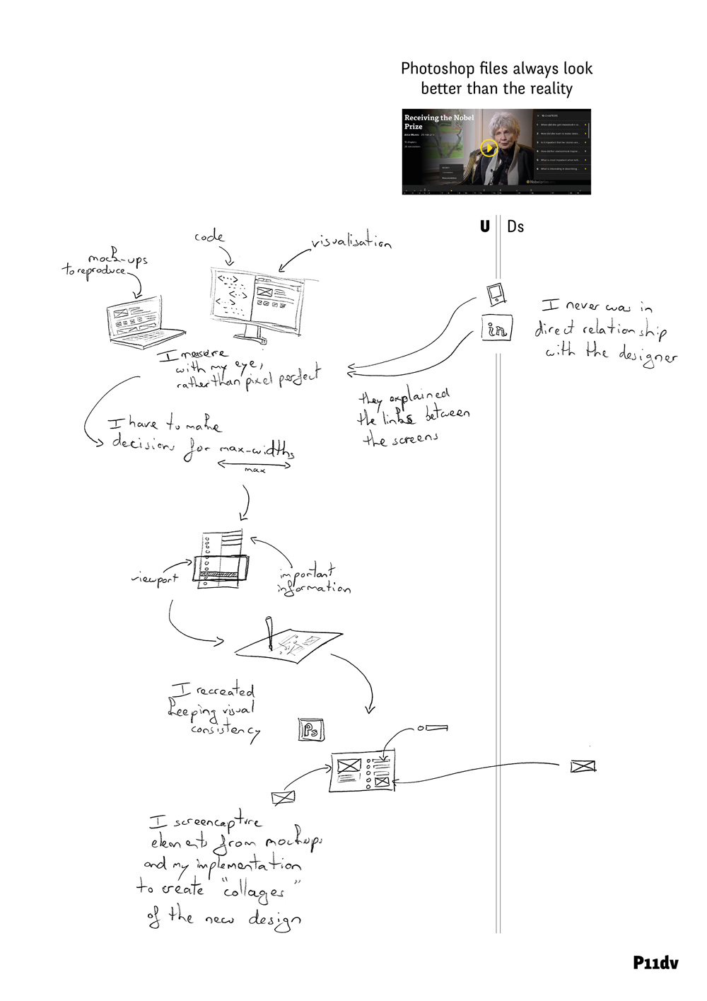 P11dv created a similar setup with two monitors. To implement the visual design, he places the mockups on the smaller screen to assess them: “I measure by eye rather than being pixel perfect.”
Developers misinterpret designs
During this process, many design decisions are lost, as developers struggle to interpret and implement the designer’s original intent. In fact, none of the initial implementations were exactly as the original design. P1ds felt that the developer “used our design as an inspiration, then he made many design decisions that he did not have to take”.
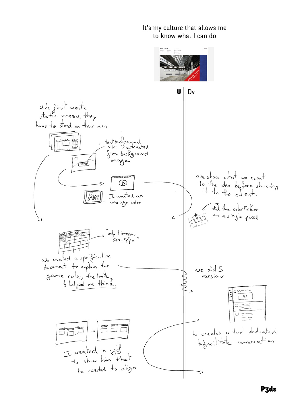 Similarly, P3ds provided a video that showed the developer how to vary a text-box color according to the background picture. He later realized that the developer had only partially implemented his idea by sampling a single pixel, instead of generating an average color based on several pixels. During the implementation phase, designers create correction documents to show the location of the mismatches and what should be modified. For example, to correct a vertical misalignment, P3ds created a video. He first traced a segmented line to highlight the misalignment and then animated the correct repositioning of the elements.
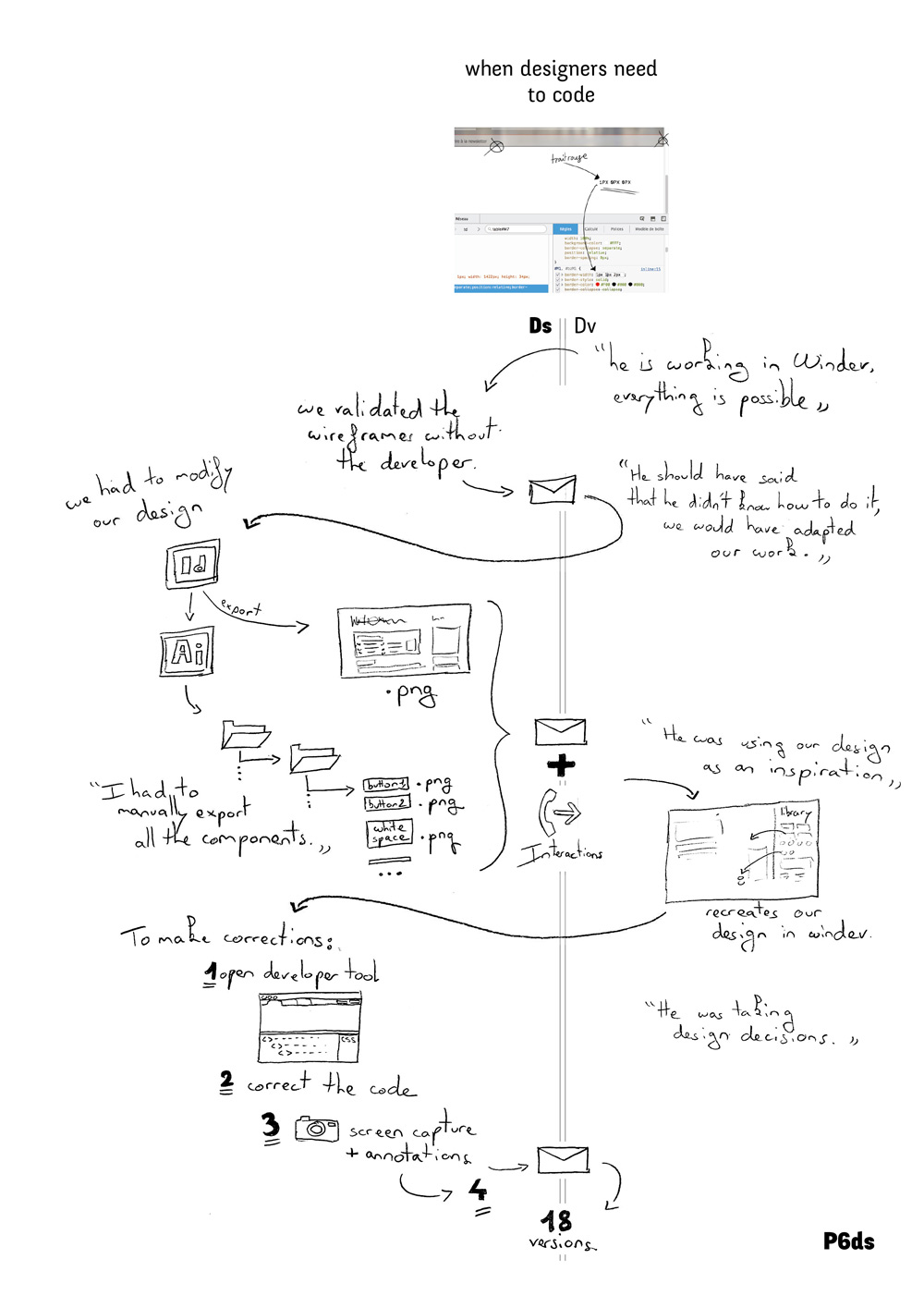 In the context of a real state website project, P6ds discovered several visual mismatches including wrong margins, colors and fonts. He decided to modify the CSS and correct the mistakes by himself, using the web-browser developer tools.Because these changes were local to P6ds’s browser, he screencaptured the new website’s look and added some annotations linking the modified CSS code to the visual result. The developer then recreated all of these steps with his own tools.
Strategies to avoid rework and redundancy
We found cases of rework and redundancy in all the interviews, but two developers and one designer explicitly mentioned strategies to avoid them.
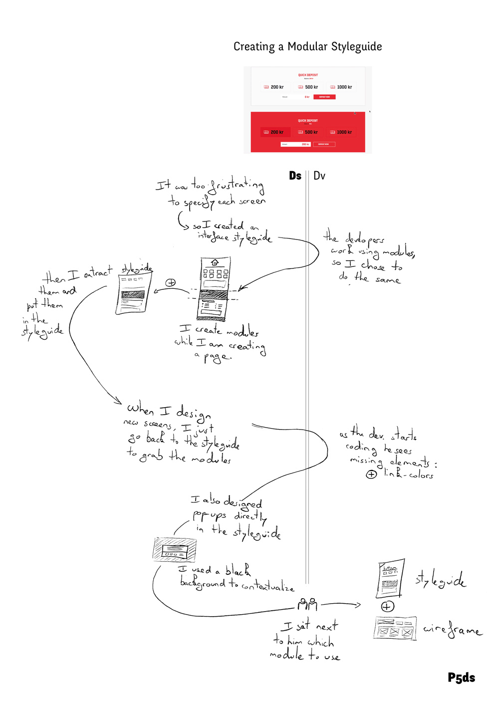 P5ds designed a complex casino website with many similar UI components. To avoid recreating them each time, she “was inspired by the developers’ way of working”: she created a modular styleguide that served as a shared visual library. She could then copy modules from the styleguide to create each new screen, gradually adding new modules or missing information such as the color of the hyperlinks, as requested by the developers.
 P12dv began with mockups and specifications for a web-based interactive advertisement builder. He used Flash to create the architecture of the interface, writing the code “so that the designer could easily touch it”. The developer encouraged the designer to directly manipulate the code to fine-tune look and feel details, such as modifying the images or changing the duration, delay and type of each animation. This strategy allowed P12dv to avoid misunderstandings and unnecessary back and forths.
Design Breakdowns
We use the term design breakdown to describe an impediment that must be fixed before the design can be implemented. We identified three recurrent types of design breakdowns related exclusively to the collaboration between designers and developers (). These categories emerged from the most common issues encountered in the 25 analyzed projects.
Missing Information
The first type of breakdown occurs when the designer makes a decision without communicating it to the developer. Two designers and four developers reported cases of missing information.
 For example, P9dv received an interactive mockup of a webpage. He could not determine whether the page’s calendar widget was interactive or simply the output of another interaction. P9dv also lacked the design rationale: “What did they create that calendar for?”
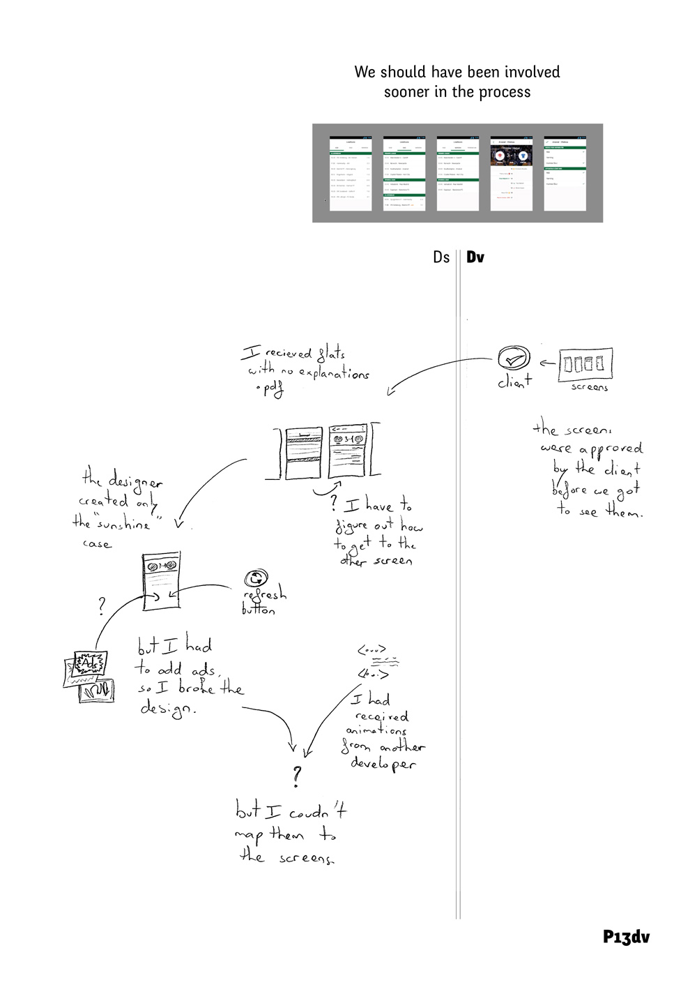 Similarly, P13dv received only static mockups for a sports application, and could not determine how to move from one screen to another. P14dv created a “design specification file” for the designer with missing information from the original design files.
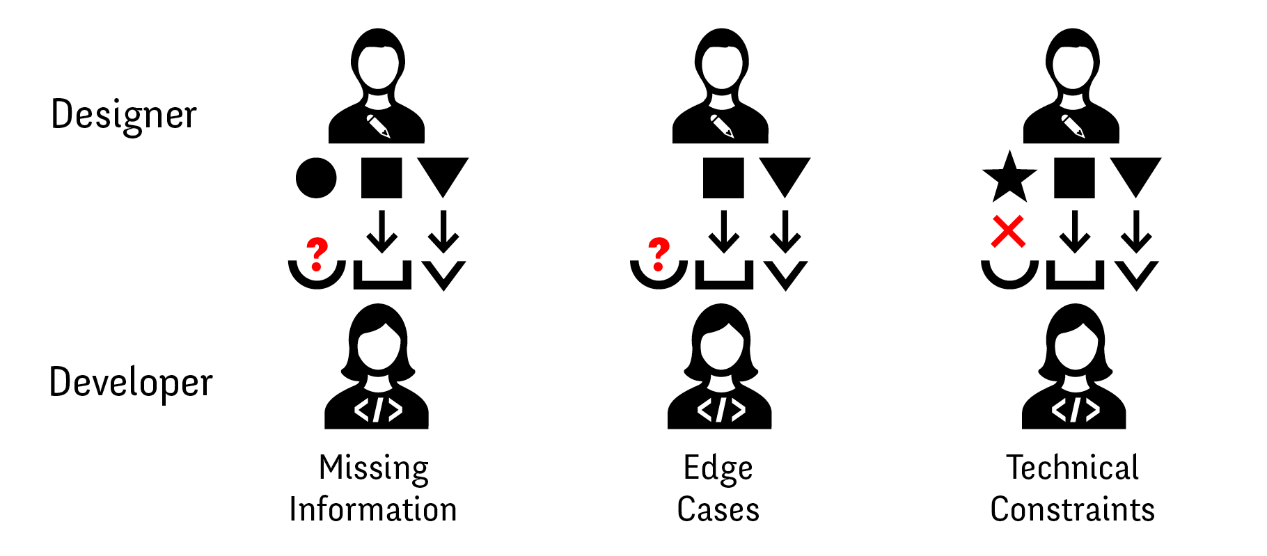
Key design breakdowns between designers and developers: Missing information: Designers can not communicate necessary details. Edge Cases: Designers do not consider certain problematic situations. Technical constraints: Designers are not aware of technical limitations.
Designers found it difficult to represent and communicate dynamic behavior to the developers.
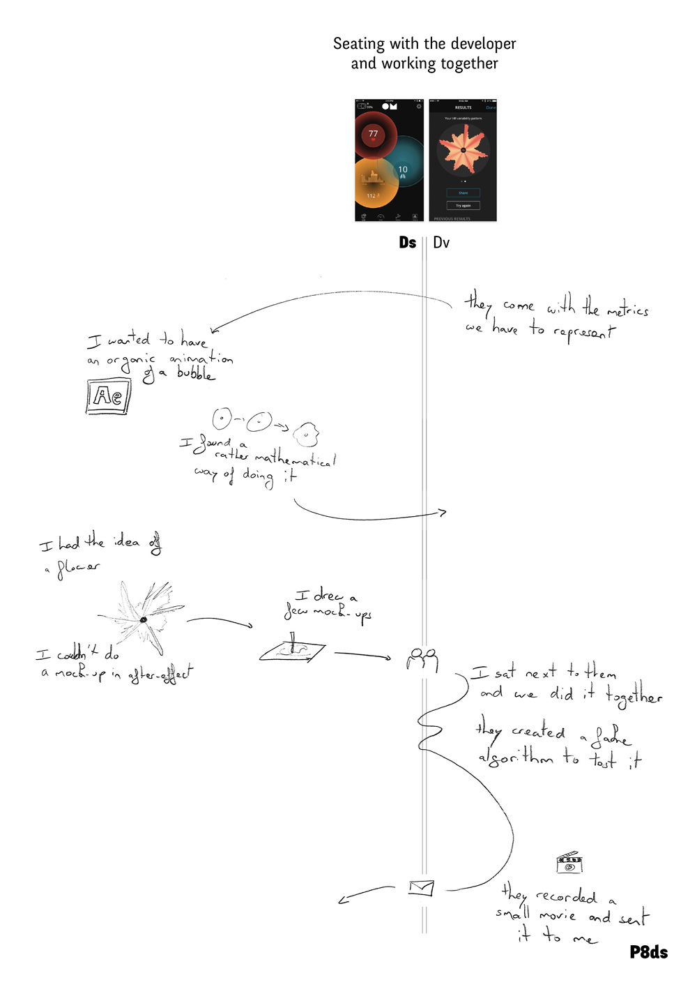 For example, P8ds wanted to create an animation of a blossoming flower but did not know how to represent her idea in After Effects. She ended up drawing a few sketches and then sat next to the developer as they worked out how to implement her idea directly in code. In two cases, the designers avoided mentioning interaction at all, relying on the developer to create off-the-shelf interactions. This supports Myers et al.’s (2008) argument that designers find interactions hard to represent. For example, P6ds provided static design documents without representing some transitions, even if they were simple: “I let the developer pick the interaction between the screens, since they are very basic.”
Edge Cases
The second type of design breakdown is missing edge cases, when designers focus on typical scenarios and do not consider extreme or problematic situations. Developers are trained to think about edge cases; designers are not. All developers reported that designers omit important edge cases from their design documents, and that they had to decide how to handle these situations themselves.
 P13dv received only mockups to develop a sport application. Because the designer had only specified the “sunshine cases”, P13dv had to make design decisions for each of the different edge cases. For example, the client required him to include advertisements, so he modified the original design to accommodate the ads.
 Similarly, P16dv prepared a responsive grid for a cruise company website. The original mockup only featured the desktop version of the website. P16dv did not know how to handle large elements that did not fit within the width of the screen of the mobile version: “Should the rectangle be transformed into a square or should it take a full row?” For P16dv, designers usually “don’t take into account the dynamic nature of the data”. Responsive websites make it particularly difficult for designers to consider all possible layout cases.
 For example, P11dv explained how designers of a responsive website had specified the element widths based on a percentage of the screen, but did not consider what the maximum width should be, forcing P11dv to make the decision using his “designer’s eye”. Some designers overcome these issues with design guidelines.
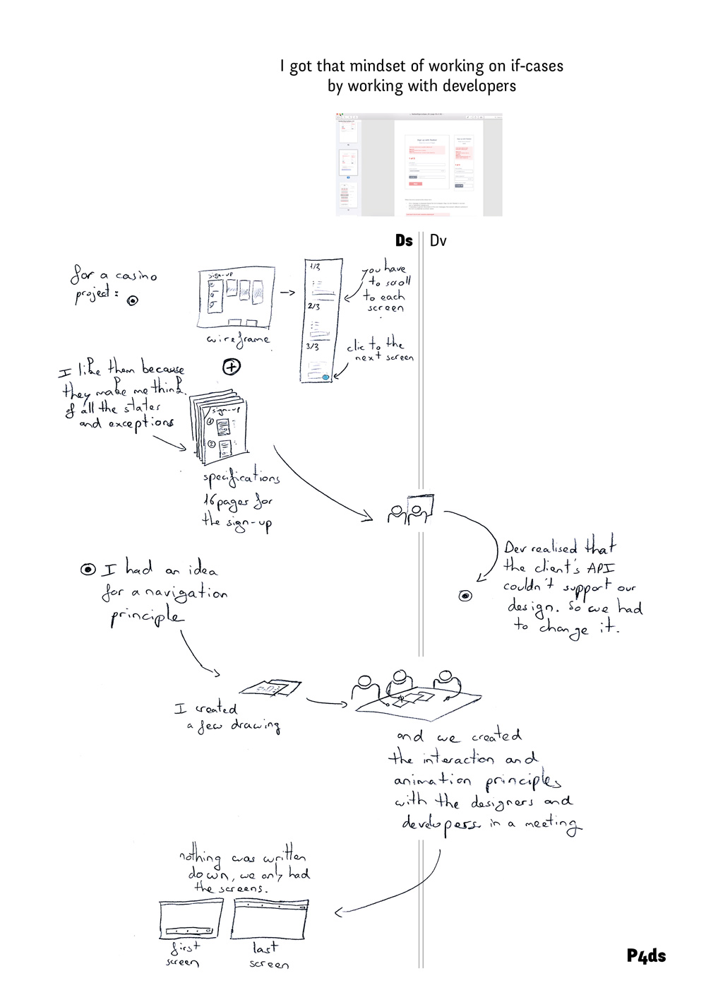 For example, P4ds created a 16-page specification with annotated wireframes to explain the sign-up functionally of awebsite. She reported that “specifications make me think of all the states and exceptions”. She also used the guideline to capture and communicate the rationale for her design decisions.
 Similarly, P3ds created a spreadsheet to help him think and “explain the rules of the game and the limits” for each website element.
Technical Constraints
The third type of design breakdown is the designer’s lack of awareness of technical limitations, either in general or with respect to the developer’s skills. Five designers and four developers reported breakdowns due to such misunderstandings, which created additional work for the developer.
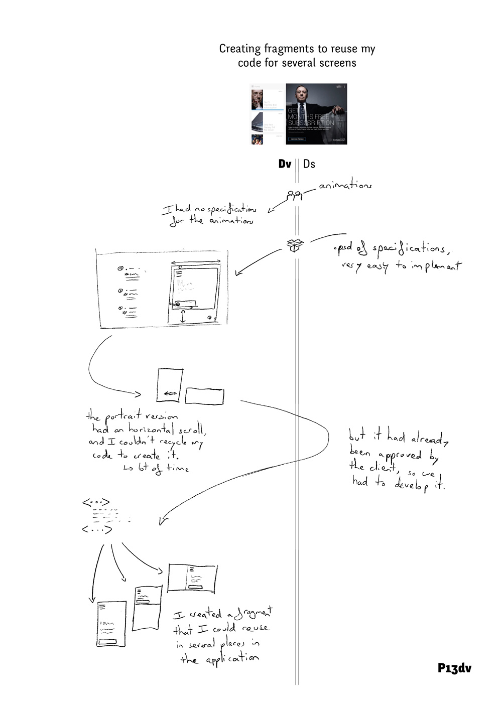 For example, P13dv received a design for an iPad application that called for horizontal scrolling when in portrait orientation. But P13dv “could not recycle his code from the landscape version to create it”. He had to reimplement it from scratch, since it had already been approved by the client. This type of misunderstanding leads developers to modify the design themselves.
 For example, P11dv created a responsive website for a start-up. The designers created a desktop and a mobile version of their design but “did not realize that they had modified the behavior between the two versions and I would have had to develop two different source codes”. Instead, he decided to redesign the layout to make it feasible as a “simple responsive website”. Not being aware of technical constraints is also a problem for designers.
 For example, when working on a complex website, the developer first told P6ds that “everything was possible”. P6ds soon discovered that the developer was unable to implement many elements with his tools, even though they had already been validated with the client. P6ds said: “He should have said it earlier, we would have adapted our design.” Instead, they were forced to redesign the project several times to accommodate the developer’s limitations. Collaboration is usually smoother when the designer is aware of the developer’s constraints and possibilities.
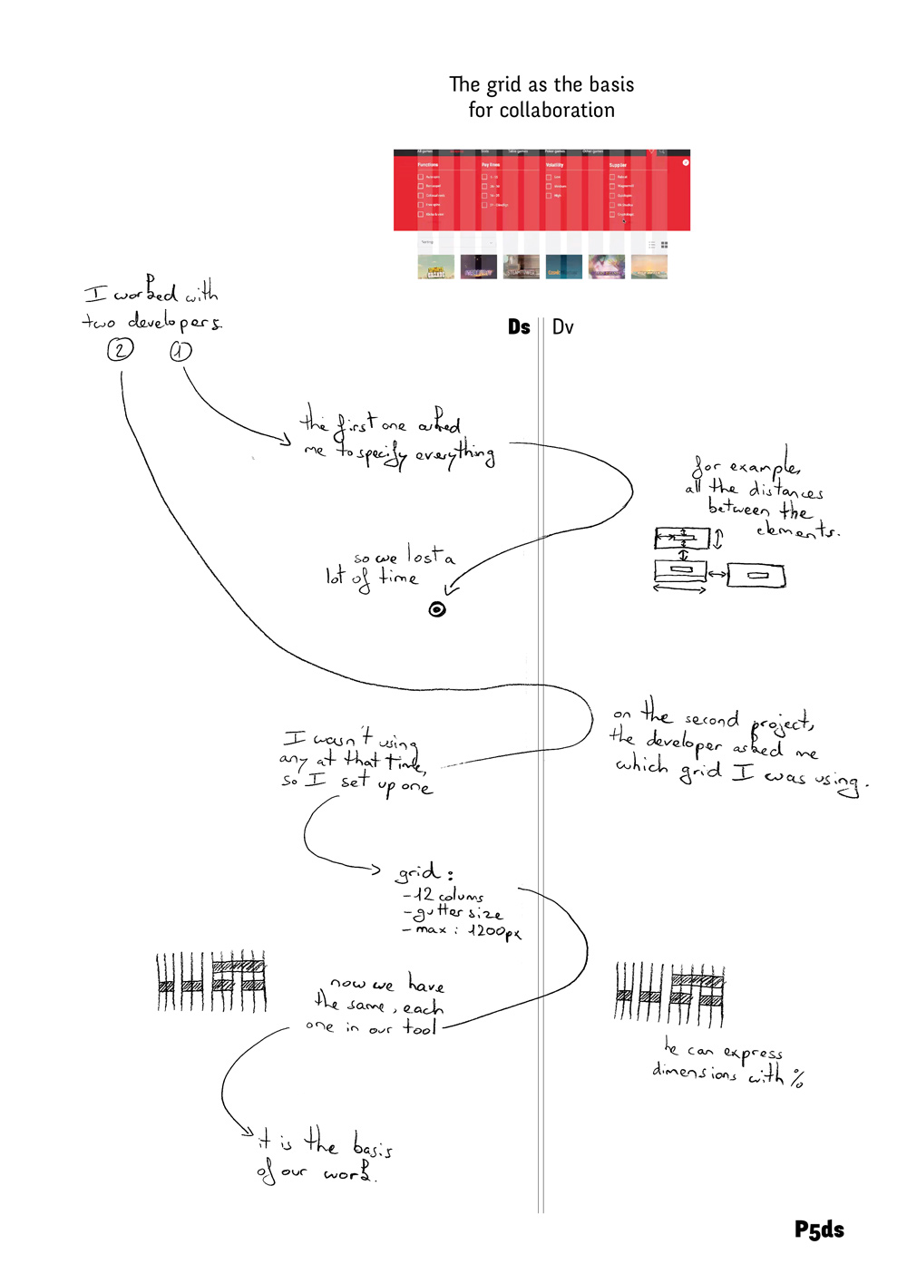 For example, P5ds worked on a project with two different developers. The first asked her to specify all the dimensions, such as the distances among all the elements on the screen, “so we lost a lot of time”. The second developer asked for a grid specification, which she created with 12 columns, a gutter size and a maximum size of 1200px. “Now we have the same, each one in our own tool.” The grid allowed the developer to express dimensions in percentages, sparing P5ds the need to make additional annotations and saving a great deal of time (Figure 46).
Late developer involvement
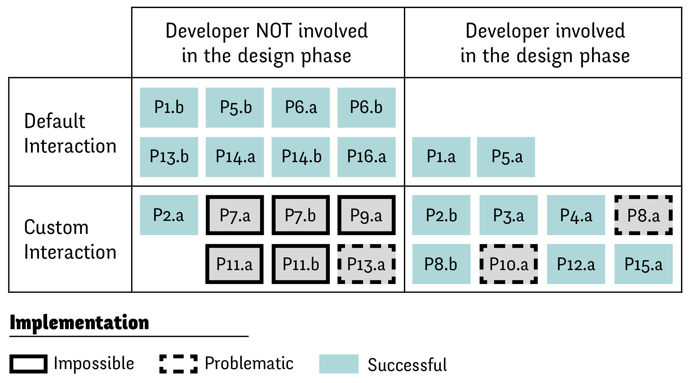
Relationship between interaction complexity and developer involvement. Lack of developer involvement in the early phase of custom interaction design is correlated with problematic or impossible implementation.
Only five of the 25 projects (two remote and three co-located) included face-to-face sessions between designers and developers dedicated to co-design the initial interaction.
 For example, P4ds had an idea for a custom navigation rule and invited all the designers and developers to help design it. The developer was able to implement the resulting navigation behavior without additional instructions or documents: “Nothing was written down, we only had the screens.” Other similar examples suggest that involving developers during the design phase makes it easier to create complex interactions (). In such cases, developers gain an understanding of the desired interaction during the meeting and designers need not fully represent it in their design documents. Developers were most likely to be called in for the design phase when the project included custom interactions.
 In most of these cases (6/8), developers successfully implemented the desired custom interaction, as in the aforementioned example of P8ds’s flower animation. However, when the project required a custom interaction and the developer was not involved at the design stage, most developers were not able to subsequently implement the proposed interaction (5/7). For example, P7ds reported that the developer “just did not implement” the custom transition he had proposed. One of the remaining cases was still problematic: P13dv was frustrated with the proposed interaction: “I could not recycle my code, but as the design had already been validated by the client I still had to implement it. I lost a lot of time.”
In summary, we identify three main types of issues when designers and developers collaborate on the creation of interactive systems: reworking and redundancy, design breakdowns and late developer involvement. We found reworking and redundancies in both designers and developer practices. Designers struggle to represent interaction with their current tools and use multiple design documents to communicate different aspects of their design. Developers spend a great amount of time recreating the designer’s documents and correcting their misinterpretations. During the implementation phase, designers and developers face three types of design breakdowns — missing information, edge cases and technical constraints — that undermine the collaboration process.
Study 2: Case Study
Study one identified three types of breakdowns that occur between designers and developers in a wide range of contexts. To further understand these breakdowns and how they are addressed, we conducted a longitudinal study of a team of designers and one developer. We observed P1ds from Study One and his team during the entire duration of a one-month project, a responsive website for a crowd-sourced directory of companies. We were interested in whether design breakdowns still appear when a developer is involved early in the project, and, if so, which strategies are used to avoid or mitigate these breakdowns.
Participants: We studied three designers and one developer (ages 24-25, one woman). This was the first time that this group of designers had collaborated with this particular developer.
Procedure: We observed the two face-to-face design meetings that involved all the designers and the developer. The first two-hour meeting () focused on the design of the website. The second meeting lasted an hour and focused on implementation. We also interviewed the designers separately, prior to the second meeting, to learn more about their design tools.
Data Collection: We video recorded both meetings and took notes. We took pictures of collaborative actions, i.e. exchanges between the designers and the developer, and their manipulation of artifacts such as drawings, notes and software. We also received copies of the emails exchanged during the project.
Analysis: We used Chronoviz (Fouse et al., 2011) to annotate relevant, interesting events during the meetings. Two coders marked and analyzed the times when a participant asked a question, or when a designer sought confirmation from a developer or vice versa. We correlated these marks to the design breakdowns classification from Study One.
Results and Discussion
The email exchanges focused primarily on discussions with the client about requirements and validating design decisions. Since these activities are beyond the scope of this paper, we focus our analysis solely on the two face-to-face meetings.
First Meeting - Accounting for design breakdowns
The main benefit of the early face-to-face meeting was to let participants seek validation from each other and to avoid potential problems. We identified examples of avoiding missing information, considering edge cases, and clarifying technical constraints. In order to avoid missing information (12 occurrences), the developer often encouraged the designers to specify concrete details about their design ideas. For example, when the designers proposed a button related to the advanced search feature of the website, the developer demanded greater precision: “Is it going to have radio buttons or checkboxes?” Similarly, when a designer suggested that “there should be two sharing buttons”, the developer immediately sought concrete details: “Ok, but what exactly do you want me to share... the URL of their website, the URL of our website or a Facebook link?” The developer required these details in order to translate the design idea into specific elements that he could implement. The mere presence of the developer pushed the designers to be more explicit about certain design issues. For example, when designing the “company card” that would be displayed on the search page, one of the designers realized that he needed to specify the title’s maximum number of characters to maintain the visual consistency.
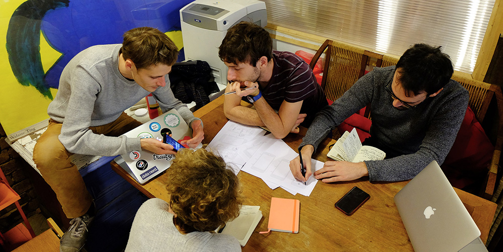
First meeting. The developer shows an example of an existing interaction to the designers while one designer represents it on paper.
The developer also pushed the designers to think about edge cases (5 occurrences). For example, when designing the category system for filtering companies, he asked the designers: “Can a project exist without a category?” This insight led one designer to come up with a different strategy: He proposed an “other” category that groups together previously uncategorized companies. Similarly, when the designers proposed adding a gesture for deselecting a category on the mobile version, the developer asked them to consider how this design decision would affect the desktop version of the website. Given the developer’s warning, the designers decided to skip the feature: “Based on what you just said, I think we should not let the user select different filters.” Designers often sought validation, confirmation or information about technical constraints (17 occurrences). This echoes the “considering implementability” category observed by Brown et al. (2012). First, they were able to confirm with the developer the feasibility of their design. For example, one designer asked the developer: “Is it possible to have a swipe gesture on a mobile website?” In order to make informed decisions, they asked the developer about the complexity of implementing certain designs. When the designers proposed a search feature for companies, the developer asked them to specify exactly what should be searchable. The designers idea was to search within all company-related information, including their descriptions. The developer replied: “Everything is possible... but if you really want to make a search inside the description, it will be a bit more complex.” He suggested only looking up names and tags, but with an autocompletion feature. The designers agreed.
Second Meeting - Fixing design breakdowns
Even though they were able to handle many design breakdowns during the first meeting, new ones appeared during the implementation process. The developer found new edge cases (4 occurrences). For example, he noticed that a company card with multiple subcategories would occlude the company’s name: “There is a risk that it overlaps with the title, I think it should be redesigned.” The designer responded: “Maybe we can put three dots and display the extra ones only on [mouse] hover.” The developer also requested missing information that he could not infer (8 occurrences). For example, he could not understand why the subcategory was not displayed on the company card. The designer had thought about this, but did not communicate it to him: “I did not explain it in my screens but here we are actually within the housing category. In fact, the housing icon should be highlighted in the upper menu.” In this case, the developer had interpreted the highlight as a hover state, and not as a selected state. The developer also asked: “What exactly is clickable on the item [company] card? Is it only the title and image or the whole card?” Another problem was that the developer could not understand the purpose of a cross in the corner of the company card: “This little cross here, what should happen when I press it? Is it a back button?” In a few cases, designers asked for more details about decisions made by the developer. For example, when reviewing the search feature, the designer asked for a clarification: “In which order are the items shown when they are displayed as results?” Designers also questioned some of the developer’s decisions: “Why do we need pagination? Is it because of the heavy loading [time of the HTTP] request?” The developer nodded as the designer proposed an alternative: “We should put the maximum number of items on the page without loading problems.”
Vocabulary mismatch between designers and developers
In both meetings, differences in the vocabulary used by designers and developers led to miscommunication. Sometimes, designers and developers used different terms for the same concept. For example, during the second meeting the developer talked about a “fixed” element using CSS terminology. The designer, who tried to take the user’s perspective, referred to the same object as a “moving” element, an element that follows the scroll. It took some time for them to discover that they were talking about the same behavior. We observed several strategies for overcoming these issues (5 occurrences). Developers and designers tried to bridge the vocabulary gap by adopting each other’s terminology. For example, when discussing whether an item should appear in several categories, one designer started using mathematical concepts when communicating with the developer: “Is it the union or the intersection of these two categories?” The developer also reformulated the original design idea in terms of UI widgets: “It is either a radio button or a checkbox.” On several occasions, designers and developers looked up specific interaction techniques on a particular website or found examples from a mobile application on a smartphone to show the others. This “communication-by-example” helped them verify that they were talking about the same interaction technique.
In summary, we found that both designers and developers actively try to mitigate design breakdowns when meeting face-to-face. Involving the developer at the beginning of the design process helped the team reduce the amount of missing information in the design documents, discover and handle edge cases and set clear technical constraints for the scope of the design. Even so, new design breakdowns occurred during the implementation phase and had to be solved collaboratively by the team. Vocabulary mismatches also created several collaboration issues, especially when discussing interactive behavior.
Discussion
Tool Silos
Today’s design and development tools operate in isolation: changes in a designer’s tool such as Sketch are not reflected in the developer’s tool, such as XCode. Worse, changes in one design document are not automatically reflected in the others. Some designers and developers address this by linking their documents via cloud-based file syncing or by referencing external resources from the code. Also, several IDEs support multiple views: UI code can be opened with a text editor or an interface builder and manipulating either tool modifies the underlying code file. Unfortunately, these solutions are tool-specific and ad-hoc, and do not reduce the amount of reworking across design documents and development tools.
Lack of Refactoring
Some graphical tools include “symbols” or “smart objects” that are referenced across documents instead of being copied. Designers can modify these smart objects and see the changes reflected wherever they are used. While this encourages modularity it also requires planning: “smart objects” must be created before being used. However, the fluid nature of design can make pre-planning difficult: new ideas or constraints may appear and clients often change their minds.
Revealing the dynamic nature of interactive systems
Our results suggest that designers are less likely than developers to specify edge cases, even though their early identification can avoid significant problems later. Because current design tools work operate with static screens, they don’t support designers in exploring of the dynamic nature of interactive systems and in discovering edge cases.
Summary
This chapter studied how designers communicate and developers interpret interactive system designs. First, we conducted 16 interviews with professional designers and developers how they collaborated during the hand-off phase. We showed that the current workflow induces a lot of rework on both sides. Designers create a multitude of redundant design documents and developers must recreate them with their own tools. This process often introduces mismatches with the original design. We then identified three key design breakdowns: missing information, when designers do not communicate a specific detail; edge cases, when designers do not think about a particular case; and technical constraints, when designers are not aware of developer’s technical limitations. The interviews also showed that when developers are not involved in the initial design of custom interactions, the implementation tends to be problematic or even impossible. To further understand how designers and developers address these breakdowns, we conducted a longitudinal case study. We found that even if the early involvement of the developer mitigated the occurrences of design breakdowns, new ones appeared in subsequent meetings. Our results suggest that designer and developer tools don’t support the transitioning between the design and the implementation phase.
Discussion
Myths behind Design Tools
In the first part of this thesis, I uncovered and analyzed designers’ practices from four complementary angles: color manipulation, visual alignment, layout creation and collaboration with developers. For each of these studies, I conducted independent analyses to avoid early generalizations. In each of these contexts, distinct frameworks emerged from specific and unrelated designers’ stories. Yet, my goal in choosing such diverse design practices was to observe recurrent patterns among them. I especially wanted to understand how current design tools supported these different practices and how designers appropriated them. After having reported on these studies independently, I now analyze the commonalities among them.
First, the four studies revealed the incredible breadth and richness of designers’ practices. Each designer, for each of their projects, invented new ways of performing design tasks. Not a single story resembled another. In their unique process, designers often used the domain-specific digital tools. However they did not merely use them, instead, they interweave their usage within a much more complex process, usually involving multiple tools. In each study, we have shown how current design tools provide only limited support for designers’ activities. If we want to design design tools that better support designers’ practices, we first need to understand current tools’ limitations. Lucy Suchman argues that “every human tool relies on, and materializes, some underlying conception of the activity that it is designed to support. As a consequence, one way to view the artifact is as a test on the limits of the underlying conception” (Suchman, 2007). From color pickers and alignment commands to layout masters and current interaction design tools, I extracted two recurring features across digital design tools.
Looking at the mismatches between tools and designers’ practices we observed in the four design practices, we can understand the limits of the underlying principles behind current design tools. I present these interrelated principles below.
Design as a hylomorphic process
In a commercial for the groundbreaking Adobe Illustrator 88, the narrator explains that Illustrator 88 is “a revolution based on new tools, tools that free the imagination and eliminate drudgery”. Behind this assumption lies the idea that tools impose restriction on an otherwise boundless creativity. This idea also implies that the act of creativity and tool use are separated phenomena. Based on the results of the four studies, I argue that state-of-the-art design tools materialize this vision of design work. Digital design tools conform with the idea that design is what anthropologist Ingold calls a “hylomorphic” process: they posit that designers already have in mind the outcome they want to achieve.

A detached description of designers' work may miss the invisible and often complex process developed by designers.
Following this idea, design tools should allow them to reach this outcome with the least effort, without getting in the way. Most current design tools examined in the four studies embed this approach, and it may partly explain why selection mechanisms and commands are so pervasive in current design tools (Manovich, 2001). To take a few specific examples, the color picker focuses on retrieving an individual color from all possible colors. The design brief behind the tool could be summarized as: “given that a designer wants to select a specific color, help her achieve this goal in the fewest steps possible”. For alignment and distribution, traditional commands focus on the action itself: aligning selected elements with a single click. In doing so, they omit the fact that alignment takes place within a much larger process of composition. In the case of layout tools as well, because the final outcome is a spatial composition of graphical and textual content, most tools focus on spatial positioning, neglecting the many other dimensions, revealed in the graphical substrates framework, that play a role in the overall process. In 1991, at a time when most design software applications were originally designed, HCI researcher and activity theorist Susanne Bødker argued that: “The established methods for design of computer applications in general, and for the user interface design in particular, do not intend to originate from the practice of the users. They are based on a detached observation and description of the work activity to be changed by the new artifact.” (Bødker, 1987). Based on the results of my four studies, I argue that current design tool embed a hylomorphic view of design practice and this assumptions reveal a profound misunderstanding of the nature of design work ().
By contrast, more often than not, designer participants in the four studies found creative constraints in their digital environment. Some strategies originated from the constraints afforded by particular tools. For example, when exploring different color palettes, one designer used the space beyond the margins of his Illustrator document to save different alternatives within the context of the final artifact. Or instead, designers appropriated their tools and re-purposed them.For example, in the designer-developer collaboration context, one designer replicated with her own tool a modularized approach that she learned from developers: she created a modular styleguide that served as a shared visual library. All these examples are instances of what Mackay calls “a co-adaptative phenomenon” (Mackay, 1990). Not only do designers adapt to technology, they also adapt it to meet their needs and this dual nature of designers interaction with digital tools is a defining part of design work.
Efficiency and User-friendliness
Because digital design tools were envisioned as obstacle on the way of the designer, they were designed by putting an emphasis on their user-friendliness and efficiency. In the Illustrator 88’s commercial, the narrator explains that traditional graphic design tools “take considerable skill to use, and even in the hands of a pro, take too much time, time that could be used to design and create” (Illustrator88). To overcome these limitations, Illustrator 88 is advertised as easy to learn and more efficient than traditional tools. When it comes to learnability, Lucy Suchman, in her account of users’ encounter with an “easy to use” photocopier demonstrated that self-explanatory digital artifact are nothing but a designers’ fantasy: “however improved the machine interface or instruction set might be, this would never eliminate the need for active sense-making on the part of the prospective users. This in turn called into question the viability of marketing the machine as “self-explanatory or self-evidently easy to use” (Suchman, 2007).
Yet, the principles of user-friendliness and efficiency are not exclusive to design tools. Instead, they represent two of the core values behind the development of personal computing. As early as the Xerox Star, the first commercial Graphical User Interface system, user interfaces were designed to be invisible to users and easy to learn. In an ACM 1985’s panel, Jeff Johnson (Smith, 1985) describes the design approach used to produce the desktop metaphor: “this design approach is intended to facilitate one’s use of the system by making the manipulation of information in the system analogous to the manipulation of physical objects on a desktop. The choice of office objects in particular is intended to facilitate learning by capitalizing on users’ familiarity with such objects and with procedures involving them”. It was not any kind of office that inspired this design, it was a executive secretary office, occupied with copy-editing, file organization and focusing on production and efficiency. A type of work very different from what is generally considered design work. In the case of design tool, the sole arguments of learnability and efficiency are wide of the mark when it comes to supporting designers’ work. Of course, they are respectable goals in themselves, but contrary to traditional work, designers face wicked problems that cannot be solved by following a prescribed series of steps that can then be optimized. That is why, for example, a command approach to perform alignment does not necessarily ease designers work. In fact, this approach limits exploration. Overall, rather than a need for efficient design tools, our studies showed a lack of support for exploration, one of the defining aspect of design work (Gaver, 2000). By focusing on the final outcome, current design tools neglect the intermediary steps in the design process.
Programming as a design tool
To counter this lack, some designers in my studies used programming. While they needed to spend time establishing their program, they then were able, for example, to easily produce hundreds of posters in one night, or to explore radical layout modifications in a second. I argue that the aforementioned principles, deeply embedded into current Graphical User Interface-based design tools, may partly be responsible for designers increasing interest for programming languages such as Processing or max/MSP. Programming does not focus on specific and production-oriented tasks, but rather, they offer utterly new languages through which designers can think and work in new ways. More than producing one final artifact, programming lets designers set up a process that can then be executed. As more and more designers start embracing this new mindset, shouldn’t designers simply learn to program ? Do we still need design software ?
Indeed, some of the most surprising and interesting stories I have collected in my four studies wouldn't have been possible without programming languages. There is no doubt that learning to program can be extremely valuable for designers. Among the different benefits reported in our four studies, the possibility of automatically applying rule to a great amount of elements was one of the main advantages identified by designers. Yet, programming cannot simply replace GUI-based design tools. Visual and code representations provide different benefits. In his visual essay about “climbing the ladder of abstraction” (Victor, 2011), Victor shows how concrete, visual and symbolic representations might complement each other. In our study about designer-developer collaboration, we could also see how their respective tools let them envision interaction on very different grounds.

A range of possible design tools, from Programming to Graphical User Interfaces.
Today, programming and Graphical User Interfaces are two mutually exclusive sets of tools. We can consider them as two opposite bounds of a large range of possible design tools (). I argue that we need to invent new interactive objects and interactions to fill in the range. Some researchers already produce some hybrid forms. For example, departing from the strictly text-based representation of code, visual programming seeks to give a visual representation to code (Myers, 1986). Visual programming tries to simultaneously preserve the range of capabilities offered by programming while enhancing it through visual representation. On the other hand of the spectrum, graphic designers work with visual content. Current GUI-based design tools generally let designers manipulate content through direct manipulation and in the context of their final outcome. This fundamental power of direct manipulation (Shneiderman, 1981) originally led to the wide acceptance of digital design tools and greatly facilitated graphic designers’ work. Therefore I argue that we need to preserve the power of graphical user interface tools while enhancing them with more computational power.
Designing
Design
Tools
In the first part of this thesis, I conducted four studies to understand designers’ practices and relationship with their digital tools. I observed and analyzed emerging phenomena from designers’ practices and I revealed current design tools' limitations. Among the many findings from the four studies, I showed that there is not a single way of doing even the most mundane design tasks. This fact led me to oppose the idea that one single tool could perfectly support any design tasks ().
Instead, I argue that we can reevaluate the tradition of tool craftsmanship that emerged in the early period of design, when designers were still considered as craftsmen and when there were as many different tools as craftsmen. Of course, not everyone can or even want to design or program their own tools, but digital tools are of a different nature than their physical counterparts. Whereas, in the pre-digital era, designers needed to adapt to expensive industrial machinery onto which they had no influence; in the digital era, code -the material their tools are built from- can easily be modified. Our current situation is also very different from the pre-industrial era: contrary to physical tools, digital ones can freely be reproduced and shared.
Instrumental Interaction
However, the current design tool environments does not encourage tool profusion. If we want to let designers choose their own tools, we need to deconstruct current software architecture. In our current digital environment, tools are trapped inside applications. Therefore, even if we have very similar color pickers in many different applications, all these color pickers are entirely distinct tools from the system perspective.
543 Broadway Chairs, Gaetano Pesce, 1992. Gaetano Pesce diverted traditional industrial process to propose ever unique chairs. As part of their practice, designers always appropriate and push the limits of existing tools.
This leads to situations where one designer might save a color palette in one software but is unable to access these colors in another application. In this thesis, I adopt an instrumental interaction perspective (Beaudouin-Lafon and Mackay, 2000) for creating novel tools. According to Beaudouin-Lafon “the Instrumental Interaction Model is based on how we naturally use tools (or instruments) to manipulate objects of interest in the physical world. Objects of interest are called domain objects and are manipulated with computer artifacts called interaction instruments”. By decoupling objects of interest and the instruments used to manipulate them, instrumental interaction proposes an utterly different paradigm. Following an instrumental interaction perspective, a designer would be able to pick one color picker and use it on all her documents e.g., videos, slides, mock-ups. Each designer could choose, for each of their project, the right set of tools; no more, no less.
The technical implementability of such an approach is beyond the scope of this thesis, but it has been an topic of research for HCI engineers. One early example proposed by Stuerzlinger and colleagues is User Interface Façades (Stuerzlinger et al., 2006), a software architecture that lets user customize existing graphical interfaces through direct manipulation. Users can, for example, drag and drop existing tools from tool palettes in an application and drop them inside another one. More recently, Klokmose and colleagues proposed Webstrates (Klokmose et al., 2015), a promising environment that turns web pages into “software entities that can evolve over time and shift roles, acting as what are traditionally considered documents in one context and applications in another, or a mix of the two.”
Design Tools as Design Probes
Using Instrumental Interaction as a framing in this second part of the thesis, I investigate how we can create novel design tools that support the wealth of design practices observed in the first part. According to Susan Boødker, “Good Design mehods must prescribe that the means applied in a specific design activity must originate from the use activity in question” (Bødker, 1987). Following this, I chose to ground my explorations in the collected designer's stories. Therefore, this second part is divided in four chapter, each devoted to the four previously investigated design practices. In these fields, I took inspiration in designer stories to design tools that closely match existing practices and thus create situated interactions. (Beaudouin-Lafon, 2004)
From a design research perspective, novel design tools are also an interesting means of understanding from a new angle how designers work. Therefore, in this thesis, I envisioned design tools as design probes. “A probe is an instrument that is deployed to find out about the unknown - to hopefully return with useful or interesting data. There is an element of risk in deploying probes; they might fail or bring unexpected results”. (Hutchinson & al., 2003). In the context of HCI, Boehner et al. argue that the flexibility of probes resulted in their wide acceptance and resulted in the production of many variations. In this thesis, I envisioned probes as “a design-oriented way to acquire inspirational glimpses of communities targeted for design” (Boehner & al., 2007). As advocated by Sengers and Gaver, probes should be open to interpretation. To inform my design of the probes, I followed a few of the technology probes' principles (Hutchinson et al., 2003). First, probes should be as simple as possible, with a single main function and a few features. This constraints implies that probes cannot fully replace design tools and thus should be experimented over short periods of time. On the other hand, design probes primarily emphasize flexibility: even if they offer very limited functionality, they should be designed to be open-ended. That open-endedness is designed to facilitate conversation. Especially, this flexibility should “give participants a voice to interpret and explain their own practices” (Vetere & al., 2006). How designers interpret and envision appropriation scenario in the context of their own work is as interesting as their explicit actions with the tools. Therefore, in this thesis, design tools were not envisioned as ends in themselves but rather as means to foster discussion with designers.
Color Tools
with help from Ghita Jalal on the probe study.
In Chapter 4, we interviewed 8 designers and artists to uncover their color manipulation practices. Analyzing the 52 stories that we collected, we created the Color Portrait Design Space that characterized the five most recurring color manipulation activities: sampling and tweaking individual colors, manipulating color relationships, combining colors with other elements, revisiting previous color choices, and revealing a design process through color. I have shown how, apart from sampling, these color manipulations are not supported by the ubiquitous color picker.
In this chapter, I present a set of four color probes that explicitly focus on each of the color manipulation activities of the design space. I designed these four probes based on the specific designer stories that prompted each of the color manipulation activities. My goal was not to support all the possible color activities observed during the interviews, but rather, to explore how we could directly turn these activities into tools that other designers could then appropriate in their daily practice.
Context
In an attempt to go beyond the ubiquitous color pickers, researchers proposed several alternatives that were mainly aimed at novices or highly specialized professions.
Color Tools for novices
Choosing colors can be a deceptively complex art for novices who do not have expertise in color theory nor experience in color manipulation. Many color tools attempt to guide novices by hiding the complexity of color manipulation and automatizing some of its principles through sets of guidelines and pre-established relationships. ACE (A Color Expert) (Meier, 1988) automatically selects colors based on a model of functional relationships among components of a graphical interface. Wang et al.’s (Wang & al., 2008) interactive colorization process lets users choose hues from a color wheel. Then, an expert system calculates optimal brightness and saturation. These expert systems support clearly defined tasks but are less helpful for creative tasks in which designers define their own rules and constraints.
Specialized Color Tools
Some specialized professions have explicit color requirements. Among them, data visualization specialists need to maximize color differences to enhance data perception. Color Brewer (Harrower & Brewer, 2003) helps users choose effective color schemes for coloring maps, based on specific properties of the data being represented and human color perception. IWantHue (IWantHue) helps users generate palettes with optimally distinct colors. Several recent tools started exploring new ways of manipulating colors in photographs. For example, Histomages (Chevalier & al., 2012) allows users to edit images by modifying a histogram of the colored pixels within the image. Users can select and change subsets of colors, such as turning the sky from shades of blue to shades of orange. Pouli and Reinhard (Pouli & Reinhard, 2011) demonstrate how to transfer color by progressively matching a histogram to a target image’s color. Meier and colleagues Interactive Color Palette Tools (Meier & al., 2004) offer additional techniques for interacting with color, introducing the idea of a painter’s palette in the digital realm. My color probes concur with these more recent approaches that explore novel ways of interacting with color.
Interacting with Color
In order to test the generative power of the Color Portraits design space and foster conversation with designers, I created a set of four probes, each designed to explore an activity that is not well supported by current tools. The probes were inspired directly from the color manipulation stories, and represent different requirements specified by the Color Portraits design space. The probes support the following activities: designing and interacting with palettes, assembling and disassembling composites, creating interactive histories, and applying color to reveal the process as users progress through a particular activity. Using StoryPortraits as raw material, I organized three different design workshops with HCI researchers and designers to generate ideas for tools based on participants’ stories represented with StoryPortraits. I was especially interested in the possibility for designers who had not participated in the interviews to grasp insights from StoryPortraits. We produced a dozen of video prototypes that I used as a basis for the design of the four probes presented below. I implemented the four probes using Processing.
Palette Explorer
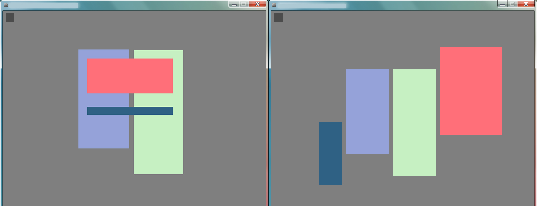
in Palette Explorer, designers can create interactive color palettes with interactive swatches, enabling them to explore spatial relationships and manipulate sets of swatches. The same colors are resized and recomposed, generating very different color effects
Our interviews with Designers and artists showed that they almost never manipulate individual colors. Instead, they created sets of colors and manipulated the relationships among them, but usually in an ad hoc way, combining features from multiple tools or creating their own techniques. Palette explorer was inspired by P2’s story in which she took photographs of several colored objects, playing with their position and visual weight to experiment with color composition and effects. Following this principle, Palette Explorer focuses on color relationships by allowing designers to manipulate colors in the context of other colors and observe how they interact. Designers can create swatches of different sizes and shapes, they can move, resize and adjust layers freely at any time to explore the effects of different color relationships in space. For example, in (), a designer first positions a red and dark blue rectangle on top of the green and purple squares to observe how they react on such backgrounds. She then positions the dark blue and red rectangles next to the others to observe how they interact together on a neutral grey background. To facilitate this exploration, Palette Explorer allows designers to modify a color in the context of the remaining colors by selecting it and moving the cursor along three axes: X for hue, Y for saturation and mouse wheel for brightness.
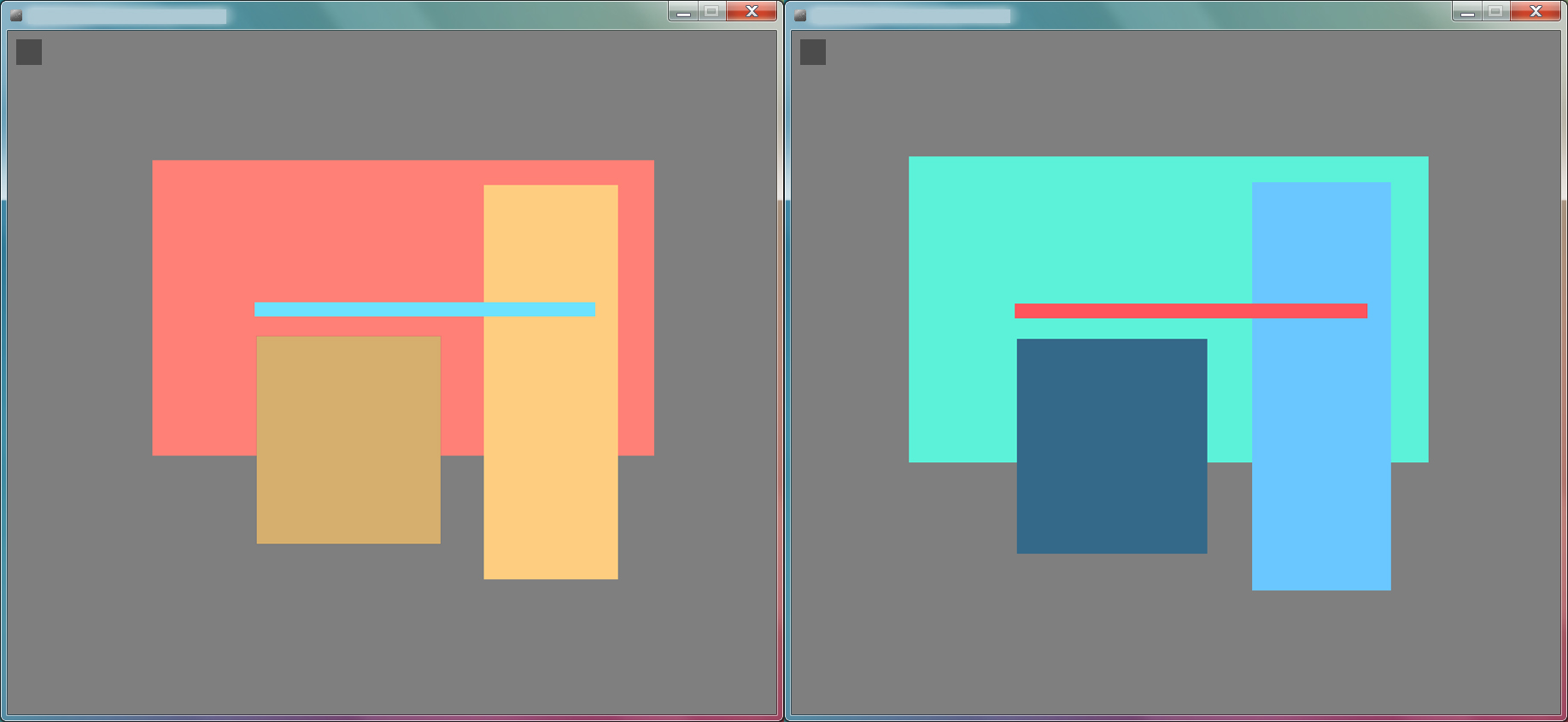
Designers can manipulate whole palette while preserving their harmony and other characteristics.
In traditional color pickers, designers are forced to choose colors by comparing them with their adjacent colors in a color space. Instead, by choosing to provide an invisible interaction, Palette Explorer focuses on the relationship between colors of the same palette. Designers can also select sets of swatches or the whole palette and modify them at the same time on any of the axes, retaining the harmony and other characteristics of the original palette. This feature was inspired by P8’s (Illustrator) story in which she modified the hue of each color by the same amount. In , the designer has shifted the red rectangle in the background to turquoise and the remaining colors have changed accordingly, creating a utterly new palette.
Color Compositor
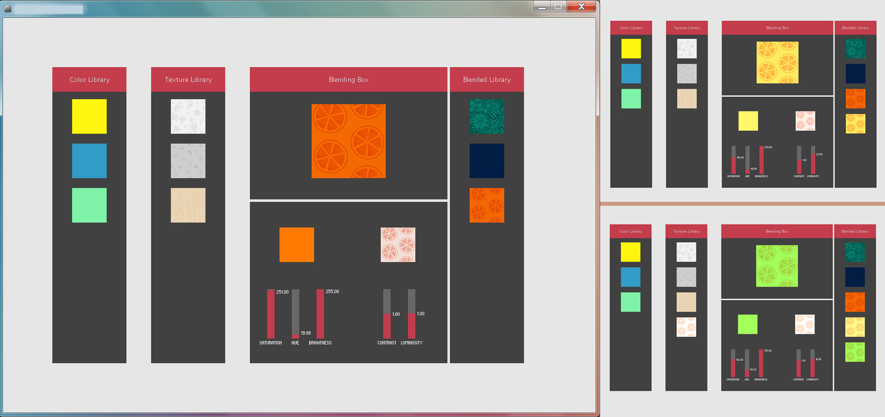
in Color Compositor, designers can combine colors and textures to create and manipulate composites.
During our interviews, we observed how designers did not treat color as a separate entity but instead manipulated them with other visual effects, including lighting and texture. They created and manipulated composites of colors and effects. However, current color tools do not let designers create, interact or decompose composites. Color Compositor lets designers combine colors and textures to create their own novel composites. They can manipulate these composite by independently manipulating either the color or the texture and directly observe in context how the composite reacts to these modifications. Designers can save composite but can also decompose the resulting textured image into its component parts. For example, in , the designer combines orange with an image containing slices of a citrus fruit. She then modifies only the color to turn the composite into lemon and lime and saves the different combination.
Color Partner
The dots grow when selected but also decrease and eventually disappear if they are not selected, revealing a history of past color choices.
The designers we interviewed reuse previous colors from earlier projects and develop their own ad hoc techniques for capturing both interesting color but also keeping their intermediary exploration steps. In current color pickers, designers are forced to select colors from the nearly infinite space of all given colors. Instead, designers tended to sample particular colors from existing sources and to tweak them. This utterly different way of envisioning color exploration is not yet supported by existing color tools. Color Partner proposes a novel way of exploring color, a partnership between a system that proposes colors and a designer who guides it. When opened for the first time, Color Partner proposes a set of 6 color dots from which designers can start their exploration. Clicking on a dot triggers the semi-random generation of new color dots (one per second) for as long as the designer does not release the cursor (). Designers can guide which colors are generated through proximity to previously generated colors: keeping the cursor close to the selected dot produces very similar colors to the original one whereas moving the cursor away results in more and more diverse colors. In current color pickers, saving a color requires an explicit action from designers, who are forced to extract the color from its original context and intermediary steps. In Color Partner, color dots become smaller over time and eventually disappear if they were not used. Clicking on a dot to select it enlarges the size of the dot. The more a color dot gets selected, the bigger it becomes. These two simple rules provides an implicit memory mechanism that reveals past color choices and allows designers to return to intermediate color choices and use them to create new colors. Because they can always visualize they past color explorations, Color Partner helps designers reflect on their past color choices. In , the designer opens ColorPartner for the first time and clicks on the red dot to start generating colors. As time goes on, the palettes follows the designer color choices and reveal how they evolved over time.
Color Revealer
in Color Revealer, Writers’ hesitations and corrections are revealed through changes in hue and intensity.
Unlike the other activities in the Color Portraits design space, process does not treat color as an end in itself, but rather as a means to an end. Color changes reveal intermediate steps or the overall state of an activity as it occurs over time. We chose to directly reify this idea observed in several participants' stories and apply it in the context of text editing. ColorRevealer captures traces of the writer’s writing process by using color as an indicator of pauses, corrections and the passing time. As they type, behind each character appears a subtle colored layer. Deleting a character also applies a new layer, so Color Revealer introduces stronger colors behind the corrected words. Contrary to digital text that can be modified seamlessly, layers only accumulate over time. As time flows, the color of the layers beeing applied also change from pale green to blue and eventually red, allowing the writer to visualize how much time went by between two text areas. In , the writer first types with very little hesitation, so the layers behind the text appear as pale green. Then, additional layers appear as the user deletes or rewrites words. here the writer has repeatedly deleted and corrected a number of words in his introduction, which introduces stronger colors behind the corrected words. Color Revealer allows users to control the mapping of colors to their writing activities and provides an adjustable timeline that lets them scroll back through earlier stages in the writing process.
These four color tools embody different aspects of the Color Portraits design space. We treat them as probes to help us evaluate how color manipulation activities are represented in the design space and, to understand color manipulation more generally.
Interacting with Probes
We selected 8 participants from the two earlier studies to explore the probes in a structured observation. Structured observation (Garcia et al., 2012) is a type of quasi-experiment (Cook et Campbell, 1979) designed to enhance external validity by combining controlled conditions that facilitate comparisons within and across realistic tasks. We wanted to understand how they interpreted each tool in general, and also in the context of their current work.
Participants: We interviewed eight participants, half from each of the two previous color interviews studies (5 men, 3 women, aged 23-40). Professions included: product designer, illustrator, painter, service designer, researcher in data visualization, information theorist, virtual reality engineer and programmer.
Procedure: Each session lasted approximately one hour in the participant’s studio or office. We presented each tool, in turn, and gave the participant five minutes to experiment and perform short tasks with each tool, as follows: Palette Explorer: Create a book’s cover page. Color Compositor: Design a textured color for the background of the book cover. Color Partner: Create your favorite red and favorite blue. Color Revealer: Write a summary of a recent project. After each task, we asked participants to think of recent color projects in which they manipulated color and show us how the tool might, or might not, be useful for those tasks. We counter-balanced the order of tools across participants.
Data collection: We collected audio recordings of each session and screen captures of their interactions with each color tool. We also took notes based on participants’ answers to a common set of interview questions.
Results
Participants suggested different ways of using the color probes both conceptually, by explaining what the tool does, and practically, explaining how they would prove useful in their current projects.
Palette Explorer
Most participants (7/8) viewed Palette Explorer as a space for sketching and experimenting with color relationships. P5 (Product designer) described Palette Explorer as “a tool for projection and sketching that allows rapid visualization of scale relationships among colors”. She wanted to create a color chart to establish a digital identity for a client and was particularly interested in using it as is to see how the colors look together in different contexts, without having to use text samples and images to do so. For example, she wanted to establish a set of colors and then experiment how they would look with different versions of her client’s logo.
Color Compositor
Participants felt that Color Compositor greatly simplified the task for creating and manipulating color composites and half of the participants explained how it would affect their current projects. P3 (Service designer) was happy to avoid using Photoshop layers when creating and experimenting with a textured color. P5 (Product designer) wanted to use Color Compositor’s texture library to group similar components for future use. Although Color Compositor focused on texture, participants had a number of suggestions for combining color with other elements, especially images. They also offered interesting ideas for how to extend it. For example, three participants suggested reproducing these patterns on very large surfaces, to establish color and texture relationships when creating wallpaper.
Color Partner
Participants viewed Color Partner as a space for exploring color. P1 (Painter) appreciated how suggesting colors helped him make color-related decisions. However, he “would not share the result of generation. The colors I get are more personal". Color Partner also allowed participants to create interesting clusters of colors and to preserve those they would later use to create a new color exploration chain. P16 (Information theorist) felt that the tool would help her get "little by little to the color I want”.
Color Revealer
Color Revealer encouraged participants to reflect on how they type and write. P16 (Information theorist) compared Color Revealer to an eraser: “When I erase an area several times, I end up seeing the trace on paper”. She also noticed that she always deleted the whole word when she makes a typo, which she had not realized before. P5 (Product Designer) explained that Color Revealer “projects your thinking as you write. It helps you feel the intensity of your writing and gives it meaning through making this process visible.” All but one participant described how they would use Color Revealer in their current projects. P1 (painter) wanted to use it when collaborating on a course he is teaching. Since his colleague is a fast typist, he wanted her to use the tool to take notes during class. He would like to then read the notes and use the change of color to help him understand when she hesitated, just as in a face-to-face conversation.
Summary
In this chapter, I designed four color tools that support the currently unsupported color activities uncovered during our interviews: Palette Explorer manipulates color relationships within a shared context; Color Compositor composes and decomposes diverse colors and textures; Color Partner generates and captures chains of color, guided by designers; and Color Revealer reveals underlying processes by subtly changing hue and color intensity. These four probes demonstrate the possibility to use designers’ practices stories into the form of StoryPortraits as insights for creating novel color tools. We then explored the probes with 8 designers and observed how both designers and scientists were able to interpret the probes in the context of their own work. The color tools demonstrate the generative power of the Color Portraits Design Space.
StickyLines
In collaboration with Marianela Ciolfi Felice.
In chapter 5, we observed how both designers and regular users of graphical authoring tools struggled to align and distribute content in their projects. We showed that current alignment and distribution commands do not support designers' needs for persistent alignment and distribution mechanisms that they could then adapt for specific cases. We also showed how the current 6 commands do not match the variety of possible alignments and distributions that designers perform. In this chapter, I present and explore the potential of StickyLines, guidelines that represent alignment and distribution as persistent objects that designers can manipulate directly. Because StickyLines are first-class objects, they have their own settings and properties, like other graphical objects. I present two different tweaking mechanisms that extend StickyLines to account for designers' need to adjust diverse elements while maintaining alignment. We then tested StickyLines in two complementary setting. We first observed how they perform against traditional command and we then explore their most advanced functionalities with designers in a structured observation.
Context
We can divide existing alignment techniques around four different strategies: commands provide immediate imperative alignment; snapping infers potential alignment and guide designers; constraints allow the creation of explicit multidimensional alignments; and reification provides an interactive and persistent aligning objects.
Command-based Techniques
Almost all current commercial applications for graphical authoring, such as Adobe Illustrator and InDesign or Microsoft PowerPoint, feature menu-based commands for alignment and distribution. A recent technique, GACA (Xu et al., 2015), can align and distribute objects in 2D if they are roughly aligned, in a single operation. The system infers relationships in the selected set, without having to work with subgroups. However, command-based techniques do not make relationships persistent and their results can be hard to predict by users.
Constraint-based Techniques
Constraints encode relationships among objects in a layout. Sketchpad (Sutherland, 1963) was the first interactive tool to integrate constraints and direct manipulation. In most constraint-based approaches, e.g., Juno (Nelson, 1985), and Dunnart (Dwyer et al., 2008), users declare constraints and the system computes a layout that satisfies them. Some systems focus instead on constraint inference, such as Chimera (Kurlander et Feiner, 1993), Pegasus (Igarashi et al., 1997) and Penguins (Chok et Marriott, 1998). For example, DesignScape (O’Donovan et al., 2015) automates “the tedious parts of design”, including alignment, by making layout suggestions based on user-defined and system-inferred constraints. In current design software, designers can hold caption key to constraint an axis while moving graphical objects. Other systems, such as Xu et al.’s beautifier (Xu et al., 2014) allow users to interact with the inferred constraints. Geometric constraints can be difficult to solve and the results can be difficult to anticipate. In the context of diagram editing, Wybrow et al. (Wybrow et al., 2008) compared one-way and multi-way constraints. One-way constraints are easy to understand but are limited. Multi-way constraints overcome these limitations, but make the system much more complex. The authors found that alignment and distribution would be more usable if they provided “truly persistent relationships”.
Snapping Techniques
As early as 1964, Sketchpad (Sutherland, 1963) featured gravity fields to snap the cursor to nearby objects. Snap-dragging (Bier and Stone, 1986), based on a ruler and compass metaphor, creates transient ‘alignment objects’ (points, circles and lines) inferred from the elements in the document. Since then, snap-dragging has been extended and new techniques have been introduced, such as keeping objects aligned across slides (Edge and al., 2015). Briar combines snap-dragging with constraints (Gleicher, 1992). Constraints are specified through augmented snapping, which takes the snapping location as an extra parameter to infer constraints. When snapping an object, the system reveals the new possible relationships to the user, who must choose among or reject them. However, the user cannot manipulate the constraints directly, only the objects, and distribution is not supported. GLIDE (Ryall et al., 1997) explores a similar approach, representing constraints with ‘indicator’ objects. In HyperSnapping (Masui, 2001), snapping objects creates constraints represented by square ‘anchors’ at the snapping points, and the snapped objects are treated as a group. While the relationships are visible, they cannot be manipulated directly and they are not persistent: the constraints are cleared when clicking outside the group.
Reification of Alignment and Distribution
Several approaches have explicitly reified the concept of alignment into interactive objects. Raisamo’s alignment stick (Raisamo, 1999) uses a physical ruler metaphor to push objects. Lineogrammer (Zeleznik et al., 2008) extends the alignment stick with a ‘grabby’ ruler that collects objects when passing over them and supports distribution. However, while the stick reifies the action of aligning, the relationships themselves are neither directly manipulable nor persistent. In Rock & Rails (Wigdor et al., 2011), specific hand gestures represent constraints and help users align objects on a multitouch tabletop. In Object-oriented drawing (Xia et al., 2016), users can create persistent alignments by linking the positions of graphical objects via attribute objects.
StickyLines
We built our design on top of the magnetic guidelines idea (Beaudouin-Lafon et Mackay, 2000) which were introduced in the context of a Colored Petri Net design tool and lated adapted for table-top surface (Frisch et al., 2011). Magnetic guidelines reify alignments into persistent graphical objects that users can directly manipulate: objects can be attached and detached from a guideline, and moving a guideline moves the objects attached to it. However, the original capabilities were limited to persistent alignment, they did not include distribution, nor taking into account the need for control and generalization. Directly building on top of our analysis of designers’ practices, we created StickyLines, interactive guidelines that maintain persistent, controllable, and generalizable alignment and distribution.
Guidelines for Persistence
StickyLines are guidelines that keep aligned and distributed graphical objects that are attached to it.
We propose to reify alignment and distribution commands into a new category of objects called StickyLines. These guidelines embed an explicit behavior: keeping aligned, and sometimes distributed, the objects being attached to it (). Designers can create guidelines and attach objects to it. Dragging an object close to a guideline highlights the snap point (center or side) that will be used for alignment when it is dropped. Dropping the object attaches it to the guideline at that snap point. Dragging an object away from its guideline detaches it. Guidelines can be manipulated like regular objects: they can be resized, moved, and deleted. Moving a guideline also moves the objects attached to it, keeping the alignment while simultaneously enabling designers to continue on moving objects. Designers can also activate the distribution behavior of individual guidelines. Because guidelines are interactive, resizing the guidelines automatically recalculates and reapplies the distribution.
Guidelines for Control
With StickyLines, I was especially interested in exploring how structuring tools such as alignment guidelines can also support designers needs for fined grained and always evolving tweaks. Study participants wanted to tweak the placement of objects attached to guidelines in order to, e.g., correct an alignment when the perceived visual center of an object is not its geometric center or to adjust the result of a distribution without modifying the position of other objects on the guideline. We created two different mechanisms to support manual tweaks while preserving the overall alignment and distribution structure
Tweaking Offsets
Moving an element with arrow keys to center it visually creates a reified offset (the purple line) that we call a tweak.
We first created what we call tweaks. Using the arrow keys to move an object repositions it, but the object remains logically attached to the guideline (). This offset, called a tweak, is recorded and displayed. Tweaks are persistent: moving the guideline preserves the offset. Tweaks belong to the objects so that if an object is detached from a guideline, its tweak will be reused when attaching the object to another guideline. Tweaks reify the action of adjusting an object’s position, which is often needed when fine-tuning a layout. They are first-class objects that can be edited, copied onto other objects, and deleted. By creating such a tweak, we preserve the capability to apply behaviors such as alignment and distribution while simultaneously allowing for explicit modifications of the rules.
Tweaking Bounding Boxes
Resizing the bounding box affects the distribution of elements on the guideline
Designers can also modify the bounding box of an object in order to, e.g., finely control its placement on a guideline when it is attached by one of its sides (). Hovering the cursor over an object displays its bounding box. The geometric bounding box is the default, but designers can resize and move it through direct manipulation, without affecting the object itself. Moving and resizing an object moves and resizes its bounding box. Bounding boxes can be copied onto other objects, replacing their current one. In the same way as tweaking the reference point reifies adjustments to the object’s position, tweaking the bounding box reifies adjustments to its extent. Because guidelines always update alignment and distribution, designers can manipulate bounding box and immediately observe the resulting effect.
Guidelines for Generality
The parallel guidelines keeps objects aligned at any angle
Study Participants also wanted more diverse types of alignments and distribution, beyond the ubiquitous horizontal and vertical ones. With StickyLines, designers can create five different types of guidelines: horizontal, vertical, circular, parallel and ghost guidelines. For horizontal, vertical, circular and parallel guidelines, designers simply click in the canvas and the guideline appears. A parallel guideline is a line at any angle that keeps objects parallel to each other, perpendicular to the line (). To create a ghost guideline, designers must first click an object. The guideline takes the object’s shape and the designer can adjust its offset. A guideline can be reshaped into another form and the positions of the attached objects adapt to the new form, allowing experimentations with different alignment types. Designers can also manipulate distribution by opening the distribution curve and manipulating it.
Structured Observation
We are interested in how designers interact with StickyLines when they need to create and tweak complex structures that will be reused. We want to observe how designers use and appropriate the advanced features of StickyLines that give them more control over alignment and distribution, and capture their strategies. We conducted a structured observation of expert use with six designers.
Participants: We recruited six designers (ages 22-30; all women) with two to seven years of experience. All participants are regular users of Adobe Illustrator and Adobe Photoshop, and some of Adobe InDesign (5/6), Sketch (3/6), Corel Draw (1/6), and Inkscape (1/6).
Apparatus: The version of StickyLines used in this study includes most of the features described earlier: horizontal, vertical and circular guidelienes, distribution (of space or reference points), re-shaping, tweaking reference points and bounding boxes, hiding/showing guidelines and tweaks. In order to keep the training time to around ten minutes and to avoid overwhelming participants with a number of features that are not at the core of the tool, we did not include parallel and ghost guidelines, and disabled feedforward, distribution curves, and automatic guideline removal.
Landscape version of the poster to reproduce
Procedure Each participant receives ten minutes of training with StickyLines, followed by two minutes of free practice. The study includes three tasks, and uses a think-aloud protocol. At the beginning of the first task, participants are given two printed posters and asked to reproduce them using the predefined objects displayed on the screen (). They are told that each task builds upon the results of the previous one – including guidelines, tweaks and bounding boxes – unless they prefer to reset the layout. The posters include ambiguous alignment and distribution relationships, as well as “irregular” shapes, to encourage diversity in the solutions. In task one, participants reproduce the first poster. In task two, they can reuse the result of task one to generate the second poster, which is a similar layout, but with a different page orientation. Half of the users convert from portrait to landscape, the other half does the opposite. The first two tasks are not timed. In task three, participants have ten minutes to continue the series by designing two more posters that they would present to a client. The three tasks take approximately 45 min, after which participants complete a post-hoc questionnaire.
Data Collection We recorded the screen and the audio and took notes. We logged the interaction of the participants with the tool and we collected the answers to the post-questionnaire.
Results and Discussion
All participants relied extensively on StickyLines to construct their layout in task one and to adapt it later for tasks two and three. In task one, most participants (5/6) used the same strategy: to “first create a guideline for the main structure” (P3) and later create secondary guidelines. For example P1 created a vertical “base mark”, rougly positioned all the objects, and only then added the other guidelines. By contrast, P2 first created all the guidelines she thought she would need before manipulating any object. She then “collected” objects by releasing a guideline close to them, in sequence.
In task two, all participants reused existing guidelines. Participants also used StickyLines to verify alignment: P4 created a vertical guideline close to two objects that were already positioned in horizontal alignments, to check whether or not they were also aligned vertically.
Strategies using Tweaks
As expected, most participants (5/6) tweaked object positions: all tweaked alignment and one (P5) also tweaked distribution. P1 based her strategy almost exclusively on tweaking reference points, barely using bounding boxes. Not surprisingly, participants created more tweaks in task one than in task two, indicating that they reused their previous tweaks. When converting the poster, P5 appreciated the persistence of tweaks: “It helps that the tweaks are still there”. Among the participants who created tweaks, some (3/5) edited them more often in task two than in task one. Only one participant copied tweaks (P2), in task three, which was more open-ended and exploratory. However, she pasted these two tweaks 16 times, a strong example of reuse. The low use of copying is probably due to the fact that the layouts required mirroring a tweak after pasting it, which is not currently supported by StickyLines, so participants decided to create new tweaks instead. More than half (4/6) expressed the need for a “mirroring” feature.
Strategies using Bounding Boxes
All participants also tweaked bounding boxes. P3 relied on this feature extensively and did not tweak reference points. In task two, participants reused tweaked bounding boxes more often than tweaked reference points: A majority of participants (4/6) copied bounding boxes and pasted them onto several objects, most during task one (only one in task two). Participants were not only interested in modifying the perceived borders of objects, but also their perceived centers. P4 modified the bounding box to position its center at the visual center of the object. She then used this new point to attach the object to a guideline.
Tweaks as Grouping Mechanisms
Interestingly, we observed that most participants (5/6) perceived guidelines not only as an alignment and distribution feature, but also as “groups” or “structures”. They appropriated tweaks to attach objects to a guideline even if they were far away from it, in order to semantically group objects together. (We refer to this as “super tweaking”.) For example, P3 explicitly used a guideline as a grouping mechanism rather than as an alignment feature. She stated: “I think of these four objects as a group but this one is not on the guideline”, so she attached the object temporarily to be able to move the whole group by dragging the guideline, and also to remember that they belonged together, since she was planning to come back later to that part of the layout.
Most participants (5/6) resized guidelines to avoid overlapping other objects and manipulated each one as a small, compact group that they could easily move around. In task 3, half the participants (3/6) moved the guidelines out of the frame to build the new poster based on their current structures. Half the participants (3/6) hid the guidelines at the end of each task, to compare their work with the printout.
StickyLines as First-class Objects
Participants used guidelines extensively during the three tasks. For the second alternative poster in task three, all participants manipulated the position and type of the guidelines more than the objects themselves, supporting the idea that participants perceive StickyLines as first-class objects. In fact, participants asked for even greater levels of interaction with StickyLines. For example, one participant wanted to “capture the distance between two guidelines in order to reuse it” (P1), and two participants said that they would like to align and distribute guidelines as if they were regular objects (P1, P4). P4 wanted to cut a line in two parts, since her “two groups are on the same line” (P4). Half the participants (3/6) also wanted to be able to merge guidelines. Some participants wanted to know if an object is at the center of a guideline (2/6), to move guidelines precisely with the arrow keys (2/6), to move multiple guidelines at once (5/6), to copy a guideline to reuse its length (1/6), to snap the center of a bounding box to the center of the object (1/6), to reveal all the bounding boxes in the layout (1/6), and to draw the guidelines themselves to define their initial length (1/6). These suggestions demonstrate the power of using guidelines to reify layout relationships, and merit future exploration.
In summary, this structured observation demonstrates that trained designers can quickly learn to use StickyLines and adapt their work practices to take advantage of guidelines and tweaking. It supports the findings from study one about the value of supporting persistence, control and generality to extend the power of tools for graphical layout. Study three also reveals examples of spontaneous appropriation, such as “super tweaking” an object’s position in order to attach it to a distant guideline.
Summary
In this chapter, I introduced StickyLines, a tool that reifies both alignment and distribution into an interactive and persistent guideline. We designed StickyLines to support a fine-grained control over alignment and distribution through the creation of tweaking objects and the use of manipulable bounding boxes. Moreover, extended the repertoire of possible alignments and distribution by allowing the creation of ghost guidelines around existing shapes. We conducted a structured observation study that demonstrates how professional designers can quickly adapt to and appropriate StickyLinessay more. StickyLines relies on the reification of alignments and adjustments, turning them into first-class objects that users not only learn to use efficiently, but also want to push further.
Layout tools
in collaboration with Philip Tchernavskij on StyleBlocks.
In our interviews with 12 professional graphic designers presented in chapter 5, we revealed that they all use sophisticated ways to structure layout. We call these structures graphical substrates and show that they consist of mapping a variety of inputs, including conceptual, content and contextual inputs, onto outputs, most notably spatial and temporal properties. However, current layout tools provide very limited support for graphical substrates and graphic designers currently either manage them by hand or rely on code to explicitly represent them in their designs.
In this chapter, I explore the generative power of graphical substrates. The goal is not to support all possible substrates but rather to demonstrate how Graphical Substrates can be a generative framework for the creation of graphic design tools. In the previous chapter, we focused on spatial output through the creation of alignment and distribution guidelines. In this chapter, I focus on the types of substrates that graphic designers reified using code. These reified Graphical Substrates extended traditional graphic design by allowing an automatic application of substrate, more diverse input types and collaboration with the reader. By reifying these graphical substrates into probe, my goal is to observe how different graphic designers react to them and how they might adopt and adapt such possibilities into their own work.
Context
Creating and structuring layout is a skilled activity and researchers created a number of dedicated tools that either guide and direct novices or assist expert graphic designers.
Supporting layout creation by novices
With the advent of desktop computing, creating layout is no longer the exclusive domain of experts, but is performed by novices as well. A common strategy for helping novices is to offer suggestions as they create layouts. For example, Design-Scape (O'Donovan2015) makes suggestions during both the brainstorming and refinement phases of layout creation, R-ADoMC (Jahanian, 2013) makes recommendations for magazine covers and Sketchplorer (Todi, 2016) provides real-time optimization of layout sketching. These recommendations take multiple factors into account, including color themes and visual balance. For more focused tasks, Edge and colleagues (Edge et al., 2015) propose automatic alignment and systematic restyling of related objects to maintain consistency across slides. Piccoli et al. (Piccoli, 2011) propose an interactive system based on principles from physics to guide content organization on the page. These systems support novices’ needs by hiding complexity from the user and focusing directly on an efficient final layout, but are less helpful for expert graphic designers who go beyond established principles to define their own rules and constraints. An alternative strategy is to build systems that automatically design and generate layouts. Several models have been proposed, such as automated responsive design (Colby, 1992), semi-automated document designs inspired by magazine layouts that adapt to device screen sizes and content selections (Kuhna, 2012) (Schrier, 2008), and adaptive grid-based document layouts (Jacobs, 2003) that automatically choose and fill in existing templates. Sukale et al. (Sukale, 2014) also automate adaptation of layouts based on users’ proximity to the screen. Yet, as Hurst et al. (Hurst, 2009) point out, “It is still unrealistic to expect automatic layout systems to rival the creativity of a good graphic designer.”
Enhancing graphic designers’ practices
Instead of replacing graphic designers, some systems provide tools that support specific needs, from solving localized “micro-problems”, to facilitating workflow and providing programming support.
At the local level, automatic tools handle many small, but crucial design challenges. For example, Moulder and Marriott (Moulder and Marriott, 2012) offer a machine learning approach to solve line-breaking issues. Expert designers can also benefit from interaction techniques that support specific and recurrent tasks, especially alignment. The GACA (Xu et al., 2015) group-aware alignment technique helps professionals deal with complex alignments. NEAT (Frisch et al., 2011a) and Grids-and-Guides (Frisch et al., 2011b) provide sets of multi-touch gestures for creating guides, as well as aligning and distributing elements on interactive surfaces. Other tools address the designer’s need to control their overall workflow. Adobe Comp 1 lets designers quickly draw initial layout ideas before moving to expert software. Gem-ni (Zaman, 2015) and Parallel Paths (Terry et al., 2004) support parallel editing and active comparison of multiple divergent visual elements. Adaptive Ideas (Lee et al., 2010) helps designers create website layouts by sampling example elements. DÉCOR (Sinha and Karim, 2015) supports web design workflow by providing recommendations for adapting layouts to accommodate a variety of screen sizes; and Adobe Edge Reflow uses media query breakpoints to help designers envision their layouts on various devices. Both local and workflow tools can significantly enhance the work practices of expert graphic designers, but only for well-defined tasks. However, graphic design, like many other creative activities, is undergoing a paradigm shift toward more programmatic approaches. For example, Processing (Reas and Fry, 2007) is a language and interactive development environment (IDE) designed to make programming more accessible for visual creators. Personal Information Management (PIM) (Maleki et al., 2014) reduces the scripting learning curve for designers. Gliimpse (Dragicevic et al., 2011) uses animation to visualize mappings between source markup and final result. These approaches empower graphic designers, but require them to think in programming rather than visual terms, which is particularly challenging for designers with no software development training.
Probing Graphical Substrates
In our study with graphic designers, we observed multiple designers explicitly reify graphical substrates into code to support (1) collaboration with the reader, (2) more diverse input, and (3) automatic application of substrates, none of which are supported by traditional tools. Inspired by these stories, we created two probes that reify graphical substrates into novel layout creation tools. The goal is not to support all possible substrates, but rather to open new opportunities for graphic designers and inspire new directions for designing tools that generate innovative layouts. Contextify reifies aspects of the reader’s context, modifying the layout according the reader’s preferences and the current reading environment (1). Linkify reifies spatial relationships, providing new inputs for modifying the layout according to dynamic properties of the content (2). Both are implemented as web applications to facilitate deployment and use by graphic designers directly in the browser, where the final articles will be read.
Contextify - Richer inputs for structuring layout
Although Responsive Design lets designers adapt layouts to the width of the reader’s display, designers must write code to accommodate other sources of input. I was inspired by P2’s book layout, which lets readers choose the page dimension, thus taking an active role in the creation of the layout.
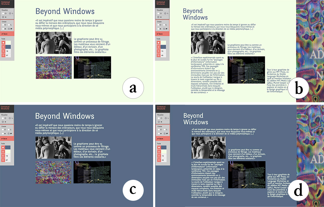
Contextify accepts inputs for tailoring layout under four reading conditions: day (a-b) vs. night (c-d); preview (a-c) vs. full detail (b-d)
Contextify provides a visual interface for defining sub-layouts based on inputs from the readers’ intentions and context. The system combines sub-layouts according to these inputs and generates the layout displayed to the reader. I implemented a contextual condition, night or day, and a condition specified by the reader when entering the page or web site: preview or detailed reading. Contextify redefines the relationship between the reader and the designer: combining these conditions results in a layout that can be tailored to four reading contexts.
I illustrate this probe with a simple scenario. Ron is designing an article on Muriel Cooper to be published in an online magazine. For the preview condition, Ron wants to show an overview of the article, so he emphasizes the title size to attract attention and includes a selection of texts and images (). He saves this first sub-layout. To guide the reader through the content in the detailed reading condition, he creates a diagonal flow (Figure 64b) and saves the second sub-layout. Ron decides to play with colors for both the night and day conditions and chooses a set of two colors (Figure 64c-d). The reader can now access the same article from four different perspectives.
Linkify - Relationships among content parameters
A major challenge is how to design a layout without knowing the content beforehand. Instead of creating a fixed layout, some designers base the layout on dynamic relationships among content properties.
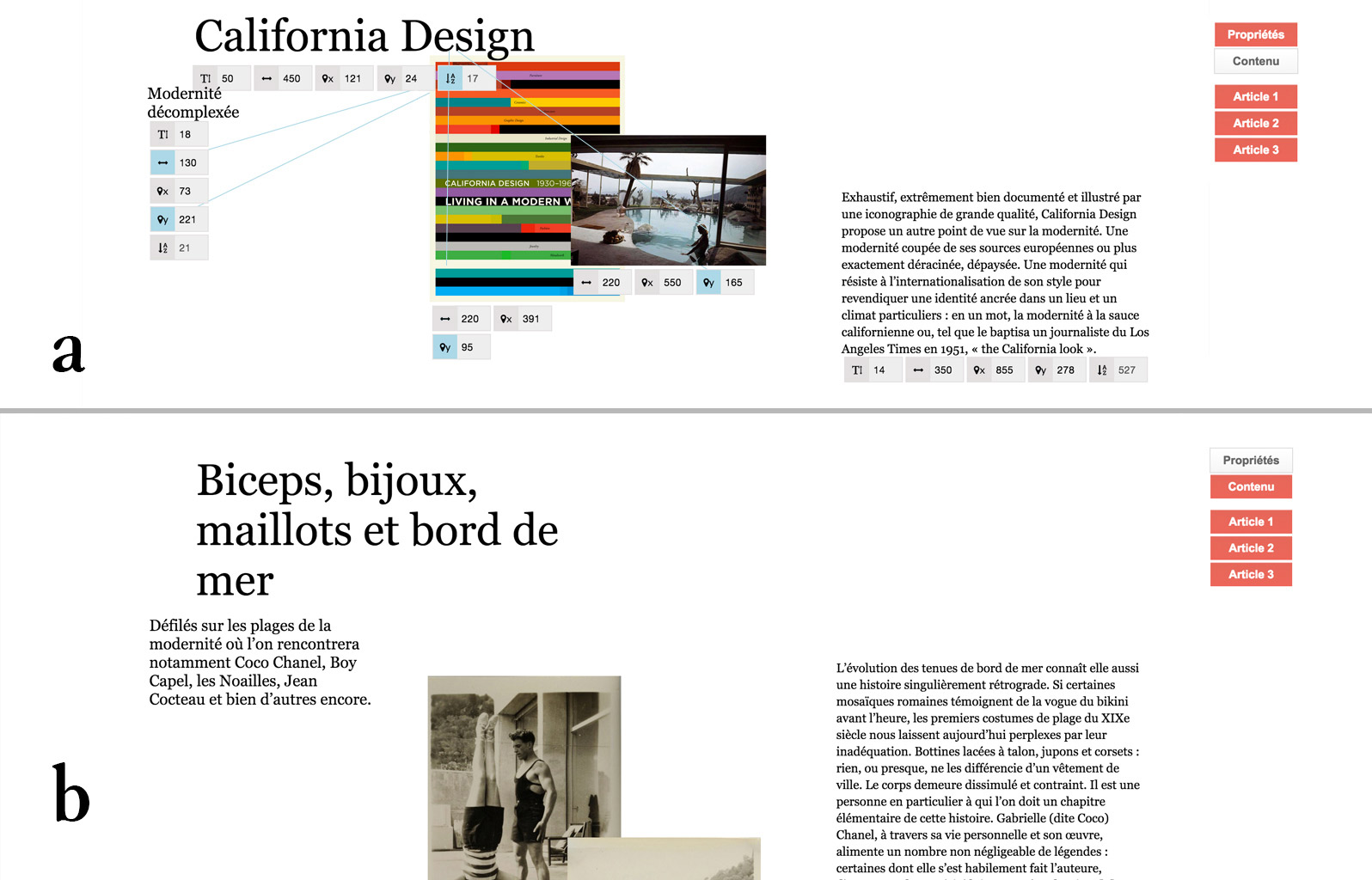
Linkify lets designers link content properties to create generative layouts. Here, the length of titles affects the position of images and subtitles
I was especially inspired by P3’s design for generating images based on title length. His layout evolves continuously according to the characteristics of each new content element. Linkify lets designers visually connect content properties to establish relationships that are then reapplied when the content changes. The user selects two content elements and the system captures the visual ratios among their properties. Once the relationship is created, it is automatically applied when the content elements change, just as a spreadsheet recomputes formulas when a cell changes. I implemented five properties: the width of an element, its horizontal and vertical positions, its font size and number of characters (for text elements).
I illustrate this probe with a simple scenario. Alice is designing a blog layout and already has the first three articles. She decides to set the title position but to position the other elements according to the title length of each blog post. She first creates an interesting composition and then draws a link between the title length and the vertical positions of the subtitle and other images (). Longer titles push the content downwards. Linkify automatically calculates this ratio based on the linked parameters. Alice checks that the relationships produce interesting results for longer titles (Figure 65b).
Exploring the Probes
Participants: We interviewed 12 graphic designers (6 men, 6 women), age 23-57, with 4-27 years of experience (mean=11), who work in various environments (freelance, studio, agency). 11 create layouts for print and digital media, one for digital media only. Seven had at at least some experience with a programming language and three already participated in Study 1.
Procedure: Each session lasted approximately one hour and a half. We gave a scripted presentation of the functions of each tool and asked the participant to perform a short task based on the above scenarios, after which they could experiment with each tool for 10-15 minutes. The Linkify task consisted of using three sample articles to create a layout for a blog that varied according to the title length. The Contextify task consisted of creating a layout for an article in an online design magazine that adapts to daytime vs. nighttime, and to the reader’s choice of whether to read a preview or the full article. We used a think-aloud protocol and counterbalanced the order of tools across participants. After each task, we asked participants to describe to a colleague what they think the purpose of the tool was and how to use it. We asked if they had a recent layout project for which they thought the tool could have been useful and to describe in detail how they would have used it. We also asked them to suggest improvements to the tool.
Data Collection: We collected audio recordings of each session and screen captures of their interactions with each tool. We also took notes based on participants’ answers to our questions.
Results
Interacting with Contextify

Two examples of layout created by participants with Contextify
Nine participants described concrete examples of how they wanted to use Contextify (). For example, P20 thought that the tool gave designers a new form of editorial power. She wanted to use the tool to design school content on tablets. Providing multiple layouts would allow students to adapt the content to their learning method: “Some need more images, some need more words, others need to see all the content at a glance. It would also be very interesting to add some types of content only at home, such as sound for example in the case of an English workbook”. Similarly, P16 explained that for her project on Danish police data, Contextify “could adapt the analysis of the data to the different jobs in the police, because they have very different needs. You could also select a global view of the information or a very precise one”. P18 is working on an editorial web project with both detailed and summary views of the same content. He would like to use Contextify to simplify the creation of these views by interacting with the tool visually rather than programming everything. Finally, P19 wants to use Contextify as a teaching tool for students to “understand and explore the challenges of adaptability beyond responsive design”. He wants the students to “design according to other factors and not only the viewport”.
Interacting with Linkify

Two examples of layouts created by participants with Linkify
Eleven participants described concrete examples of how they wanted to use Linkify (). For example, P24, a graphic designer working in close relationship with a developer, wanted to use the tool as an “interface between designers and developers”. Instead of waiting for her colleague to implement the layouts in order to see how they render on each page, she could try her substrate directly, with multiple content examples, and make adjustments before handing it off to the developer. P22 wanted to link content parameters to create the layout of an archive. She would use the “organic nature of the tool” to generate a layout that prompts new encounters and relationships among images because: “It is not very interesting to have traditional linear layout for archives”. P13 was curating a webpage on which, every week, he published four animated images with a text that analyzes them. He would like to use Linkify “to create a completely different layout without having to redesign everything each time, because by modifying the last page, all the others are going to evolve.” He thought this would add a sense of “temporal evolution” and would offer a new perspective on his old content every week.
Extending Graphical Substrates
Participants quickly understood the power of reifying graphical substrates in tools such as Contextify and Linkify. They also gave feedback and suggested improvements, including new inputs they would like to use and new ways to turn substrates into fully interactive objects. We categorized the suggestions in two classes: generalization and reification.
Generalization - Extending inputs
Contextify supported only two sets of inputs that designers could experiment with. Ten participants suggested other inputs that would support and extend the dynamic nature of their projects. Some participants wanted to control environmental and contextual parameters in order to adapt the reading experience to the current context, such as the reader’s current location (P20); current weather; ambient sound level (P19); or even a continuous time parameter to facilitate fluid changes in the layout (P13, P21). Other participants proposed letting readers specify their needs, thus creating a line of communication between the reader and the graphic designer. Suggestions included: age, handicap (P16), memory type (P20) and reading urgency (P17). Participants also wanted to create layouts according to different types of readers including author or client (P18, P23) or even job types (P16, P15). Linkify was limited to five content properties to define relationships. Eight participants suggested additional properties such as opacity (P19) or white space between elements (P15, P17, P23). They also wanted to access non-content properties, such as viewport (P18), margins and visual reference points (P17).
Graphical Substrates as interactive objects
Overall, participants wanted more ways to interact with the substrates they were creating. First, participants wanted the substrates to become persistent, so that they could easily reuse them across projects. P17 wanted to use Linkify across several projects: “To remember the common parameters I usually use in all my layouts. The system could directly reuse these parameters at the beginning of a new project”. He was currently working on a knowledge management system and wanted the system to “directly understand some of my links and patterns and suggest new possibilities based on them”. Second, participants wanted more control over the links provided by Linkify. For example, they wanted to manipulate the ratios, e.g. to invert them or specify them as absolute or relative values (P19). They also wanted to set the values (P14) and define the bounds (P16, P13) of some parameters.
Linkify and Contextify demonstrate that we can reify the concept of graphical substrates into tools that address previously unmet needs of professional graphic designers. These tools should support a wide variety of inputs and outputs and be flexible to let designers break rules.
StyleBlocks
To further explore the power of graphical substrates for web layout, we created a prototype, StyleBlocks, that combines and extends Linkify and Contextify. The goal is to rethink CSS stylesheets as interactive graphical substrates. CSS (Cascading Style Sheets) is a declarative language to specify web content layout. CSS supports a large set of properties but is a very static language. Designers have to use Javascript to implement any non-trivial dynamic behavior. Preprocessors such as SASS support higher-level constructs, including variables and expressions, but still generate static style sheets.
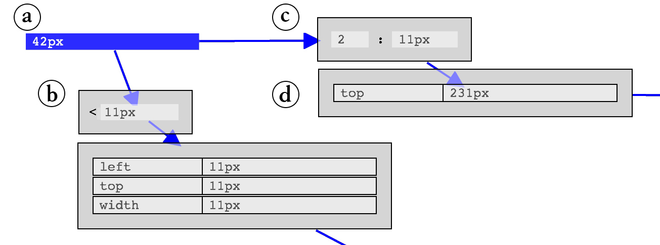
StyleBlocks supports arbitrary values (a), operators (limits (b) and ratios (c)) as well as CSS declarations (d).
StyleBlocks () reifies CSS declarations into interactive blocks that can be attached to content with pipes. In addition to CSS declarations, blocks can also represent operators, which perform functions on style declarations, e.g. limiting or scaling values. Designers create blocks from scratch or extract them directly from content by clicking on it. They connect blocks with pipes to map the output from one block to the input of another. The resulting substrates can express relationships among any numerical CSS properties (). Several substrates specifying sub-layouts can be applied in sequence or in parallel depending on their connections.
StyleBlocks builds on both Linkify and Contextify and incorporates feedback from Study 2. Participants wanted to create substrates from a wider variety of inputs in both probes. StyleBlocks supports the creation of relationships among numerical CSS properties and readers can provide their own inputs by specifying CSS values. Participants also wanted to interact with the relationships they created in Linkify. In StyleBlocks, designers can interact with relationships by adding operators such as ratios and limits.
Reifying CSS declarations is similar in spirit to Attribute Objects (Xia et al., 2016). StyleBlocks extends this idea with interactive relationships among attributes. We were also inspired by visual languages such as PureData, which are widely used by artists to prototype and create interactive digital audio pieces.
Scenario
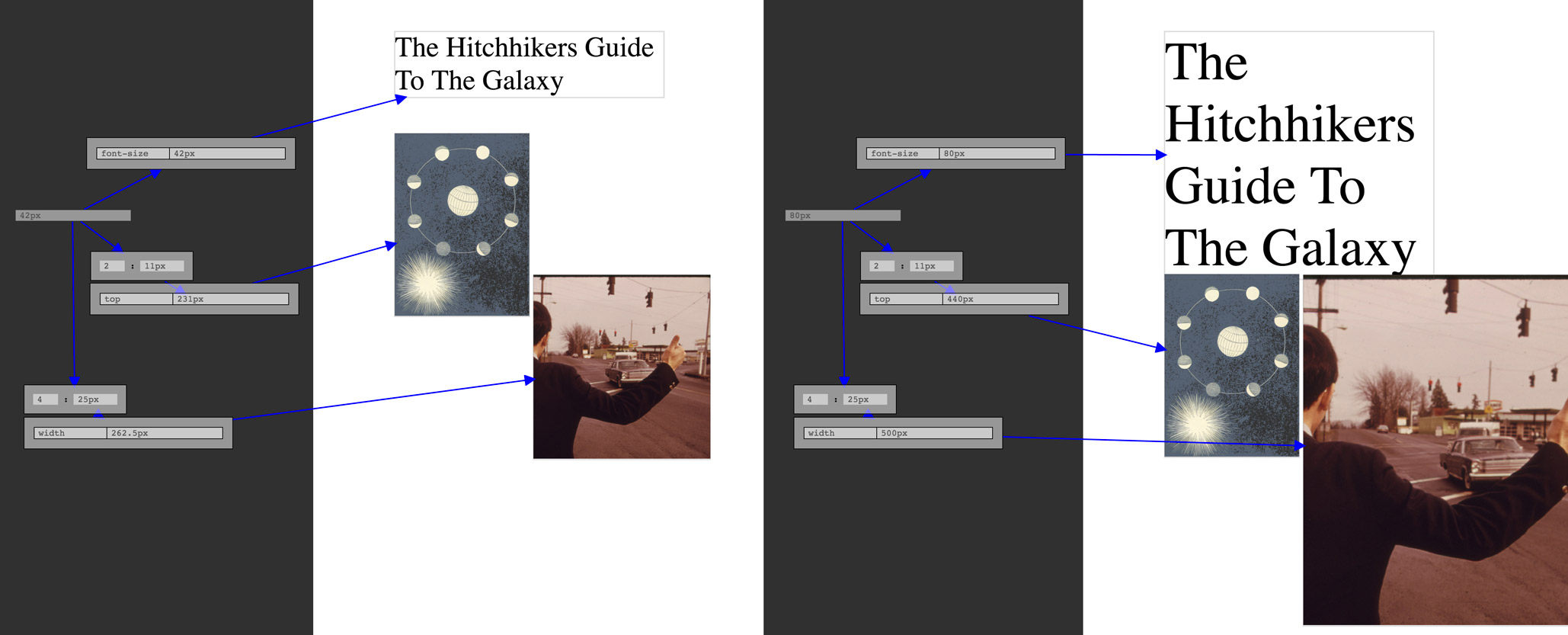
StyleBlocks: Designers create substrates that link the CSS properties of a web page. Here, a substrate generates the layout from a single value, 42 for the left page and 80 for the right one
We illustrate StyleBlocks with a simple scenario inspired by P5 from the empirical study. Alice is a graphic designer who wants to create a layout for the novel the Hitchhiker’s Guide to the Galaxy. Alice’s idea is to use the number 42 for many different aspects of the layout. She begins by creating a block with the value 42. She then draws relationships between that number and the horizontal position blocks (left) of images as well as the font size block of the title. If she decides to change the number, she can modify it and instantly see the results on the layout.
She can also interact with the substrate to modify the nature and bounds of the relationships. For example, she wants two images to respond differently to the number, so she adds a ratio block between the number and the left block of one image and sets the value of the ratio to obtain a result she likes. Now, the number controls the left position of the two images, but in different proportions. However the two images can still go beyond the borders of the page. Alice positions the image in its desired extreme position. She clicks on it to reveal its properties and extracts the left block. She then feeds that value to a limit block by drawing a pipe, and adds the limit to the relationship. Now the relationship is bound by an extreme position and the image cannot go off the page.
Discussion
StyleBlocks illustrates the generative power of fully reifying graphical substrates for graphic design tools. Below, we reflect on how StyleBlocks addresses the needs of designers identified in our empirical study, as well as the challenges of investigating this new design space.
Extending the vocabulary of inputs and outputs
Study 1 demonstrated that graphic designers create substrates based on a wide variety of inputs and outputs that are seldom supported by existing tools. We chose to reify CSS declarations as they describe layout properties. This opens up new possibilities in terms of inputs and outputs. For example, designers can now access opacity (P19), viewport (P18) and margins (P17). Designers and even readers can also provide their own inputs, by specifying a CSS value. This supports P2’s story where readers specified the page dimension to influence the final layout. However, using CSS currently limits the scope of properties to those available in the language. Designers can provide their own inputs, but only by manually specifying a CSS value. Going beyond this limitation requires opening up the system to external inputs, i.e. implementing a protocol for connecting external data to layouts.
Providing greater flexibility through Reification
Study 1 showed that graphic designers establish design principles that guide, but do not strictly define the layout. StyleBlocks supports flexibility by supporting the tweaking of relationships using ratios (P14) and limits (P13, P16). For example, P10 had to break his substrate to fit extreme images in the layout. StyleBlocks lets him limit the height of the image. Substrates are independent from content. They can be reused and combined by detaching and reattaching them to other modules. This supports P12’s strategy of combining existing graphical substrates to produce a diverse set of coherent layouts. However, adding more complex conditions to StyleBlocks is a challenge. Constraint systems such as Apple Auto Layout support spatial constraints, but they generally do not let designers simultaneously keep and tweak a relationship.
Back and forth between layout and Graphical Substrates
Study 1 showed that designers use both top-down and bottom-up strategies for creating and manipulating substrates. StyleBlocks lets designers manipulate both the final layout and the substrate within the same workspace, using the same interactions, which enables a constant back-and-forth. Designers can start by building an example layout, then extract interesting properties and reify them into an independent structure that can then be reused and manipulated. This would facilitate P7’s workflow, so she would not have to manually create the substrate for her grammar book before handing it off to another designer. Designers can also build a substrate from scratch and iterate quickly, since it is instantly reapplied to the whole layout. Designers currently write code to produce feedback loops. For example, P3 experimented with algorithms that produce simple yet expressive rules for his images. StyleBlocks would let him modify the substrate and see the resulting images immediately without the indirection of changing and re-executing code. However, whereas StyleBlocks lets designers change the content while keeping existing blocks, it does not automatically apply these blocks to the new content. Supporting CSS classes would address this problem, letting designers further automate substrates.
Diversifying Representations of Graphical Properties
StyleBlocks currently borrows CSS’s representation of graphical properties as text. This means that colors, positions, and transformations can all be connected together in a consistent way. However, designers would benefit from more expressive representations of graphical properties, such as representing positions as points and lines or ratios as rectangles. This would let designers apply existing graphical techniques and workflow to work with substrates.
Exploring other types of Graphical Substrates
We plan to explore which abstractions offer an optimal balance between power and simplicity within the design space of graphical substrates. We chose to model graphical relationships as networks of blocks and pipes. This approach is closer to programing than visual design. In the future, we plan to continue working with graphic designers to develop and evaluate a more extensive vocabulary of graphical substrates.
Summary
This chapter explores how we can graphical substrates be reified into graphic design tools. Based on graphic designers’ strategies presented in chapter 5, we created and tested two software probes: Contextify reifies context inputs and lets designers tailor layouts according to the reader’s intention and context; Linkify reifies spatial relationships to let designers create dynamic relationships based on content properties. We explored these two probes with 12 professional graphic designers who explained how they would enrich their current projects. They also suggested improvements such as extending the set of possible inputs and outputs as well as making graphical substrates persistent and manipulable. We then incorporated their suggestions into a new prototype, StyleBlocks, that reifies CSS declarations into interactive graphical substrates. StyleBlocks lets designers use both top-down and bottom-up strategies for creating and manipulating substrates, thus enabling a constant back and forth between structure and content. We argue that graphical substrates offer a general framework for generating new forms of layout creation tools that meet the evolving needs of professional graphic designers.
Enact
in collaboration with Germán Leiva
We have now seen how we can reify graphical substrates, providing new interactive representations for graphic designers to explore layout creation. To complete this thesis work on designers’ tools, I need to investigate the creation of design tool at the edges of design work. Creating interactive systems requires the combined work of designers and developers. In chapter 8, we have seen how they both struggle to transition from design to implementation, particularly when designing complex interactions. While individuals work closely together, their tools and artifacts do not, thus creating impediments such as design breakdowns that hinder the collaboration process. Designers’ traditional tools, such as vector, raster graphics and even video-editing, were not designed to handle dynamic behaviors. As a result, designers still find it much easier to communicate static visual appearance than dynamic interaction (Myers et al., 2008).
In this chapter, we want to explore tools at the boundaries of two very distinct practices: design and development. Based on the finding from chapter 8, we conducted a participatory design workshop to elicit the types of representation that new tools should provide to facilitate the creation of custom interaction. We then designed and implemented Enact, a live environment for prototyping touch-based interactions that supports designer-developer collaboration. With ENACT, we explored how to combine interconnected visual, symbolic and interactive representations.We then conducted two structured observations to study how Enact might impact the designer-developer collaboration process.
Context
Designing, communicating and implementing interaction is complex. To manage the complexity of creating interactions, researchers proposed three different approaches to facilitate the prototyping of custom interactions: interaction standards, tools inspired by designer practices, tools inspired by developer practices and tools inspired by both practices.
Towards interaction standards
One possible path towards a better integration of design and development artifacts is standardization (Wiemann, 2016). Currently, software vendors propose their own guidelines and standards for interaction. For example, Google’s material design and Apple’s iOS Human Interface Guidelines recommend standards for mobile interaction on their respective platforms. Practitioners prototyping tools such as InVision3 also provide a limited and standardized interaction vocabulary to activate transitions between screens. Some researchers also proposed tool that encourage a shared vocabulary. For example, ActionSketch (Barros and Carneiro, 2013) uses colors and symbols to represent three stages of the interaction: initial state, user actions and system actions as well as common situations. We believe that standards should be encouraged for well-established interactions to facilitate the communication between designers and developers. However, when creating novel interactions, standards are yet to be established and are not a suitable solution.
Tools inspired by designer practices
Another approach focuses on augmenting traditional design artifacts. For example, SILK (Landay and Myers, 1995) lets designers quickly create interactions using interactive sketches while DEMAIS (Bailey et al., 2001) provides an interactive multimedia storyboard also based on sketches. The designers’ strokes and text annotations are used as an input design vocabulary to transform static sketches into working examples. Similarly, FrameWire (Li et al., 2010) infers interaction flows from paper-prototype videos to detect hot spots and generate page-based prototypes. Forsyth & Martin (Forsyth and Martin, 2014) use tagged digital storyboards to infer behavioral information, such as states and actions.
While these tools enable discrete standard interactions, fewer let designers prototype continuous interactions. Monet (Li and Landay, 2005) enables designers to prototype continuous widgets by demonstrating interactions on top of sketches. Designers explicitly define interaction states and the system infers the correct state through multiple examples. Using inference improves informal prototyping, but these interaction descriptions are opaque and are of limited use for the final implementation.
Tools inspired by developer practices
Code-oriented artifacts can be enhanced with other representations such as notations, diagrams and test-cases. For example, InterState (Oney et al., 2014) combines constraints and state machines to facilitate reuse. InterState provides a live editor where developers can edit a program and visualize the states as they interact with the interface. Proton (Kin et al., 2012a) and Proton++ (Kin et al., 2012b) use Regular Expressions to express multi-touch interactions. In d.tools (Hartmann et al., 2007), Hartmann et al. bring test-driven development benefits to physical prototypes. d.tools lets developers rapidly test their design and analyze results, for example to identify the most frequently used interaction. Juxtapose (Hartmann et al., 2008) lets developers create code alternatives and modify variables at run-time to facilitate the exploration of multiple alternatives. These tools mainly solve developers’ needs, but we do not know if they are also suitable for designers.
Tools inspired by both practices
Recently, some researchers propose to integrate graphical and symbolic vocabulary to create dynamic graphics. Kitty is a dynamic drawing tool supporting the creation of animated scenes through functional interactions between graphical entities (Kazi et al., 2014). Kitty relies on direct manipulation of graphics but also enables the manipulation of functional interaction with input-output functions. Apparatus (Schachman, 2017) is a graphics editor that combines direct manipulation with data-flow programming. This combination enables users to think both spatially and symbolically. While these tools provide interaction authoring capabilities, they focus on the creation of dynamic drawings, illustrations and diagrams, not on prototyping interactions. For this reason, these interactions generally follow a fixed path, e.g., a constrained drag and drop, and do not take into account all the input capabilities of the target device. Victor proposes a tool that lets artists interactively create drawings with behavior simulations (Victor, 2013). The tool provides designer-friendly direct manipulation of graphics but also relies heavily on developer-friendly resources such as linear algebra, parameterization and recursion. To design tools that lets both designers and developers prototype novel interactions, we first want to understand the types of representations that this tool should support.
Participatory Design Workshop
This participatory design workshop attempts to tease apart problems that arise from generating design ideas and those that arise from an inability to successfully represent the interaction itself. First, we are interested in whether design breakdowns are simply a natural result of the creation process, or if they are also by-products of the limitations in the representations used to describe interactive systems. Second, since these representations are traditionally the product of designers, we wanted to elicit new kinds of representations by asking designers and developers to create them together.
Participants: We recruited two designers and two developers (all men, ages 24-33). The developers had not previously worked with the designers. They had 1.5 to 10 years of experience collaborating across disciplines. Besides the four active participants, the authors attended the workshop: two as observers and two as participant-observers.
Procedure: The workshop lasted three hours and featured two activities designed to examine how designers represent and communicate existing interaction behaviors. To make the interactions more challenging to describe, we avoided standard widgets such as buttons, or standard interactions such as mouse clicks. Instead, we chose novel, unfamiliar interaction techniques from two mobile applications that rely heavily on continuous gestures. Participants were given the opportunity to explore these techniques for themselves on a mobile device we provided. The techniques included:
Interaction 1: The Clear to-do list mobile app uses a spread gesture to progressively indicate the creation of a new item between two existing items. Lifting the fingers creates the item.
Interaction 2: The Paper note-taking mobile application uses a lasso technique to select an area of the canvas to be cut, which can then be moved with a pan gesture. While moving, a tap with another finger outside the selection copies it at that particular location.
Interaction 3: The Paper app uses a lasso selection to specify an area to fill with a color selected by tapping on a color swatch. When the lasso crosses itself, the area is colored with the so-called even-odd winding rule, leading to unexpected results.
Activity 1 - Warm-up interaction game (1h): Designers and developers were divided into two pairs, grouped by roles. Designers received Interaction 1 and developers received Interaction 2. We asked the designers to describe the interaction as they would ideally communicate it and asked the developers how they would receive it. We instructed them to give as complete a description as possible. When participants were satisfied with their representation, they gave the resulting artifacts to the other pair. Each pair then tried to describe what they understood from the representation. Afterwards, participants discussed the issues encountered as they created and interpreted the representations.
Activity 2 - Communicating an interaction (2h) The two designer-developer pairs received Interaction 3. We asked each pair to come up with strategies or new representations that fully communicate the original interaction. We asked them to create representations that satisfy both members of the pair.
Data Collection: We collected all artifacts created by the participants: sketches, diagrams, text descriptions, paper prototypes and stop-motion videos. We took photographs and videos as they manipulated these artifacts, and took notes during the discussions.
Results and Discussion
Lack of completeness
Participants took approximately 15 minutes each to create and be satisfied with their representations in Activity 1. Even so, it was clear that, even though they were given a fully functioning interaction, the four proposed representations were incomplete. This suggests that some design breakdowns are a by-product of inadequate representations. The designers relied primarily on visual representations based on drawings and annotations. Developers felt that these were effective in communicating the overall idea, but left too many unanswered questions for correct implementation. For example, the designers did not communicate certain types of feedback, such as the gesture spread threshold or the animated transition that placed new items at the top of the list. During the discussion, one of the developers explained that: “if I receive a picture, I first need to translate it into text and then I need to translate it into code.” Developers relied mainly on text, including programming vocabulary, complemented by a few visual elements. Text descriptions provided specific information for the implementation but did not clearly convey the look and feel of the interaction to the designers. For example, when trying to represent Interaction 2, developers did not communicate the increased opacity outside the selection and the flash effect when pasting the copied area.
Strategies for creating complete representations
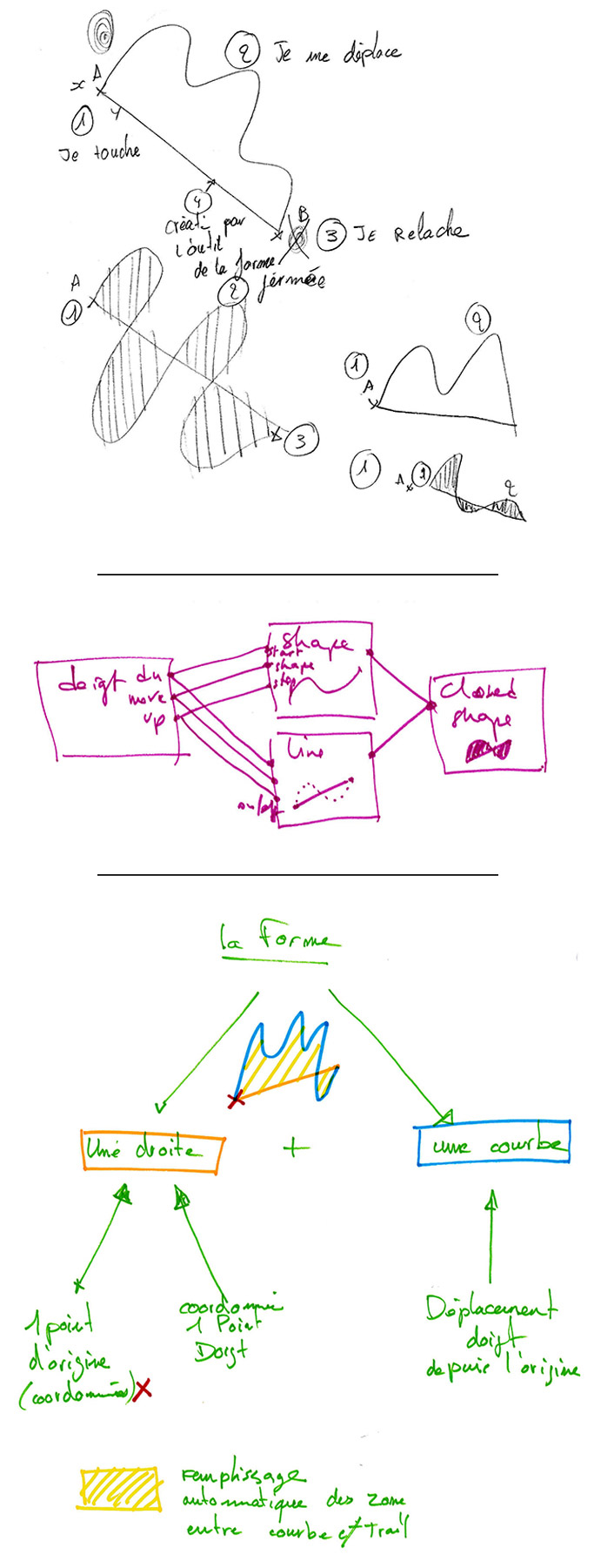
Designer drew a snapshot of the interaction at four points in time - Developer created a diagram connecting primitive graphical elements and functions with user inputs - Designer merged the two representations with an example
During Activity 2, the two pairs explored seven different strategies for fully representing and communicating the interaction. We describe two of the most promising: Pair 1 decomposed interaction 3 using examples from other applications: the lasso tool from Photoshop combined with the paint bucket from Illustrator. The designer from Pair 1 proposed recording videos to demonstrate the use of these tools and combine them. He argued that this strategy would avoid misunderstandings as well as provide a complete description of the interaction. The developer from Pair 1 proposed a shared “lexicon” describing the objects of the program, their characteristics and the tools that can interact with them. Pair 1 thought that a common vocabulary would facilitate the discussion about how to extract common components. In order to reach a shared and complete representation, both pairs refined their representations through multiple iterations. They started with a visual example, and then added rules and annotations to produce a more complete description. For example, the designer from Pair 1 drew a snapshot of the interaction at four points in time: “(1) I touch, (2) I move (3) I release (4) The tool creates the closed shape.” (). Next, the developers and designers collaborated to gradually generalize the description of the interaction. The developer, inspired by the designer’s representation and his knowledge of “flow programming”, drew a diagram representing the different components of the interaction: finger, shape, line and closed shape. Based on the developer’s representation, the designer built a new representation that combined the strengths of both proposals. He color-coded a visual example and mapped each graphical element to a detailed programming oriented description: “a straight line between the point of origin and the current finger position [...] a curve that records the complete path of the finger from the origin to the current finger position [...]”. In summary, we observed that even when provided with an existing and complete interaction, both designers’ and developers’ representations suffered from missing information and edge cases. This suggests that current representations are limited and may result in design breakdowns. When asked to create complete representations, designers first started by representing a concrete example on top of which both designers and developers gradually added rules. Based on these results, we need to create tools that support this gradual enrichment of representations.
Enact: prototyping interaction
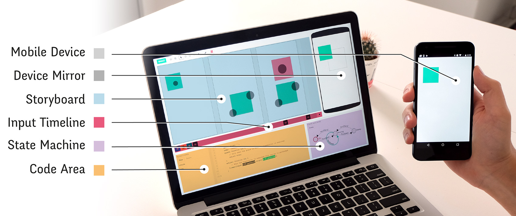
Enact is composed of a target device and a desktop interface with five areas: a storyboard with consecutive screens, an event timeline with screen’s handlers, a state machine, a code editor and a device mirror
Based on the workshop findings, we created ENACT, a prototyping tool for continuous touch-based mobile interactions. The goal of Enact is to allow designers and developers to collaborate through interaction prototyping. ENACT is composed of a target device and a desktop interface with five areas (): a storyboard, an input timeline, a state machine, a code editor and an augmented mirror. These areas represent multiple viewpoints, are interconnected and manipulate different aspects of the source of truth.
Specifying the interaction
A StoryBoard for interaction discretization
Designers most commonly depict the different visual states of an interaction with diagrams, wireframes or mockups. In mainstream graphic design software, designers need to manually maintain the consistency among screens, e.g., using copy and paste, therefore introducing redundancy in the artwork. In ENACT, each visual state is aware of its past and future visual states. Objects created in one state exist also in future states and changes are automatically propagated. Changes include transformations, such as translation and scaling, and setting properties such as fill color. A change in the second screen propagates to subsequent screens, but also breaks the propagation from the previous state, screen 1, to the current one. To reactivate the propagation, the user simply needs to modify the second screen to look like the firs one.
Providing concrete input examples
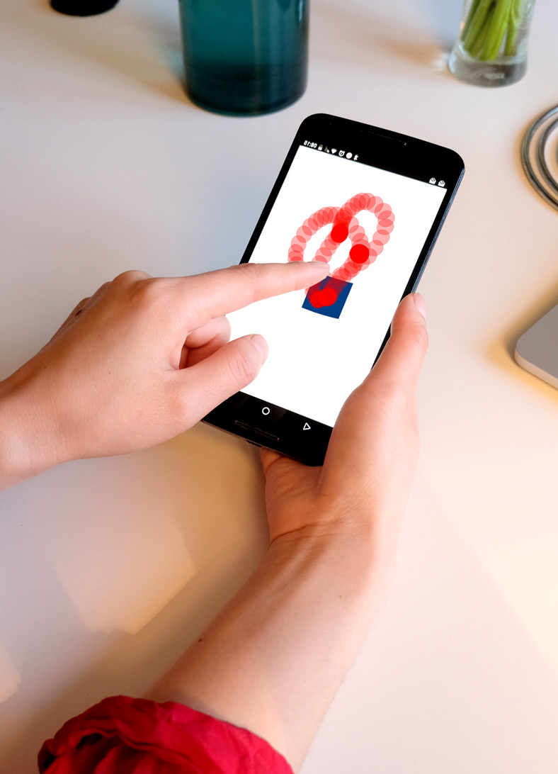
Recording a touch input example directly on the mobile device
In current tools, user inputs are only described as annotations on top of the visual state. In contrast, ENACT’s screens are associated with an actual user input event. Touch inputs events are recorded from the target device in the input timeline. First, the designer presses the record button at the right of the input timeline. While the designer performs the desired input on the target device (), a real-time feedback appears on the target device mirror. Once all touches have ended, the recorded input events are saved in the timeline and associated with the existing screens. In ENACT, input events are treated as first-class objects, they live side-by-side with other graphical elements such as polygons and paths. This leverages the current designer practices but also provides new capabilities. For example, user inputs can be used to position other visual objects relative to them. In order to navigate the recorded events, the current input event can be dragged in the screens to show the path of the touches as feedforward. Also, the screen markers can be repositioned in the timeline to associate that visual state with a different input event.
Generating Animations from the StoryBoard
Animations are a quick and simple medium to illustrate an interaction and can be an interesting medium for transmitting the interaction description to developers. However, designers currently need specialized tools to create them and thus resort to video only for extremely complex cases. ENACT automatically generates animations descriptions based on the storyboard. Since each visual state is associated with an input event, ENACT knows the time between states. With this information the system can animate the visual objects properties between states by using each screen as a keyframe at the time of its associated input event. Currently, ENACT uses linear interpolation, but other interpolation functions could easily be added. By pressing play, the animation is executed on the target device and replicated in the mirror alongside touch information. Such lightweight animations let designers and developers check the relationship and timing between user inputs and visual states in the context of a real device. They provide a stepping stone towards creating an actual interaction.
Programming Interactions
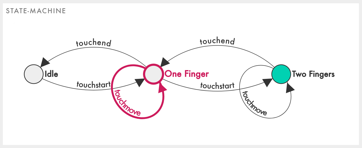
The state machine always highlights in red the current active state while interacting with the mobile.
ENACT organizes the interaction code with a top-level state machine (). The state machine always highlights in red the current active state while interacting with the mobile. In that way, both designers and developers can understand through Enaction the current state of the interaction. The system provides a default state machine, with two states and three transitions, that supports continuous touches from one finger. Users can create new states with double-click and new transitions with control-drag. When the user selects a state or transition, ENACT shows its code in the editor as a JSON (JavaScript Object Notation) object. Transitions are named after their input event, they have a source and a target state (inferred from the diagram), a guard condition and an action function. ENACT only executes the transition’s action function when its input event is detected and the guard condition is satisfied. States can also execute action functions when activated (on enter) or deactivated (on exit). Guards and actions are written in JavaScript and interpreted right away. Any code declaration valid in JavaScript is also valid on ENACT.
Reusing design elements with code markers
Instead of forcing developers to recreate the screens, developers can reuse elements directly from the storyboard, in accordance with the Multiple viewpoints and One source of truth principles. Users can control-drag elements from the storyboard to the code editor (Figure 73f) to generate a code marker. Code markers are expressions that reference existing design elements. They share the element’s color and can be edited on double-click. When the user hovers over a code marker, the storyboard highlights the corresponding elements. Alternative to dragging, users can type $ followed by a dot to access visual elements such as screens ($.Sn ), rectangles ($.Rn ), circles ($.Cn ), polygons ($.Pn ), touches ($.T0, $.T1,...) and measures ($.Mn ). Position and size labels can also be directly dragged to the code, e.g. by dragging a rectangle’s x-position label, ENACT generates $.R1.position.x.
Code markers and absolute values
A code marker such as $.R1.position.x refers to the x-position of R1 at any time, i.e. in any screen. Sometimes, however, developers want to reuse absolute values from the proposed design, such as an initial color or a particular position. This is achieved by specifying absolute references. By shift-dragging a R1’s y-position from screen S1 to the editor, ENACT generates the absolute reference $.S1.R1.position.y. The code marker displays its absolute value, e.g. 237 but stays bound to the corresponding element. Thus, designers can modify their design at any time, and changes are directly reflected in the code and ready to be tested on the mobile device. These “active values” are useful to create initial/final visual states or thresholds such as minimum or maximum values, e.g. to return an element to its original position or to constraint an element’s size.
Creating input-output mappings
ENACT provides built-in functions, such as $.isInside({touch:,shape:}) and $.map({input:,output:}). Users can create recurrent functions to avoid code duplication and use them on any state machine action. To prototype interactive behaviors, developers can link user inputs with system outputs. ENACT’s map function connects changes in the input properties, such as change in position of the touches, with changes of the output properties, such as the position of graphical objects. For example, dragging rectangle R1 with one finger can be done by adding $.map({input:$.T0.position, output:$.R1.position}) to the touchmove transition of the default state machine. The map function can take additional parameters for further customization: min and max to set the minimum and maximum values of the output property, and ratio to control the relationship between the changes in the input and the changes in the output. For example, a ratio of 0.5 creates a two-to-one mapping and a ratio of 2 creates a one-to-two mapping. Besides these parameters, ENACT’s code has access to the full power of the JavaScript language, including variable declarations, control structures and function definitions.
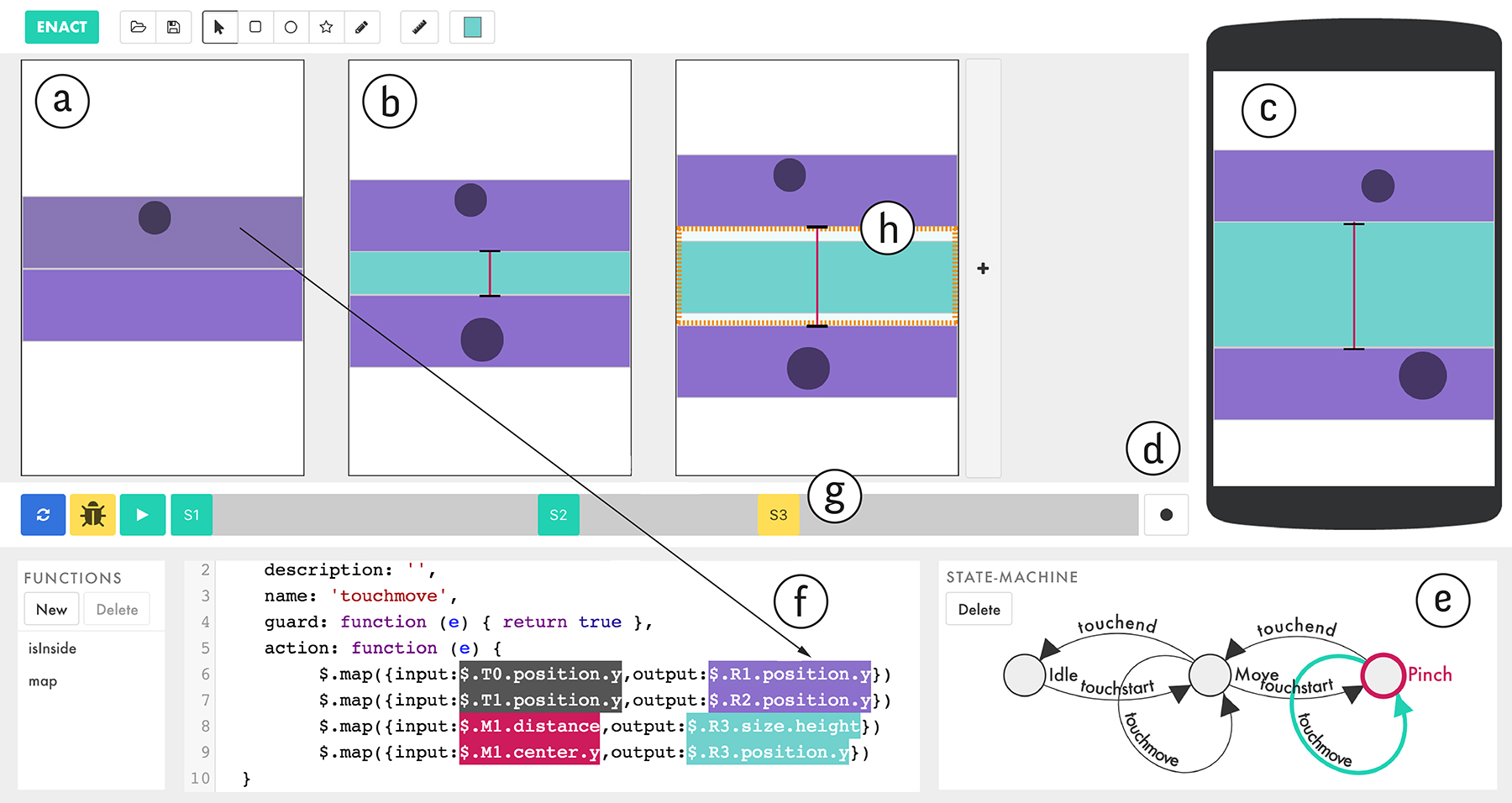
The interface of Enact.
Measures: reifying distances and points
The map inputs in ENACT are not limited to touches: Visual property changes can also be used as map inputs. Developers are used to working symbolically with graphical relationships. With ENACT, developers can still use symbolic expressions to calculate these relationships, but they can also reify them as Measures to Reveal the invisible. Measures are first-class visual objects that can be drawn between two points of interest in a shape, a touch input or another measure. For example, to manipulate the spread of a pinch gesture, a Measure can be created between the two touches (Figure 73b).
Target device and augmented mirror
ENACT encourages early exploration of interactions during prototyping. By default, ENACT shows the first screen on the target device (Figure 73a). This contextualizes the design, helping users evaluate decisions in the context where they will be used. Designers use the target device to record touch input and to interact with the current design. ENACT applies the changes in the state machine code as soon as they happen. Since there is no waiting time, the code can be edited live and the result is immediately available. Sometimes, the user’s hands can occlude important aspects of the interaction on the target device. The device mirror in the desktop interface (Figure 73c) replicates the state of the target device in real time, showing all the visual property changes. Furthermore, the augmented mirror displays the current measure that is not visible on the mobile device and can display object properties to facilitate debugging.
Automated testing
One key challenge of the designer-developer collaboration is the synchronization of both the design and the code at all time in the project. ENACT propose the use of automated tests to simplify the synchronization between code and design representations. The automated test let users execute the pre-recorded input on the target device at the touch of a button: When pressing the Test button, ENACT sets the target device to match the first screen; Then, the recorded input events are synthesized and executed on the target device, triggering the same code as if they were actual user inputs. Each resulting output is displayed in the corresponding screen of the storyboard. If the output matches the screen, the screen name turns green in the timeline. If there are differences, the screen name turns yellow (Figure 73g) and the obtained output is displayed on top of the original design, with the differences highlighted in orange (Figure 73h). When navigating the recorded input events, each test result is shown to illustrate the complete history of test results.
Mismatches between the screens and the actual interaction reflect inconsistencies, which designers and developers can fix them by changing the code, the screens, or both. We envision the automated testing as a support for designers and developers to perform alignment work (Brown et al., 2012)
System Description
ENACT is a client-server web application developed with Vue, Node.js, Socket.io, CodeMirror and D34. We use reactive data bindings to provide liveness within the desktop interface. The mobile device is connected through an ad-hoc protocol on top of Socket.io messages. We extended the CodeMirror parser with regular expressions to support code markers, i.e. expressions of the form $.{screen}.{object}.{property}.{sub-property}.
Scenario
Anton, a designer, and Petra, a developer, use ENACT to collaboratively prototype a custom interaction (Figure 73) to create items in a to-do list. They want to explore a spread gesture to progressively indicate the creation of a new item between two existing items. Anton represents the existing list-items with purple rectangles and the new one with a blue rectangle. To communicate the visual design to Petra, Anton draws the look of the interface at different stages in the storyboard. Anton draws two purple rectangles (R1, R2) and a blue rectangle (R3) on the first screen (Figure 73a). When Anton adds a second screen (S2), all the elements from the previous screen are present thanks to the storyboard propagation. To finalize the design, Anton positions R1 and R2 a little apart and increases the size of R3 (Figure 73b). Finally, Anton decides to tweak R1’s color and size. He only needs to modify S1 because changes propagate automatically to S2. To communicate the interaction design to Petra, Anton records a pinch gesture and locates each screen according to the input example (Figure 73g). Anton records the example directly on the mobile device, demonstrating how the user should interact with the system. When all the touches are up (T0 and T1), recording stops. Anton can then drag the screen name in the timeline to position the screen at the proper point of the interaction. Petra receives Anton’s design. She first examines the screens and watches the generated animation on the device mirror to understand Anton’s specification. Petra interacts with the target device, realizing that she needs to expand the state machine to account for a pinch gesture (Figure 73e). She decides to create a Pinch state with three new transitions: touchstart, touchmove and touchend. In the Pinch’s touchmove action, she creates two new mappings. One between the first finger’s y-position and the first rectangle’s y-position, another between the second finger’s y-position and the second rectangle’s y-position. To do so, she directly drag touches, visual elements and properties from the screens designed by Anton (Figure 73f) into the code editor. After adding the new action, Petra checks the interaction by interacting on the mobile. Petra notices that R3 is not being resized. She creates a measure (M1) by dragging a line between R1 and R2 (Figure 73b). She then drags M1 to create a new map between M1’s distance and R3’s height. She is satisfied with the result and sends the design back to Anton. Anton realizes that the new to-list item should not grow bigger than the existing items. He specifies this by adding a third screen with the expected sizes. He runs the automatic testing. The current implementation increases the height of R3 beyond the expected value (Figure 73h). Anton decides to fix the implementation himself. He adds a maximum value to the previous mapping created by Petra. Anton extracts R3’s height from the third screen, creating an absolute reference and setting it as the max value. Now Anton can tweak the size directly from the storyboard without the need of modifying the code.
Preliminary Study
To better understand how designers and developers interact with ENACT, we conducted a structured observation study (Garcia, 2014) with an earlier version of Enact. This earlier version had graphical rule templates () similar to the map function to program interactivity instead of the editor and the state machine.
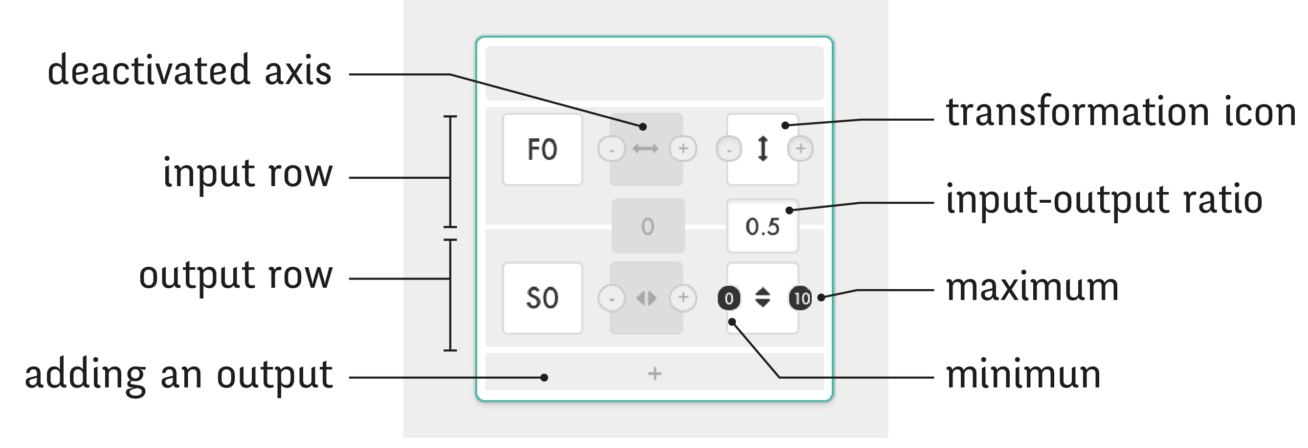
The rules proposed in an earlier version of Enact. Input-output rules connect one input with one or more outputs. This rule maps F0’s (Finger Zero) Y-axis translation to S0’s (Shape Zero) Y-axis scale with a 2:1 ratio (0.5 multiplier).
Participants: We recruited four participants (1 woman, ages 26-34): two professional developers (P1dv and P2dv) and two professional designers (P3ds and P4ds), who create web sites, mobile applications or interactive installations. Their experience collaborating across disciplines ranges from 3 to 8 years.
Procedure: We gave a short presentation of ENACT and asked participants to create a set of three different interactions with gradually increasing difficulty: “simple drag”, “pull down curtain” and “pinch to create item”. We prompted the first task orally and presented the last two in the form of rough sketches. After the three tasks, we gave participants 15 minutes to experiment freely with ENACT. The study uses a think-aloud protocol and takes approximately one hour, after which we ask a set of post-hoc questions.
Data Collection & Analysis: We recorded audio and video of the participants’ interactions with ENACT, on the computer and on the interactive device. We also took notes during the interviews. We performed a thematic analysis (Braun and Clarke, 2006) of the collected data to extract common themes across participants, both during the tasks and the post-hoc interviews. After looking for emerging themes, we revisited the data to specify the themes and to extract relevant quotes.
Results and Discussion
All participants were able to create the three proposed interactions. Participants were not asked to be quick, they were instead encouraged to talk while doing the tasks. Nevertheless, all participants finished the first task in less than three minutes without prior training. All participants finished task 2 in less than five minutes and task 3 in less than 15 minutes.
An embodied perception of interaction
Surprisingly, even though they had not created any rule yet, all participants tried to interact with shapes on the mobile device. P1dv noted that ENACT approaches interaction from “a sensible point of view, just like the end user would experience it on the mobile”. All the participants interacted with the mobile as soon as they created rules. Thanks to the liveness of the system, P1dv realized that one of his rules was incomplete: “now I realize that it grows only downwards, I need to move it up.” Some participants also appreciated the testing feature. For example, after the first interaction, P2dv decided to rely exclusively on the automatic testing to verify the rules. As P4dv could not understand why the interaction on the mobile did not react as expected, he ran the automated test and slowly navigated the history of the test results on the screen.
Enriching the interaction possibilities
Participants were able to use ENACT’s features but, as they engaged with the tool, they wanted greater levels of interaction. For example, participants wanted to extend the provided rules. P1dv wanted more control over the rules: “I want to add this delta value. I want operators to correct rules.” P2dv also wanted to be able to bind shapes and values in the rules, so that he could directly modify the latter by moving the corresponding shapes in the storyboard.
Structured Observation
We wanted to observe and compare the strategies used by designer-developer pairs to represent, communicate and implement interactions with their own tools and with ENACT. For ecological validity, we organized the observation in three phases that reflects common collaboration situations: communication of the initial design (designer only), initial implementation (developer only) and side-by-side collaboration (both co-located).
Participants: We recruited 12 participants (6 women and 6 men, ages 23-35): six professional developers (P1dv to P6dv) paired with six professional designers (P1ds to P6ds), who create web sites, mobile applications or interactive installations. Their experience in collaborating across disciplines ranges from 0 to 7 years. P1dv and P6dv reported no collaborative experience as they were just starting their front-end developer career.
Procedure: Each pair first creates an interactive prototype of an existing interaction with their preferred tools (TRADITIONAL condition). First, we show the designer an interaction on a mobile device. Only the designer had access to the proposed interaction throughout the study. The designer has 10 minutes to create a design that communicates all the details he deems relevant for creating a prototype with the same behavior. Then the designer sends the document to the developer, who has 15 minutes to create an interactive prototype based on the received design. During this time, we show a more complete version of the interaction to the designer. Finally, we give the pair another 15 minutes to sit together, review the initial implementation and work together to prototype the final version of the interaction. Once the TRADITIONAL condition is over, we give a short presentation of ENACT and let each participant practice for 10 minutes. We then follow the same protocol, but this time both the designer and the developer are instructed to use ENACT. The study uses a think-aloud protocol and takes approximately two hours. After each block, we perform a post-hoc interview. We chose to use the same two interaction techniques that we previously described and used during the participatory workshop: Interaction One and Interaction Two. We decomposed each in an “initial” and a “final” version. We prototyped the two interactions using Enact to focus the task on the interaction behavior. The two interactions are balanced across pairs: P1, P2 and P4 started with Interaction One while P3, P5 and P6 started with Interaction Two.
Data Collection: We recorded audio and video, both over the shoulder and of the desktop screen. We also took notes during the tasks and the post-hoc interviews.
Analysis: We performed a thematic analysis (Braun, 2006) of the collected data to extract common themes across participants, both during the tasks and the post-hoc interviews. After looking for emerging themes, we revisited the data to specify the themes and to extract relevant quotes.
Results and Discussion
ENACT is a tool designed to prototype the type of interactions provided to the participants. It was therefore reasonable to assume that participants would perform better with ENACT than with TRADITIONAL tools. On the other hand, ENACT is a new tool and with only a short training session, participants were able to finish much more of the interactive prototypes. In the ENACT condition, all pairs provided the basic interactivity of the initial version of the interaction. Five out of six even provided the basic interactivity of the final version and one of them implemented all the details of the final interaction. On the other hand, in the TRADITIONAL condition, only one pair managed to provide the basic interactivity of the initial version, i.e. five out of six pairs did not finish the initial version. Since we gave participants very little time and did not expect them to finish everything, we concentrate most of the discussion on the collaborative strategies rather than on performance measures.
Collaborative Strategies
All the designers used the same workflow to communicate the design to the developer during the TRADITIONAL condition. Designers created a screen flow document depicting the stages of the user-interface with a graphic software. Then, they sent it to the developer either in the original format, as a PDF or through a specialized tool such as InVision. Designers illustrated the output changes with different screens and explained the user inputs with circles, icons, traces, text annotations or a combination of these. None of the designers used animations or video to communicate interactivity.
In the TRADITIONAL condition, developers ran into problems interpreting the interactivity and reproducing the visual look. When text annotations were not present, developers expected them. For example, P5dv said “I don’t understand this” when viewing the design for the first time. When text annotations were minimal, developers also expected more details. For example, P3dv said “I don’t know if these are multiple interactions or different steps of the same interaction” and that she “prefer[s] comments saying ‘when this happens then that happens”. Four developers ignored the graphic design and used either: no visual elements at all (only console logs), gray buttons and wrongly colored rectangles. Two developers used external color pickers to extract the right color from the design and copy the hex string. All the developers ignored the sizes of the rectangles: for Interaction One the height of the rectangle in the design was not replicated and for Interaction Two developers generally used rectangles instead of the square in the design. ENACT trivially fixes most of these problems because developers work on top of the provided design.
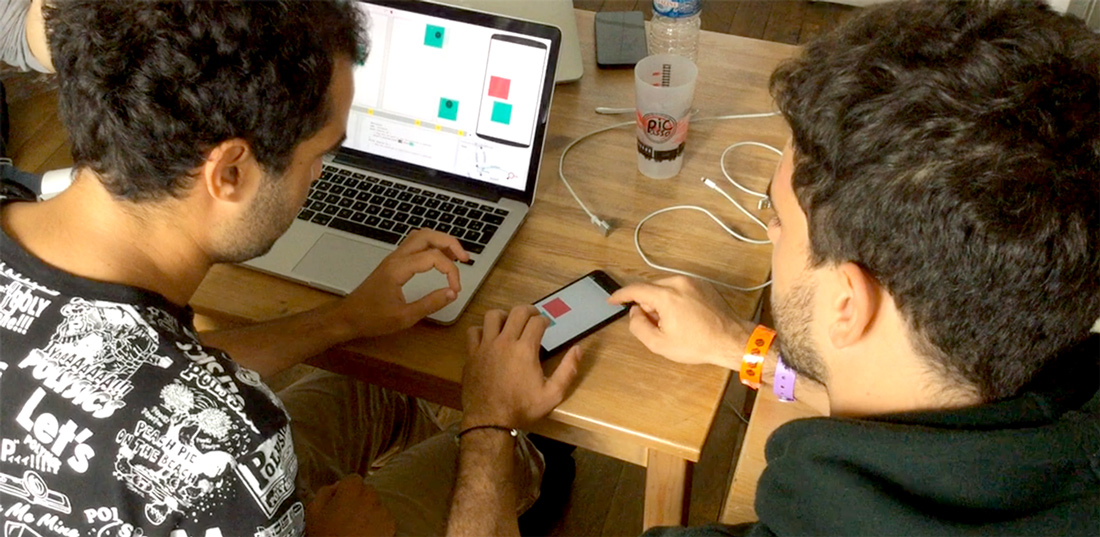
On the right, P4ds performs a “mimicking gesture” on-device to communicate the design. On the left, P4dv performs a “mimicking gesture” off-device to understand the proposed design.
In the ENACT condition, designers used the animation to refine the storyboard and developers used it to understand the interaction. Thus, the generated animation worked as a contact point between the two activities while working asynchronously. Only one designer asked for icons to represent user input and another expressed the need for text annotations. We believe that text annotations were not highly demanded due to the extensive use of ENACT’s generated animation. Developers also mentioned the usefulness of showing the touch information in the device mirror while the animation was being played. In the TRADITIONAL condition, all developers used print logs to confirm the triggering of input events. ENACT’s live state machine diagram provided the same level of confidence to the developer, without extra effort, in a more detailed and simpler way.
Opportunities for co-creation
By analyzing the video data, we measured the number of “mimicking gestures”, i.e. when a participant performs the interaction with the hands either to understand it or to communicate it, both outside the device and on the device. We only counted “mimicking gestures” during the side-by-side phase (), not when they were working individually. Designers were much more involved during the side-by-side collaboration with ENACT than with TRADITIONAL tools (Figure 76). With ENACT, all designers interacted with the target device (M = 8, SD = 3.65) while only three designers did it with TRADITIONAL tools (M = 1.17, SD = 1.46). One explanation could be the sense of ownership of the prototype. With TRADITIONAL tools, developers recreate the design with their own tools. It is not the designer’s design that will come to life but a mere replica. With ENACT, developers literally add interactivity to the artifact provided by the designer. Designers might therefore feel a higher sense of ownership over the prototype under construction, thus increasing participation. P4ds said “you have the impression to be living in the same environment, that we share the same language”.
Tools with a flexible barrier between design and development can create interesting opportunities for collaborative prototyping. P2ds was not sure she should create an input example: “am I suppose to do this?”. On the contrary, P5ds was really interested in the programming capabilities of ENACT: he started adding interactivity by himself forgot to finish the description of the interaction on the storyboard. When P5dv received the design he said “What should I do now? This is already coded!”. During the side-by-side collaboration, P5dv built on top of P5ds’s implementation, even extending the storyboard himself. Similarly, P6ds added some interactivity to the Interaction One prototype and P6dv directly started to fix several edge cases in the implementation, such as checking that the touches are inside the shapes and that the rectangle is constrained to a vertical movement. Most of the designers were intimidated by the code editor but not by the live state machine diagram. We believe that visual and intermediate representations help breaking the silos between these communities of practice.
The use of interactive representations helped designers and developers to find edge-cases. Five out of six pairs found three or more of the seven edge cases in the final version of the interaction. For example, while interacting with her first implementation attempt, P3dv realized that shapes where dragged even when her finger was outside them. Similarly, P5ds noticed that Interaction One behaved differently depending on which rectangle was touched first. He shared his finding with P5dv, who added an if statement to determine which touch should be associated with each rectangle.
Summary
In this chapter, I investigated the creation of design tools that support the transition from design to development. We first ran a participatory design workshop to study the role played by the representations of interactions in breakdowns. We observed that the limitations of the representations used to communicate interaction result in missing information and edge cases. Our results suggest that communicating and representing interactions requires an iterative process, from individual concrete examples to rule-based representations. Based on these findings, we created Enact, a live environment for prototyping touch-based interactions by combining interconnected visual, symbolic and interactive representations. Storyboard propagation and code markers reduce redundancies within and across representations. ENACT’s state machine diagram and target mirror assist designers and developers to quickly explore the interaction and detect edge cases. We conducted two structured observations to gather feedback from professional designers and developers and to analyze the impact of ENACT during collaborative prototyping. The first study shows that all participants were able to manipulate the symbolic, visual and interactive representations of ENACT to achieve the tasks at hand. Both groups greatly appreciated the reduced time-to-interaction. The second study suggests that ENACT provides new opportunities for co-creation. Designers participated more with ENACT than with traditional tools during the side-by-side phase of the collaborative task. Also, pairs working with ENACT found more edge cases than with traditional tools.
Discussion
In the second part of this thesis, I designed, implemented and explored nine probes in four different design contexts. All of them were created independently based on the specific designers’ stories from the four contexts. In this chapter, I look back at the probes and analyze the recurring principles that emerged from them to propose a set of principles for designing design tools.In chapter 6, I first introduced the notion of Design Substrate as a descriptive framework in the context of layout structuring. In this second part of the thesis, the concept of Design Substrates turned out to be fundamental for my design work. Graphical Substrates are interactive visual objects that represent relationships between graphical elements. By reifying these relationships, e.g., turning them into interactive objects, they scaffold designers’ exploration phase.
Yet, substrates are not in themselves new. While Garcia et al. coined the term and designed the first substrates that bridge analog and digital music creation methods (Garcia, 2012), the phenomenon of substrates can be observed in many other contexts. In a second, non-digital example, Jacques Bertin created physical and manipulable matrices () for his data visualizations. He created a substrate composed of the wooden sticks that hold rows together.
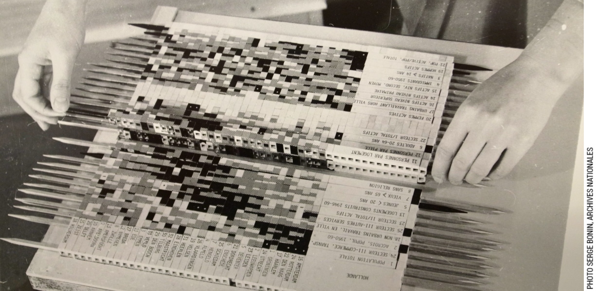
A physical substrate created by Jacques Bertin to explore datasets
By reifying them -in this case, making them tangible using wooden sticks- Bertin created a creative space for exploration. Data analysts can, by inserting, removing and rearranging rows, observe the data from different angles. In this thesis I envisioned tool design as the reification of existing ad hoc practices that are turned into interactive Design Substrates. Whereas most current tools target the end point of the design task (see chapter 8), substrates embody the design process, the intermediary steps and the overarching principles generally only articulated in designers' minds.
Reifying Design Substrates
One of the key benefit in reifying Design Substrates is that each of them provides a new lens through which designers can apprehend the content they work with. Different Design Substrates provide different ways of understanding the same phenomenon. For example, both StickyLines and the Enact’s measurement tool visualize what designers and programmers were previously using in other forms: either as commands or as mathematical formulas. Some of the representations proposed by design tools may overlap or have direct equivalents in other representations. However, very often, each representation gives access to information that is hardly graspable through a second one. For example, Palette Explorer focuses on the relationships among colors while Color Partner focuses on the history of color choices. In Enact, the sequential representation of interaction provides a clear visual description of the key moments of an interaction, but the programmatic representation may more easily reveal edge cases.
A second advantage of reifying Design Substrates is their potential for automation. Design Substrates are particularly powerful when they embody rules and relationships that are automatically applied to content. This automation gives designers a much greater scale of exploration because if they decide to modify their substrates, they will be able to observe the results on all the content. This can be especially useful as, in our empirical studies, designers modified their Design Substrates over time. Even after their creation, designers modify existing relationships to account for new content, or even to continue exploring. Using and manipulating substrates are equally important for designers. In Color Partner, colors are kept over time and reflect the activity. In Color Compositor, designers can decompose what they previously composed, nothing is irreversible. By reifying substrates, we can develop design tools that stand as an interesting middle ground between GUI-based design tools and programming. As visual objects, they provide interaction mechanisms that follow direct manipulation principles, but also by embody behaviors and rules, giving designers new possibilities for testing their ideas.
Creating Substrates: bottom-up or top-down
Allowing designers to manipulate and interact with Design Substrates can empower them, but if we want to make substrates truly useful, we need to address the question of their creation. With automation comes a greater risk of loosing creative freedom. In the context of weaving, Luther Hooper mentioned that “with each stage of mechanical improvement of the loom, as moreover is the case with all machine in varying degrees, the weaver’s freedom and his or her control of the conception of their work is reduced” (Fetro, 2017). In my empirical studies, I found that designers create novel and dedicated substrates that take into account specific constraints and opportunities offered by the project. They might also partially reuse previous structures that they created for previous projects. In our four empirical studies, we have seen that designers created substrates both from a top-down, but also from a bottom up approach. When creating substrates, designers do not necessarily start with the structure itself. Instead, in many cases, Design Substrates emerge from examples, as designers explore different possibilities with existing content samples. In our empirical studies, we have observed the importance of exploration with examples and generalization. For example, we showed how the process of representing interaction first started from an example that then needs to be abstracted.
I argue that structures should be reifiable from examples, i.e., design tools should let designers extract relationships and rules from existing examples. In my probes, I have proposed several mechanisms that allow designers to create Substrates from examples. In Palette Explorer, designers can create a sample palette and can then modify this original palette as a whole, retaining its original harmony. In StickyLines, we allow designers to create guidelines based on existing shapes by creating “a ghost”, a guidelines that take the shape of an existing object. In StyleBlocks, designers can extract CSS properties from HTML content and thus create relationships out of examples. Designers can also separate these extracted values from the examples they originated from, to fully abstract them. Finally, we based Enact on our findings from our participatory design workshop where visual and sequential examples of interactions serve as a basis for abstracting the general rules in code. We also provide mechanisms for extracting specific values from the storyboard to the rules. Because we maintain the relationship between the storyboard the code, designers can directly modify the implemented interaction by modifying the example in the storyboard.
Tweaking
One of the graphic designers I interviewed in the beyond grids projects explained that a graphic designer’s role is “to organize other people’s mess”. Indeed, graphic designers organize content, but content is never quite as easy to organize as it ought to be, so designers need to account for exceptions. Designers integrate these exception into their existing principles by tweaking them, modifying them just a little bit. When manipulating colors, designers often sampled existing ones, but they then invariably manually adjusted the resulting color; when aligning and distributing graphical elements, designers usually tweaked individual objects to account for mismatches between objects’ perceived visual weight and reference points; when structuring layout, designers established structures but very often needed to break their own rules to account for extreme cases; and when communicating with developers, designers needed to take into account edge cases. Tweaking is a fundamental design practice and all these examples show how pervasive the need for tweaking mechanisms is.
Revealing and reifying relationships or constraints into interactive objects can be a powerful mechanism for designing design tools. However, in current software, existing structuring mechanisms tend to be rigid and binary: either graphical elements fully obey the structure they belong to, or there is no structure at all. Designers' uses of substrates show much more nuanced patterns in their daily practices. In all the empirical studies that I conducted in part 1, designers did not consider all substrates as fully rigid structures. As most of designers’ substrates were not reified and were only mental constructs, designers could easily determine how strongly each substrate would be enforced. While some constraints were considered unbreakable, some others could allow more flexibility. When creating design tools, tool designers should take into account the flexibility of their substrates. Enforcing rigid rules greatly undermines substrates’ usability and designers might end up resorting to a more manual process even when there is an existing mechanism.
In my probes, I have only started to explore some mechanisms to support tweaking. For example, in StickyLines, we proposed two different mechanisms for designers to tweak individual objects’ alignment: tweaks and bounding boxes. In Color Partner, designers can choose to either tweak or completely modify colors by adjusting the cursor’s distance from the original color. In StyleBlocks, designers can customize their relationships by adding ratios and bounds to existing relationships. To foster the usefulness and exploration possibilities of Design Substrates, I argue that tweaking mechanisms should also be reified to create flexible structures.
Conclusion
To conclude this thesis, I present a summary of the different contributions of this thesis and I discuss directions for future research. This dissertation attempts to shed light on digital graphic design tools and to question them more than 30 years after their introduction on the market. While their quest for transparency resulted in their relative invisibility, designers gradually started to question their steady hegemony. This thesis investigates two main research questions: how do designers currently work with design software? How can we create design tools that better support design practice?
Summary of Contributions
In the first part of this thesis, I investigated how designers work with design software. I first proposed a methodology, StoryPortraits to conduct design research focusing on the material aspects of the design process. Based on critical object interviews, StoryPortraits synthesize and visualize designers' stories into a form that better support later analysis and inspire design conversation. I conducted six studies to explore this question at four different different levels of designers practices.
When manipulating colors, designers and artists invariably go beyond the mere selection of a color in a pre-defined color-space. Based on 35 stories from eight designers and artists, we proposed a design space to describe the five most recurrent color manipulation performed by designers: sampling and tweaking individual colors, manipulating color relationships, combining colors with other elements, revisiting previous color choices, and revealing a design process through color. We also validated the design space with eight scientists and engineers and showed how current color tools do not support most of the activities of the color manipulation design space.
When aligning and distributing content, designers create strategies to overcome the limitations of current alignment and distribution commands. We categorized the current limitations and strategies to overcome them in three categories: lack of persistence, as commands require designers to reapply commands for each modification of the overall composition; lack of control as designers had issues predicting the result of the alignment and distribution commands and could not go beyond their binary nature; lack of generality as designers needed to align graphical elements beyond horizontal and vertical alignments. The current alignment and distribution commands leave aside the far more complex compositions that designers create.
When looking at the overall layout composition practices, our interviews with 12 graphic designers revealed that they use surprisingly sophisticated structures that go beyond the grid. We define them as graphical substrates: principles that guide the layout but rarely appear in the final result. We presented a framework to describe how designers establish graphical substrates based on properties extracted from concepts, content and context, and use them to compose layouts in both space and time. We showed that whereas most designers could not fully express their graphical substrates in their tools, some designers reified them in code. This allowed them to automatically apply substrates, to extend the types of inputs as well as to involve the readers in their creative process.
Finally, when looking at designers practices when collaborating with developers, our 16 interviews showed that the current workflow induces a lot of rework on both sides. Designers create a multitude of redundant design documents and developers must recreate them with their own tools. This process often introduces mismatches with the original design. We also identified three key design breakdowns: missing information, when designers do not communicate a specific detail; edge cases, when designers do not think about a particular case; and technical constraints, when designers are not aware of developer’s technical limitations. Our longitudinal case study showed that even if the early involvement of the developer mitigated the occurrences of design breakdowns, new ones appeared in subsequent meetings. Our results show that designer tools don’t support the transitioning between the design and the implementation phase.
Overall, these four projects demonstrate a mismatch between the current graphic design tools and designers practices. Based on the results of the four investigations, I propose a critical analysis of current design tools. I argue that mainstream design software posit that design is a hylomorphic process: that designers first create in mind a perfect image of their project and then only do they apply it to still matter. Instead, my four studies demonstrate that designers actively interact with digital tools, to overcome limitations as well as exploiting opportunities.
In the second part of the thesis, I investigated how we can create novel design tools that support the wealth of design practices observed in part 1. In contrast to the current trend of requiring designers to learn to program, I argue that we can reify graphical substrates to preserve the power of graphical user interface tools while enhancing them with more computational power. Adopting an instrumental interaction perspective, let me create design tools based on specific designers' practices to provide greater nuance. I created a set of probes designed to explore the creation of design tools grounded in specific designer stories. By decoupling objects of interest and the instruments used to manipulate them, each designer could choose, for each of their project, the right set of tools; no more, no less. They could craft their own toolbox. I also created design tools as design probes to give participants a voice to interpret their own practice and as a way to foster discussion with designers.
I grounded the design of the different probes in specific designer stories. Yet, the different probe studies that I conducted in the second part of this thesis showed how designers were able to both adopt and adapt substrates that originated in other designers’ practices. We observed the phenomenon of co-adaptation when they were able to use tools in the way we envisioned it but were also able to envision how they would adapt them for their own projects. Designers were able to interpret the probe in the context of their own work and, in some cases, could explore possibilities that they had never envisioned with traditional tools.
In the context of color manipulation, I designed four color tools to specifically support the currently unsupported color activities uncovered during our interviews: Palette Explorer manipulates color relationships within a shared context; Color Compositor composes and decomposes diverse colors and textures; Color Partner generates and captures chains of color, guided by designers; and Color Revealer reveals underlying processes by subtly changing hue and color intensity. We then explored the probes with 8 designers and observed how both designers and scientists were able to interpret the probes in the context of their own work. The color tools demonstrate the generative power of the Color Portraits Design Space.
In the context of alignment and distribution, I presented StickyLines, a tool to experiment about the reification of both alignment and distribution into an interactive and persistent guideline. We incorporated tweaks and modifiable bounding box to increase designers control over alignment and distribution and we extended the repertoire of possible alignments and distribution by allowing for more diverse and non-orthogonal guidelines. We then explored Stickylines in a structured observation study that demonstrates how professional designers can quickly adapt to and appropriate the more advanced features of StickyLines. Designers treated StickyLines as first-class objects that they wanted to extend further.
In the context of layout creation, I explored how we could reify graphical substrates into graphic design tools. I first created: Contextify reifies context inputs and lets designers tailor layouts according to the reader’s intention and context; Linkify reifies spatial relationships to let designers create dynamic relationships based on content properties. I explored these two probes with 12 professional graphic designers who explained how they would enrich their current projects and wanted to extend the current probes. We then incorporated their suggestions into a new prototype, StyleBlocks, that reifies CSS declarations into interactive graphical substrates that support a constant back and forth between structure and content.
Finally, in the context of designer-developer collaboration, we ran a participatory design workshop that demonstrated how communicating and representing interactions require an iterative process, from individual concrete examples to rule-based representations. We included these findings to design Enact, a live environment for prototyping touch-based interactions by combining interconnected visual, symbolic and interactive representations. We conducted two structured observations to gather feedback from professional designers and developers and to analyze the impact of Enact during collaborative prototyping. The first study shows that all participants were able to manipulate the symbolic, visual and interactive representations of Enact. The second structured observation suggests that Enact provides new opportunities for co-creation. Designers participated more with Enact than with traditional tools during the side-by-side phase of the collaborative task.
In this thesis I envisioned tool design as the reification of existing ad hoc design practices, turning them into interactive Design Substrates. Looking back at the different probes and how they embody different aspects of graphical substrates, I finally discussed principles for designing design tools. Reifying Design Substrates from designers practices let designers explore their ideas at different scales. To support this reification, tools should provide mechanisms for extracting substrates from existing examples and not only creating them in a top-down approach. Finally, Design Substrates should embed tweaking mechanisms to reinforce their application beyond binary structures. By embracing flexibility, they can account for the variability of designers content and intentions.
Research Perspectives
Limitations of Graphical Substrates
The proposed design substrates are not finite and unsurpassable design tools. Instead, they are a set of first examples that demonstrate the existence of a yet-unexplored design space for digital design tools. The stories documented in this thesis represent new creative possibilities for design tools, and each designer might come up with a different tool to support the same specific story. This, indeed, happened very often in the design workshops I organized. The type of graphical substrate presented in this thesis are still very limited. Diversifying representations of graphical substrates is crucial to explore their potential. Researchers in other domains also started exploring new types of representations that may inspire future directions for the creation of design substrates. For example, Zinenko, in the context of programming, demonstrated how interactive representations can let developers visualize and manipulate “polyhedral relational representations” in order to improve program restructuring (Zinenko, 2016).
Yet, providing computational power while preserving the power of interactive visual representations remains a challenge. Following Enact's approach, i.e. facilitating the translation between different synchronized representations, can represent a direction but we need to explore more ways of translating concept representations. Tools such as Gliimpse (Dragicevic, 2011) that animate the transition between representation can alleviate some of the impediments regarding context switch for example. Moreover, ensuring a graceful cohabitation of unrelated design tools might be a never ending endeavor. Graphical Substrates in the context of instrumental interaction require a separation of data (content) and representation that may lead to compatibility issues, an issue already identified by Beaudouin-Lafon (2004). The three different qualities that a good instrument should possess: reinterpretability, resilience and scalability all apply to graphical substrates. Methods such as graceful degradation (Florins and Vanderdonckt, 2004) can be interesting ways to implement these qualities.
Beyond Universalism
Beyond design tools, this thesis questions the underlying assumptions of universality in human-computer interaction. As Grudin pointed out in his history of HCI (Grudin, 2012), the field defined itself by devoting its attention to non-professional uses of technology and by focusing on non-experts. This angle led to an emphasis on usability (Satchell and Dourish, 2009) and user-friendliness as well as pursuing an ideal of transparent interfaces (Bolter and Gromala, 2003). However, HCI is moving beyond the notion of use, with third wave HCI demanding for new values such as aesthetic and instrumentness (Bertelsen, 2007), among others. This thesis belongs to this trend and questions the traditional emphasis on averages, the idea that one tool or one functionality could best resolve the issues of a particular community of practice. This thesis shows that, at least for creative communities such as graphic and interaction design, practitioners always reinvent their process and adapt it for each new project.
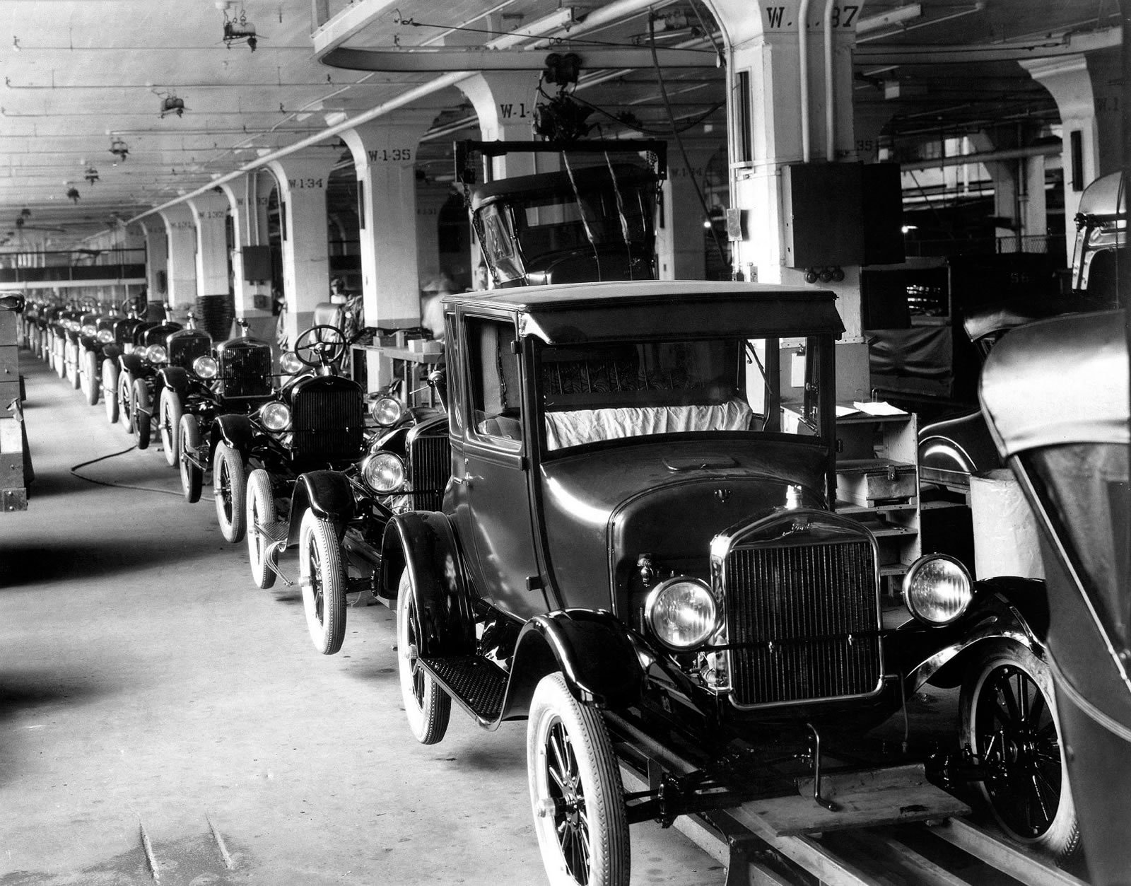
The constraints of the industrial process made it coherent to design standardized mass produced goods, but these constraints don't exist in the digital world any more. We can create personalized digital design tools.
By basing my tools not on median solutions, but instead on specific outlying practices and even specific designers stories, I propose a novel path to design. This thesis' probes do not intend to solve a problem for the majority. Instead, they grow from very specific practices and turn them into tools that other designers can reuse and interpret in their own terms. I believe that this approach could be extended to many domains.
In an era where we are all being provided with “tailored” services and information on social media and search engines, our design tools still live in a pre-digital era with the idea that one-size-fits-all (). This thesis demonstrated how we could move beyond this model towards tailored design tools. However, the temptation would be great for design tools designers to try to “tailor” tools to designers a priori, in the same way that we can't control how the information we receive has been selected. I believe, on the other hand, that it is crucial that designers remain in control of their choices. Design Tools should be tailored to individual designers, but available to everyone.
Finally, the outcome of graphic and interaction design work could also follow the same path. Current social media applications generally tailor their content to each user, but their interfaces remain identical for everyone. Some of the designers I interviewed started inviting readers in their design process to let them tweak the final design to their own needs. With my probes, I only scratched the surface of the potential partnership that we could establish for creating a more inclusive design process. Design Tools could become an interface for establishing evolving conversations between designers and non-designers.
This thesis stands as an invitation for design tool makers to step in.
Publications
- (2015). "Color Portraits: From Color Picking to Interacting with Color", In Proceedings of the 33rd Annual ACM Conference on Human Factors in Computing Systems. (CHI15). New York, NY, USA, pp.4207-4216. ACM. Honorable Mention Award
- (2016). "Beyond Snapping: Persistent, Tweakable Alignment and Distribution with StickyLines", In Proceedings of the 29th Annual Symposium on User Interface Software and Technology. (UIST16). New York, NY, USA, pp.133-144. ACM.
- (2017). "Muriel Cooper, Information Landscapes", In Back-Office n°1, “Making Do, Making With”. Paris, France, pp.104-117. Ed. B42 & Fork.
- (2017). "Design Breakdowns: Designer-Developer Gaps in Representing and Interpreting Interactive Systems", In Proceedings of the 2017 ACM Conference on Computer Supported Cooperative Work and Social Computing. (CSCW17). New York, NY, USA, pp.630-641. ACM.
- (2017). "Beyond Grids: Interactive Graphical Substrates to Structure Digital Layout", In Proceedings of the 2017 CHI Conference on Human Factors in Computing Systems. (CHI17). New York, NY, USA, pp.5053-5064. ACM.
Bibliography
- (2013). Interaction of Color: 50th Anniversary Edition Yale University Press, New Haven.
- (2008). SwingStates: Adding State Machines to Java and the Swing Toolkit, Softw. Pract. Exper.. New York, NY, USA, September, 2008. Vol. 38 (11), pp.1149-1182. John Wiley & Sons, Inc..
- (2016). Digital Design Theory. Readings from the Field Princeton Architectural Press.
- (2009). Graphic design theory : readings from the field Princeton Architectural Press.
- (1969). GENESYS: An Interactive Computer-Mediated Animation System. Thesis at MIT.
- (2001). Supporting Multimedia Designers: Towards More Effective Design Tools, In Proc. Multimedia Modeling: Modeling Mutlimedia Information and Systems (MMM2001)., pp.267-286.
- (2001). “DEMAIS: Designing Multimedia Applications with Interactive Storyboards", In Proceedings of the Ninth ACM International Conference on Multimedia. New York, NY, USA, pp.241-250. ACM.
- (2015). "Immodest Proposals: Research Through Design and Knowledge", In Proceedings of the 33rd Annual ACM Conference on Human Factors in Computing Systems. New York, NY, USA, pp.2093-2102. ACM.
- (2013). "A Technique to Improve Sketches of Rich Interactions", In Proceedings of the 12th Brazilian Symposium on Human Factors in Computing Systems. Porto Alegre, Brazil, Brazil, pp.22-31. Brazilian Computer Society.
- (2013). "A Technique to Improve Sketches of Rich Interactions", In Proceedings of the 12th Brazilian Symposium on Human Factors in Computing Systems. Porto Alegre, Brazil, Brazil, pp.22-31. Brazilian Computer Society.
- (2004). "Designing Interaction, Not Interfaces", In Proceedings of the Working Conference on Advanced Visual Interfaces. New York, NY, USA, pp.15-22. ACM.
- (2000). "Instrumental Interaction: An Interaction Model for Designing post-WIMP User Interfaces", In Proceedings of the SIGCHI Conference on Human Factors in Computing Systems. New York, NY, USA, pp.446-453. ACM.
- (2000). "The architecture and implementation of CPN2000, a post-WIMP graphical application", In Proceedings of the 13th annual ACM symposium on User interface software and technology., pp.181-190.
- (2003). "Prototyping tools and techniques", In The human-computer interaction handbook: fundamentals, evolving technologies and emerging applications., pp.1017-1039.
- (2000). Reification, Polymorphism and Reuse: Three Principles for Designing Visual Interfaces, Proceedings of the working conference on advanced visual interfaces., pp.102-109.
- (1997). "From Web Press to Web Pressure: Multimedia Representations and Multimedia Publishing", In Proceedings of the ACM SIGCHI Conference on Human Factors in Computing Systems. New York, NY, USA, pp.279-286. ACM.
- (2005). "Little History of Photography", In Selected Writings. Harvard University Press.
- (2007). "Instrumentness for Creativity Mediation, Materiality & Metonymy", In Proceedings of the 6th ACM SIGCHI Conference on Creativity &Amp; Cognition. New York, NY, USA, pp.233-242. ACM.
- (1986). "Snap-dragging", In ACM SIGGRAPH Computer Graphics. Vol. 20 (4), pp.233-240.
- (2006). The Reification of Metaphor As a Design Tool, ACM Trans. Comput.-Hum. Interact.. New York, NY, USA, December, 2006. Vol. 13 (4), pp.490-530. ACM.
- (2007). "How HCI Interprets the Probes", In Proceedings of the SIGCHI Conference on Human Factors in Computing Systems. New York, NY, USA, pp.1077-1086. ACM.
- (2003). Windows and mirrors: Interaction design, digital art, and the myth of transparency MIT press.
- (2006). Using thematic analysis in psychology, Qualitative research in psychology. Vol. 3 (2), pp.77-101. Taylor & Francis.
- (2017). graphic means, a History of Graphic Design Production
- (2012). "Joint implicit alignment work of interaction designers and software developers", In Proceedings of the 7th Nordic Conference on Human-Computer Interaction: Making Sense Through Design., pp.693-702.
- (2011). "Collaborative events and shared artefacts: Agile interaction designers and developers working toward common aims", In Agile Conference (AGILE), 2011., pp.87-96.
- (1966). Toward a theory of instruction Vol. 59 Harvard University Press.
- (2013). "It's Alive! Continuous Feedback in UI Programming", In Proceedings of the 34th ACM SIGPLAN Conference on Programming Language Design and Implementation. New York, NY, USA, pp.95-104. ACM.
- (1945). As We May Think, interactions. New York, NY, USA, March, 1945. Vol. 3 (2), pp.35-46. ACM.
- (1987). Through the interface - A human activity approach to user interface design, DAIMI report series. Vol. 224 Aarhus University.
- (2007). Seeds of Cross-Media Production, Comput. Supported Coop. Work. Norwell, MA, USA, December, 2007. Vol. 16 (6), pp.539-566. Kluwer Academic Publishers.
- (2004). "Revisiting Visual Interface Programming: Creating GUI Tools for Designers and Programmers", In Proceedings of the 17th Annual ACM Symposium on User Interface Software and Technology. New York, NY, USA, pp.267-276. ACM.
- (2012). "Histomages: fully synchronized views for image editing", In Proceedings of the 25th annual ACM symposium on User interface software and technology., pp.281-286.
- (1854). The Principles of Harmony and Contrast of Colors: and Their Applications to the Arts London Longman, Brown, Green and Longmans.
- (1998). "Automatic construction of intelligent diagram editors", In Proceedings of the 11th annual ACM symposium on User interface software and technology., pp.185-194.
- (1992). "Maintaining Legibility, Structure, and Style of Information Layout in Dynamic Display Environments", In Posters and Short Talks of the 1992 SIGCHI Conference on Human Factors in Computing Systems. New York, NY, USA, pp.73-74. ACM.
- (2005). "Designers' Use of Paper and the Implications for Informal Tools", In Proceedings of the 17th Australia Conference on Computer-Human Interaction: Citizens Online: Considerations for Today and the Future. Narrabundah, Australia, Australia, pp.1-10. Computer-Human Interaction Special Interest Group (CHISIG) of Australia.
- (1979). “Quasi-experimentation: design and analysis issues for field settings” RandMcNally.
- (2007). About face 3: the essentials of interaction design John Wiley & Sons.
- (1989). Computer and Design, Design Quarterly. Vol. 142 Walker Art Center.
- (2011). Design thinking: Understanding how designers think and work Blommsbury.
- (2002). "Creative cognition in design: processes of exceptional designers", In Proceedings of the 4th conference on Creativity & cognition., pp.14-19. ACM Press.
- (2001). Can a machine design?, Design Issues. Vol. 17 (4), pp.44-50. MIT Press.
- (1967). Simulation of computer aided design. Thesis at University of Manchester Institute of Science and Technology (UMIST).
- (2017). Instruments of inquiry: Understanding the nature and role of tools in design, International Journal of Design. Vol. 11 (1) Chinese Institute of Design.
- (2011). "Influence of Design Tools on Conceptually Driven Processes", In Proceedings of the 8th ACM Conference on Creativity and Cognition. New York, NY, USA, pp.327-328. ACM.
- (2000). "Using a technique from graphic designers to develop innovative system designs", In Proceedings of the 3rd conference on Designing interactive systems: processes, practices, methods, and techniques., pp.20-26. ACM Press.
- (2012). "Pussy Galore et Bouddha du futur. Femmes, graphisme, etc.", In Pour une critique du design graphique. Dix-huit essais. B42.
- (1984). MacDraft (Version 1.2a) Internet Archive.
- (1986). User Centered System Design: New perspectives on human-computer interaction
- (2011). Outil Numérique et Design Graphique. Thesis at École des Beaux-Arts de Rennes.
- (2006). "External Representations in Ubiquitous Computing Design and the Implications for Design Tools", In Proceedings of the 6th Conference on Designing Interactive Systems. New York, NY, USA, pp.241-250. ACM.
- (2011). "Gliimpse: Animating from Markup Code to Rendered Documents and Vice Versa", In Proceedings of the 24th Annual ACM Symposium on User Interface Software and Technology. New York, NY, USA, pp.257-262. ACM.
- (2008). "Dunnart: A constraint-based network diagram authoring tool.", In Graph Drawing. Vol. 5417, pp.420-431.
- (2016). "RtD Comics: A Medium for Representing Research Through Design", In Proceedings of the 2016 ACM Conference on Designing Interactive Systems. New York, NY, USA, pp.971-982. ACM.
- (1989). Translations” and Boundary Objects: Amateurs and Professionals in Berkeley’s Museum of Vertebrate Zoology, 1907--39, Social Studies of Science. Vol. 19 (3), pp.387-420.
- (2015). "Mixed-initiative approaches to global editing in slideware", In Proceedings of the 33rd Annual ACM Conference on Human Factors in Computing Systems., pp.3503-3512.
- (1962). Augmenting Human Intellect:A Conceptual Framework, SRI Summary Report AFOSR-3223. Director of Information Sciences, Air Force Office of Scientific Research, Washington DC, Contract AF 49(638)-1024.
- (2012). "The Untapped Promise of Digital Mind Maps", In Proceedings of the SIGCHI Conference on Human Factors in Computing Systems. New York, NY, USA, pp.1017-1026. ACM.
- (2002). Psychophysical model of chromatic perceptual transparency based on substractive color mixture, JOSA A. Vol. 19 (6), pp.1084-1095. Optical Society of America.
- (2012). "The Material Move How Materials Matter in Interaction Design Research", In Proceedings of the Designing Interactive Systems Conference. New York, NY, USA, pp.486-495. ACM.
- (2011). User experience design and agile development: managing cooperation through articulation work, Software: Practice and Experience. Vol. 41 (9), pp.963-974. Wiley Online Library.
- (2011). User experience design and agile development: managing cooperation through articulation work, Software: Practice and Experience. Vol. 41 (9), pp.963-974. Wiley Online Library.
- (2017). Oeuvrer avec les machines (Working with digital machines), Back-Office. Vol.1, Fork Editions & B42 Editions.
- (2010). Searching for design research questions: some conceptual clarifications, Questions, hypotheses & conjectures: discussions on projects by early stage and senior design researchers.
- (2004). La recherche-projet : une méthode pour la recherche en design, Symposium de recherche sur le design, Bâle, Suisse.
- (1954). The critical incident technique., Psychological bulletin. Vol. 51 (4), pp.327. American Psychological Association.
- (2004). "Graceful degradation of user interfaces as a design method for multiplatform systems", In IUI. Vol. 4, pp.140-147.
- (2014). "Extracting Behavioral Information from Electronic Storyboards", In Proceedings of the 2014 ACM SIGCHI Symposium on Engineering Interactive Computing Systems. New York, NY, USA, pp.253-262. ACM.
- (2014). "Extracting Behavioral Information from Electronic Storyboards", In Proceedings of the 2014 ACM SIGCHI Symposium on Engineering Interactive Computing Systems. New York, NY, USA, pp.253-262. ACM.
- (2011). "ChronoViz: A System for Supporting Navigation of Time-coded Data", In CHI '11 Extended Abstracts on Human Factors in Computing Systems. New York, NY, USA, pp.299-304. ACM.
- (2011). "Grids &38; Guides: Multi-touch Layout and Alignment Tools", In Proceedings of the SIGCHI Conference on Human Factors in Computing Systems. New York, NY, USA, pp.1615-1618. ACM.
- (2011). "Neat: a set of flexible tools and gestures for layout tasks on interactive displays", In Proceedings of the ACM International Conference on Interactive Tabletops and Surfaces., pp.1-10.
- (1993), Research in Art and Design, RCA Research Papers, 1: 1, London: Royal College of Art.
- (2009). History of Processing, as told by John Maeda, Writing of Ben Fry.
- (2003). Behind the Blip: essays on the culture of software. New York: Autonomedia.
- (2012). "Interactive Paper Substrates to Support Musical Creation", In Proceedings of the SIGCHI Conference on Human Factors in Computing Systems. New York, NY, USA, pp.1825-1828. ACM.
- (2014). "Structured observation with polyphony", In Proceedings of the 2014 conference on Designing interactive systems - DIS '14. New York, New York, USA, pp.199-208. ACM Press.
- (2012). Annotated Portfolios, interactions. New York, NY, USA, July, 2012. Vol. 19 (4), pp.40-49. ACM.
- (2000). "Alternatives: exploring information appliances through conceptual design proposals", In Proceedings of the SIGCHI conference on Human Factors in Computing Systems., pp.209-216.
- (2012). "What Should We Expect from Research Through Design?", In Proceedings of the SIGCHI Conference on Human Factors in Computing Systems. New York, NY, USA, pp.937-946. ACM.
- (2012). "What Should We Expect from Research Through Design?", In Proceedings of the SIGCHI Conference on Human Factors in Computing Systems. New York, NY, USA, pp.937-946. ACM.
- (2011). "Making Spaces: How Design Workbooks Work", In Proceedings of the SIGCHI Conference on Human Factors in Computing Systems. New York, NY, USA, pp.1551-1560. ACM.
- (1999). Discovery of grounded theory: Strategies for qualitative research Aldine Transaction, Chicago.
- (1992). "Briar: a constraint-based drawing program", In Proceedings of the SIGCHI conference on Human factors in computing systems., pp.661-662.
- (2014). Aspects of research through design: a literature review, Proceedings of DRS., pp.1667-1680.
- (2009). "What designers want: Needs of interactive application designers", In 2009 IEEE Symposium on Visual Languages and Human-Centric Computing (VL/HCC)., sep, 2009., pp.139-146. IEEE.
- (2012). "A Moving Target—The Evolution of Human-Computer Interaction", In Human-computer interaction handbook: Fundamentals, evolving technologies, and emerging applications. (3rd edition).., January, 2012. Taylor & Francis Group.
- (2003). ColorBrewer. org: an online tool for selecting colour schemes for maps, The Cartographic Journal. Vol. 40 (1), pp.27-37. Taylor & Francis.
- (2007). "Authoring sensor-based interactions by demonstration with direct manipulation and pattern recognition", In Proceedings of the SIGCHI conference on Human factors in computing systems - CHI '07. New York, New York, USA, pp.145. ACM Press.
- (2006). "Reflective physical prototyping through integrated design, test, and analysis", In Proceedings of the 19th annual ACM symposium on User interface software and technology - UIST '06. New York, New York, USA, pp.299. ACM Press.
- (2008). "Design as exploration", In Proceedings of the 21st annual ACM symposium on User interface software and technology - UIST '08. New York, New York, USA, pp.91. ACM Press.
- (2009). "Getting Inspired!: Understanding How and Why Examples Are Used in Creative Design Practice", In Proceedings of the SIGCHI Conference on Human Factors in Computing Systems. New York, NY, USA, pp.87-96. ACM.
- (2017). "What Is Interaction?", In Proceedings of the 2017 CHI Conference on Human Factors in Computing Systems., pp.5040-5052.
- (2009). "Review of Automatic Document Formatting", In Proceedings of the 9th ACM Symposium on Document Engineering. New York, NY, USA, pp.99-108. ACM.
- (1995). Cognition in the Wild MIT Press.
- (2003). "Technology Probes: Inspiring Design for and with Families", In Proceedings of the SIGCHI Conference on Human Factors in Computing Systems. New York, NY, USA, pp.17-24. ACM.
- (1997). "Interactive beautification: a technique for rapid geometric design", In Proceedings of the 10th annual ACM symposium on User interface software and technology., pp.105-114.
- (2013). Making: Anthropology, Archaeology, Art and Architecture Routledge.
- (1996). Art de la couleur, édition abrégée Bordas Editions.
- (2003). "Adaptive Grid-based Document Layout", In ACM SIGGRAPH 2003 Papers. New York, NY, USA, pp.838-847. ACM.
- (2013). "Recommendation System for Automatic Design of Magazine Covers", In Proceedings of the 2013 International Conference on Intelligent User Interfaces. New York, NY, USA, pp.95-106. ACM.
- (2016). Reification of visual properties for composition tasks. Thesis at Université Paris-Saclay.
- (1999). "Redesigning Design/CPN: Integrating interaction and petri nets in use", In Proceedings of Second Workshop on Practical Use of Coloured Petri Nets and Design/CPN., pp.119-133.
- (2010). Misfit Phaidon.
- (2016). "Live Tuning: Expanding Live Programming Benefits to Non-Programmers", In Proceedings of the Second Workshop on Live Programming Systems.
- (1972). "A Personal Computer for Children of All Ages", In Proceedings of the ACM Annual Conference - Volume 1. New York, NY, USA ACM.
- (2014). "Kitty: Sketching Dynamic and Interactive Illustrations", In Proceedings of the 27th annual ACM symposium on User interface software and technology - UIST '14. New York, New York, USA, pp.395-405. ACM Press.
- (2014). "Kitty: Sketching Dynamic and Interactive Illustrations", In Proceedings of the 27th annual ACM symposium on User interface software and technology - UIST '14. New York, New York, USA, pp.395-405. ACM Press.
- (2011). "Conversations with the network", In Digital Design Theory. Princeton architectural press.
- (2012). "Proton: Multitouch Gestures as Regular Expressions", In Proceedings of the 2012 ACM annual conference on Human Factors in Computing Systems - CHI '12. New York, New York, USA, pp.2885. ACM Press.
- (2012). "Proton++: A Customizable Declarative Multitouch Framework", In Proceedings of the 25th annual ACM symposium on User interface software and technology - UIST '12. New York, New York, USA, pp.477. ACM Press.
- (2005). "Human color perception, cognition, and culture: why red is always red", In Proc. SPIE. Vol. 5667, pp.234-242.
- (2015). "Webstrates: Shareable Dynamic Media", In Proceedings of the 28th Annual ACM Symposium on User Interface Software &38; Technology. New York, NY, USA, pp.280-290. ACM.
- (2011). Status Quo at 66, Karl Gerstner, Review of 5*10 Years of Graphic Design etc.. Hatje Cantz.
- (2012). "Semi-automated Magazine Layout Using Content-based Image Features", In Proceedings of the 20th ACM International Conference on Multimedia. New York, NY, USA, pp.379-388. ACM.
- (1993). Inferring constraints from multiple snapshots, ACM Transactions on Graphics (TOG). Vol. 12 (4), pp.277-304. ACM.
- (1995). "Interactive Sketching for the Early Stages of User Interface Design", In Proceedings of the SIGCHI Conference on Human Factors in Computing Systems. New York, NY, USA, pp.43-50. ACM Press/Addison-Wesley Publishing Co..
- (1998). Examining Transcription: A Theory-Laden Methodology. ERIC.
- (2010). "Designing with Interactive Example Galleries", In Proceedings of the SIGCHI Conference on Human Factors in Computing Systems. New York, NY, USA, pp.2257-2266. ACM.
- (2007). Boundary negotiating artifacts: Unbinding the routine of boundary objects and embracing chaos in collaborative work, Computer Supported Cooperative Work (CSCW). Vol. 16 (3), pp.307-339. Springer.
- (2011). Considering your tools Libre Graphics Research Unit.
- (1964). Le geste et la parole Albin Michel.
- (2017). Graphic Means: A History of Graphic Design
- (2010). "FrameWire: A Tool for Automatically Extracting Interaction Logic from Paper Prototyping Tests", In Proceedings of the SIGCHI Conference on Human Factors in Computing Systems. New York, NY, USA, pp.503-512. ACM.
- (2010). "FrameWire: A Tool for Automatically Extracting Interaction Logic from Paper Prototyping Tests", In Proceedings of the SIGCHI Conference on Human Factors in Computing Systems. New York, NY, USA, pp.503-512. ACM.
- (2005). "Informal prototyping of continuous graphical interactions by demonstration", In Proceedings of the 18th annual ACM symposium on User interface software and technology - UIST '05. New York, New York, USA, pp.221. ACM Press.
- (2012). Turing Complete User, Considering your tools. Libre Graphics Research Unit.
- (2002). Using video to support interaction design, DVD Tutorial, CHI. Vol. 2 (5)
- (2000). Responding to cognitive overload: Co-adaptation between users and technology, Intellectica., January, 2000. Vol. 30, pp.177-193.
- (1999). Is Paper Safer? The Role of Paper Flight Strips in Air Traffic Control, ACM Trans. Comput.-Hum. Interact.. New York, NY, USA, December, 1999. Vol. 6 (4), pp.311-340. ACM.
- (1990). Users and customizable software: A co-adaptive phenomenon. Thesis at Massachusetts Institute of Technology, Sloan School of Management.
- (1997). "HCI, natural science and design: a framework for triangulation across disciplines", In Proceedings of the 2nd conference on Designing interactive systems: processes, practices, methods, and techniques., pp.223-234.
- (2000). "Video artifacts for design: Bridging the gap between abstraction and detail", In Proceedings of the 3rd conference on Designing interactive systems: processes, practices, methods, and techniques., pp.72-82.
- (2000). The Xerox" Star": A Retrospective, IEEE Computer. Vol. 22
- (2014). "Liveness, Localization and Lookahead: Interaction Elements for Parametric Design", In Proceedings of the 2014 Conference on Designing Interactive Systems. New York, NY, USA, pp.805-814. ACM.
- (2001). The language of new media Cambridge Mass. MIT Press.
- (2004). Tools for the body (schema), Trends in cognitive sciences. Vol. 8 (2), pp.79-86. Elsevier.
- (2001). "HyperSnapping", In Human-Centric Computing Languages and Environments, 2001. Proceedings IEEE Symposia on., pp.188-194.
- (2014). Le design des programmes, des façons de faire du numérique. Thesis at Paris 1, Sorbonne.
- (2017). "Muriel Cooper, Information Landscapes", In Back-Office. Paris, France, pp.104-117. B42 and Fork.
- (2017). "Design Breakdowns: Designer-Developer Gaps in Representing and Interpreting Interactive Systems", In Proceedings of the 2017 ACM Conference on Computer Supported Cooperative Work and Social Computing. New York, NY, USA, pp.630-641. ACM.
- (2000). ""Bloat": The Objective and Subject Dimensions", In CHI '00 Extended Abstracts on Human Factors in Computing Systems. New York, NY, USA, pp.337-338. ACM.
- (1988). "ACE: A Color Expert System for User Interface Design", In Proceedings of the 1st Annual ACM SIGGRAPH Symposium on User Interface Software. New York, NY, USA, pp.117-128. ACM.
- (2004). Interactive color palette tools, IEEE Computer Graphics and Applications. Vol. 24 (3), pp.64-72. IEEE.
- (2004). Dutch type. 010 Publishers.
- (1973). Painting Photography Film MIT Press.
- (1884). "Art and Socialism", In Political Writings of William Morris. A. L. Morton.
- (2012). "Learning How to Trade off Aesthetic Criteria in Layout", In Proceedings of the 2012 ACM Symposium on Document Engineering. New York, NY, USA, pp.33-36. ACM.
- (1993). "An ethnographic study of graphic designers", In Proceedings of the Third European Conference on Computer-Supported Cooperative Work 13--17 September 1993, Milan, Italy ECSCW’93., pp.295-309.
- (1998). A brief history of human-computer interaction technology, interactions. Vol. 5 (2), pp.44-54. ACM.
- (1986). "Visual programming, programming by example, and program visualization: a taxonomy", In ACM SIGCHI Bulletin. Vol. 17 (4), pp.59-66.
- (1993). "Marquise: Creating Complete User Interfaces by Demonstration", In Proceedings of the INTERCHI '93 Conference on Human Factors in Computing Systems. Amsterdam, The Netherlands, The Netherlands, pp.293-300. IOS Press.
- (2008). "How designers design and program interactive behaviors", In Visual Languages and Human-Centric Computing, 2008. VL/HCC 2008. IEEE Symposium on., pp.177-184.
- (1985). "Juno, a constraint-based graphics system", In ACM SIGGRAPH Computer Graphics. Vol. 19 (3), pp.235-243.
- (1974). Computer Lib: You Can and Must Understand Computers Now; Dream Machines: New Freedoms Through Computer Screens— A Minority Report Self-Published.
- (2000). "Sitemaps, Storyboards, and Specifications: A Sketch of Web Site Design Practice", In Proceedings of the conference on Designing interactive systems processes, practices, methods, and techniques - DIS '00. New York, New York, USA, aug, 2000., pp.263-274. ACM Press.
- (2015). "Designscape: Design with interactive layout suggestions", In Proceedings of the 33rd Annual ACM Conference on Human Factors in Computing Systems., pp.1221-1224.
- (2014). "InterState: A Language and Environment for Expressing Interface Behavior", In Proceedings of the 27th annual ACM symposium on User interface software and technology - UIST '14. New York, New York, USA, pp.263-272. ACM Press.
- (2014). "InterState: A Language and Environment for Expressing Interface Behavior", In Proceedings of the 27th annual ACM symposium on User interface software and technology - UIST '14. New York, New York, USA, pp.263-272. ACM Press.
- (2009). Unusual use of objects after unilateral brain damage. The technical reasoning model, Cortex. Vol. 45 (6), pp.769-783. Elsevier.
- (2010). "How to Support Designers in Getting Hold of the Immaterial Material of Software", In Proceedings of the SIGCHI Conference on Human Factors in Computing Systems. New York, NY, USA, pp.2513-2522. ACM.
- (2014). Pour un design graphique libre. Thesis at ENSAD.
- ( 1972 ). Design for the real world : human ecology and social change, pp. xxviii, 339 p. :. Thames and Hudson London.
- (2008). "Designers' natural descriptions of interactive behaviors", In 2008 IEEE Symposium on Visual Languages and Human-Centric Computing., sep, 2008., pp.185-188. IEEE.
- (2016). "Mogeste: Mobile Tool for In-situ Motion Gesture Design", In Proceedings of the 2016 ACM International Joint Conference on Pervasive and Ubiquitous Computing: Adjunct. New York, NY, USA, pp.345-348. ACM.
- (2016). "Mogeste: Mobile Tool for In-situ Motion Gesture Design", In Proceedings of the 2016 ACM International Joint Conference on Pervasive and Ubiquitous Computing: Adjunct. New York, NY, USA, pp.345-348. ACM.
- (2007). Capturing and analysing own design activity, Design Studies. Vol. 28 (5), pp.463-483. Elsevier.
- (2011). "A Novel Physics-based Interaction Model for Free Document Layout", In Proceedings of the 11th ACM Symposium on Document Engineering. New York, NY, USA, pp.153-162. ACM.
- (1966). The Tacit Dimension Routledge.
- (1994). Organizational obstacles to interface design and development: two participant-observer studies, ACM Transactions on Computer-Human Interaction (TOCHI). Vol. 1 (1), pp.52-80. ACM.
- (2011). Progressive color transfer for images of arbitrary dynamic range, Computers & Graphics. Vol. 35 (1), pp.67-80. Elsevier.
- (2011). The Quantel Paintbox, a pioneering computer graphics workstation, Quantel.eu.
- (1999). "An alternative way of drawing", In Proceedings of the SIGCHI conference on Human Factors in Computing Systems., pp.175-182.
- (2007). Processing: A Programming Handbook for Visual Designers and Artists The MIT Press.
- (2012). Progammer avec Erik van Blokland, Catalogtree, Amanda Cox, Nicholas Felton, FIELD, LUST, Boris Müller, onformative, Jonathan Puckey, Sosolimited & Trafik, Graphisme en France, code<>outils<>design. Centre National d'Art Plastique.
- ( 2010 ). Form+code in design, art, and architecture Princeton Architectural Press New York.
- (2007). Making do and getting by, in : Kyes, Zak ; Owens, Mark. Forms of Inquiry : The Architecture of Critical Graphic Design. Architectural Association Publications.
- (2015). "Using the Djnn Framework to Create and Validate Interactive Components Iteratively", In Proceedings of the 7th ACM SIGCHI Symposium on Engineering Interactive Computing Systems. New York, NY, USA, pp.230-233. ACM.
- (1973). Dilemmas in a general theory of planning, Policy sciences. Vol. 4 (2), pp.155-169. Springer.
- (1997). "An interactive constraint-based system for drawing graphs", In Proceedings of the 10th annual ACM symposium on User interface software and technology., pp.97-104.
- (2014). "A systematic literature review for agile development processes and user centred design integration", In Proceedings of the 18th international conference on evaluation and assessment in software engineering., pp.5.
- (2009). "Beyond the User: Use and Non-use in HCI", In Proceedings of the 21st Annual Conference of the Australian Computer-Human Interaction Special Interest Group: Design: Open 24/7. New York, NY, USA, pp.9-16. ACM.
- (2017). Apparatus: A Hybrid Graphics Editor / Programming Environment for Creating Interactive Diagrams, Strange Loop.
- (2010). Generating systems from multiple sketched models, Journal of Visual Languages & Computing., apr, 2010. Vol. 21 (2), pp.98-108.
- (1984). The reflective practitioner: How professionals think in action Vol. 5126 Basic books.
- (2008). "Adaptive Layout for Dynamically Aggregated Documents", In Proceedings of the 13th International Conference on Intelligent User Interfaces. New York, NY, USA, pp.99-108. ACM.
- (2013). I Want Hue
- (2006). "Staying Open to Interpretation: Engaging Multiple Meanings in Design and Evaluation", In Proceedings of the 6th Conference on Designing Interactive Systems. New York, NY, USA, pp.99-108. ACM.
- (2000). Creating Creativity: User Interfaces for Supporting Innovation, ACM Trans. Comput.-Hum. Interact.. New York, NY, USA, March, 2000. Vol. 7 (1), pp.114-138. ACM.
- (1981). "Direct Manipulation: A Step Beyond Programming Languages", In Proceedings of the Joint Conference on Easier and More Productive Use of Computer Systems. (Part - II): Human Interface and the User Interface - Volume 1981. New York, NY, USA, pp.143-. ACM.
- (2013). "Ten Lessons Learned from Integrating Interaction Design and Agile Development", In 2013 Agile Conference., aug, 2013., pp.42-49. IEEE.
- (1996). The sciences of the artificial MIT press.
- (1958). Du mode d'existence des objets techniques Méot.
- (2015). "Responsive Designs in a Snap", In Proceedings of the 2015 10th Joint Meeting on Foundations of Software Engineering. New York, NY, USA, pp.544-554. ACM.
- (1999). Rethinking the book. Thesis at Massachusetts Institute of Technology.
- (1994). "Typographic Space", In Conference Companion on Human Factors in Computing Systems. New York, NY, USA, pp.437-438. ACM.
- (2001). Digital paint systems: An anecdotal and historical overview, IEEE Annals of the History of Computing. Vol. 23 (2), pp.4-30. IEEE.
- (1975). Pygmalion: a creative programming environment. Thesis at STANFORD UNIV CA DEPT OF COMPUTER SCIENCE.
- (1985). "The Desktop Metaphor As an Approach to User Interface Design (Panel Discussion)", In Proceedings of the 1985 ACM Annual Conference on The Range of Computing : Mid-80's Perspective: Mid-80's Perspective. New York, NY, USA, pp.548-549. ACM.
- (1989). "The structure of ill-structured solutions: boundary objects and heterogeneous distributed problem solving", In Distributed Artificial Intelligence (Vol. 2). San Francisco, CA, USA, pp.37-54. Morgan Kaufmann Publishers Inc..
- (1989). Institutional Ecology, `Translations' and Boundary Objects: Amateurs and Professionals in Berkeley's Museum of Vertebrate Zoology, 1907-39, Social Studies of Science. Vol. 19 (3), pp.387-420.
- (1995). "Financial Viewpoints: Using Point-of-view to Enable Understanding of Information", In Conference Companion on Human Factors in Computing Systems. New York, NY, USA, pp.208-209. ACM.
- (1988). The articulation of project work: An organizational process, The Sociological Quarterly. Vol. 29 (2), pp.163-178. Wiley Online Library.
- (1987). Qualitative analysis for social scientists Cambridge University Press.
- (2006). "User Interface FaçAdes: Towards Fully Adaptable User Interfaces", In Proceedings of the 19th Annual ACM Symposium on User Interface Software and Technology. New York, NY, USA, pp.309-318. ACM.
- (2007). Human-Machine Reconfiguration, Plans and Situated Action, 2nd Edition Cambridge University Press.
- (2014). "The Proxemic Web: Designing for Proxemic Interactions with Responsive Web Design", In Proceedings of the 2014 ACM International Joint Conference on Pervasive and Ubiquitous Computing: Adjunct Publication. New York, NY, USA, pp.171-174. ACM.
- (1995). "The High-tech Toolbelt: A Study of Designers in the Workplace", In Proceedings of the SIGCHI Conference on Human Factors in Computing Systems. New York, NY, USA, pp.178-185. ACM Press/Addison-Wesley Publishing Co..
- (1995). Designers and their tools: computer support for domain construction. Thesis at COLORADO UNIV AT BOULDER DEPT OF COMPUTER SCIENCE.
- (2011). "Inspirational Bits: Towards a Shared Understanding of the Digital Material", In Proceedings of the SIGCHI Conference on Human Factors in Computing Systems. New York, NY, USA, pp.1561-1570. ACM.
- (1963). Sketchpad: a man-machine graphical communication system. Thesis at MIT.
- (2013). "A Perspective on the Evolution of Live Programming", In Proceedings of the 1st International Workshop on Live Programming. Piscataway, NJ, USA, pp.31-34. IEEE Press.
- (2004). "Variation in Element and Action: Supporting Simultaneous Development of Alternative Solutions", In Proceedings of the SIGCHI Conference on Human Factors in Computing Systems. New York, NY, USA, pp.711-718. ACM.
- (2008). "Where All the Interaction is: Sketching in Interaction Design As an Embodied Practice", In Proceedings of the 7th ACM Conference on Designing Interactive Systems. New York, NY, USA, pp.445-454. ACM.
- (2008). "Where All the Interaction is: Sketching in Interaction Design As an Embodied Practice", In Proceedings of the 7th ACM Conference on Designing Interactive Systems. New York, NY, USA, pp.445-454. ACM.
- (1970). The Luddites: Machine Breaking in Regency England Shocken.
- (2016). "Sketchplore: Sketch and Explore with a Layout Optimiser", In Proceedings of the 2016 ACM Conference on Designing Interactive Systems. New York, NY, USA, pp.543-555. ACM.
- (1928). Die Neue Typography Verlag des Bildungsverbandes der Deutschen Buchdrucker.
- (1987). Gustave Caillebotte New Haven: Yale University Press.
- (2009). Interaction Design Sketchbook self-published.
- (2006). "A Magic Box for Understanding Intergenerational Play", In CHI '06 Extended Abstracts on Human Factors in Computing Systems. New York, NY, USA, pp.1475-1480. ACM.
- (2013). Media for thinking the unthinkable, Presented at the MIT Media Lab on April 4, 2013.
- (2013). Media for thinking the unthinkable, Presented at the MIT Media Lab on April 4, 2013.
- (2011). Up and Down the Ladder of Abstraction, Self-Published.
- (2012). A century of Gestalt psychology in visual perception: II. Conceptual and theoretical foundations., Psychological bulletin. Vol. 138 (6), pp.1218. American Psychological Association.
- (2014). "Previsualization with Computer Animation (Previs): Communicating Research to Interaction Design Practice", In Proceedings of the 26th Australian Computer-Human Interaction Conference on Designing Futures: The Future of Design. New York, NY, USA, pp.11-20. ACM.
- (2008). Color design for illustrative visualization, IEEE Transactions on Visualization and Computer Graphics. Vol. 14 (6), pp.1739-1754. IEEE.
- (2016). Patterns as a tool for collaboration: A case study of collaboration between designers and developers through user interface pattern libraries.. Thesis at Umeå University.
- (2011). "Rock & rails: extending multi-touch interactions with shape gestures to enable precise spatial manipulations", In Proceedings of the SIGCHI Conference on Human Factors in Computing Systems., pp.1581-1590.
- (1986). The grid: History, use, and meaning, Design Issues., pp.15-30. JSTOR.
- (1994). Design patterns for object-oriented software development, Reading Mass.
- (2005). Future Interaction Design Springer London.
- (2008). Comparing usability of one-way and multi-way constraints for diagram editing, ACM Transactions on Computer-Human Interaction (TOCHI). Vol. 14 (4), pp.19. ACM.
- (2016). "Object-oriented drawing", In Proceedings of the 2016 CHI Conference on Human Factors in Computing Systems., pp.4610-4621.
- (2014). "Global beautification of layouts with interactive ambiguity resolution", In Proceedings of the 27th annual ACM symposium on User interface software and technology., pp.243-252.
- (2015). "GACA: Group-Aware Command-based Arrangement of Graphic Elements", In Proceedings of the 33rd Annual ACM Conference on Human Factors in Computing Systems. New York, NY, USA, pp.2787-2795. ACM.
- (2005). Interaction Design of Tools for Fostering Creativity in the Early Stages of Information Design, Int. J. Hum.-Comput. Stud.. Duluth, MN, USA, October, 2005. Vol. 63 (4-5), pp.513-535. Academic Press, Inc..
- (2015). "GEM-NI: A System for Creating and Managing Alternatives In Generative Design", In Proceedings of the 33rd Annual ACM Conference on Human Factors in Computing Systems. New York, NY, USA, pp.1201-1210. ACM.
- (2008). "Lineogrammer: creating diagrams by drawing", In Proceedings of the 21st annual ACM symposium on User interface software and technology., pp.161-170.
- (2007). "Research Through Design As a Method for Interaction Design Research in HCI", In Proceedings of the SIGCHI Conference on Human Factors in Computing Systems. New York, NY, USA, pp.493-502. ACM.
- (2016). Interactive Program Restructuring. Thesis at Université Paris-Saclay.
Remerciements
Cette thèse est un hommage à tous les designers dont les histoires ont donné corps à mon travail. Pourtant moi-même designer, il n’y a pas eu un seul entretien dont je ne sois ressortie sans avoir découvert une nouvelle facette du design. La modestie dont font généralement preuve les designers en interview n’a d’égale que la richesse des pratiques qu’ils mettent en oeuvre au quotidien. Citer tous les designers qui ont participé sous de très nombreuses formes à mon travail nécessiterait plusieurs pages, mais j'aimerais en particulier rendre ici hommage à Frédéric Teschner qui s'est éteint alors que je travaillais encore sur notre entretien ainsi que le collectif BAM (Thomas Thibault, Morgane Chevalier, Anthony Ferretti), Louise Druhle, Raphaël Bastide, Sarah Garcin, Marie-Astrid Bailly-Maître, Nicolas Taffin, Fanny Prudhomme, Betty Montarou, Camille Esayan, Kévin Donnot et Élise Gay, Ulrike Weiss, Fanette Mellier, etc. dont les contributions ont été décisives.
J'aimerais aussi remercier ici ma directrice et mon directeur de thèse: Wendy Mackay and Michel Beaudouin-Lafon qui ont accueilli à bras ouvert la jeune designer et aspirante chercheure que j'étais, m'ont patiemment enseigné les arcanes de la recherche tout autant que l'interaction humain-machine et qui ont appuyé chacun de mes projets. J'aimerais également remercier mon jury de thèse dont les réflexions m'ont donné assez de grain à moudre pour écrire une seconde thèse. L'équipe ex)situ, ensuite, les permanents comme les doctorants, qui ont permis à la chercheuse en herbe que j'étais de s'épanouir et ont largement enrichi mon travail de leurs conseils. Alors que la plupart des thèses sont très solitaires, j'ai eu la chance de collaborer avec des collègues incroyablement talentueux: Ghita Jalal qui m'a transmis le virus de l'étude des autres, Marianela qui m'a montré comment se conduit une recherche exemplaire, Philip qui a littéralement réifié mon idée en prototype et Germán qui m'a montré à quel point la collaboration designer/developpeur pouvait être fructueuse. J'aimerais enfin remercier mes ami·es pour m'avoir soutenue pendant ces trois années et toute ma famille pour leur indéfectible amour.
Acknowledgments
I hope that this thesis will, at least, showcase the amazing diversity and creativity in designers' practices, especially in France. There hasn't been a single interview from which I didn't learn a new facet of design. If nothing else, this thesis is a love letter to design and designers. Properly acknowledging all the designers who contributed in numerous forms to this work would require too many pages but I would like to pay a special tribute to Frédéric Teschner who passed away while I was still working on our interview as well as collectif BAM (Thomas Thibault, Morgane Chevalier, Anthony Ferretti), Louise Druhle, Raphaël Bastide, Sarah Garcin, Marie-Astrid Bailly-Maître, Nicolas Taffin, Fanny Prudhomme, Betty Montarou, Camille Esayan, Kévin Donnot et Élise Gay, Ulrike Weiss, Fanette Mellier, etc. whose contributions were decisive.
I would like to first thank my two thesis advisors, Michel Beaudouin-Lafon and Wendy Mackay, who welcomed me when I was only an aspiring design researcher and taught me human-computer interaction but also all the arcanes secrets of research. While most PhDs are very solitary work, this thesis is a fortunate exception. I would also like to thank my thesis jury for their insightful feedback that gives me enough material to start a second PhD. The ex)situ lab has been a very warm place for me, faculty members as well as fellow PhD students, always providing great advices. I was extremely fortunate to work with incredible colleagues without whom this research wouldn't have existed: Ghita who first contaminated me with her love for observing and listening to people, Marianela who showed me how we could conduct exemplary HCI research, Philip who literally reified my very small ideas into a fascinating prototype and Germán who demonstrated how fruitful a designer/developer collaboration could be. To conclude, I would like to thank my friends for cheering me up as well as my family and my love for their constant support.
Credits
I wrote this PhD dissertation directly in HTML, using Sublime Text as my editor with the lovely FairyFloss color theme. Both the online and the printed versions of the thesis are set in Spectral, an open-source font by Production Type. Finally, I used the minimalistic yet amazing HTML2Print by OSP to transform the pure HTML file into a decently printable .pdf file. Publishing a PhD thesis dissertation online in the form of a website is still quite rare, I would like to thank Anthony Masure for paving the way with his own thesis and pushing me to do the same.
Unless stated otherwise, this work is licensed under a Creative Commons BY-NC-SA 4.0 License.